About this packaging
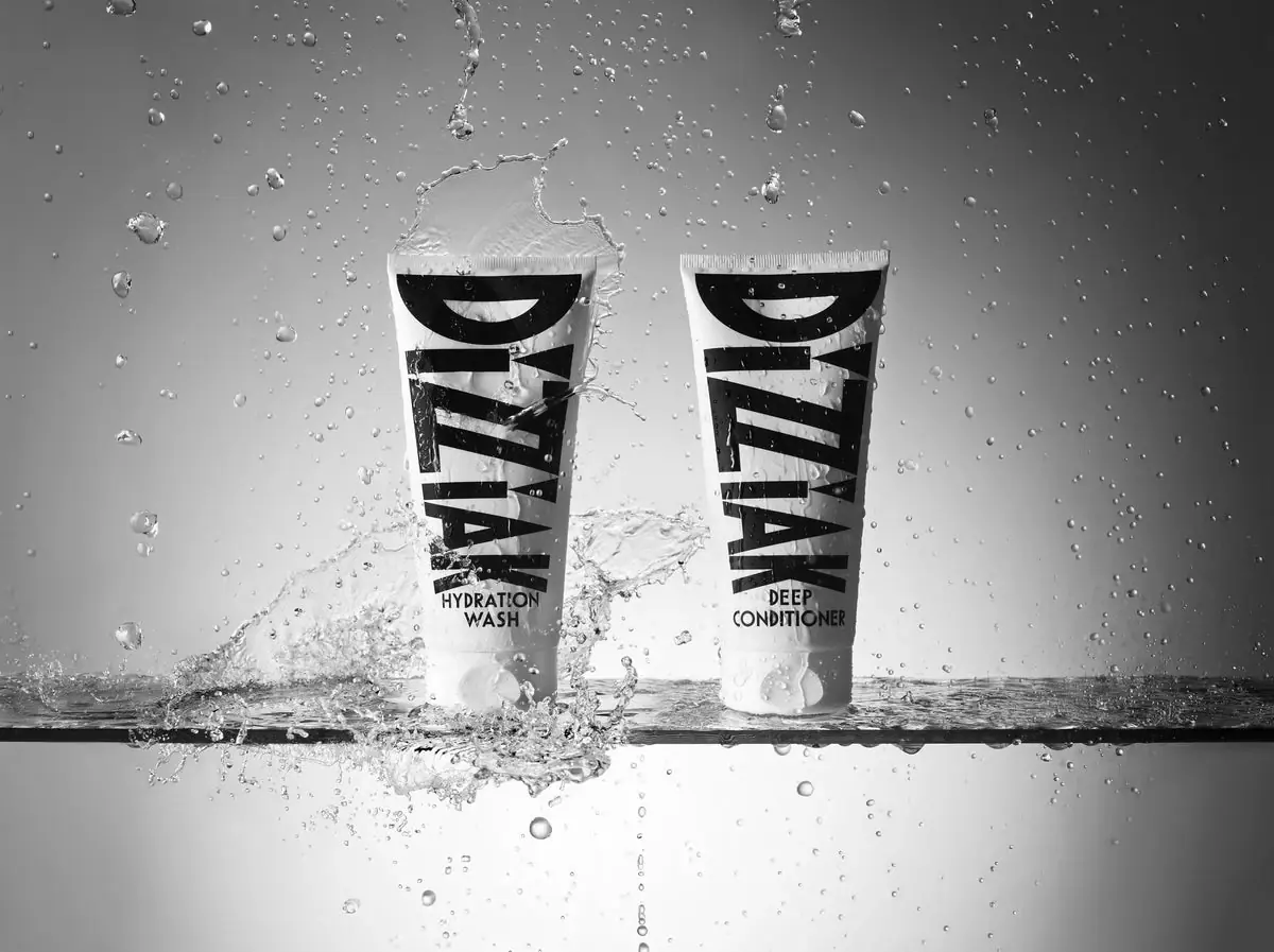
DIZZIAK Hydration Duo combines a 200 mL wash and 200 mL conditioner in matching squeezable tubes. The selected black-and-white image shows both packs in water, using oversized vertical lettering to make each product role visible even in a dramatic campaign scene.
The official duo page names Hydration Wash and Deep Conditioner, each 200 mL, and describes the set packaging as 100% recyclable.[1]
Pack construction & use
- Matched pair
- DIZZIAK describes the two 200 mL packages as 100% recyclable. The product page does not identify the material or local collection route.[1]
- Visual coding
- Both tubes share the same tall black DIZZIAK wordmark and pale body; the product names near the bottom distinguish wash from conditioner.Observed in the reference photograph
What makes the design work
Editorial analysis of this packaging reference.
Brand name as a graphic stripe
DIZZIAK runs vertically in very large type, turning the brand into the dominant visual element and making the pair recognizable in a busy image. The products then use smaller role labels to clarify the difference between them.
Pairing reads as a routine
The near-identical tubes sit side by side, with WASH and DEEP CONDITIONER placed at the same lower position. That repeated layout makes the two-step system easy to understand without adding separate color codes.
Monochrome remains legible in motion
Black type against white packaging holds contrast against the water and splashes in the image. The simple palette keeps the product names readable despite an active campaign scene and reinforces the duo’s unified identity.
Ideas for your next brief
- Keep a routine set visually unified, then distinguish each item with consistently placed function labels.
- Oversized vertical branding can create a strong paired-product silhouette without relying on separate colors.
Sources & further reading
Researched 19 October 2026