Photography: DIZZIAK official photography. Images belong to their respective owners.
DIZZIAK

Oversized black lettering unites two pale haircare tubes
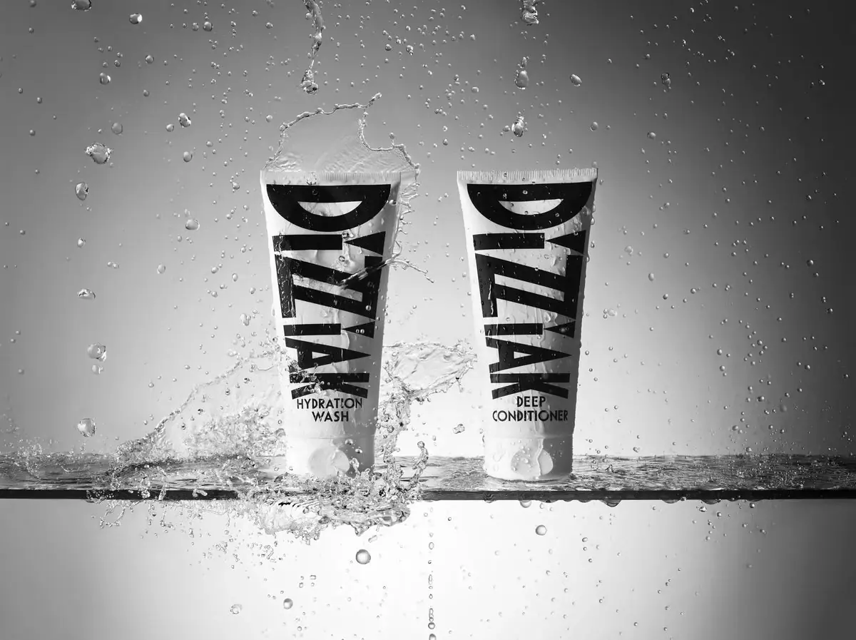
Hydration Duo uses almost identical tubes to present a wash-and-condition pair. Each pale body is dominated by an oversized rotated DIZZIAK wordmark, while two short horizontal lines near the cap identify Hydration Wash or Deep Conditioner. The black-and-white photograph places both tubes amid splashes, making the strong letter shapes and repeated silhouette the main stabilising elements. This study compares the two fronts within the single selected duo. Their shared appearance establishes a real paired hierarchy, while exact physical colour standards and hidden construction remain outside the evidence.
- Hair
- Light pack
- Bold typographic
- Luxe monochrome
About this study
The single selected Hydration Duo image showing two products: Hydration Wash and Deep Conditioner. Comparisons apply to these inspected fronts, not every DIZZIAK package.
Sources & evidence · Reviewed 2026-10-19Color Palette
Approximate colours interpreted from photography. These are screen references, not official brand colours or print specifications.
Pack body
Pale tube field
#E9E9E7
Approximate light body and cap value in the monochrome reference. The image supports a tonal relationship rather than a verified physical white shade.
Ink
Near-black lettering
#121212
Approximate large wordmarks and smaller product names. Dark graphics dominate the visible body area and hold their identity against the pale field.
Typography
Suggested visual alternatives, not confirmed brand typefaces. Any scale below is an illustrative estimate.
The maker name is exceptionally large and rotated along each tube's length. Heavy strokes, broad letter shapes and diagonal joins turn it into a graphic structure rather than a modest header. It extends close to the sealed end and down toward the functional text. HYDRATION WASH and DEEP CONDITIONER then return to an upright reading direction in two smaller bold lines at matching positions. The pair therefore repeats a strong identity first and differentiates function second. The visual contrast between wordmark and role label is chiefly size and orientation, not colour.
Fonts
Original large identity alternative
Anton
- Looks like
- Heavy condensed display sans
- Type
- Condensed display sans serif
- Weight
- Regular
- Case
- Uppercase
- Tracking
- Compact with individually checked counters
- Fallback
- Impact, Arial Black, sans-serif
Use as a starting point for a bold original name, changing its orientation and proportions rather than copying the proprietary letterform pattern. Test how taper and curvature alter the outer strokes.
Product-role alternative
Barlow Condensed
- Looks like
- Bold compact practical sans
- Type
- Condensed sans serif
- Weight
- SemiBold, Bold
- Case
- Uppercase over one or two lines
- Tracking
- Normal
- Fallback
- Arial Narrow, Arial, sans-serif
Keep the functional names easy to distinguish beneath the much larger identity. Check both words of a two-line name so the first line alone does not create ambiguity between products.
Structure & Proportions
Visual proportions and finish previews are illustrative. Confirmed construction details and uncertainties are distinguished in the study notes.
Proportions
| Purpose | Value | Preview |
|---|---|---|
| Body almost fully used by identity | The maker lettering spans most of the main tube area, leaving a relatively small lower field for product function. | — |
| Matched paired silhouette | Both packs have similar apparent heights, tapers and cap widths in this view. The visual match does not establish measured dimensions or identical component suppliers. | — |
| Small functional landing area | The product names sit between the end of the large lettering and the cap, giving a consistent place to look for the difference between the tubes. | — |
Shapes
| Element | Value | Preview |
|---|---|---|
| Tube body | Broad straight crimp tapering toward a lower cap with softened edges. | |
| Wordmark field | Large rotated letterforms with heavy bars and diagonals, filling the body rather than sitting inside a separate panel. | |
| Role-label block | Two short upright lines centred immediately above each cap. |
Finishes
Smooth pale body appearance
Tube wall and cap · matte
Water-generated reflections
Wet surfaces in the selected photograph · gloss
Formats and materials
| Formats | Two tall squeeze tubes displayed together as Hydration Duo, Straight crimped upper ends and pale bottom caps, Officially identified 200 mL Hydration Wash and 200 mL Deep Conditioner |
| Materials | The official duo page describes the packaging as fully recyclable, but does not identify exact tube resins, laminate layers or local collection routes in the inspected text., The smooth pale bodies do not establish a mono-material construction or recycled-content percentage., Cap polymer, label or direct-print construction, and any internal seals remain unverified. The brand's environmental wording is not expanded into an independent technical finding. |
| Closures | Both tubes rest on pale lower caps with visible seams and opening recesses. The caps keep the pair's base treatment consistent and mark the dispensing ends. They remain shut in the selected photograph, so the outlet geometry, seal and hinge operation are not inspected. The wet scene does not establish waterproof labelling or leak resistance. |
| Decoration | Repeated oversized rotated maker wordmarks, Matched lower function-label positions, No visible botanical illustration or separate colour band distinguishing the two fronts |
Front Panel
Schematic reading order. The diagram’s zone heights do not represent measured artwork proportions.
The front reads as large lettering integrated with a pale tube field, without an enclosing label border. Both products use the same dominant identity and an equivalent lower role block. The contrast between angled or rotated maker strokes and upright function names helps separate those jobs. The image does not reveal whether the graphics are directly printed or carried by a film, and no front capacity line is confidently readable in the splash photograph.
| Zone | Content |
|---|---|
| Upper and middle body | Very large dark DIZZIAK wordmark aligned along the tube length. |
| Lower wash identity | HYDRATION above WASH on the left tube in the selected composition. |
| Lower conditioner identity | DEEP above CONDITIONER on the right tube, using the same role-label position. |
| Cap area | Pale closure face with physical opening details rather than additional prominent front copy. |
Range System
This reference includes two directly inspected products, so the shared hierarchy can be compared without inventing a whole-brand rule. The official page confirms that they are paired as a wash routine. Their near-identical graphic treatment establishes unity, while plain-language role names supply differentiation. This works as a two-product example but does not prove that every DIZZIAK format uses the same material, orientation or cap. The pair should also be tested separately, because customers may not always see both products together.
- Hydration Wash and Deep Conditioner occupy equivalent two-line blocks.
- Both fronts repeat the same large maker identity and pale closure treatment.
- A fictional routine could preserve unity while adding an independent secondary cue for users who need faster differentiation than small wording alone provides.
Back of Pack & Shelf
The reverse, underside, opened caps and any shared outer packaging are absent. The official listing provides ingredients and usage, but their printed arrangement is not visible.
- Do not invent a duo carton just because the products are sold together.
- Do not turn the source-confirmed 200 mL quantity into a claim about a readable front line in this image.
- For an original routine pair, ensure each individual product retains its own practical identity and instructions when separated from the set.
On shelf
As an interpretation, the shared oversized logo would make the pair easy to associate at a distance. The trade-off is that the two roles have much less graphic area than the maker name. Real use could require a closer look to choose wash rather than conditioner, particularly when one tube is wet, turned away or separated from the other. A useful evaluation would test role identification without relying on left-right placement, because that arrangement belongs to the photograph rather than a guaranteed storage position.
Imagery
The official product image is rendered in monochrome, with the tubes standing cap-down on a narrow wet horizontal support. Suspended droplets fill the surrounding grey field, and a larger splash crosses part of the left pack. The heavy lettering remains recognisable as a repeated shape, while the lower function names are readable at this enlarged scale. The water supplies motion and a use-related association without adding another printed graphic. Because the entire scene is black and white, it cannot verify subtle physical undertones in the tubes, cap or ink.
Guidelines
Editorial principles for an original design brief, not official brand guidelines.
Do
- Keep shared identity consistent across a routine pair.
- Put functional differences in a predictable readable location.
- Test each product separately as well as together.
- State environmental claims with their source and technical limits.
- Treat monochrome photography as tonal evidence rather than an exact colour standard.
Don't
- Do not depend on photographed left-right placement to identify products.
- Do not infer tube material from a recycling statement.
- Do not claim waterproof print from a splash image.
- Do not reproduce the proprietary oversized letter shapes or exact orientation.
Sources & evidence
- Hydration Duo — DIZZIAKproduct
How this study was built
edition · Sourced fact
The official page identifies Hydration Wash and Deep Conditioner, each 200 mL, as the paired routine.Hydration Duo — DIZZIAKstructure · Sourced fact
The brand describes fully recyclable packaging, but the page does not supply exact tube construction or local collection specifications.Hydration Duo — DIZZIAKtypography · Visual observation
Both tubes carry large rotated maker lettering above much smaller upright function names.Hydration Duo — DIZZIAKrange · Visual observation
The two directly inspected fronts share layout and silhouette while their role names distinguish the products.Hydration Duo — DIZZIAKpalette · Visual observation
The selected monochrome image establishes a dark-on-pale tonal relationship rather than exact package colours.Hydration Duo — DIZZIAKimagery · Visual observation
Droplets and splashes surround the cap-down tubes, with water partly crossing the left pack.Hydration Duo — DIZZIAK
What remains unverified
- Monochrome photography cannot establish exact physical colour undertones.
- The brand's recyclability statement lacks component material and local-route detail in the inspected page.
- Reverse panels, open caps and any outer packaging are absent.
- Original fonts, print process and measured dimensions are unverified.
Give your AI
packaging taste
Give your design or image tool a packaging study: palette, type, structure, front panel and principles for an original brief.
Export this styleFree with an email. PACK.md works in Claude, ChatGPT, Cursor and image tools.
More like this

Color Wow
Tall condensed naming on a broad reflective silver jar

EADEM
Mirror-bright tube, oversized black identity, juicy campaign color
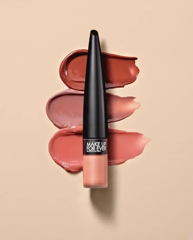
MAKE UP FOR EVER
Long tapered black cap above a compact colour chamber
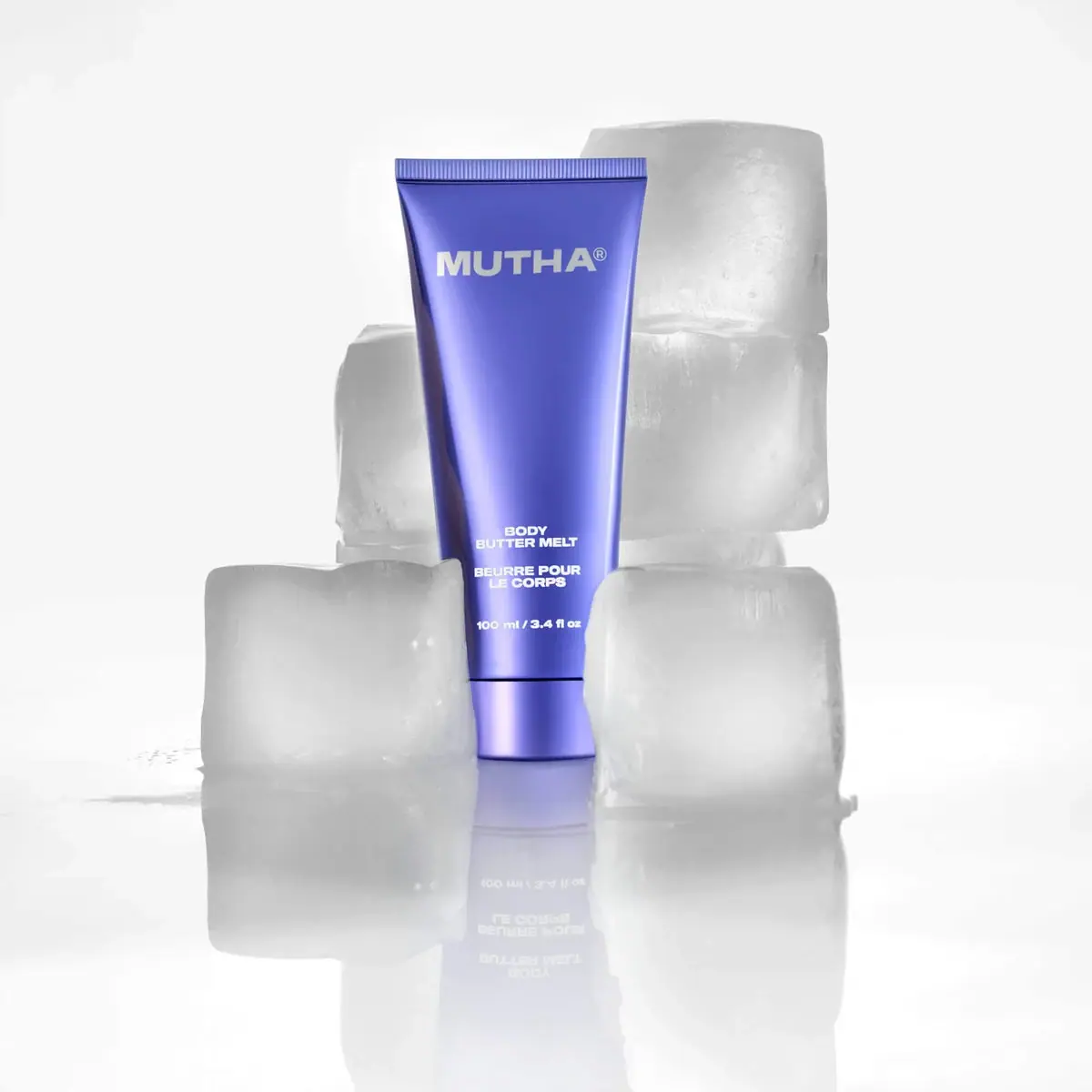
MUTHA
Reflective violet tube with bold maker and spacious middle
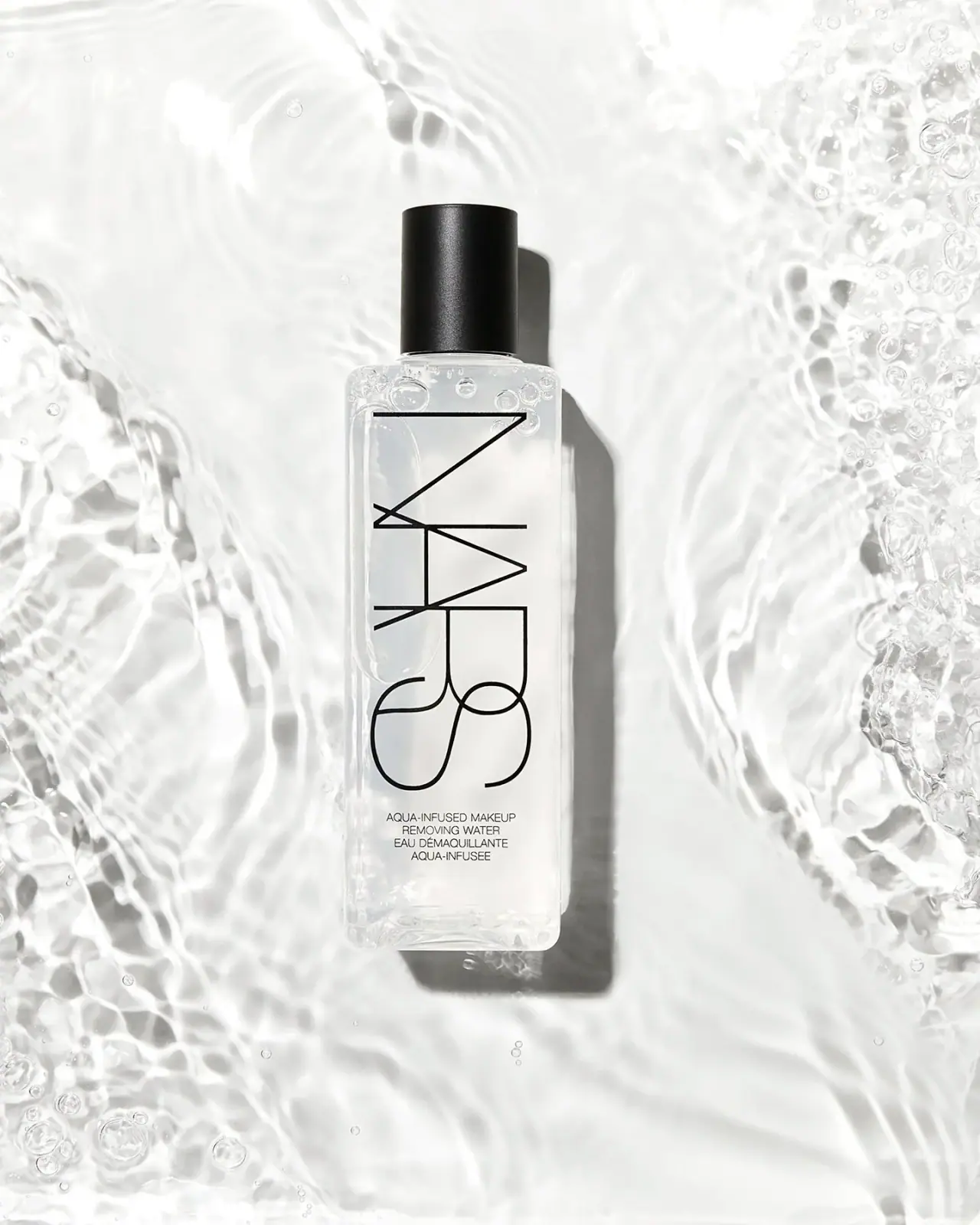
NARS
Clear elongated bottle with oversized interlocking mark and black cap
Pat McGrath Labs
Gold pigment kit with sparse labelling and sequin-filled pouch
Rodial
Reflective silver with parallel vertical foundation lettering

Saie
giant lowercase wordmark over frosted shade