About this packaging
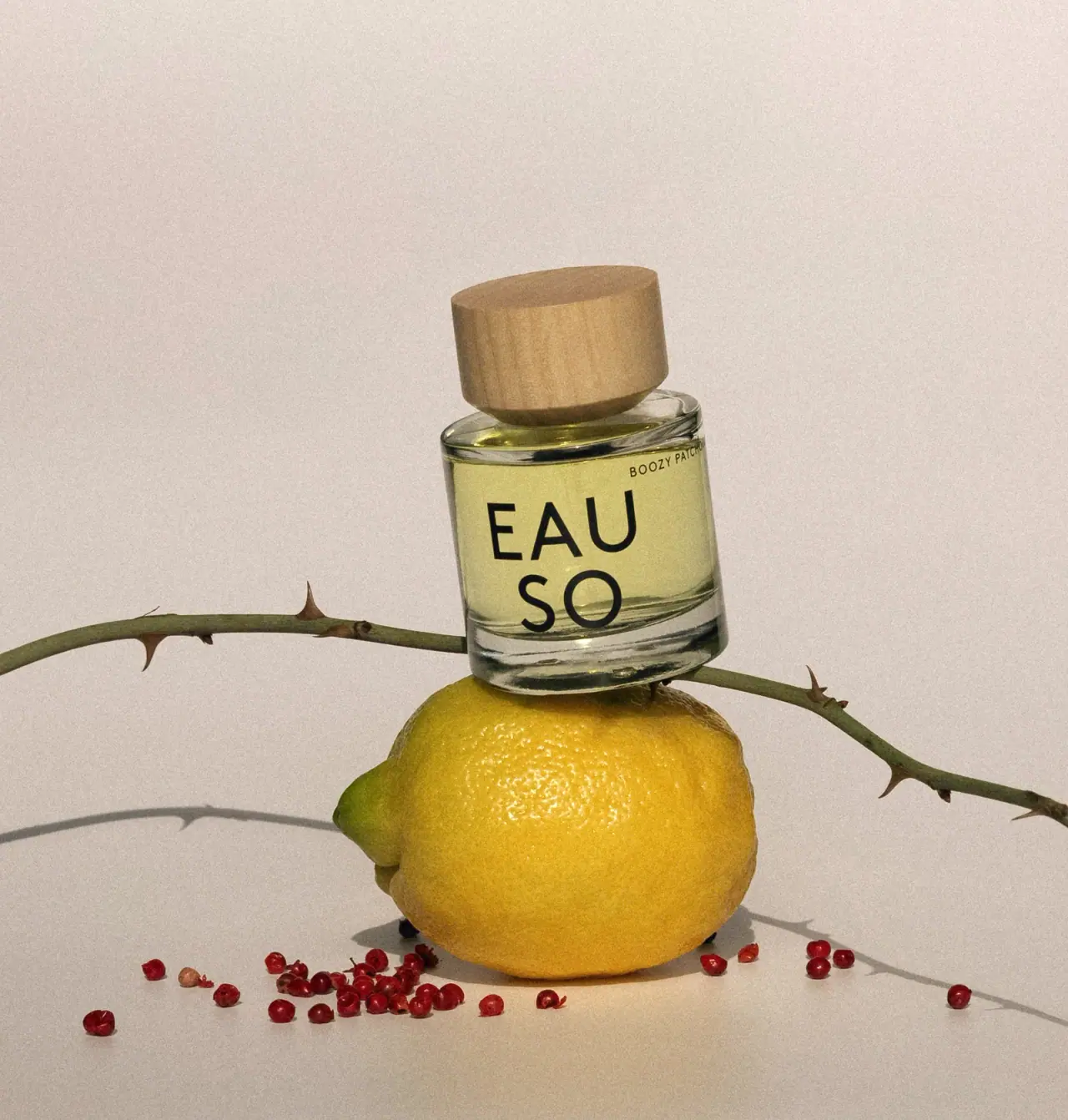
EAUSO VERT’s Boozy Patchouli bottle sets oversized stacked lettering against a compact rounded cylindrical body and broad pale cap. Lemon, peppercorns and a thorned stem stage the scent story around the package without becoming printed decoration.
The official listing identifies Boozy Patchouli as a 50 ml Eau de Parfum and credits perfumer Pascal Gaurin.[1]
Pack construction & use
- Rounded bottle and broad cap
- The selected image shows a clear cylindrical-looking bottle with rounded shoulder and base, pale grain-textured cap and lightly tinted contents. The brand FAQ identifies glass bottles and a crimpless push-pump requiring professional separation; cap material is not specified.[2]
- Front hierarchy
- The cover places a small Boozy Patchouli name above the large stacked EAU / SO wordmark.Observed in the reference photograph
What makes the design work
Editorial analysis of this packaging reference.
Logo as the main panel
Stacking EAU over SO fills the bottle face and makes the wordmark read as a graphic block. The scent name stays close to the shoulder as a quieter identifier.
Two rounded volumes provide contrast
The broad opaque-looking cap sits above a compact clear cylindrical body. Its pale grain-textured appearance contrasts with the glass reflections; exact cap material and treatment are unverified.
Props echo scent notes
Lemon and peppercorns frame the bottle. These still-life cues relate to listed citrus and pepper notes, while the package itself remains visually spare.
Ideas for your next brief
- Let a stacked wordmark occupy the main face when the brand identity is a key recognition cue.
- Use one larger closure shape to create a clear contrast with a compact bottle body.
Sources & further reading
Researched 19 October 2026