About this packaging
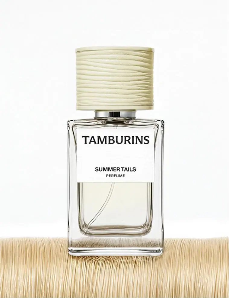
Tamburins’ Summer Tails perfume pairs a rectangular bottle with a tall ridged cap. A white front label separates a prominent Tamburins mark from the smaller scent name, giving the clear block a quiet, ordered face.
Tamburins lists Summer Tails in 50 ml and 11 ml sizes. The selected image shows the 50 ml bottle.[1]
Pack construction & use
- Bottle and cap
- The cover shows a clear-looking rectangular bottle, white label, and ribbed pale cap.Observed in the reference photograph
- Front hierarchy
- TAMBURINS appears above SUMMER TAILS and PERFUME on the front label.Observed in the reference photograph
What makes the design work
Editorial analysis of this packaging reference.
Block and texture
Straight bottle edges contrast with the fine horizontal ridges on the cap. The cap adds surface detail to a clean rectangular body.
Whitespace divides information
A large blank interval between brand and scent name clearly separates the two reading levels.
Quiet label field
Black type on white keeps the front readable while the cap’s ridges provide the main tactile-looking detail.
Ideas for your next brief
- Use a simple rectangular body as a calm counterpoint to a more tactile closure.
- Separate brand and variant with intentional whitespace when both need clear but distinct hierarchy.
Sources & further reading
Researched 19 October 2026