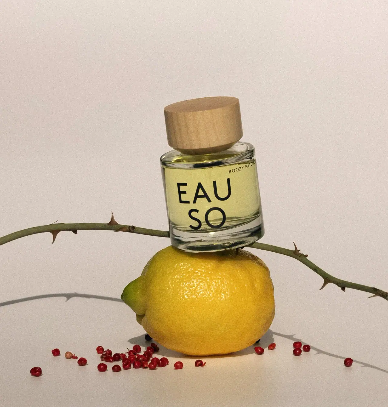
Photography: EAUSO VERT official photography. Images belong to their respective owners.
EAUSO VERT

Oversized stacked lettering on a clear round perfume bottle
The selected Boozy Patchouli bottle is compact and cylindrical-looking, with a broad pale grain-textured cap and a deep clear base. Oversized black EAU / SO lettering occupies most of the visible body, while the scent name appears as a small uppercase line near the upper right shoulder. Pale yellow-green contents remain visible around and behind the letters. The rounded shoulder and curved base distinguish this object from a hard-edged rectangular flacon. Lemon, pink peppercorns and a thorned stem build the campaign composition around the bottle without becoming printed decoration.
- Perfume
- Light pack
- Bold typographic
About this study
Selected Boozy Patchouli 50 mL bottle image with stacked lettering, rounded clear body and pale grain-textured cap. Other fragrances and outer cartons are not audited.
Sources & evidence · Reviewed 2026-10-19Color Palette
Approximate colours interpreted from photography. These are screen references, not official brand colours or print specifications.
Pack body
Pale grain-textured cap
#B69B6D
Approximate natural tan appearance with visible grain. The inspected sources do not specify wood species, construction, coating or internal insert.
Pale yellow-green contents
#CECC82
Approximate visible liquid appearance through glass in this photograph. It is not a printed colour or a verified range code; lighting and nearby lemon can affect perception.
Ink
Black identity
#181A12
Approximate large lettering and small scent-name colour. The dark typography is the primary graphic contrast against transparent glass and pale liquid.
Typography
Suggested visual alternatives, not confirmed brand typefaces. Any scale below is an illustrative estimate.
The split EAU / SO name forms two large black lines, with the upper line wider than the lower. Open counters and generous letter size turn the producer into the principal face graphic. The much smaller Boozy Patchouli line sits near the shoulder, shifted to the right and partly following the bottle’s curvature out of view. This is a marked scale contrast rather than a conventional centred stack of brand, product and volume. The identity dominates at distance; scent selection requires a closer view of the small upper line.
Fonts
Large stacked identity alternative
Manrope
- Looks like
- Manrope
- Type
- Geometric sans serif
- Weight
- Medium 500 / SemiBold 600
- Case
- Uppercase
- Tracking
- Open but optically balanced
- Fallback
- sans-serif
A proposed face for an original large two-line name. Develop a distinct word split and letter arrangement rather than reproducing EAU / SO; check how curvature affects the outer letters.
Small scent identifier
IBM Plex Sans
- Looks like
- IBM Plex Sans
- Type
- Grotesque sans serif
- Weight
- Regular 400 / Medium 500
- Case
- Uppercase
- Tracking
- Modestly open
- Fallback
- sans-serif
Use for a compact fragrance name near the shoulder. Long names should remain readable from the intended front view instead of disappearing around the side or becoming excessively small.
Structure & Proportions
Visual proportions and finish previews are illustrative. Confirmed construction details and uncertainties are distinguished in the study notes.
Proportions
| Purpose | Value | Preview |
|---|---|---|
| Body | The bottle reads as a short broad cylinder with elliptical shoulder and base contours. Perspective is not used to calculate diameter or wall thickness. | — |
| Cap | The pale cap is substantial and close to the body in width, creating a second simple cylindrical volume above the glass. | — |
| Typography | The stacked identity occupies most of the useful front height above the clear base, while the scent line remains a narrow strip near the shoulder. | — |
Shapes
| Element | Value | Preview |
|---|---|---|
| Bottle | Compact rounded cylindrical form with visible curved shoulder and base. | |
| Cap | Broad pale cylindrical cover with a flat-looking top. | |
| Stacked identity | Two large horizontal text lines forming one graphic block. | |
| Clear base | A deep-looking curved transparent band below the main liquid field. |
Finishes
Clear glass reflections
Bottle shoulder, side and base. · transparent
Low-reflection grain appearance
Pale cap; material and treatment unverified. · matte
Formats and materials
| Formats | A compact clear cylindrical-looking perfume bottle with rounded shoulders, a substantial clear base and a broad cylindrical cap. The official product page gives 50 mL / 1.7 fl. oz. Eau de Parfum. |
| Materials | The brand FAQ explicitly refers to its glass bottles. It describes a crimpless push-pump system requiring professional separation before recycling; this is a current brand packaging statement rather than an exposed view of the selected bottle’s internals., The cap looks wood-like with visible grain, but its exact material, species, insert and treatment are not specified in the accessed primary pages. Pump subcomponents and decoration inks are also unitemised. |
| Closures | The broad cap is fitted over the neck, hiding the atomiser. The FAQ supports a push-pump context, but the photograph does not reveal cap retention, pump hardware or a user-removable refill closure. No refill system is inferred. |
| Decoration | Large two-line black identity and a much smaller scent name are the visible graphics. There is no opaque paper label or printed botanical illustration visible on the front. |
Front Panel
Schematic reading order. The diagram’s zone heights do not represent measured artwork proportions.
The visible face is largely transparent, with large black lettering placed over the pale liquid field. A small scent name sits along the upper edge at the right. The clear base forms a natural lower boundary beneath the large letters. The composition does not rely on a bordered label, centred crest or dense front description.
| Zone | Content |
|---|---|
| Upper scent line | Boozy Patchouli appears in small uppercase near the right shoulder. Part of the text curves away from the frontal view, so an additional straight-on image would improve full-name legibility. |
| Large producer block | EAU sits above SO in a bold-scale arrangement. Its dark letterforms perform the work that an illustration or coloured label might do on another perfume. |
| Transparent surroundings | Pale liquid and reflected background remain visible around the letters. There is no evidence here of an opaque printed colour field. |
| Lower base | The thick-looking clear band gives the bottle a visual footing. No quantity or supporting line is clearly readable in this selected area. |
Range System
The official listing identifies Boozy Patchouli and its 50 mL format. Only this photographed bottle is audited. The strong producer block and small scent line suggest an architecture that could accommodate multiple fragrances, but neither liquid colour nor cap appearance is established as a universal range code.
- For an original fragrance family, preserve the distinction between a stable producer graphic and a clearly readable changing scent name. A short hero name should not set a grid that fails when another scent name is longer.
- A clear bottle exposes differences in liquid appearance, but relying on those differences alone would make selection vulnerable to lighting and formula variation. This is design guidance rather than a claim about the full EAUSO range.
Back of Pack & Shelf
Rear copy, underside marks, atomiser and any outer carton are not shown. The selected angle provides a strong identity view but not a complete technical packaging record.
- Confirm the rear and underside before placing concentration, volume or batch information in a diagram.
- Keep brand recycling instructions separate from an unsupported claim that the assembled pump and cap are curbside recyclable.
- Do not infer a screw-off refill opening from the visible cap.
On shelf
The oversized black name is likely to survive thumbnail reduction better than the small shoulder identifier. The broad cap and clear curved base provide recognition through silhouette even when the liquid is pale. This is visual interpretation, not a retail test. For comparison between scents, the catalogue should retain a readable scent title outside the image rather than relying entirely on the photographed small text.
Imagery
The bottle balances visually above a lemon, with a thorned green stem passing behind it and pink peppercorns scattered below. The official note list includes citrus and pink pepper, supporting the scene’s aromatic association without making the props an ingredient quantity claim. A warm pale background and hard shadows give the image a tactile still-life quality. The lemon’s saturated yellow and the peppercorn red are excluded from the packaging palette. The tilted bottle makes the curved geometry clear while also pushing the small scent line toward the edge of readability.
Guidelines
Editorial principles for an original design brief, not official brand guidelines.
Do
- Describe the rounded cylindrical geometry visible in the photo.
- Make the changing scent name readable despite the dominant producer block.
- Separate cap appearance from unverified wood and coating specifications.
- Use the FAQ to qualify glass and pump recycling as separate component issues.
Don't
- Do not call the bottle a hard-edged clear rectangle.
- Do not infer cap species, certification or refillability from natural-looking grain.
- Do not promote liquid colour into a verified scent-coding system.
- Do not include lemon yellow or peppercorn red as printed package colours.
Sources & evidence
How this study was built
edition · Sourced fact
Official listing gives Boozy Patchouli 50 mL Eau de Parfum and citrus/pink-pepper notes.Boozy Patchouli — EAUSO VERTstructure · Sourced fact
FAQ identifies glass bottles and crimpless push-pumps requiring professional separation.Product and packaging FAQ — EAUSO VERTstructure · Visual observation
Rounded cylindrical body and curved base contradict a hard-edged rectangular description.typography · Visual observation
Large stacked EAU / SO dominates a small right-shoulder scent line.palette · Visual observation
Black type, pale cap and pale liquid belong to the object; fruit colours are scene props.imagery · Visual observation
Bottle is staged above lemon with thorned stem and scattered pink peppercorns.range · Editorial interpretation
Stable identity versus small variant line is transferable, but other fragrance coding is not established.
What remains unverified
- Cap material, species, coating and insert are not specified in inspected sources.
- FAQ pump statement is brand-level; selected hardware remains hidden.
- Colour approximations include visible liquid, not production ink specifications.
- Reverse, underside, carton and original fonts are unverified.
Give your AI
packaging taste
Give your design or image tool a packaging study: palette, type, structure, front panel and principles for an original brief.
Export this styleFree with an email. PACK.md works in Claude, ChatGPT, Cursor and image tools.
More like this

Akro
soft pink interrupted by an assertive black signature
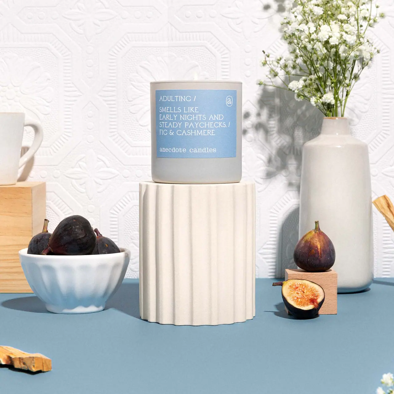
Anecdote Candles
A pale-blue label tells its story through punctuation
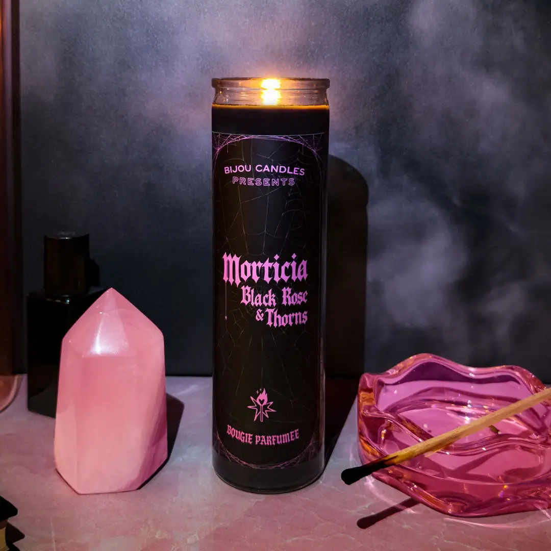
Bijou Candles
Pink blackletter and fine webs on a tall dark candle
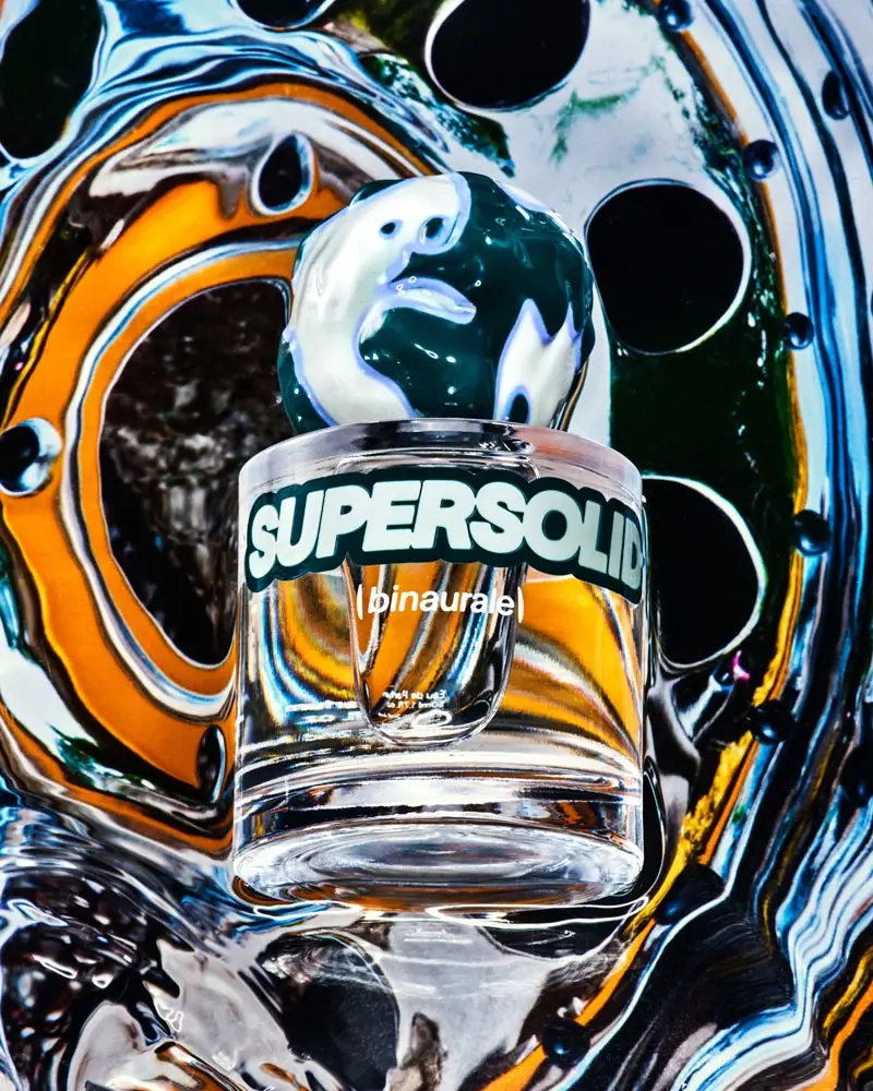
Binaurale
Globular teal cap above slanted pale fragrance lettering
Blake Brown
sculptural rose-brown fragrance with a jewel-like centre

Boy Smells
candy-shell flacons over blush pink glass

D.S. & Durga
deadpan grotesk names on parchment labels
Escentric Molecules
Clear rectangular fragrance with giant symbol and layered coded graphics