About this packaging
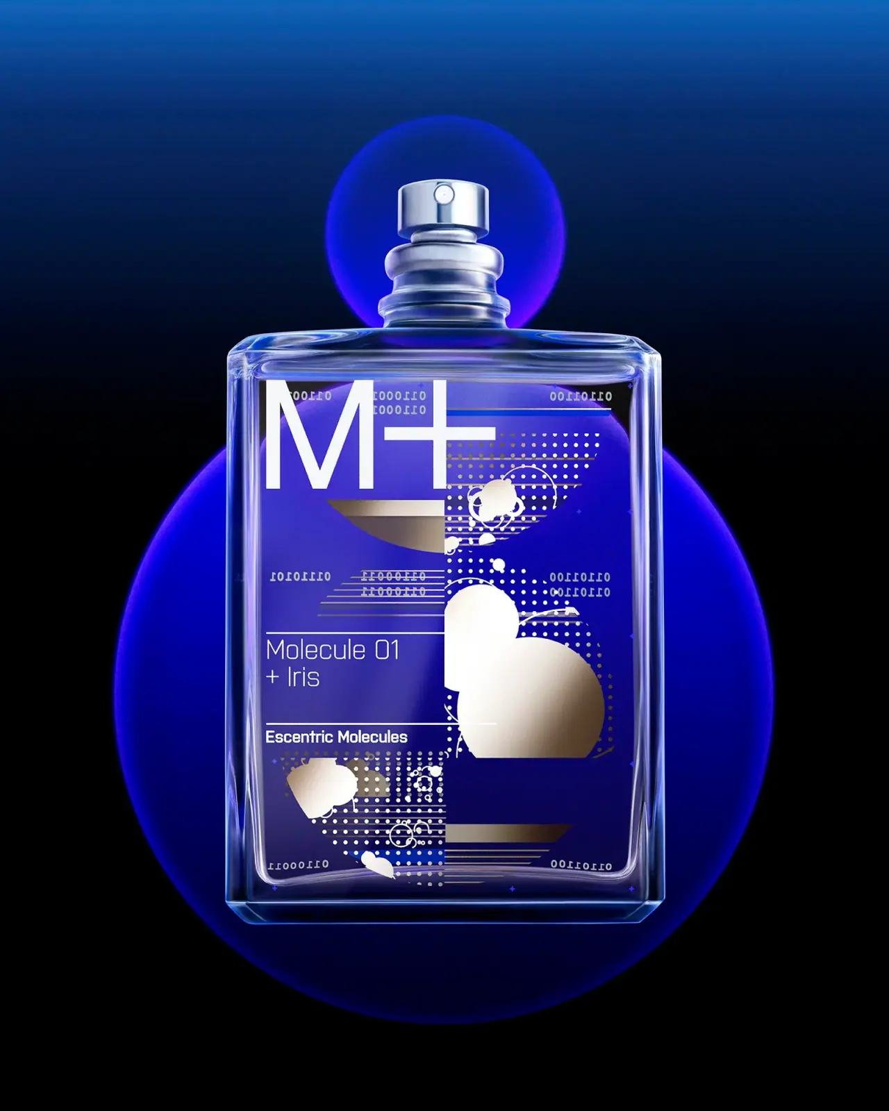
Escentric Molecules Molecule 01 + Iris uses a clear rectangular fragrance bottle as a canvas for a layered, abstract front graphic. The official page offers 30 mL and 100 mL formats and identifies the pairing as Iso E Super with iris, while the photographed graphic gives the bottle its own visual rhythm.
Escentric Molecules describes Molecule 01 + Iris as Iso E Super paired with iris.[1]
Pack construction & use
- Clear bottle and exposed sprayer
- The selected cover shows a rectangular transparent bottle with rounded corners and an exposed silver-colored spray nozzle.Observed in the reference photograph
- Visible graphic layers
- Circular forms, dot grids, short bars and small digit-like marks overlap across the bottle's visible face. Some details appear reversed through the transparent body, so the photograph does not establish that all artwork is applied to the front surface or identify its application method.Observed in the reference photograph
What makes the design work
Editorial analysis of this packaging reference.
An oversized initial creates a first read
The large white M+ sits above the smaller product and brand lines, giving the bottle an immediately recognizable symbol before the full name is read. The simple typographic stack holds its own against the busier background graphic.
Abstract marks around a clear reading zone
Dots, bars, circles and digit-like details create a systematic-looking graphic field, especially on the right and lower areas. The left-aligned product and maker lines retain their own reading zone between thin rules; the marks are not presented as a verified ingredient diagram or decoded data.
Transparent hardware keeps the format visible
The bare spray nozzle and clear bottle preserve visibility of the vessel rather than enclosing the whole neck in a large cap. This leaves the printed graphic as the dominant visual feature and keeps the dispensing point apparent.
Ideas for your next brief
- Use one oversized symbol to establish hierarchy when a front graphic contains many smaller marks.
- Build a repeatable abstract vocabulary from dots, bars and shapes without presenting it as technical data.
- Keep exposed dispensing hardware visually integrated when the pack’s printed face is already dense.
Sources & further reading
Researched 19 October 2026