Photography: Josh Caudwell — fragrance still-life photography. Images belong to their respective owners.
Escentric Molecules

Clear rectangular fragrance with giant symbol and layered coded graphics
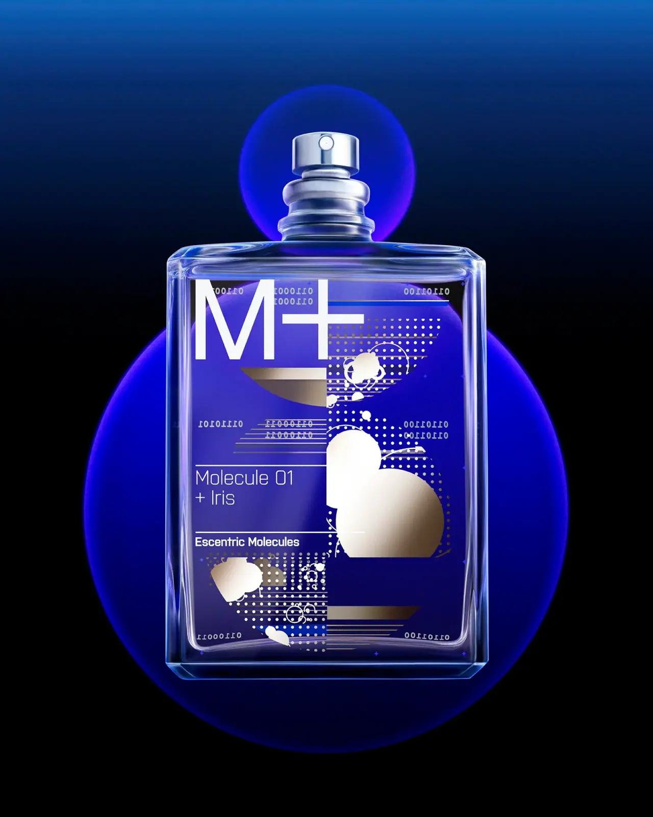
Molecule 01 + Iris uses a transparent rectangular fragrance bottle as a layered graphic surface. A huge white M+ occupies the upper left, while a smaller left-aligned product block and maker line sit between fine horizontal rules below. Dot fields, clipped circles, short parallel bars and digit-like details fill the surrounding area. The exposed silver-colored sprayer keeps the hardware visible. Josh Caudwell's blue-violet scene passes through and reflects around the bottle, so its dramatic blue appearance should not be mistaken for a verified blue vessel or liquid.
- Perfume
- Dark pack
- Bold typographic
- Maximalist pattern
About this study
Selected Molecule 01 + Iris photograph by Josh Caudwell. Exact pictured capacity and graphic application planes not established; blue-violet scene color not treated as fixed bottle color.
Sources & evidence · Reviewed 2026-10-19Color Palette
Approximate colours interpreted from photography. These are screen references, not official brand colours or print specifications.
Pack body
Clear edge highlight
#C5D1E0
Illustrative pale reflection on the transparent-looking vessel and exposed hardware, not an opaque body-color specification. Blue-violet transmitted scene color is deliberately excluded as a fixed pack color.
Ink
Bright white graphic
#F4F2EB
Large M+, readable product lines and portions of the abstract pattern. It remains the strongest light anchor against the saturated photographic setting.
Accent
Warm silver-gold graphic
#ADA18A
Some circles, bars and dots appear warm metallic or reflective. Exact ink, foil and coating process are not established.
Typography
Suggested visual alternatives, not confirmed brand typefaces. Any scale below is an illustrative estimate.
The very large M+ sign establishes the fastest read at upper left. Below, Molecule 01 and + Iris form a much smaller thin sans block, left-aligned between horizontal separators. The maker line below is smaller again but heavier. Tiny digit-like marks belong to the surrounding graphic vocabulary and should not be read as product instructions. The system combines a single oversized sign with an orderly text zone, allowing complex decoration to remain secondary to identifiable naming.
Fonts
Original large sign and product name
Roboto
- Looks like
- Light geometric technical sans
- Type
- Neo-grotesque sans-serif
- Weight
- Light, Regular
- Case
- Original symbol or capitals; title-case product
- Tracking
- Natural open spacing
- Fallback
- Arial, sans-serif
Use a different large sign and a restrained product title in an original design. Keep enough stroke strength in the smaller text when it crosses a transparent surface or bright reflection.
Maker and fine information
IBM Plex Sans
- Looks like
- Neutral compact sans
- Type
- Grotesque sans-serif
- Weight
- Regular, SemiBold
- Case
- Title case and small functional text
- Tracking
- Natural spacing
- Fallback
- Arial, sans-serif
Alternative for a compact maker line and genuine supporting information. Decorative microtype should be invented as clearly nontechnical pattern rather than suggesting verified molecular or safety data.
Structure & Proportions
Visual proportions and finish previews are illustrative. Confirmed construction details and uncertainties are distinguished in the study notes.
Proportions
| Purpose | Value | Preview |
|---|---|---|
| Broad rectangular canvas | The bottle offers a large front relative to its small exposed sprayer, letting the graphic field dominate the silhouette. | — |
| Large-to-small jump | The M+ sign is far larger than the product block and tiny graphic marks, producing a pronounced hierarchy without needing many text colors. | — |
| Left reading zone | Product and maker text align in a calmer lower-left area while much of the complex shape-and-dot activity concentrates to the right and bottom. | — |
| Visible clear border | A reflective transparent-looking margin surrounds the artwork, keeping the physical bottle edge legible despite dense decoration. | — |
Shapes
| Element | Value | Preview |
|---|---|---|
| Bottle body | Broad rectangle with softened corners and a substantial-looking clear lower edge. | |
| Exposed atomizer | Small silver cylindrical actuator over stepped neck rings. | |
| Abstract graphic vocabulary | Circles and clipped discs, dot arrays, horizontal bars and irregular pale splashes. | |
| Text rules | Thin horizontal lines define a calmer left-aligned name-and-maker area. |
Finishes
Clear reflective vessel
Body edges, shoulders and base reveal the background through the object; exact material specification unknown. · transparent
Silver hardware appearance
Exposed actuator and stepped neck fittings; alloy and plating unverified. · metallic
Warm reflective graphic appearance
Selected circles and bars; no confirmed foil or metallic ink method. · metallic
Formats and materials
| Formats | Transparent rectangular fragrance bottle with exposed spray actuator; selected photograph has no legible net quantity, although the official page offers 30 mL and 100 mL options |
| Materials | The vessel has clear reflective walls, rounded corners and a substantial-looking base. Exact glass composition, recycled content and wall dimensions are not established by the selected sources., Sprayer and neck fittings appear silver-colored. Some graphic elements also look reflective, but their material and application method are unknown. The image does not establish whether all artwork lies on the front, back or multiple surfaces. |
| Closures | An exposed cylindrical spray actuator with a small round front opening sits above several stepped neck rings. No separate cap is shown. This describes the selected presentation rather than asserting a universal brand policy or proving that no protective cover exists for shipping. Pump dose, neck fixation, refillability and transport lock are not visible. |
| Decoration | Oversized M+ sign at upper left, Left-aligned product block bounded by fine horizontal rules, Small heavier maker line, Dense abstract dots, bars, circles and irregular marks, Tiny digit-like strings and crosses visible through the layered face |
Front Panel
Schematic reading order. The diagram’s zone heights do not represent measured artwork proportions.
The graphic face works as a layered composition rather than a conventional paper-label rectangle. The giant sign occupies the top-left corner, and the product title has its own lower-left ruled space. Abstract marks cross much of the remaining surface at several scales. Some tiny details appear reversed through the clear body, warning against assigning all visible decoration to the front plane. A production reconstruction would need both sides and the actual artwork separation, not just the striking frontal image.
| Zone | Content |
|---|---|
| Large sign | White M+ leads the upper-left region and functions as a rapid visual identifier before the full fragrance name. |
| Product name | Molecule 01 + Iris is set in two thin sans lines aligned left, beneath a fine horizontal rule. |
| Maker line | Escentric Molecules appears below a second separator in a smaller but denser sans treatment. |
| Abstract field | Dot arrays, clipped circles, bars and irregular marks create visual complexity around the practical text zone. |
| Micrographic layer | Digit-like strings and tiny crosses add a coded aesthetic without supplying a verified formula, ingredient map or manufacturing data. |
Range System
The official page describes this fragrance as Iso E Super paired with iris and places it within M+. That naming relationship is sourced; the study does not decode each graphic mark as an ingredient or establish a universal color system across the collection. Only this photographed Iris bottle is visually analyzed. Current size options do not establish which capacity the undimensioned photograph shows.
- An original family can retain a stable readable name area while allowing a larger abstract field to vary.
- Use a consistent sign-to-title hierarchy if decoration becomes complex, without copying the source's M+ identity.
- Keep variant names explicit rather than relying on atmospheric lighting or unexplained graphic symbols to distinguish formulas.
Back of Pack & Shelf
A reverse view, base and carton are not inspected. Transparency reveals some layered marks but does not provide a reliable map of rear labeling or complete regulatory information.
- Inspect both bottle sides before deciding which graphic layer is printed where.
- Obtain the base or carton before assigning net capacity.
- Keep decorative code-like marks separate from actual required product information.
On shelf
Interpretively, the enormous sign can give a densely decorated bottle a clear visual starting point, while the ruled name zone provides a practical second read. The fine dots and micrographics will merge at small scale, leaving the large sign, broad shapes and reflective outline. Because transparency changes the apparent contrast, an independent design should be reviewed against light, dark and neutral backgrounds. A campaign image with luminous circles cannot alone predict how the bottle reads on a crowded shelf.
Imagery
Josh Caudwell frames the bottle with large luminous blue-violet circular forms against a dark field. A smaller circle appears behind the atomizer and larger forms surround the body, echoing the on-pack geometry at a much larger scale. Their light transmits through the vessel and catches its edges, making the transparent object look intensely colored. The scene does not establish the actual liquid hue, glass tint or a physical glowing material. No method of constructing the luminous forms is inferred.
Guidelines
Editorial principles for an original design brief, not official brand guidelines.
Do
- Establish one large simple entry point into complex graphics.
- Protect a readable product-name zone.
- Separate transmitted scene color from package specification.
- Inspect both sides of transparent packaging before mapping artwork.
- Treat code-like marks as visual language unless their meaning is documented.
Don't
- Do not call the bottle or liquid blue from this lighting alone.
- Do not assign all graphics to the front surface.
- Do not interpret decorative digits as a verified formula.
- Do not infer a cap policy or refill mechanism from the exposed sprayer.
- Do not reproduce the M+ sign and exact circle/dot composition.
Sources & evidence
- Escentric Molecules — Molecule 01 + Irisproduct
- Josh Caudwell — Product Photographyphotographer
How this study was built
edition · Sourced fact
Official page identifies the Iso E Super and iris pairing and current size options, without proving selected photo capacity.Escentric Molecules — Molecule 01 + Irisstructure · Visual observation
Transparent rectangular body and exposed silver-colored spray hardware are visible.Josh Caudwell — Product Photographytypography · Visual observation
Large M+ sits upper left above a smaller left-aligned product and maker sequence.Josh Caudwell — Product Photographylabel · Visual observation
Ruled reading zone coexists with dots, circles, bars and digit-like details; application planes are not established.Josh Caudwell — Product Photographypalette · Visual observation
White and warm reflective-looking graphics sit over strong transmitted blue-violet scene light.Josh Caudwell — Product Photographyimagery · Visual observation
Luminous external circles echo graphic geometry without proving blue glass or liquid.Josh Caudwell — Product Photographyrange · Editorial interpretation
Large sign plus protected reading zone is an adaptable hierarchy, not a decoded molecular visual system.
What remains unverified
- No legible capacity in selected photograph.
- Exact vessel/hardware materials and decoration processes unknown.
- Front/back graphic placement unresolved through transparent body.
- Original fonts and micrographic meanings unverified.
- Reverse, base, carton and separate cap not inspected.
Give your AI
packaging taste
Give your design or image tool a packaging study: palette, type, structure, front panel and principles for an original brief.
Export this styleFree with an email. PACK.md works in Claude, ChatGPT, Cursor and image tools.
More like this

Bomba Curls
tropical foliage gathered around a bold yellow nameplate
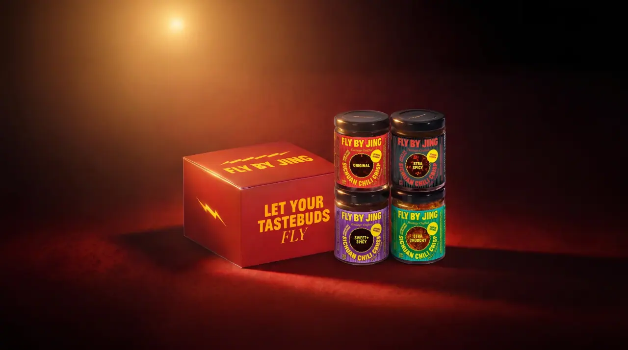
Fly By Jing
sichuan street poster, turned up loud
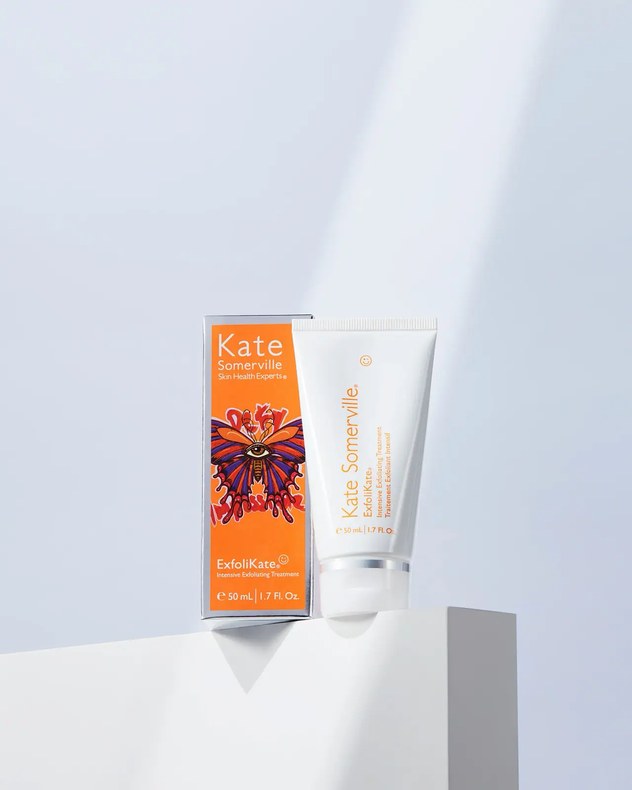
Kate Somerville
Orange artist carton beside a clean white vertical-text tube
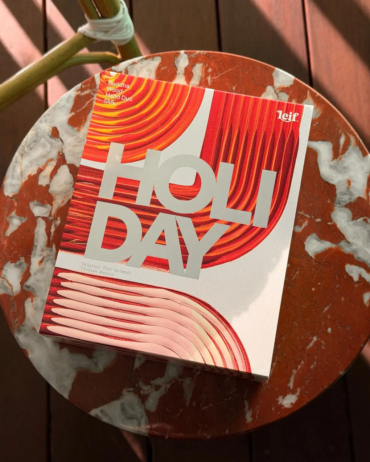
Leif
Huge silver holiday type over vivid plotted paint curves
Peace Out Skincare
Patterned peace hand over forceful black pouch typography
Soft Services
Diagonal cream paper type revealing a vivid blue bar

Akro
soft pink interrupted by an assertive black signature
Anecdote Candles
A pale-blue label tells its story through punctuation