About this packaging
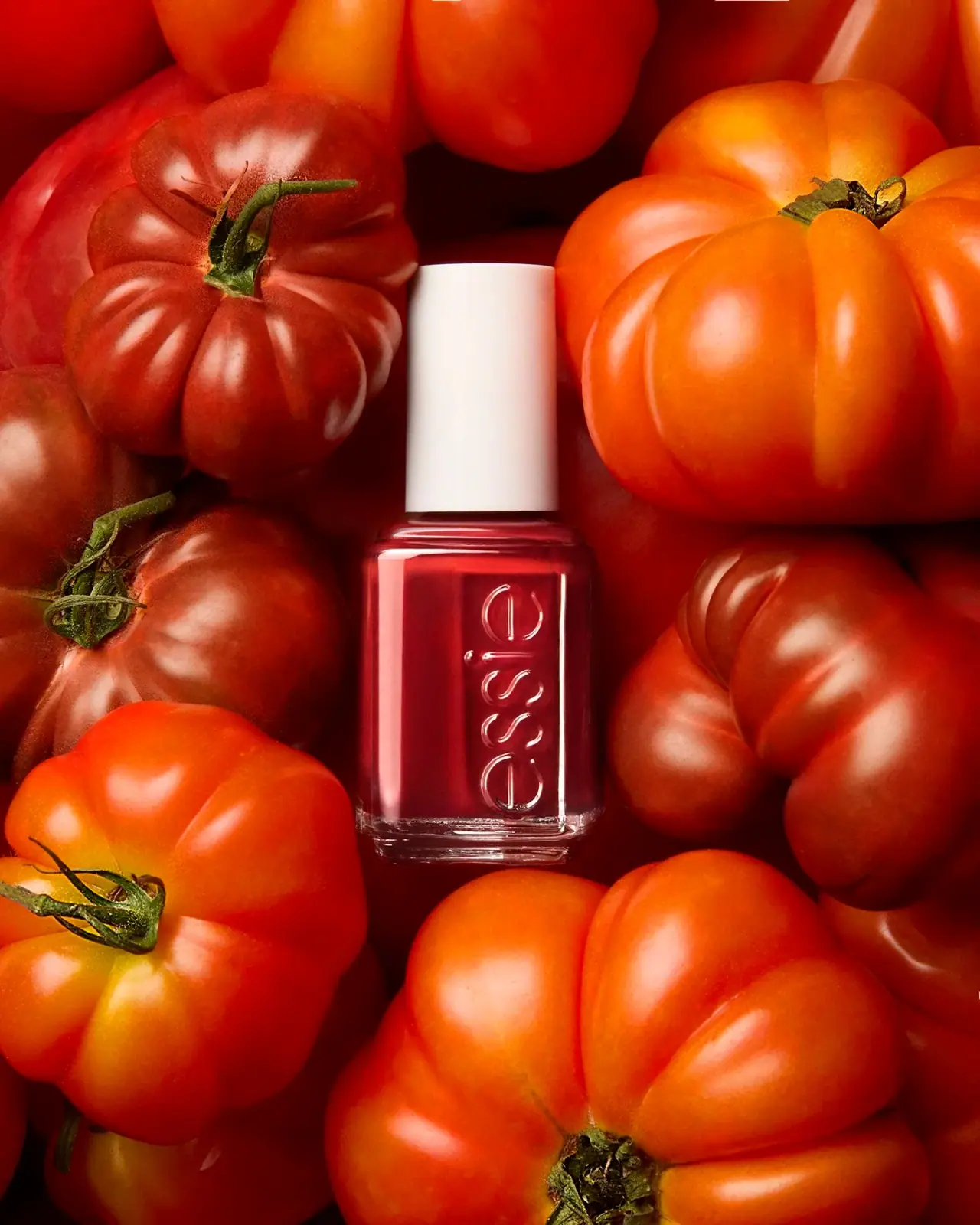
Essie’s red-polish campaign centers a square-sided bottle among tomatoes, using a concentrated red field to make the color feel vivid. The tall white cap and Essie wordmark remain visible within the close crop.
Essie’s official Original Enamel collection covers the brand’s core nail-polish family and application guidance.[1]
Pack construction & use
- Container
- The cover shows a square-sided bottle filled with red polish; no capacity is legible.Observed in the reference photograph
- Closure
- A tall white cap rises above the short bottle neck.Observed in the reference photograph
- Edition
- The official collection page identifies the Original Enamel family; the selected campaign image does not identify a shade.[1]
What makes the design work
Editorial analysis of this packaging reference.
Color made experiential
Oversized tomatoes surround the bottle with a near-monochrome red field. The food imagery makes the polish color feel familiar and saturated while the bottle remains the only manufactured object at the center.
The bottle as a color sample
The polish is visible through the clear front and sides, making the bottle itself a color sample. The raised Essie wordmark adds recognition on the narrow panel.
Neutral cap within saturated colour
The white cap interrupts the red field and gives the bottle a clear upper endpoint. Although the tomatoes are closely cropped, the bottle’s full main silhouette remains visible from cap to base.
Ideas for your next brief
- Use colour-related props to make a shade campaign memorable while keeping the product silhouette visible; do not imply that the props are ingredients.
- Keep the cap and wordmark readable when a campaign crop is tight.
Sources & further reading
Researched 19 October 2026