About this packaging
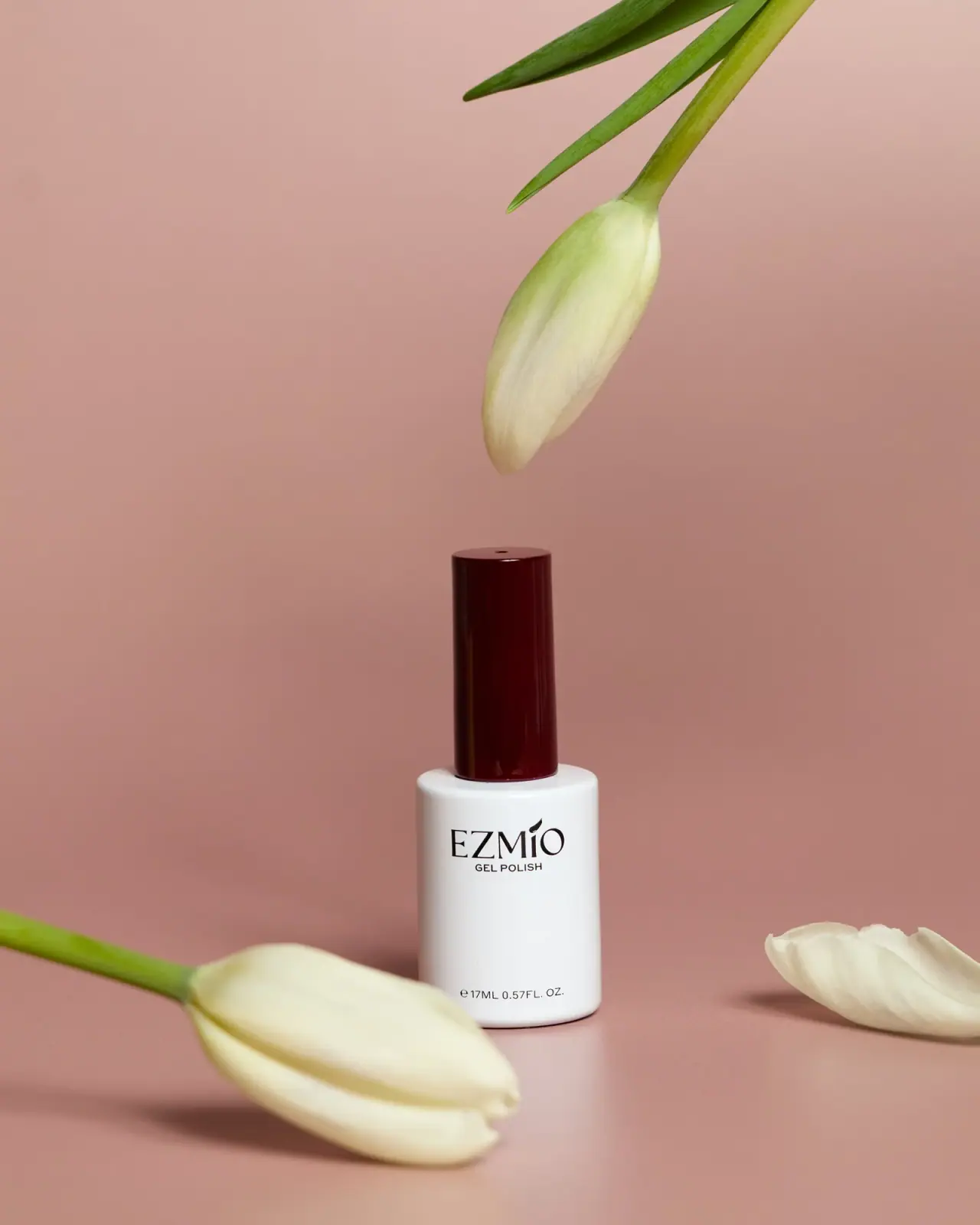
Ezmio Gel Polish is shown in a white cylindrical bottle topped with a tall burgundy cap. The black wordmark and product category sit on the front, with the 17 ml quantity printed near the base.
The official Ezmio collection page presents the brand’s gel polish range; this cover identifies the pictured bottle as 17 ml Gel Polish.[1]
Pack construction & use
- Bottle and cap
- The selected cover shows a white cylindrical bottle with a tall burgundy cylindrical cap. Exact component materials and the hidden applicator are not established.Observed in the reference photograph
- Front information
- The bottle reads EZMIO, GEL POLISH and 17 ml / 0.57 fl oz.Observed in the reference photograph
What makes the design work
Editorial analysis of this packaging reference.
Closure as a strong accent
The burgundy cap creates a dark colored vertical accent above the otherwise white bottle. The selected image does not establish a shade name or prove that cap color encodes the formula shade.
Compact information stack
The brand and category are centered, with the volume line close to the lower edge. This preserves a legible stack on a small package.
Open space below the identity
The maker and small GEL POLISH line sit high on the white body, leaving a broad unprinted interval before the quantity near the base. Pale flowers and the pink background are photographic props.
Ideas for your next brief
- Use a contrasting closure as an identity accent, while documenting shade identification separately rather than assuming the cap represents formula color.
- Keep brand, product type and quantity in a compact front-facing stack on small-format containers.
Sources & further reading
Researched 19 October 2026