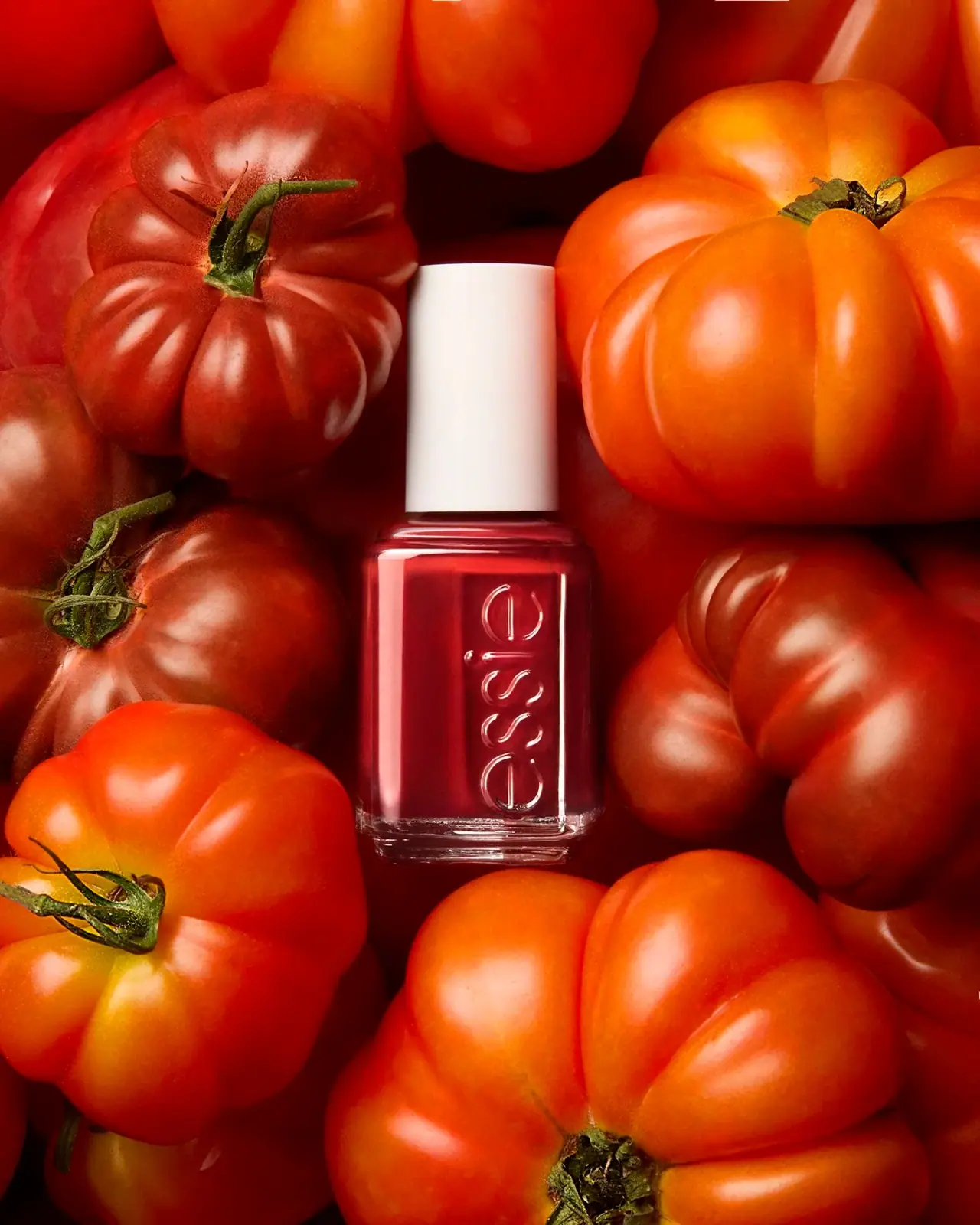
Photography: Alana Tyler Slutsky / ATS Studio — product photography. Images belong to their respective owners.
Essie

Visible red colour, clear relief and a white cap
The selected Essie campaign photograph reduces the packaging read to three strong elements: visible red polish, a tall plain white cap and large vertical lowercase lettering in clear relief. The rectangular bottle preserves an unobstructed colour area beside the wordmark, while its transparent-looking base and edges outline the contents. Tomatoes surround the complete visible bottle with a saturated red-orange field, making the white closure an unusually strong orientation cue. The exact shade is not identified in the photograph, so this study concerns the selected Original-style red campaign specimen rather than a named colour or every Essie range.
- Make-up
- Light pack
- Bold typographic
- Colour-coded range
About this study
Selected ATS Studio red Original-style Essie campaign bottle. Exact shade, capacity and formula edition are unidentified; no broader range specification is claimed.
Sources & evidence · Reviewed 2026-10-19Color Palette
Approximate colours interpreted from photography. These are screen references, not official brand colours or print specifications.
Pack body
Visible red polish
#B82029
Approximate colour seen through the main chamber. It represents this photographed red formula, not a verified named shade, a painted bottle wall or an exact colour-match standard.
Warm white closure
#F3ECE6
Approximate cap colour under the warm campaign lighting. The pale cap provides a stable visual interruption within the dense red surroundings.
Accent
Clear edge highlight
#E7C8C0
A visual proxy for illuminated clear-looking edges and raised lettering. These highlights inherit the scene colour; they are not a separate pink ink or coating specification.
Typography
Suggested visual alternatives, not confirmed brand typefaces. Any scale below is an illustrative estimate.
One large lowercase house mark runs vertically along the visible face, reading from the lower area toward the shoulder. Its outline and reflections provide recognition without an opaque printed block. There is no readable category, shade name or quantity competing with it on this photographed face. The hierarchy is therefore primarily physical: colour chamber first, white closure second, relief lettering as the closer-view identity cue. A complete commercial artwork system would need information beyond what this view reveals.
Fonts
Original lowercase identity alternative
Quicksand
- Looks like
- Quicksand
- Type
- Rounded sans serif
- Weight
- Regular 400 / Medium 500
- Case
- Lowercase
- Tracking
- Natural to slightly open
- Fallback
- sans-serif
A starting point for an original rounded lowercase name, not a substitute for copying the Essie logo. Develop distinct letterforms and assess how counters and strokes behave in relief. A flat font specimen cannot predict the legibility of clear raised lettering.
Proposed supporting information
Inter
- Looks like
- Inter
- Type
- Sans serif
- Weight
- Regular 400 / Medium 500
- Case
- Sentence case for functional details
- Tracking
- Normal
- Fallback
- sans-serif
Suggested only for an original concept’s shade identifier and practical information on a separately verified surface. No such text is readable in the selected photograph, so this is design guidance rather than a reconstruction of Essie’s unseen labels.
Structure & Proportions
Visual proportions and finish previews are illustrative. Confirmed construction details and uncertainties are distinguished in the study notes.
Proportions
| Purpose | Value | Preview |
|---|---|---|
| Body and cap | The white cap is tall relative to the short colour chamber, giving the small bottle a clearly upright silhouette. No numeric ratio is inferred from the campaign image. | — |
| Colour window | A substantial uninterrupted red area remains beside the vertical lettering. The mark does not cover the full width with opaque ink. | — |
| Clear base | The transparent-looking lower margin is visibly distinct from the filled chamber and catches horizontal highlights, helping separate the object from similarly coloured props. | — |
Shapes
| Element | Value | Preview |
|---|---|---|
| Bottle front | Rectangular face with softened corners and a short stepped shoulder. | |
| Cap | Plain narrow cylinder with a flat-looking top in the photographed view. | |
| Vertical identity zone | A long narrow column of rounded lowercase letterforms runs along the bottle face. |
Finishes
Glossy clear-looking walls
Bottle perimeter and visible lower base; substrate unverified. · transparent
Relief-like clear lettering
Large vertical wordmark, described by appearance rather than a verified moulding process. · emboss
Softly reflective white cap
Closure exterior; no tactile coating is asserted. · matte
Formats and materials
| Formats | A small square-sided nail-polish bottle with a short stepped shoulder, clear-looking lower base and tall white cylindrical cap. The full cap and bottle base are visible within the selected composition. |
| Materials | The image shows transparent-looking walls and a relief-like wordmark, but the inspected official collection page does not provide a component material specification. Bottle and cap substrates remain unverified in this study., The polish colour is visible through the walls. A clear appearance does not by itself establish glass, a specific moulding technique or a particular wall thickness. |
| Closures | A tall plain white cylinder covers the short neck. The photograph shows the closed state only, so brush profile, wand length, thread geometry and internal sealing components are not inspected. |
| Decoration | The large clear relief wordmark is the main visible identity device. It appears integrated with the vessel surface, but the exact forming process and tooling specifications are not verified., No broad opaque paper label is visible on the selected face. That does not mean the entire bottle is label-free or that shade information is absent elsewhere. |
Front Panel
Schematic reading order. The diagram’s zone heights do not represent measured artwork proportions.
The selected visible face uses the bottle surface itself as the identity field. A clear relief name leaves the formula visible behind or beside it, avoiding a large printed rectangle. This approach makes light and viewing angle part of the graphic presentation: highlights and shadows define the letters instead of a high-contrast ink colour.
| Zone | Content |
|---|---|
| Vertical house identity | Large lowercase lettering rises along the right-hand portion of the visible face. Its length makes it an architectural feature of the bottle rather than a small label signature. |
| Open colour area | The adjacent uninterrupted chamber shows the red formula. It is central to product understanding because the shade itself is the main variation shoppers would need to inspect. |
| White closure | The cap is visually plain in this view, creating a clean endpoint above the glossy red body. It is not treated as evidence of where a shade sticker may or may not appear. |
| Clear perimeter | Edge and base highlights define the bottle inside the surrounding red scene. These optical boundaries become especially useful when package contents and props share a hue. |
Range System
The official page establishes an Original Enamel collection, but the extracted page offers limited product detail and the selected photo supplies no readable shade identifier. The visible-content principle is well demonstrated by this one red specimen; it should not be used to assign a specific commercial shade or current formula version.
- An original colour range can keep a recognisable neutral cap and vessel silhouette while allowing the visible formula to differentiate variants. This is a design interpretation of the selected object, not a full audit of the real collection.
- Colour visibility should be supplemented by a readable shade name or code on an appropriate verified surface, particularly for similar reds and different lighting conditions. The selected image does not show where that information belongs on the actual bottle.
Back of Pack & Shelf
Only one principal bottle face is presented. The reverse, underside, top marking and open brush assembly are not visible as readable information surfaces.
- Do not invent a shade name from tomato colour or choose a familiar Essie red without evidence.
- Verify quantity, shade code, ingredients and mandatory text from actual artwork before mapping secondary surfaces.
- A proposed information label should preserve the main colour window while remaining readable at the small physical scale.
On shelf
The white cap offers a simple neutral landmark while the clear vessel lets the coloured contents lead. Relief lettering may be less legible in flat light than in this strongly lit photograph, so recognition should not be assumed from a single favourable view. This is a visual assessment, not measured retail performance. The specimen is useful for studying how a consistent physical silhouette can coexist with a highly variable product colour.
Imagery
Large ribbed tomatoes pack the frame around the nail-polish bottle, alternating deeper reds with bright orange-red highlights. Their organic curves contrast with the bottle’s straight sides and smooth white cylinder. The bottle is fully visible from cap to base even though the props are closely cropped. Strong directional light catches both tomato skins and the raised-looking clear letters, creating a shared glossy atmosphere. ATS Studio’s portfolio includes the matching image file, confirming photographic provenance. Tomatoes function as colour props, not ingredient evidence or a shade identification system.
Guidelines
Editorial principles for an original design brief, not official brand guidelines.
Do
- Keep enough unobstructed chamber area to judge the visible product colour.
- Test relief lettering under soft and directional light before relying on it for recognition.
- Preserve the difference between the square-sided body and cylindrical closure.
- Label the selected colour as unidentified unless a readable shade code or exact source resolves it.
Don't
- Do not infer the shade name from the tomatoes or a visually similar catalogue swatch.
- Do not turn clear highlights into a separate opaque pink print colour.
- Do not assume a specific brush, bottle substrate or moulding process from a closed campaign view.
- Do not describe this composition as hiding the bottle base or cap; the complete main silhouette is visible.
Sources & evidence
How this study was built
edition · Sourced fact
The official page identifies the Original Enamel family without identifying the selected red shade.Essie — Original Enamel collectionimagery · Sourced fact
ATS Studio portfolio includes the matching ATS_Essie_02 image.ATS Studio — portfolio, ATS_Essie_02structure · Visual observation
A short square-sided colour chamber supports a tall white cylindrical cap; both cap and base are visible.typography · Visual observation
Large vertical lowercase relief-like lettering is the only clearly readable identity element on the selected face.label · Visual observation
No broad opaque label covers the visible colour chamber.palette · Visual observation
Red contents, white cap and clear edge highlights are distinguished from tomato scenery.range · Editorial interpretation
A neutral closure and visible formula can support colour differentiation; no named-shade mapping is asserted.
What remains unverified
- Exact shade name and capacity are not readable.
- Official collection page is accessible but provides limited extracted product detail.
- Materials, forming process, brush and closure internals are unverified.
- The relief appearance is visible; its production method and depth are not measured.
- Secondary font role is proposed for an original adaptation, not observed on the photographed face.
Give your AI
packaging taste
Give your design or image tool a packaging study: palette, type, structure, front panel and principles for an original brief.
Export this styleFree with an email. PACK.md works in Claude, ChatGPT, Cursor and image tools.
More like this

AKT
Lilac stage directions with a quiet metallic detail
Bouclème
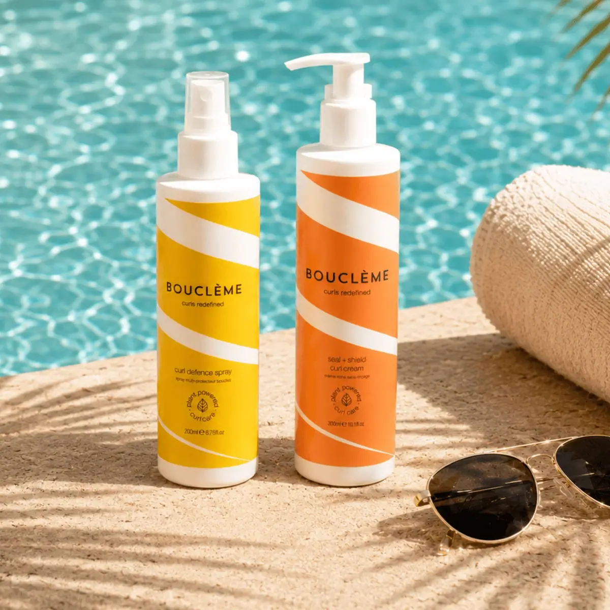
warm colour blocks crossed by flowing white ribbons
Ceremonia
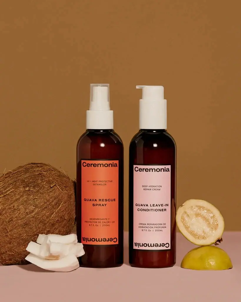
Warm colour labels bounded by upright and inverted wordmarks

Dr. Bronner’s
A bright soap wrapper with a densely ordered voice
KraveBeauty
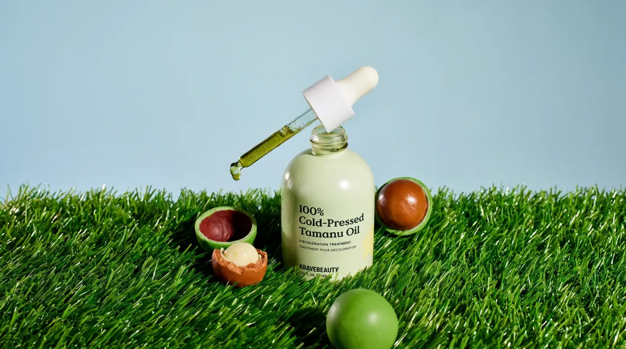
cropped wordmarks on minty skincare bottles
L'Oréal Paris
translucent amber shampoo under a gilded serif masthead

Malin+Goetz
pharmacy label set in bracketed helvetica

Native
white drugstore bottles, scent-tinted vertical caps