Photography: Sonique Studio — Ezmio Beauty campaign photography. Images belong to their respective owners.
Ezmio Beauty

White polish bottle, tall burgundy cap, spare serif identity
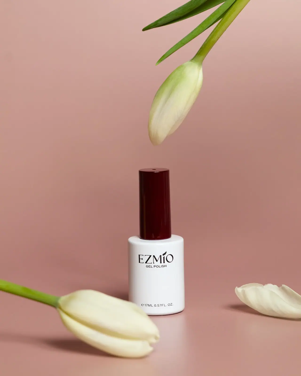
The selected Ezmio Gel Polish bottle uses a tall glossy burgundy cap as its strongest color accent above a simple white cylindrical body. A black serif maker name sits high on the front with a small plain GEL POLISH line directly beneath. The quantity is placed near the base, leaving a broad quiet interval between identity and contents. The photographed package reads 17 mL / 0.57 fl oz, but does not reveal a shade name; burgundy is documented as cap color, not formula color.
- Make-up
- Light pack
- Luxe monochrome
- Heritage label
About this study
Selected 17 mL Gel Polish bottle with burgundy cap in Sonique Studio's 2025 campaign. Shade and cap-coding rules remain unidentified.
Sources & evidence · Reviewed 2026-10-19Color Palette
Approximate colours interpreted from photography. These are screen references, not official brand colours or print specifications.
Pack body
Bottle white
#EEEFEB
Approximate opaque-looking cylindrical body, providing a neutral field for the small dark identity group.
Burgundy closure
#420D12
Deep glossy cap color, distinct from the blush backdrop. It is not treated as a verified polish shade identifier.
Ink
Dark lettering
#241B1C
Maker, category and quantity share a nearly black tone, with the serif identity providing most of the typographic character.
Typography
Suggested visual alternatives, not confirmed brand typefaces. Any scale below is an illustrative estimate.
EZMIO is the largest visible text, using a refined high-contrast serif voice with an accent-like custom detail above the name. GEL POLISH sits immediately below in much smaller plain capitals. The bottom quantity uses another compact plain line. This concentrates the identity in the upper body rather than spreading wording evenly over the face. The long blank interval before the quantity gives the otherwise small cylindrical container a restrained appearance, while the tall cap supplies vertical emphasis.
Fonts
Original maker identity
Bodoni Moda
- Looks like
- High-contrast classical display serif
- Type
- Modern display serif
- Weight
- Regular, Medium
- Case
- Uppercase
- Tracking
- Optical, preserving thin strokes
- Fallback
- Didot, Georgia, serif
Proposed for a new short maker name. Give the lettering its own spacing and details rather than adding the source accent-like motif or copying the EZMIO silhouette.
Category and quantity
Inter
- Looks like
- Small neutral sans-serif
- Type
- Neo-grotesque sans-serif
- Weight
- Regular, Medium
- Case
- Uppercase category; conventional units
- Tracking
- Natural to slightly open
- Fallback
- Arial, sans-serif
Alternative for a clear GEL POLISH category and accurate net contents on an independently designed bottle. Its simplicity helps keep the serif mark distinct at a small overall scale.
Structure & Proportions
Visual proportions and finish previews are illustrative. Confirmed construction details and uncertainties are distinguished in the study notes.
Proportions
| Purpose | Value | Preview |
|---|---|---|
| Cap-to-body contrast | The cap is narrower than the bottle and contributes substantial height to the overall silhouette. No numerical height ratio is inferred. | — |
| Shoulder reveal | A visible white shoulder surrounds the cap base, making the transition between the two cylinders clear. | — |
| High identity placement | Maker and category sit in the upper area of the bottle, leaving more empty field below than above the group. | — |
| Low quantity anchor | The contents line sits close to the lower edge, separated from the identity by a broad unprinted interval. | — |
Shapes
| Element | Value | Preview |
|---|---|---|
| Bottle body | Short broad cylinder with gently softened shoulder and lower edge. | |
| Tall cap | Narrow cylindrical closure with nearly straight sides and a flat-looking top. | |
| Upper identity group | Compact serif wordmark and tiny category line sharing a centered axis. | |
| Lower contents line | Small horizontal text near the bottle's bottom boundary. |
Finishes
Glossy burgundy closure
Cap side wall and top, where narrow highlights define the cylinder. · gloss
Smooth pale body
White bottle surface with broad soft highlights; no exact varnish or tactile treatment established. · gloss
Formats and materials
| Formats | Closed cylindrical gel-polish bottle marked 17ML / 0.57FL. OZ., with a tall narrower cylindrical cap |
| Materials | The white body and burgundy cap appear opaque and smooth; exact glass, polymer, coating or pigment specifications are not established by the accessed sources., The hidden contents cannot be identified by the cap color, and the photograph does not prove a protective light-blocking specification. |
| Closures | A tall straight-sided cap sits above a narrower central neck area within the broad white shoulder. The package is closed, so the thread, seal, brush and stem are not visible. The familiar nail-polish format is not enough to document brush width, bristle material or refillability. |
| Decoration | Large serif maker line high on the bottle body, Small uppercase category directly below, Small quantity line near the bottom edge, No visible shade swatch or named color on the selected front |
Front Panel
Schematic reading order. The diagram’s zone heights do not represent measured artwork proportions.
The front reads as sparse dark typography on an uninterrupted white body rather than a separate framed label. The maker/category pair forms one compact group near the shoulder. A small quantity statement forms a second anchor near the base. Nothing visible between them supplies a named shade or ingredient story, so the empty field should not be filled with invented content in the study.
| Zone | Content |
|---|---|
| Maker identity | The serif EZMIO mark is the main front graphic. Its accent-like detail adds character without a large separate emblem. |
| Product category | GEL POLISH follows directly below the maker in much smaller plain uppercase letters, clarifying the category with minimal visual weight. |
| Open body field | The broad white interval below the identity keeps the small bottle visually quiet. It is not a demonstrated shade window or removable label area. |
| Net contents | The lower marking identifies 17 mL and 0.57 fl oz. The image does not reveal where any batch or shade code might be located elsewhere. |
Range System
The official collection establishes a gel-polish range, while Sonique Studio's portfolio identifies a 2025 Ezmio campaign. Neither resolves the exact shade in the selected image. A burgundy cap could be an identity device or another coding choice, but this study does not decide between them without evidence. The following are possible principles for an original range, not verified Ezmio shade rules.
- A stable neutral body and contrasting cap can create a recognizable family, but actual shade identification still needs a documented name, code or swatch.
- If an original maker uses one cap color for every polish, ensure users can distinguish shades through another visible label area.
- Keep category and quantity positions consistent when changing an original wordmark or collection name, without assuming all source bottles share identical typography.
Back of Pack & Shelf
The reverse, underside, open applicator and any retail carton are absent. No shade sticker, ingredients, directions or batch code can be mapped from the selected front.
- Inspect the cap top and base closely before locating a shade code; the small dark mark on the cap top is not legible here.
- Obtain an open view before describing brush geometry or handle ergonomics.
- Do not assume the white container's material or opacity meets a particular technical requirement without a specification.
On shelf
Interpretively, the long dark cap provides a strong silhouette above a compact pale base. The small serif identity may reward close viewing, while the empty white field keeps the bottle recognizable without visual clutter. However, the front does not identify the shade, so a real collection display would need another reliable way to distinguish products. A new design should test that requirement independently of the floral campaign setting.
Imagery
White tulips and green stems frame the upright bottle against a muted pink background. One bud hangs above the cap, drawing attention to its height, while another crosses the foreground. The organic shapes soften the two-cylinder object without appearing as printed artwork. The blush scene and green stems are not part of the package palette, and the flowers do not establish the polish's ingredients or shade.
Guidelines
Editorial principles for an original design brief, not official brand guidelines.
Do
- Distinguish cap color from formula shade unless verified.
- Use the relationship between cap and body to define silhouette.
- Keep maker and category clearly grouped.
- Record visible quantity without inventing an SKU name.
- Verify shade-label placement separately for a usable range.
Don't
- Do not call the pictured shade burgundy.
- Do not infer glass, resin or UV-barrier performance.
- Do not place the broad blank field above the wordmark when it is below.
- Do not copy the EZMIO accent detail or serif lettering.
- Do not describe the floral props as package artwork.
Sources & evidence
How this study was built
edition · Sourced fact
Official collection confirms gel-polish context; photographer portfolio lists an Ezmio 2025 content shoot without identifying this shade.Ezmio Beauty — Product collection · Sonique Studio — Commercial photography portfoliostructure · Visual observation
White cylindrical body supports a tall narrower burgundy cap.Sonique Studio — Commercial photography portfoliotypography · Visual observation
Large serif maker line sits directly above a small plain GEL POLISH descriptor.Sonique Studio — Commercial photography portfoliolabel · Visual observation
A broad blank white interval separates upper identity from the lower 17ML / 0.57FL. OZ. marking.Sonique Studio — Commercial photography portfoliopalette · Visual observation
White, burgundy and dark lettering belong to the pack; pink and green belong to the scene.Sonique Studio — Commercial photography portfolioimagery · Visual observation
Tulips and stems frame the bottle without establishing ingredient or shade facts.Sonique Studio — Commercial photography portfoliorange · Editorial interpretation
A contrasting closure could provide family identity, but the image does not prove a cap-based shade code.
What remains unverified
- Exact shade unknown and not inferred from the cap.
- Materials, coating and hidden applicator unspecified.
- Reverse, underside and retail carton unseen.
- Exact fonts and dimensions unidentified.
- Photographer project route failed direct opening; primary indexed portfolio confirms 2025 campaign provenance.
Give your AI
packaging taste
Give your design or image tool a packaging study: palette, type, structure, front panel and principles for an original brief.
Export this styleFree with an email. PACK.md works in Claude, ChatGPT, Cursor and image tools.
More like this
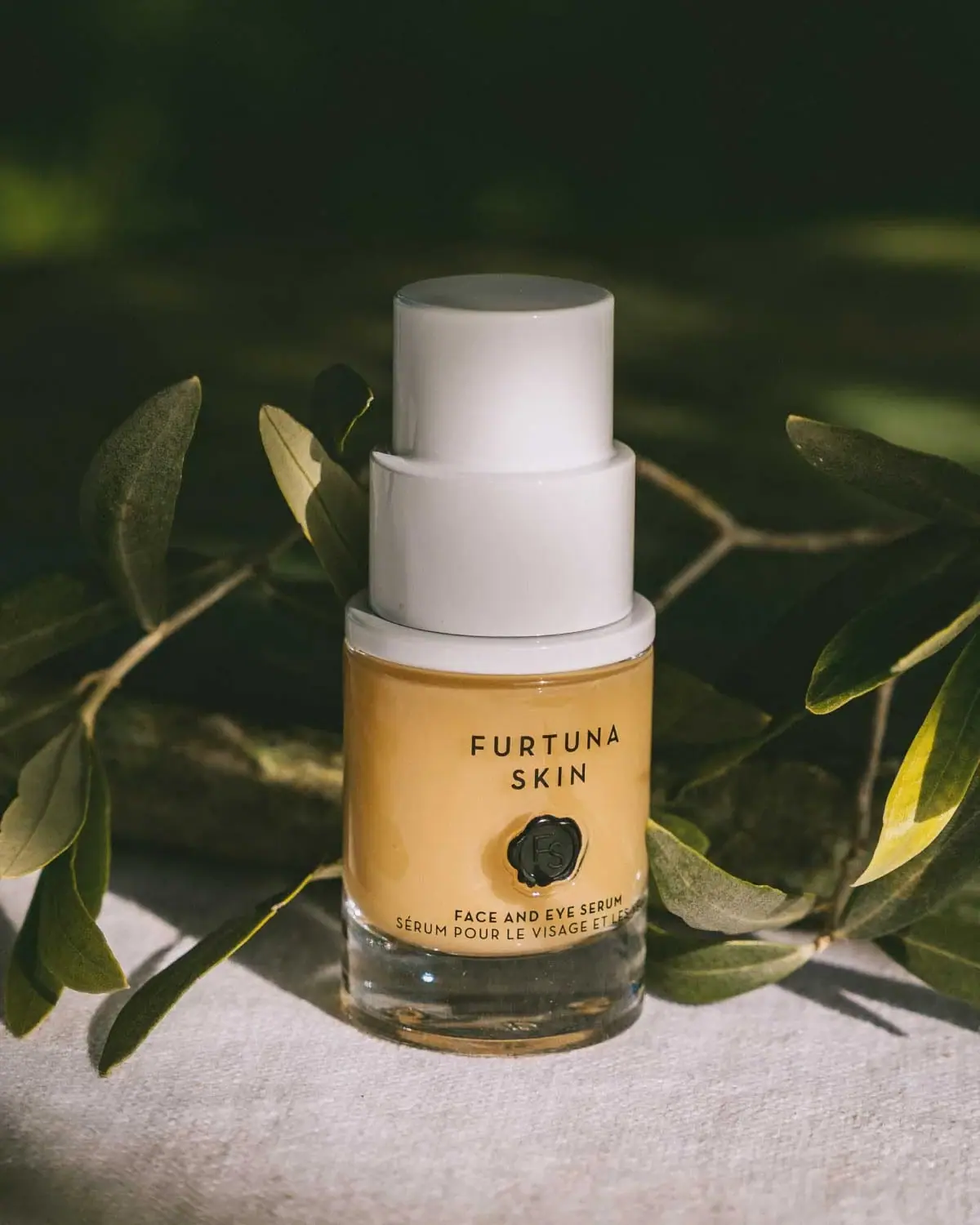
Furtuna Skin
A tiered white top above a warm sealed identity
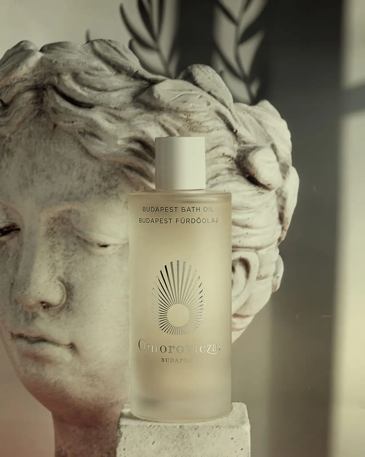
Omorovicza
Frosted bath-oil cylinder with a reflective radiating emblem
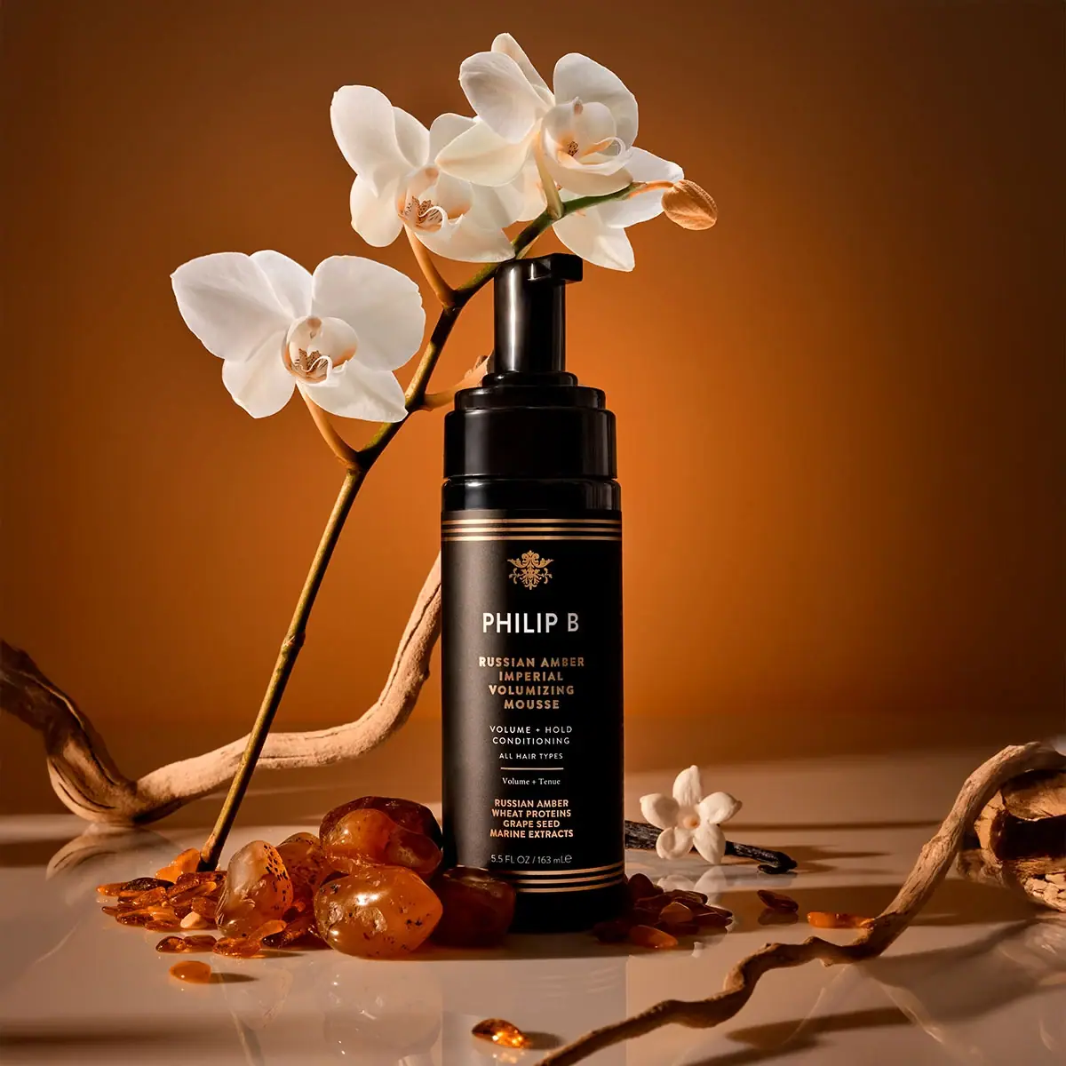
Philip B
gold rules and a crest on a black foamer
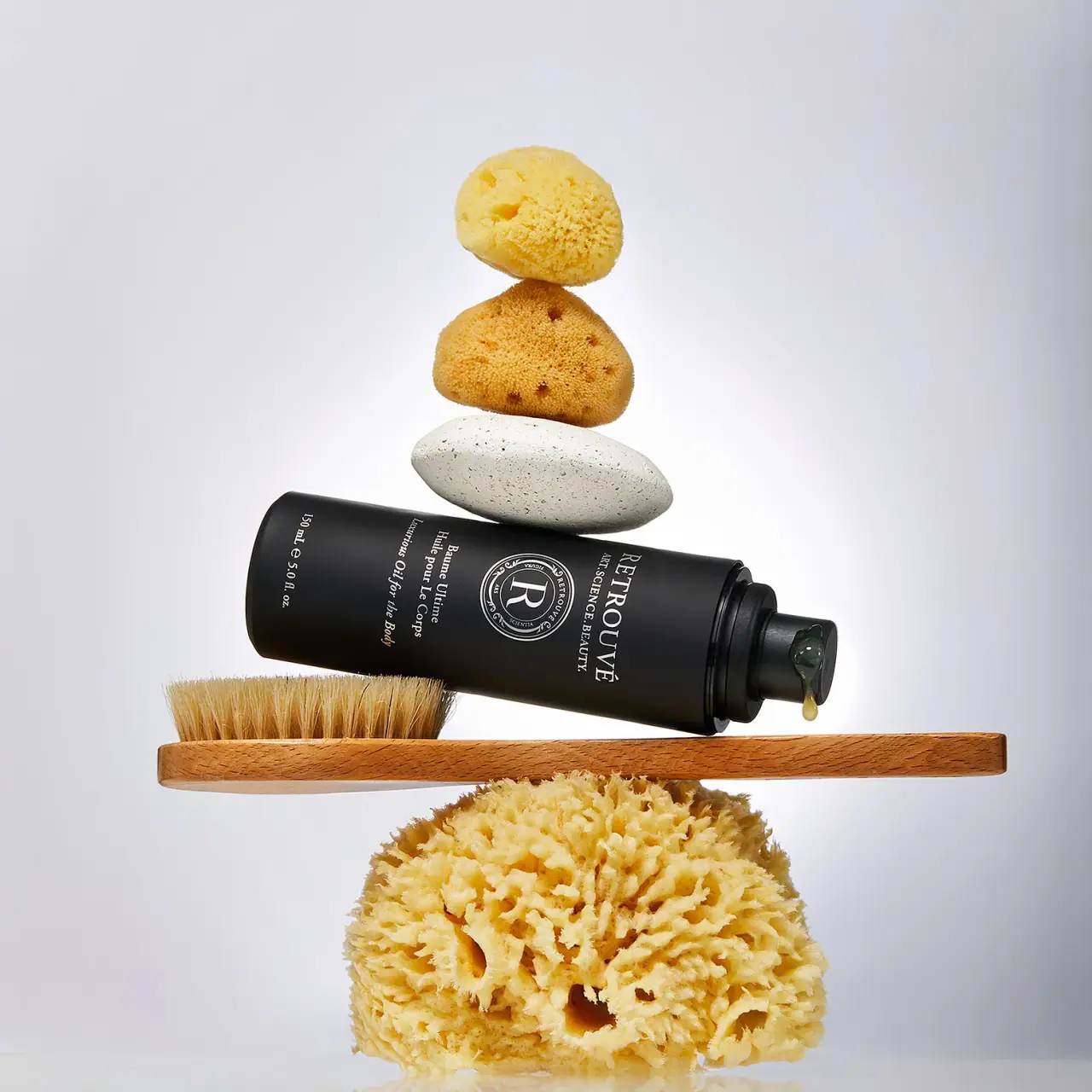
Retrouvé
White serif seal on a black airless body-oil cylinder

Aerangis
a quiet numbered object, an intimate scent memory

Alexander McQueen
An oval flacon crowned with dense black relief

Arquiste
blush transparency, white lettering and a stepped gold cap

Chabaud
A framed perfume label beneath a clear architectural cap