About this packaging
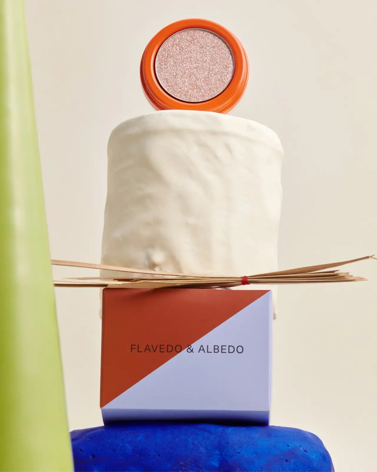
Flavedo & Albedo’s Rose Quartz eyeshadow is shown as a shallow round pot with an orange rim around a pale shimmer pan. Its two-tone carton uses a separate diagonal rust-and-lavender graphic, extending the brand palette beyond the product shade.
The official Velvet Eyeshadow listing identifies the 1.8 g format and its aluminum pot; the selected shade is Rose Quartz.[1]
Pack construction & use
- Pot
- The brand identifies the eyeshadow container as an aluminum pot and describes the material as recycled and infinitely recyclable. The cover shows its broad orange rim around the pan.[1]
- Carton
- The selected image shows a rust-and-lavender diagonal split with a centered Flavedo & Albedo wordmark.Observed in the reference photograph
What makes the design work
Editorial analysis of this packaging reference.
A broad color frame
The orange rim provides a strong outline around the small shimmer pan, giving the pot a recognizable perimeter.
Carton and shade play different roles
The carton’s rust and lavender blocks do not imitate the eyeshadow color; they act as a brand-level graphic, while the pot signals the shade.
One quiet mark
The carton uses a small centered wordmark within the color split, keeping its geometric division as the main outer-pack visual.
Ideas for your next brief
- Give a small pan a broad colored rim so the product is recognizable at a glance.
- Let the outer carton carry a repeatable brand graphic while the pot itself signals the individual shade.
Sources & further reading
Researched 19 October 2026