Photography: Flavedo & Albedo official photography. Images belong to their respective owners.
Flavedo & Albedo

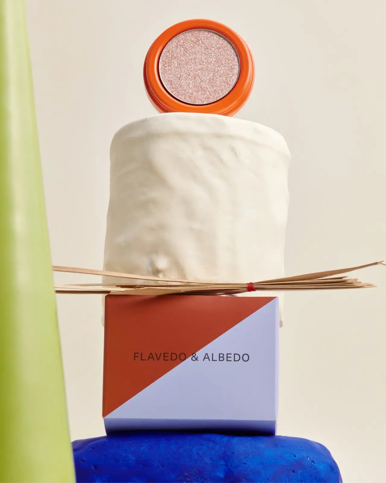
An orange pan above a sharply divided two-colour carton
The selected Velvet Eyeshadow photograph puts two different kinds of recognition into one composition: an open orange pot exposes the pale shimmering formula, while a rust-and-lavender carton carries the producer name. A single rising diagonal divides the carton face, cutting across a restrained horizontal wordmark. The strong geometry does not attempt to illustrate the eyeshadow or mimic its colour. Instead, the open product provides shade information and the carton supplies a memorable graphic identity. This study follows the photograph catalogued as Rose Quartz; the accessible official page verifies the Velvet family but does not independently identify this pictured shade.
- Make-up
- Light pack
- Playful colour
- Bold typographic
About this study
Selected open orange Velvet pot and rust/lavender carton, catalogued as Rose Quartz. The accessible primary page verifies the family but not the individual photographed shade.
Sources & evidence · Reviewed 2026-10-19Color Palette
Approximate colours interpreted from photography. These are screen references, not official brand colours or print specifications.
Pack body
Bright orange pot
#EB5B19
Approximate visible rim colour. The saturated ring makes the small circular product legible against a pale sculptural prop; the coating composition is unknown.
Label
Rust upper field
#A53F2A
Approximate upper-left carton colour, warmer and darker than the pot. It forms one half of the diagonal identity rather than a demonstrated shade code.
Lavender lower field
#B9B5D7
Approximate lower-right carton field. Its cooler pale colour gives the diagonal a distinct edge without outlines or decorative borders.
Ink
Dark wordmark
#352D31
Approximate dark neutral lettering across both coloured fields. The actual ink specification and required production contrast remain unverified.
Typography
Suggested visual alternatives, not confirmed brand typefaces. Any scale below is an illustrative estimate.
The visible carton face contains one modest horizontal producer line, centred across the diagonal. Its uppercase sans-serif letters have enough spacing to stay distinct as the background changes behind the name. No large product descriptor competes with it on this face. The result is restrained typography within an assertive colour composition: the diagonal provides movement, while the wordmark supplies a stable reading direction. Shade, ingredients and quantity cannot be mapped from this photographed face.
Fonts
Carton identity alternative
Manrope
- Looks like
- Manrope
- Type
- Geometric sans serif
- Weight
- Regular 400 / Medium 500
- Case
- Uppercase
- Tracking
- Modestly open
- Fallback
- sans-serif
Use for a new, compact producer name crossing a two-colour field. Test contrast on both halves and develop distinct lettering rather than imitating the existing wordmark.
Supporting product information proposal
Source Sans 3
- Looks like
- Source Sans 3
- Type
- Humanist sans serif
- Weight
- Regular 400 / SemiBold 600
- Case
- Sentence case with short uppercase identifiers
- Tracking
- Neutral for small text
- Fallback
- sans-serif
A proposed companion for shade and use information on surfaces not visible here. It is not an attribution of the original hidden copy; use actual-size proofs to preserve legibility on a small carton.
Structure & Proportions
Visual proportions and finish previews are illustrative. Confirmed construction details and uncertainties are distinguished in the study notes.
Proportions
| Purpose | Value | Preview |
|---|---|---|
| Pot rim | A broad orange ring frames the circular formula surface. The rim remains visually substantial even though the pot is partly hidden behind a prop. | — |
| Carton face | A broad rectangular front provides a large two-colour field around the relatively small name. The diagonal rises from lower left toward upper right. | — |
| Identity spacing | The producer line occupies a limited central band, leaving substantial unprinted-looking colour around it. No numerical grid or physical dimensions are inferred. | — |
Shapes
| Element | Value | Preview |
|---|---|---|
| Open product pan | Circular pale shimmer surface inside an orange ring. | |
| Pot rim | Rounded concentric edge with smooth highlights; lid unseen. | |
| Carton | Straight-edged folded rectangular package. | |
| Colour division | A clean diagonal separates rust and lavender without an outline. |
Finishes
Smooth orange highlights
Visible pot rim; coating process unknown. · gloss
Flat two-colour graphic
Carton face; precise board finish unverified. · matte
Formats and materials
| Formats | A small open circular eyeshadow pot shown separately above a closed rectangular carton. The official Velvet page lists 1.8 g / 0.06 oz; no container dimensions are supplied. |
| Materials | The official product page identifies the pot as recycled aluminium. Its recyclability statement is a brand claim and does not establish collection availability in every market., The image shows a folded carton, but board grade, coatings, adhesive and internal supports are unverified. The orange surface does not identify the coating chemistry. |
| Closures | The pot is displayed open with no lid visible. A hinge, screw thread, friction lid or other closing mechanism cannot be established. The carton is closed, with its opening flaps and internal arrangement outside the useful view. |
| Decoration | A rust/lavender diagonal split and dark horizontal name create the carton identity. The open pot relies on its orange ring and exposed product rather than readable front-facing copy in this view. |
Front Panel
Schematic reading order. The diagram’s zone heights do not represent measured artwork proportions.
The visible carton front works as a single graphic field rather than a conventional bordered label. A rising diagonal passes behind the middle of the horizontal producer name. The two directions create tension without turning the words themselves. The open pot has no readable label in this view, so the study does not invent a matching circular lid graphic.
| Zone | Content |
|---|---|
| Upper-left field | Rust occupies the upper-left portion, producing a warm visual relationship to the brighter orange pot without matching it exactly. |
| Lower-right field | Lavender fills the opposing triangular area and continues onto the visible lower edge. It gives the front a cool counterweight. |
| Central identity | The dark uppercase producer line crosses the colour boundary. Its horizontal orientation remains easy to follow even though the field beneath it is diagonal. |
| Exposed formula | The open circular pan shows a pale pink-champagne shimmer. This is direct product appearance, not proof of a printed shade swatch or a universal colour-coding rule. |
Range System
The official page describes Velvet as a family offered in matte and metallic formula finishes. Only this photographed pot-and-carton pairing is visually audited. The image demonstrates how a bold container and carton can coexist with a relatively subtle actual shade; it does not prove that carton colours change per shade or that every item uses identical graphics.
- For an original collection, let verified shade identification remain explicit in text or a controlled swatch even when the outer identity uses unrelated brand colours. An attractive diagonal alone cannot communicate a precise makeup shade.
- A second formula finish could keep the same clear hierarchy while changing only verified product information. This is design guidance, not an observed Flavedo & Albedo range specification.
Back of Pack & Shelf
The rear, bottom, inner carton and pot lid are not shown. The source provides product information but does not reveal its printed placement on this specimen.
- Verify the actual shade label and batch information from a readable alternate view before documenting their position.
- Do not assume that ingredients, net weight or recycling instructions appear on the visible front.
- Do not infer refillability or a reusable interchangeable pan from an open pot photograph.
On shelf
The diagonal carton would likely register as a colour block before the relatively small producer name becomes readable. The open orange ring is more immediately distinctive than the pale formula inside it. That is a visual interpretation rather than a retail test. A closed-pack ecommerce image would still be needed to show what a purchaser receives, because this art-directed open presentation prioritises colour and texture over a complete structural explanation.
Imagery
The pack is arranged as a sculptural still life. An off-white irregular pedestal supports the open pot, while a bundle of narrow tan sticks tied with red thread sits above the carton. A cobalt support below and a chartreuse vertical object at the left add strong scene colours. These props are not package components and are excluded from the packaging palette. The separation between pot and carton makes both the actual formula and the graphic face visible, although it hides part of the pot body and all closure details.
Guidelines
Editorial principles for an original design brief, not official brand guidelines.
Do
- Keep the wordmark readable on both sides of a diagonal colour boundary.
- Separate the product shimmer from claims about container finishes.
- Use the official aluminium identification while qualifying coating and closure unknowns.
- Show a closed-pack view alongside an open formula image when explaining the full object.
Don't
- Do not turn the cobalt and chartreuse scene props into packaging colours.
- Do not infer a hinge, screw lid or refill mechanism from the open pot.
- Do not describe the carton split as a proven shade-coding system.
- Do not identify the pictured shade solely from the generic family page.
Sources & evidence
How this study was built
structure · Sourced fact
Official page identifies a recycled aluminium pot and net weight 1.8 g / 0.06 oz.Velvet Eyeshadow — Flavedo & Albedorange · Sourced fact
Official page describes matte and metallic formula finishes; package coding across shades is not demonstrated.Velvet Eyeshadow — Flavedo & Albedolabel · Visual observation
Rust/lavender diagonal crosses behind a horizontal dark producer name.typography · Visual observation
A modest uppercase sans-serif identity is the only readable carton text in this view.palette · Visual observation
Orange pot and rust/lavender carton are distinct from cobalt and chartreuse props.imagery · Visual observation
Open pot shows pale shimmer while pedestal hides lower structure and lid is absent.edition · Editorial interpretation
Study remains limited to the photographed pairing; family facts do not independently establish shade identity.
What remains unverified
- Shade name remains catalogue identification; accessible product text does not independently map this image to Rose Quartz.
- Lid, reverse, inner carton and pan assembly are unseen.
- Aluminium pot is source-confirmed; coating, carton specification and printing processes are unknown.
- Fonts and colours are proposed alternatives or approximations; scene props are excluded.
Give your AI
packaging taste
Give your design or image tool a packaging study: palette, type, structure, front panel and principles for an original brief.
Export this styleFree with an email. PACK.md works in Claude, ChatGPT, Cursor and image tools.
More like this

ACURE
Iridescent spectacle with practical, tightly ordered type

Bask
sunny yellow with a playful turquoise signature

Beame
Orange bubble lettering, pink mascot, clear product badge

Bread Beauty Supply
bubblegum pumps and a fat black wordmark

Cut By Fred
Orange gel, cropped geometry and bold bilingual utility

Dune Suncare
Coral bottle with striped vertical identity and small left-aligned copy

e.l.f. Cosmetics
Pink tube, black cap, oversized thin lowercase signature
Ethique
Orange carton, oversized white script and a lathered square bar