About this packaging
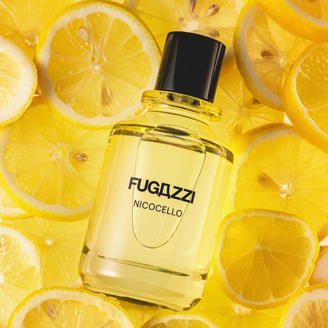
Fugazzi Nicocello is presented in a clear, substantial-looking rectangular fragrance bottle with a dark cylindrical cap. Its crisp front wordmark and pale yellow liquid connect visually to the official description’s citrus-led fragrance story.
Fugazzi’s official Nicocello page classifies the fragrance as citrusy/fresh and gives a 100 mL size. The brand says the name draws on the founder’s father Nico and his homemade limoncello tradition; the page identifies the product as made in Italy.[1]
Pack construction & use
- Bottle format
- The selected cover shows a transparent rectangular vessel with rounded corners, a visibly thick base and a black cylindrical cap.Observed in the reference photograph
- Fragrance size
- Fugazzi lists Nicocello at 100 mL. Its product page provides no packaging-material or recycling specification for this bottle.[1]
What makes the design work
Editorial analysis of this packaging reference.
Citrus cues begin before the label copy
The pale yellow contents and transparent vessel make the liquid part of the front-facing composition. That visual cue supports the official citrus positioning without additional illustration.
Bold wordmark above a compact name
FUGAZZI appears in a strong uppercase line above the smaller NICOCELLO name. The stacked arrangement keeps brand recognition immediate while preserving a clear product-level identifier.
Weight comes from silhouette
The rectangular body and thick visible base create a grounded block, balanced by rounded corners and a narrow neck. The dark cap completes the geometry as a distinct vertical element.
Ideas for your next brief
- Let a visible product color reinforce a fragrance family when the formula itself is visually distinctive.
- Separate brand and fragrance name by scale so both remain readable on a compact front face.
- Use a substantial base and softened corners to balance a geometric bottle silhouette.
Sources & further reading
Researched 19 October 2026