Photography: Fugazzi official photography. Images belong to their respective owners.
Fugazzi

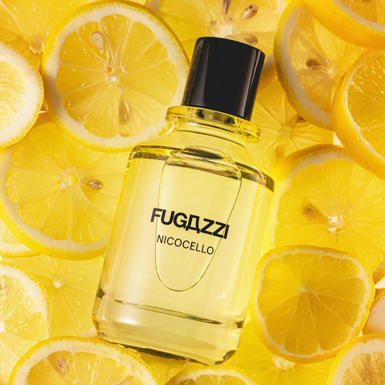
Clear yellow flacon, bold black name and glossy cap
Nicocello uses a clear rectangular flacon and a compact two-line identity to let the contents and silhouette carry much of the visual impression. The bold black FUGAZZI maker sits above the smaller NICOCELLO name, without a visible opaque front label field. A tall glossy black cap supplies a solid counterpoint to the pale yellow liquid and transparent body. In the selected official photograph, overlapping lemon slices fill the background and reinforce the brand's citrus story. This study separates that strongly yellow campaign setting from the bottle's unverified material and manufacturing details.
- Perfume
- Light pack
- Bold typographic
- Clinical minimal
About this study
Selected Nicocello bottle in official lemon-themed photography, contextualised by the 100 mL product listing. Other Fugazzi formats and hidden package components are not inspected.
Sources & evidence · Reviewed 2026-10-19Color Palette
Approximate colours interpreted from photography. These are screen references, not official brand colours or print specifications.
Pack body
Glossy black cap
#171717
Approximate cap colour without its bright reflected stripe. The nearly matching text and cap create visual continuity across different surfaces.
Ink
Near-black front identity
#161512
Approximate maker and fragrance lettering, providing the main text contrast against the pale contents.
Accent
Pale lemon liquid appearance
#EBD783
Approximate contents-and-transmitted-light colour. The dense yellow lemon setting affects this impression, so it is not a calibrated liquid or vessel colour standard.
Typography
Suggested visual alternatives, not confirmed brand typefaces. Any scale below is an illustrative estimate.
FUGAZZI is a strong uppercase sans-serif wordmark with a distinctive angular central letter treatment. It occupies one broad line and sets a firm horizontal anchor on the transparent face. NICOCELLO follows in a lighter, smaller uppercase sans line, retaining enough width to read as a separate fragrance name. The contrast is primarily weight and scale, not multiple colours or ornate framing. Both lines share a compact central area with large empty margins above and below. The proprietary maker forms are recognisable even without a paper panel or illustration.
Fonts
Original bold maker alternative
Archivo
- Looks like
- Heavy compact grotesque sans
- Type
- Grotesque sans serif
- Weight
- Bold, ExtraBold
- Case
- Uppercase
- Tracking
- Compact to normal
- Fallback
- Arial, sans-serif
Build a new maker name with a different letterform character and rhythm. Preserve strong contrast without copying the proprietary angular letter treatment or compressing every character into the same pattern.
Fragrance-name alternative
Inter
- Looks like
- Plain lighter uppercase sans
- Type
- Sans serif
- Weight
- Regular, Medium
- Case
- Uppercase
- Tracking
- Normal to slightly open
- Fallback
- Arial, sans-serif
Keep the original fragrance name visibly subordinate to the maker while retaining enough size for direct reading. Test on a transparent filled sample because background and liquid change perceived contrast.
Structure & Proportions
Visual proportions and finish previews are illustrative. Confirmed construction details and uncertainties are distinguished in the study notes.
Proportions
| Purpose | Value | Preview |
|---|---|---|
| Broad transparent body | The rectangular reservoir provides a large unobstructed front plane around the two compact text lines. Soft corners prevent the silhouette from reading as a sharp-edged block. | — |
| Visually substantial base | The lower transparent region appears thicker than the side walls, giving the bottle a grounded look. Actual mass and glass thickness are not measured. | — |
| Tall cap over short neck | The black cylinder forms a prominent vertical upper element, with a much shorter transparent neck transition beneath it. | — |
Shapes
| Element | Value | Preview |
|---|---|---|
| Main flacon | Rounded rectangular volume with broad front and softened lower corners. | |
| Cap | Tall smooth black cylinder with a slightly curved upper outline in perspective. | |
| Neck ring | Short broad circular-looking transition under the cap. | |
| Identity block | Two concise horizontal text lines occupying the central face. |
Finishes
Clear reflective body appearance
Shoulders, sidewalls and base · transparent
Polished black cap appearance
Fitted closure · gloss
Formats and materials
| Formats | Transparent rectangular flacon with softened corners, Substantial-looking lower base and short raised neck, Tall fitted black cylindrical cap, Official product listing identifies 100 mL |
| Materials | The body has a glass-like transparent appearance, but the inspected page does not provide a component material or glass-composition specification., The glossy black cap's substrate and finishing process are unverified; its reflection does not establish a metal shell., The front lettering's application method is unknown. Direct print, transfer and transparent carrier constructions cannot be distinguished confidently from this campaign image. |
| Closures | The fitted cap conceals the sprayer and neck assembly. A broad transparent-looking ring is visible below it, followed by a short narrow neck and rounded shoulders. This stepped transition separates the solid black cylinder from the wider body. The cap is not removed, so attachment mechanism, spray head, refill access and seal are not inspected. No magnetic or screw-on claim is supported merely by the exterior silhouette. |
| Decoration | Single bold maker line above a smaller fragrance name, No visible opaque front label rectangle, Large clear margins around the compact identity, No printed lemon artwork visible on the selected body |
Front Panel
Schematic reading order. The diagram’s zone heights do not represent measured artwork proportions.
The front identity appears against the visible liquid rather than an opaque paper field. The heavy maker line sits above a lighter fragrance name, and the surrounding clear area lets the body geometry remain legible. A large clear curved feature crosses the photographed face, but this image does not establish whether it belongs to surface liquid, optical refraction or permanent bottle detail. It should not be turned into a manufacturing requirement. The two readable text lines remain the reliable information structure, while quantity and concentration are not confidently visible on this front.
| Zone | Content |
|---|---|
| Maker line | FUGAZZI in bold dark uppercase lettering with its distinctive angular letter treatment. |
| Fragrance identity | NICOCELLO in a smaller lighter uppercase line beneath the maker. |
| Clear surrounding field | Visible pale yellow contents and reflections, without an opaque decorative panel or fruit illustration. |
| Upper structure | Cap, neck ring and shoulders establish the transition into the wider bottle, with no additional readable headline. |
Range System
The official page identifies Nicocello as a 100 mL citrus/fresh fragrance and explains the name through a family limoncello story. That context supports the selected lemon scene and yellow visual association. It does not mean the bottle contains a beverage, nor does it establish a colour code for all Fugazzi perfumes. The compact maker/name hierarchy could support a family of titles, but other product bodies, caps and labels have not been compared here. The range lesson is therefore a proposed design principle rather than an audited brand rule.
- The selected maker line is visually stronger than the specific Nicocello name.
- The official lemon note and naming story align with the campaign's citrus cues.
- An original related fragrance could change its own name while keeping a consistent reading area, but any physical colour variation would need separate formula and packaging evidence.
Back of Pack & Shelf
The reverse, underside, opened sprayer and outer packaging are absent. No full information layout is reconstructed from the spare front.
- The official 100 mL size is sourced product context rather than a clearly readable front quantity line.
- No barcode, batch marking, ingredient panel or disposal instructions are visible.
- For original transparent packaging, choose secondary information placement that remains readable when contents, background and viewing angle change.
On shelf
As a visual interpretation, the two-line black identity is direct and easy to locate against a light fill. The glossy cap helps define the bottle's upper silhouette, while the broad base suggests visual substance. On a dark or visually busy shelf, the same clear body could lose some edge definition, and background objects could compete with the text. A useful evaluation would inspect the filled bottle against both pale and dark surroundings, separating the package's own contrast from the unusually saturated lemon background that makes this reference so immediate.
Imagery
The bottle lies diagonally across a dense field of overlapping lemon slices. Their bright yellow flesh, pale pith and visible seeds create a detailed background while the cap and wordmark supply strong dark anchors. Light travels through the transparent body, making the pale liquid appear connected to the citrus around it. The official brand description names lemon among the fragrance notes and relates Nicocello to homemade limoncello, grounding the broad story. The photograph is still a constructed scene: it does not prove literal lemon juice in the formula, a particular liquid colour in neutral light or a measured bottle weight.
Guidelines
Editorial principles for an original design brief, not official brand guidelines.
Do
- Separate maker and fragrance by weight and scale.
- Test transparent-pack lettering against multiple backgrounds.
- Use source-backed narrative to explain photographic props.
- Describe apparent thickness separately from measured weight.
- Leave ambiguous optical features unclassified until another view confirms them.
Don't
- Do not copy the proprietary angular maker letterform.
- Do not identify glass composition or cap material from reflections.
- Do not infer refillability from the cap silhouette.
- Do not describe surrounding lemons as a literal formula ingredient list.
- Do not treat the clear curved photographic feature as verified bottle tooling.
Sources & evidence
How this study was built
edition · Sourced fact
Official product page identifies Nicocello in a 100 mL format and classifies it as citrus/fresh.Nicocello — Fugazzi Fragrancesimagery · Sourced fact
The brand names lemon among its notes and explains Nicocello through Nico's homemade limoncello story, supporting the broad citrus campaign association.Nicocello — Fugazzi Fragrancesstructure · Visual observation
The approved image shows a softened rectangular transparent body, thick-looking base, short neck transition and tall black cap.Nicocello — Fugazzi Fragrancestypography · Visual observation
A bold dark maker line sits above a smaller lighter fragrance name without a visible opaque front label field.Nicocello — Fugazzi Fragrancespalette · Visual observation
Pale yellow contents and black identity are intensified by a dense yellow lemon scene, preventing a neutral colour measurement.Nicocello — Fugazzi Fragranceslabel · Editorial interpretation
The ambiguous clear curved feature is excluded from confirmed construction guidance because one photograph does not establish its origin.
What remains unverified
- Bottle and cap materials, print process, exact fonts and measured dimensions are unverified.
- The clear curved feature across the front is not established as permanent bottle construction.
- Liquid colour is influenced by the dense yellow photographic scene.
- Sprayer, reverse, underside, carton and refillability are not inspected.
Give your AI
packaging taste
Give your design or image tool a packaging study: palette, type, structure, front panel and principles for an original brief.
Export this styleFree with an email. PACK.md works in Claude, ChatGPT, Cursor and image tools.
More like this
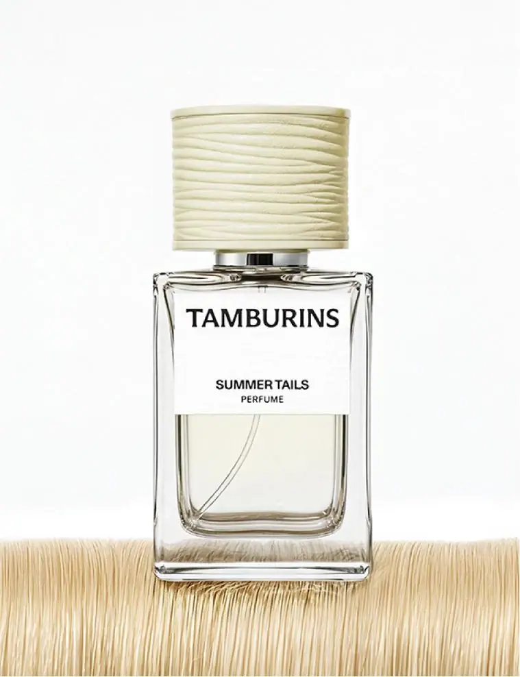
TAMBURINS
striated cream cap above a restrained black-and-white label

AussieZinc
Sun-yellow numerals on a tall, information-rich white cylinder

BioSeivas
Vertical serif identity on a mauve treatment band
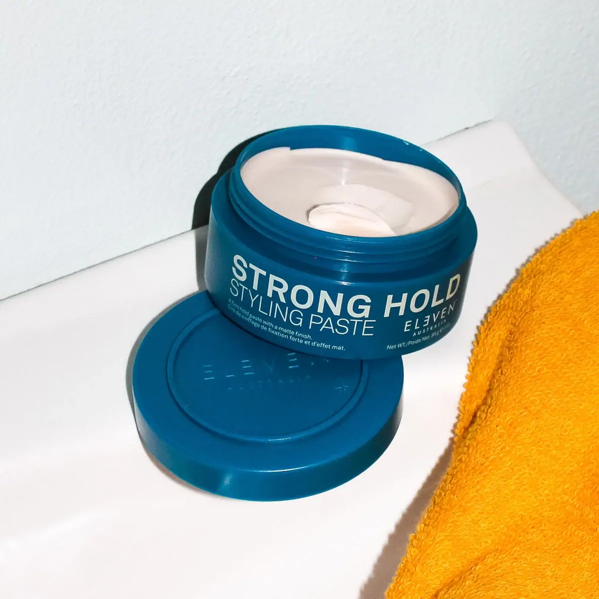
ELEVEN Australia
Deep blue open jar with emphatic hold-first typography
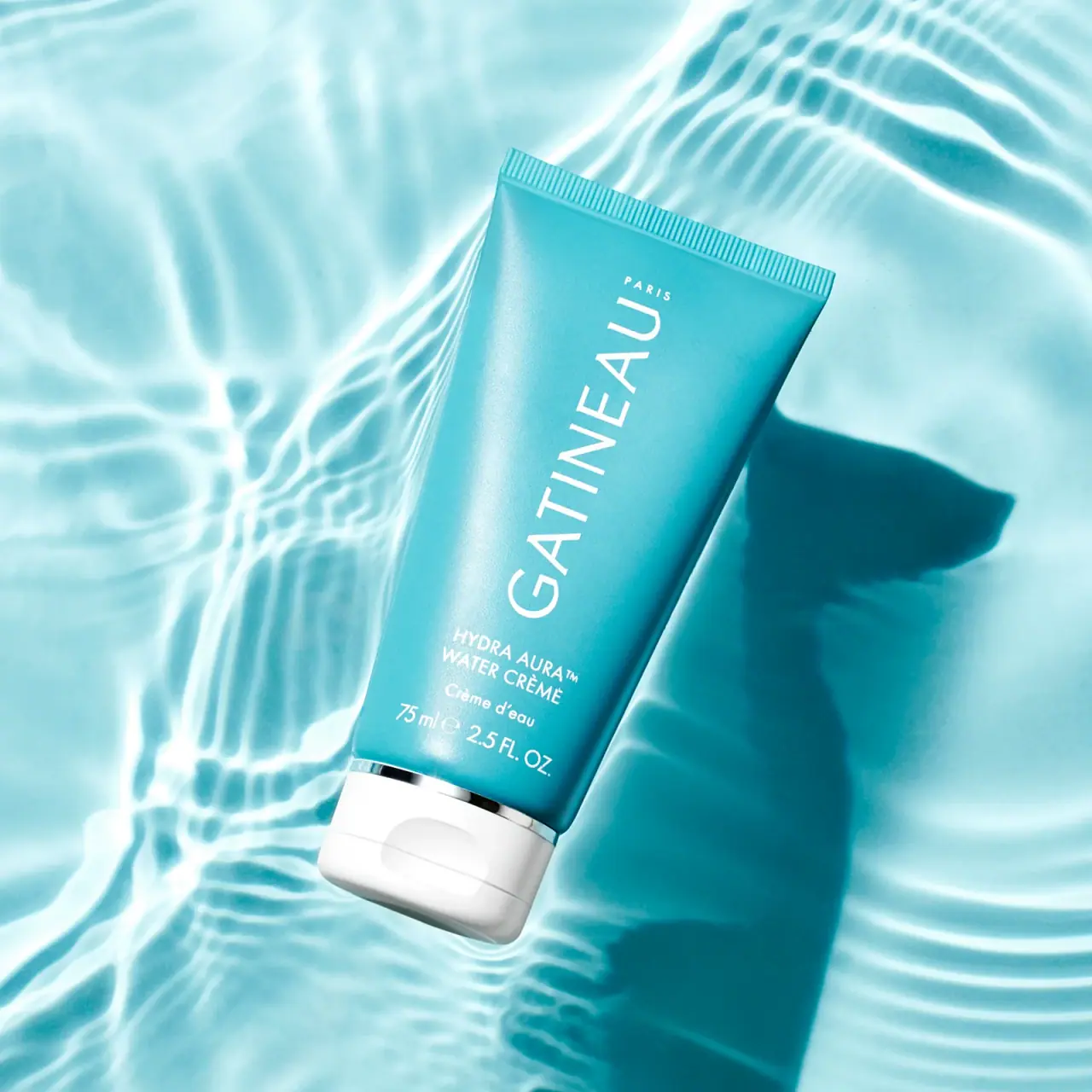
Gatineau
Turquoise tube with lengthwise white name and silver accent

Malin+Goetz
pharmacy label set in bracketed helvetica
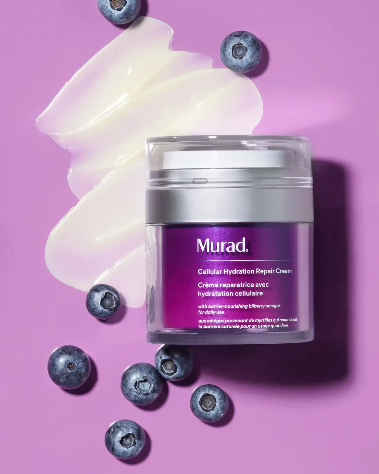
Murad
Purple inner field framed by clear walls and silver

Native
white drugstore bottles, scent-tinted vertical caps