About this packaging
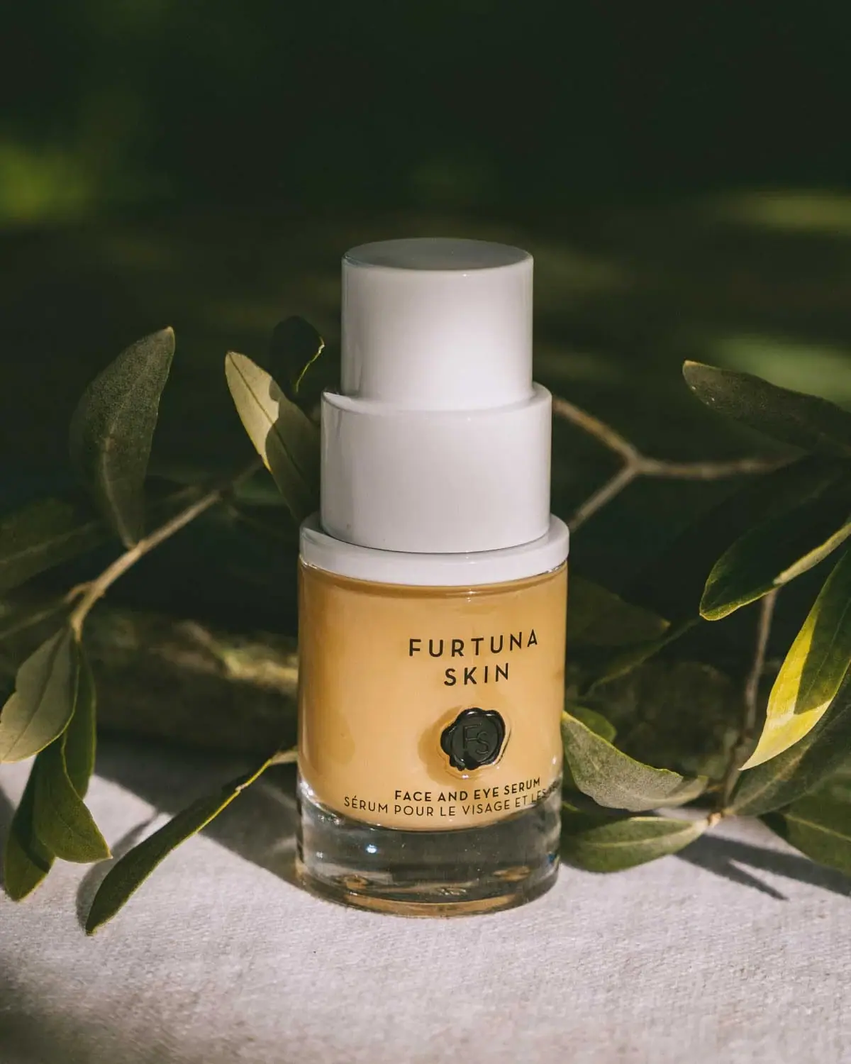
Furtuna Skin’s Porte Per La Vitalità Face & Eye Serum appears in a compact pump bottle with a broad, tiered white actuator. A dark seal-like emblem anchors the bilingual product name against the warm-toned container.
Furtuna presents Porte Per La Vitalità as a serum for both face and eye areas. Its application instructions describe dispensing one to three pumps before spreading a thin layer.[1]
Pack construction & use
- Bottle and pump
- The cover shows a rounded bottle with a clear-looking lower section and a broad, tiered white pump assembly.Observed in the reference photograph
- Front label
- Furtuna Skin is stacked above a dark circular seal, with the English and French product names along the lower front.Observed in the reference photograph
What makes the design work
Editorial analysis of this packaging reference.
The pump assembly gives a small serum a strong profile
The broad, tiered white pump rises above a compact rounded bottle and creates an unusually substantial closure silhouette. It remains easy to see in the botanical setting, giving the small pack an identifiable shape from a distance.
A seal emblem anchors the bilingual name
Furtuna Skin appears above a dark circular seal, followed by Face and Eye Serum and its French translation near the base. The seal interrupts the otherwise simple text stack and gives the front panel a distinct central mark without crowding the product name.
Amber and green connect the bottle to the estate scene
The warm amber-looking product and translucent-looking lower bottle contrast with dark green leaves and a pale fabric surface. This is a visual color association rather than a confirmed material or formula-color specification; the label remains clearly readable against the body.
Ideas for your next brief
- Give a small treatment bottle a recognizable silhouette through a closure proportion that differs from the container body.
- Use one seal-like mark to break up a bilingual front label while keeping the product name readable.
- Let a botanical setting support the package palette without treating photographic color as proof of bottle material.
Sources & further reading
Researched 19 October 2026