Photography: Furtuna Skin official photography. Images belong to their respective owners.
Furtuna Skin

A tiered white top above a warm sealed identity
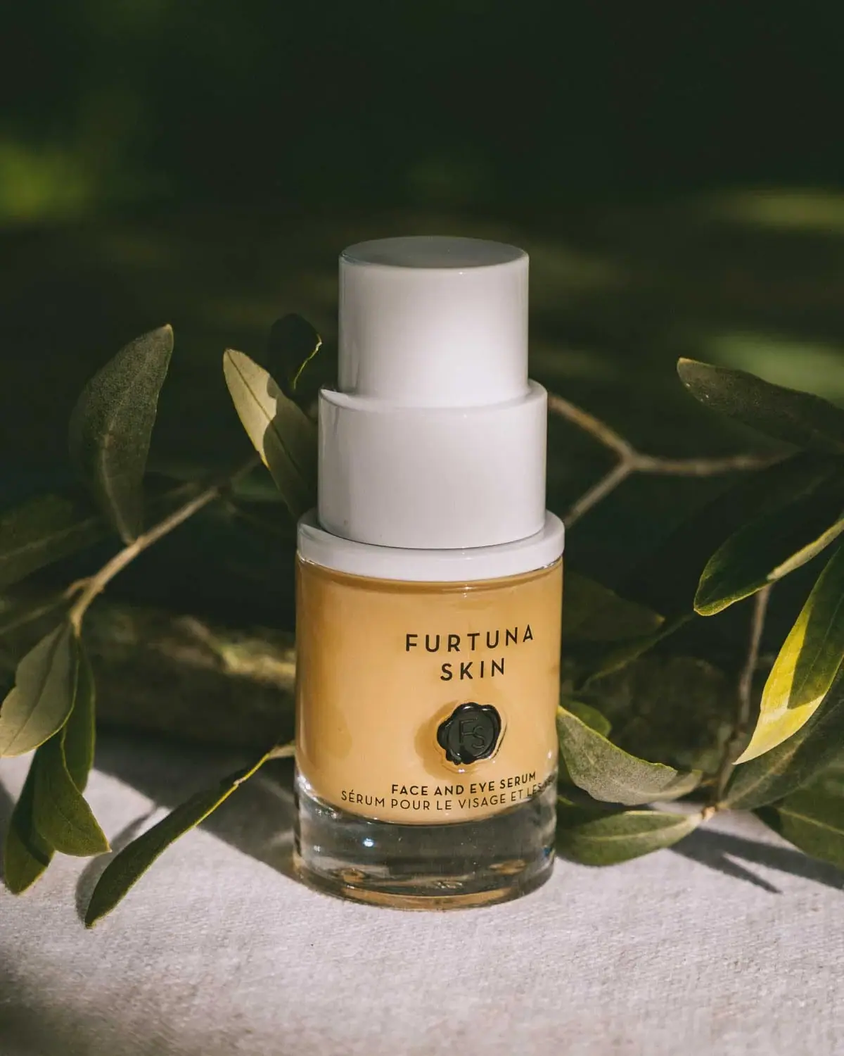
The selected Face & Eye Serum bottle combines a short transparent-looking cylinder, warm golden contents and an unusually substantial stepped white upper assembly. A spaced two-line house name sits above a dark wax-seal-like emblem, with compact English and French product naming near the lower curved edge. The identity is therefore both modern and referential: the white geometry feels precise, while the irregular seal adds a handcrafted-looking accent. This study follows the approved botanical photograph of this particular front; it does not identify the original fonts, infer wax construction or turn the warm colour into a bottle-material specification.
- Skincare
- Light pack
- Heritage label
- Luxe monochrome
About this study
Approved Face & Eye Serum editorial photograph with warm chamber, tiered white top and dark seal-like emblem. Source asset names 30 ml, but front capacity is not independently legible.
Sources & evidence · Reviewed 2026-10-19Color Palette
Approximate colours interpreted from photography. These are screen references, not official brand colours or print specifications.
Pack body
Warm golden optical field
#D6A357
Approximate colour seen through the main chamber. Formula colour, illumination and reflections may contribute; it is not evidence of an amber glass wall or a specified opaque coating.
Soft white closure
#EBE7E3
Approximate white upper assembly. Its broad pale geometry provides the strongest contrast against the dark botanical background and differentiates the top from the warm body.
Ink
Deep dark emblem and type
#20231B
Approximate near-black front text and central seal-like mark. Greenish reflections from the setting make a precise ink colour uncertain; this is not a claim of a dedicated green production colour.
Typography
Suggested visual alternatives, not confirmed brand typefaces. Any scale below is an illustrative estimate.
The uppercase house name is widely spaced and split into two centred lines. The dark emblem sits below as a compact graphic anchor, followed by the smaller bilingual product description. The lower lines appear to follow the cylinder’s curvature in perspective rather than a verified curved-text artwork path. The brand has breathing room, while the functional wording is compact and close to the transition into the clear base.
Fonts
Spaced house identity
Montserrat
- Looks like
- Montserrat
- Type
- Geometric sans serif
- Weight
- Medium 500 / SemiBold 600
- Case
- Uppercase
- Tracking
- Generous on short identity lines
- Fallback
- sans-serif
An alternative for a new two-line house name with an open rhythm. Preserve the clear gap between the words without copying the original Furtuna Skin letter arrangement or treating wide tracking as a substitute for readable size.
Bilingual product descriptor
Inter
- Looks like
- Inter
- Type
- Sans serif
- Weight
- Medium 500
- Case
- Uppercase
- Tracking
- Slightly open, adjusted for the curved surface
- Fallback
- sans-serif
A practical alternative for short English and French lines near the base. Check the longer translation on a real curved surface: words near the sides may become harder to read even when the centre remains clear.
Structure & Proportions
Visual proportions and finish previews are illustrative. Confirmed construction details and uncertainties are distinguished in the study notes.
Proportions
| Purpose | Value | Preview |
|---|---|---|
| Upper assembly | The stepped white top is substantial relative to the short filled chamber, making it a major silhouette feature rather than a small finishing cap. | — |
| Clear base | A pronounced transparent-looking lower margin sits beneath the warm chamber. Apparent depth is influenced by optics and is not a measured wall thickness. | — |
| Front hierarchy | The house name, emblem and small bilingual descriptor form a vertical stack within the warm area, leaving the lower clear margin mostly free of major graphics. | — |
Shapes
| Element | Value | Preview |
|---|---|---|
| Bottle | Short circular cylinder with softly rounded lower edges and a clear-looking base. | |
| White upper assembly | Stacked cylindrical steps decrease in width toward the top; exact internal function is unverified. | |
| Seal-like emblem | A roughly circular mark with uneven contour and internal monogram-like relief. |
Finishes
Optical clear base
Lower bottle and exposed edges; substrate unverified. · transparent
Smooth white top
Tiered upper assembly, with soft reflected highlights. · gloss
Dimensional seal appearance
Dark front emblem; preview refers to relief-like appearance, not confirmed embossing or wax. · emboss
Formats and materials
| Formats | A compact cylindrical serum bottle with a clear-looking lower base and a stepped white dispensing/closure assembly. The brand’s product content confirms pump dispensing, but the exact nozzle is not exposed in the selected angle. |
| Materials | The inspected official product and story pages do not provide a component material specification. Transparency and apparent base depth do not independently verify glass, while white hardware does not identify a particular polymer., The central emblem looks dimensional and seal-like. Its material, attachment and forming process remain unknown; a wax-like appearance is not proof that it is wax. |
| Closures | The white top consists visually of a broad lower ring, a larger cylindrical middle section and a narrower tall upper section. The photograph does not reveal which boundaries separate a cover, actuator or other components, so their engineering roles are not reconstructed. |
| Decoration | Sparse dark type and one central seal-like emblem occupy the front without a large opaque label rectangle. The text application method is not identified by the photograph. |
Front Panel
Schematic reading order. The diagram’s zone heights do not represent measured artwork proportions.
The front uses a three-part central axis: spaced identity, a compact emblem and functional naming. The warm visible chamber supplies the background. A separate opaque printed panel would conceal that field, so the sparse arrangement lets the bottle’s contents and optical depth contribute to the design.
| Zone | Content |
|---|---|
| Upper identity | Two short uppercase lines sit high on the visible chamber. Their spacing makes the producer name distinct without requiring a coloured banner or decorative border. |
| Central emblem | A dark seal-like form creates a small visual interruption. Its uneven contour contrasts with the regular cylindrical bottle and concentric white top. |
| Lower product names | English and French descriptions sit close to the lower edge of the warm area. The long French line approaches the curved sides, making actual-size and viewing-angle tests relevant for any adaptation. |
| Clear lower margin | The transparent-looking base remains a visual buffer below the type. Highlights here create depth but should not be treated as an additional printed frame. |
Range System
The official product page offers several sizes of Face & Eye Serum, while the source image filename identifies this editorial asset with the 30 ml version. Capacity is not clearly readable on the photographed front, so the analysis remains focused on visible geometry rather than verified physical dimensions. No other product’s colour or closure is used to define a universal system.
- For an original line, repeat the spaced house identity and a distinctive central emblem while keeping the actual product name readable. Different products would still need an explicit functional distinction.
- A larger format may need a different balance between closure and body; do not mechanically scale every element from this compact specimen. The strong stepped-top proportion is an observation of this photograph, not a mandatory family ratio.
Back of Pack & Shelf
The back, underside and opened dispensing assembly are unseen. Official usage text confirms pumping but does not establish a rear artwork grid.
- Verify quantity, ingredients, responsible-party information and any batch marks from the actual edition before transcribing them.
- Do not infer an airless mechanism, preservative benefit, refill insert or removable pump from the tiered external shape.
- Keep any original-design back text on a readable area with enough contrast; the clear base and curved sides may not provide a stable ground.
On shelf
The tall white stepped top and small dark seal offer two recognition cues at different distances: silhouette first, emblem on closer inspection. The warm body field separates them from a generic all-white treatment bottle. This is a visual interpretation, not a tested retail conclusion. A neutral front packshot and open-pump view would be needed to assess recognition and dispensing without the photograph’s dramatic lighting.
Imagery
The bottle sits on pale fabric among dark green leafy branches. Strong light warms the visible serum field and creates deep shadows behind the white top, which becomes the clearest silhouette feature. The leaves frame rather than cover the front identity. The fabric’s texture contrasts with the smooth bottle and upper assembly. This is a botanical editorial setting; it does not independently verify the plant species, formula ingredients, geographical location or packaging material.
Guidelines
Editorial principles for an original design brief, not official brand guidelines.
Do
- Preserve the relationship between the short chamber and substantial stepped top when analysing this specimen.
- Describe the central mark by its visible contour and relief rather than an invented material.
- Check the long bilingual line from several viewing angles on the actual cylinder.
- Keep botanical scene colours separate from the bottle and closure specification.
Don't
- Do not infer glass or amber-coloured walls from the warm visible chamber.
- Do not treat the seal-like emblem as a verified wax seal or certification.
- Do not assign airless, refillable or hygienic performance claims to the external pump shape.
- Do not use formula marketing language to explain an unverified packaging mechanism.
Sources & evidence
- Porte Per La Vitalità Face & Eye Serum story — Furtuna Skinbrand
- Face & Eye Serum — Furtuna Skinproduct
How this study was built
edition · Sourced fact
Official product identifies Face & Eye Serum and offers multiple sizes; the photographed front shows the bilingual product name.Face & Eye Serum — Furtuna Skinstructure · Sourced fact
Official story describes pump dispensing, but does not specify the selected assembly’s internal construction.Porte Per La Vitalità Face & Eye Serum story — Furtuna Skinlabel · Visual observation
Spaced two-line house name, dark seal-like emblem and small bilingual descriptor form a central stack.typography · Visual observation
Dark uppercase lettering uses spacing and position to distinguish identity from function.palette · Visual observation
Warm chamber, white upper assembly and dark accents belong to the pack; leaf green mainly belongs to scenery.imagery · Visual observation
Pale fabric and leafy branches frame the bottle under strong light.range · Editorial interpretation
Transferable guidance concerns silhouette and information hierarchy, not a verified universal brand system.
What remains unverified
- Non-www product URL failed; www version and official story were accessible.
- Bottle, top and emblem materials and manufacturing methods are unspecified.
- Exact nozzle and component functions within the stepped assembly are not visible.
- Reverse, base marking and opened mechanism were not inspected.
- Original fonts, exact production colours and physical dimensions are unverified.
Give your AI
packaging taste
Give your design or image tool a packaging study: palette, type, structure, front panel and principles for an original brief.
Export this styleFree with an email. PACK.md works in Claude, ChatGPT, Cursor and image tools.
More like this
Ezmio Beauty
White polish bottle, tall burgundy cap, spare serif identity
Omorovicza
Frosted bath-oil cylinder with a reflective radiating emblem
Philip B
gold rules and a crest on a black foamer
Retrouvé
White serif seal on a black airless body-oil cylinder

Aerangis
a quiet numbered object, an intimate scent memory

Alexander McQueen
An oval flacon crowned with dense black relief

Arquiste
blush transparency, white lettering and a stepped gold cap

Chabaud
A framed perfume label beneath a clear architectural cap