About this packaging
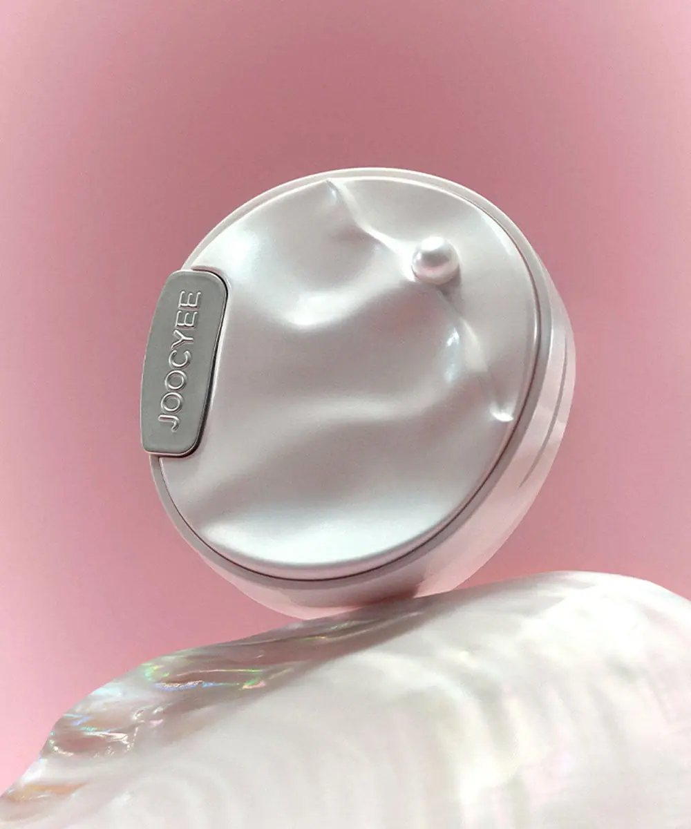
JOOCYEE’s Heart of Oysters compact translates a shell theme into an uneven, pearl-like lid with a small raised bead. A narrow silver-colored brand plaque interrupts one edge, leaving most of the sculptural surface free of text.
JOOCYEE presents Heart of Oysters as a limited-edition collection. This blush-and-highlighter format carries the shell theme into the case itself, making its closed exterior useful as a design reference.[1][2]
Pack construction & use
- Compact / closure
- The rounded case has a visible seam between lid and base. Its lid carries softly undulating relief and a pearl-like bead; the surface appearance does not establish the underlying material.Observed in the reference photograph
What makes the design work
Editorial analysis of this packaging reference.
Shell relief as format identity
The lid’s concave ridges and raised pearl turn the oyster reference into a tactile form rather than a printed illustration. This makes the compact recognizable even when the front label is small.
Pearl-like surface
The pale reflective finish and soft pink setting reinforce the collection’s watery, iridescent visual language. The simple background also makes the lid contours and specular highlights easier to read.
A restrained brand marker
JOOCYEE appears on a narrow plaque along the lid edge. The small plaque gives a clear brand identifier without interrupting the shell silhouette or turning the compact into a text-heavy object.
Ideas for your next brief
- Translate a collection concept into the compact’s physical relief, not only its printed graphics.
- Keep a small, high-contrast brand plaque visible while preserving the main sculptural surface.
Sources & further reading
Researched 19 October 2026