About this packaging
Kosas positions The Sun Show as a baked bronzer within its color range; the cover emphasizes the compact itself as the hero.
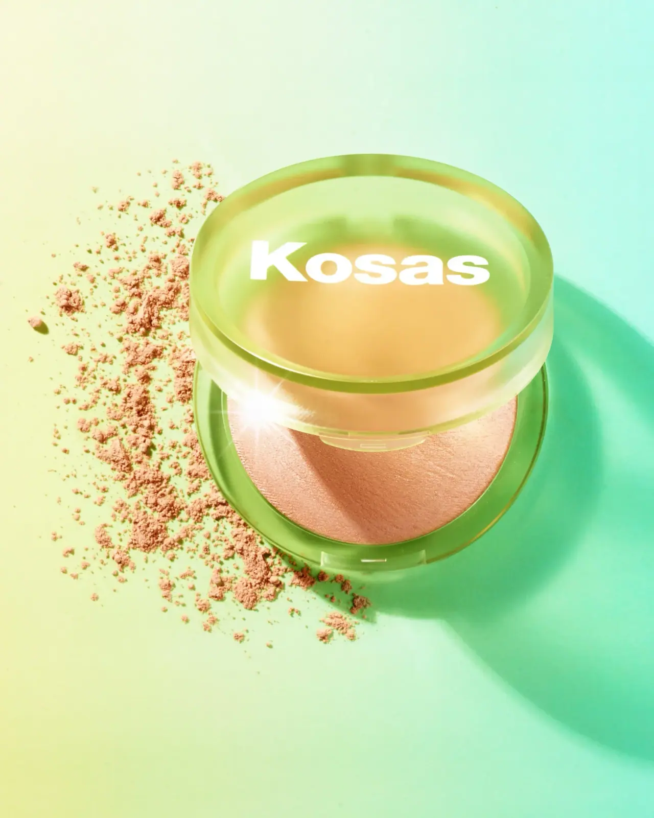
Kosas identifies The Sun Show as a talc-free baked bronzer offered in multiple shades. The selected image focuses on its translucent compact and visible powder pan.[1]
Pack construction & use
- Compact and pan
- Kosas identifies The Sun Show as a baked bronzer. The selected image shows a round translucent yellow-green compact through which the domed pan is visible; the exact compact material is not stated.[1]
- Lid mark
- The white Kosas wordmark is centered across the raised lid. The powder surface remains visible around it, making the compact color and product itself part of the front presentation.Observed in the reference photograph
What makes the design work
Editorial analysis of this packaging reference.
Product visible through the lid
The translucent compact turns the powder pan into part of the front-facing design. The color and form of the product become immediate recognition cues without printing a shade illustration.
Wordmark spans the circular face
The broad white logo crosses the lid’s center and remains readable against the yellow-green ground. Its horizontal placement counterbalances the circular silhouette.
Compact geometry frames the pan
The raised domed top and visible side seam make the lid-base relationship clear. The shallow round form signals a hand-held cosmetic while keeping the product itself visible.
Ideas for your next brief
- A translucent compact can make the product color part of the visual identity.
- Place a horizontal wordmark across a round lid to balance its circular outline.
Sources & further reading
Researched 19 October 2026