Photography: Joocyee official photography. Images belong to their respective owners.
Joocyee

Pearlescent shell relief with an off-centre bead and plaque
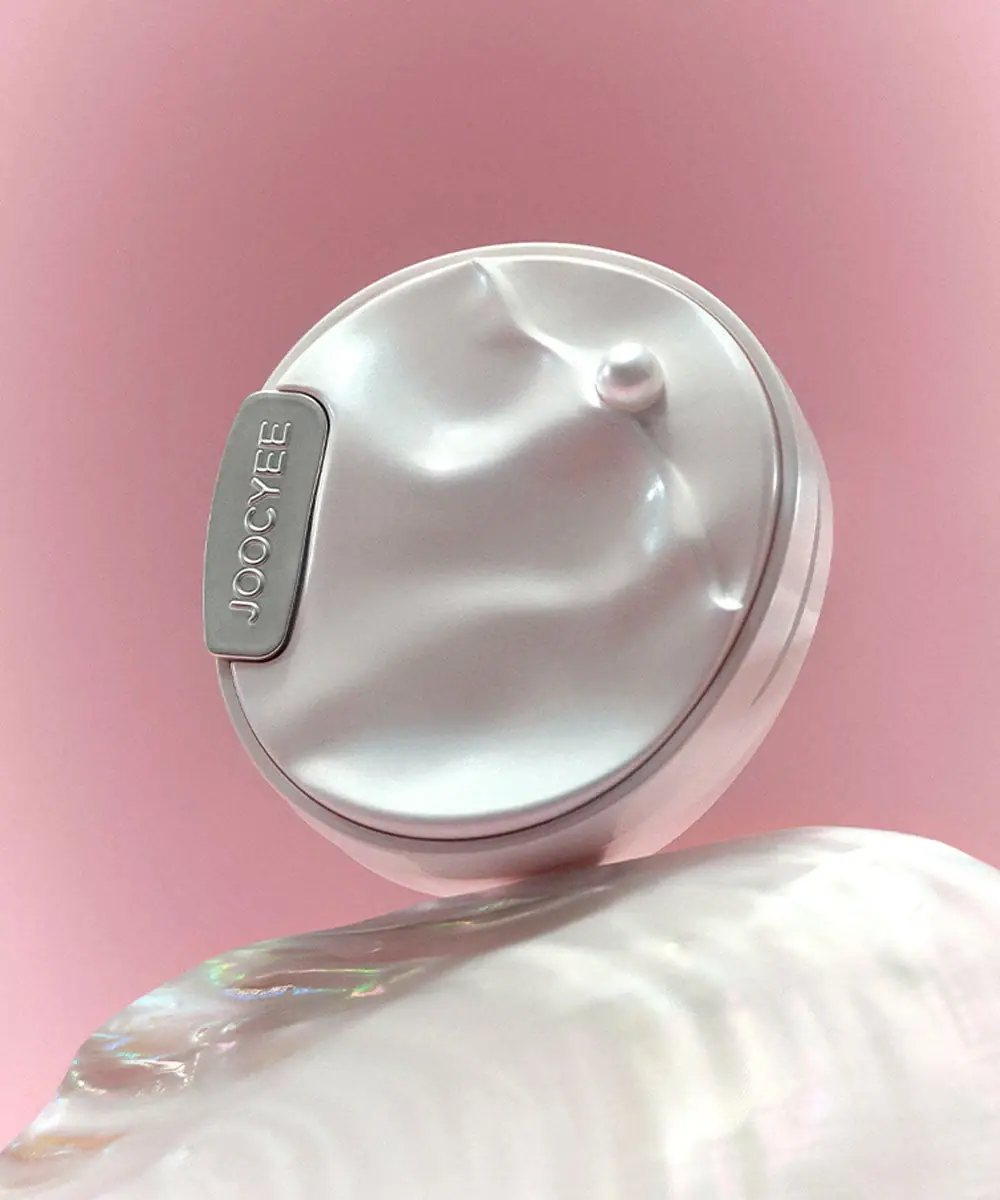
The selected Heart of Oysters compact translates a shell reference into a pale undulating lid with a small pearl-like raised bead. A narrow silver-grey plaque at the left edge carries the producer name in relief, leaving the rest of the circular surface free of copy. The rim and visible seam distinguish lid from base, while reflected pink from the scene softens the otherwise pale object. The product page identifies a blush/highlighter family, but this closed view does not reveal the powder, mirror, pan configuration or shade label.
- Make-up
- Light pack
- Luxe monochrome
About this study
Selected closed Heart of Oysters compact. Exterior relief and plaque audited; interior and exact visible shade identification unavailable.
Sources & evidence · Reviewed 2026-10-19Color Palette
Approximate colours interpreted from photography. These are screen references, not official brand colours or print specifications.
Pack body
Pearl-white lid
#E1E4DF
Approximate pale reflective shell surface. Subtle grey, cyan and pink shifts arise from finish and lighting; they are not independently specified printed colours.
Pale reflected blush
#DBCDCD
Approximate pink cast on the lower case in this photograph. It is explicitly a reflection-sensitive appearance, not a verified pink material or separate shade code.
Accent
Silver-grey plaque
#9EA39E
Approximate narrow identity plaque and surrounding highlights. A metallic-looking surface does not establish metal construction or plating.
Typography
Suggested visual alternatives, not confirmed brand typefaces. Any scale below is an illustrative estimate.
The exterior has one visible text element: JOOCYEE along a narrow rounded rectangular plaque. It follows the plaque’s long axis, which appears vertical because of the compact’s rotated pose. The letters have a light outlined or relief-like appearance rather than a flat high-contrast ink treatment. No product name, shade, quantity or descriptive line competes on the lid. The sculptural surface is therefore the primary hierarchy, with the small plaque acting as attribution. Supporting information would need to be verified on unseen surfaces.
Fonts
Plaque identity alternative
Quicksand
- Looks like
- Quicksand
- Type
- Rounded sans serif
- Weight
- Medium 500 / SemiBold 600
- Case
- Uppercase
- Tracking
- Neutral to modestly open
- Fallback
- sans-serif
A proposed rounded voice for an original small plaque. Develop distinct lettering and test relief depth or contrast through prototyping rather than assuming pale raised letters will always read well.
Supporting information proposal
Inter
- Looks like
- Inter
- Type
- Sans serif
- Weight
- Regular 400 / Medium 500
- Case
- Sentence case with short uppercase identifiers
- Tracking
- Neutral
- Fallback
- sans-serif
A practical alternative for a proposed base label or outer carton. Such surfaces are unseen here, so this is original design guidance rather than an attribution of the product’s hidden typography.
Structure & Proportions
Visual proportions and finish previews are illustrative. Confirmed construction details and uncertainties are distinguished in the study notes.
Proportions
| Purpose | Value | Preview |
|---|---|---|
| Circular field | A broad circular lid provides room for a few large undulations rather than a dense repeating pattern. | — |
| Raised bead | The bead is small relative to the lid and sits away from the centre, creating a focal point without making the composition symmetrical. | — |
| Plaque | The narrow elongated identity panel occupies a limited strip near the edge, preserving most of the shell-like surface. | — |
Shapes
| Element | Value | Preview |
|---|---|---|
| Compact outline | Circular case shown at an angle, with a visible lid/base seam. | |
| Lid relief | Broad irregular concave and raised wave-like contours. | |
| Pearl-like bead | Small rounded raised feature positioned off-centre. | |
| Identity plaque | Narrow rounded rectangle following one edge. |
Finishes
Pearl-like sheen
Undulating lid and bead; process and composition unverified. · pearlescent
Silver-grey plaque appearance
Edge identity panel; substrate unknown. · metallic
Raised-looking identity
Plaque lettering; preview represents relief, not verified embossing. · emboss
Formats and materials
| Formats | A closed round compact with an undulating lid and visible perimeter seam. The official page describes Heart of Oysters Blush & Highlighter and lists S224 Ripple Pink and D310 Light Sparkle options. |
| Materials | The accessed product and collection pages do not specify case substrate, plaque material, bead composition or pearlescent coating process. Neither shell-like appearance nor a pearl-like bead proves natural shell or pearl content., The selected closed view does not establish an internal mirror, pan material, hinge mechanism, refill system or magnetic parts. |
| Closures | A fine seam separates the lid from the lower case around the visible edge. The plaque sits near the perimeter, but the photograph does not demonstrate whether it is attached to a hinge, latch or purely decorative region. Opening direction and retention remain unverified. |
| Decoration | The main decoration is physical-looking relief: broad irregular waves, shallow valleys and a small off-centre bead. The only visible text is concentrated on the edge plaque. |
Front Panel
Schematic reading order. The diagram’s zone heights do not represent measured artwork proportions.
There is no conventional front label. A small plaque identifies the producer while the lid acts as a sculptural surface. The plaque’s straight elongated shape contrasts with the irregular waves around it. Because the compact is closed, the image is useful for exterior form and finish analysis but cannot explain the makeup format inside.
| Zone | Content |
|---|---|
| Main relief field | Large smooth undulations spread across the pale circular lid. Their broad scale lets reflections describe the shape without printed outlines. |
| Off-centre bead | A small rounded feature provides the clearest focal point within the relief. Its pearl-like appearance is a visual analogy, not a material identification. |
| Producer plaque | The narrow silver-grey panel carries the only readable exterior text. Its near-edge position keeps the central shell surface uninterrupted. |
| Perimeter seam | A thin dark line and layered rim distinguish the lid from the lower case. They do not reveal the opening mechanism. |
Range System
The official collection places Heart of Oysters among limited editions, and the exact product listing names two blush/highlighter options. The selected asset is catalogued within this family, but no shade code is readable on its closed exterior. The study therefore analyses the case without assigning a visible powder colour or assuming identical interiors across variants.
- An original collection can repeat a sculptural exterior across products while keeping the functional category and shade clear on verified secondary surfaces. The exterior alone should not be expected to communicate everything.
- A different finish on the same relief would change how the waves read. Prototype under several light directions before treating a pearlescent effect as a reliable substitute for a strong silhouette.
Back of Pack & Shelf
Base, hinge, latch, interior and any carton are unseen. Shade names, quantity, ingredients and product-category placement cannot be reconstructed.
- Use an open view before describing a mirror, pan or applicator compartment.
- Verify a base label before assigning the photographed specimen to a shade code.
- Do not infer refillability or magnetic closure from a neat perimeter seam.
On shelf
The undulating pale lid and small bead should be recognised before the narrow brand plaque becomes readable. The silver-grey panel provides a stable text area but has limited tonal contrast, so reflections can affect recognition. This is visual interpretation rather than a consumer test. A useful catalogue should pair this sculptural hero with an open product view and a neutral exterior image to explain both contents and surface behaviour.
Imagery
The compact is tilted against a soft pink background above a large iridescent shell-like prop. That prop reflects rainbow colours more strongly than the compact itself, so its holographic-looking spectrum should not be transferred to the package finish. Soft directional light traces the lid valleys and bead, while the rotated pose makes the plaque nearly vertical. The scene reinforces the oyster theme through form and sheen rather than through water or literal ingredient imagery.
Guidelines
Editorial principles for an original design brief, not official brand guidelines.
Do
- Separate the compact’s pearlescence from the stronger iridescent prop.
- Keep the bead and plaque material descriptions qualified.
- Use open and underside views to explain functional contents.
- Test small relief lettering under varied lighting.
Don't
- Do not claim natural shell or pearl components from appearance.
- Do not describe unseen mirror, hinge or refill features as verified.
- Do not assign a shade from the closed lid alone.
- Do not confuse a relief preview with a confirmed embossing process.
Sources & evidence
How this study was built
edition · Sourced fact
Official product lists S224 Ripple Pink and D310 Light Sparkle within blush/highlighter family.Heart of Oysters Blush & Highlighter — JOOCYEErange · Sourced fact
Official collection presents Heart of Oysters in limited-edition context.Heart of Oysters collection — JOOCYEEstructure · Visual observation
Closed circular case has undulating lid, off-centre bead and visible perimeter seam.typography · Visual observation
Only readable exterior text sits on a narrow edge plaque.label · Visual observation
Plaque leaves most sculptural lid free of copy.palette · Visual observation
Pale pearl-like lid and silver-grey plaque show scene-dependent pink reflections.imagery · Editorial interpretation
Iridescent shell prop reinforces theme but does not specify the compact’s coating.
What remains unverified
- Case, plaque, bead and finish materials unverified.
- Closed view does not establish mirror, pan, hinge, latch or refill system.
- Product options are source-listed but no shade code is visible on lid.
- Fonts proposed; pink reflection and iridescent prop kept separate from fixed package colours.
Give your AI
packaging taste
Give your design or image tool a packaging study: palette, type, structure, front panel and principles for an original brief.
Export this styleFree with an email. PACK.md works in Claude, ChatGPT, Cursor and image tools.
More like this

African Botanics
Technical black label with a low serif signature

al.ive body
warm architectural calm, built as a paired vanity object

bareMinerals
a restrained black compact framing the powder itself

BeautyPWR
Clear square shell, white cream cup, black serif identity

Christian Louboutin
Faceted turquoise base beneath an extreme silver taper
Clé de Peau Beauté
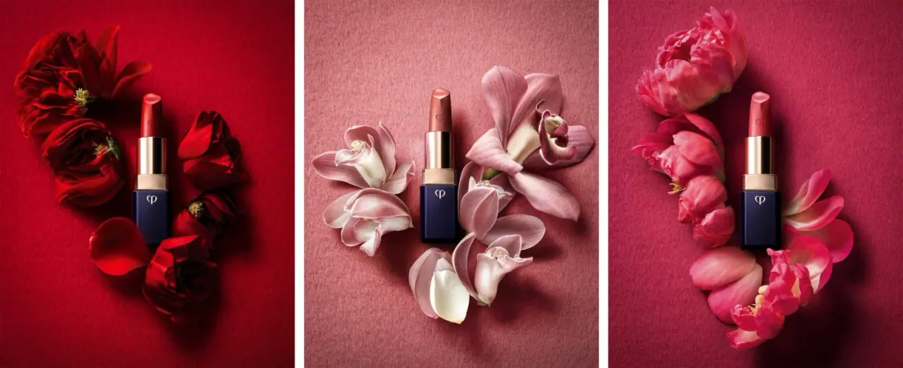
Faceted navy base, reflective gold barrel, discreet repeated emblem

Color Wow
Tall condensed naming on a broad reflective silver jar

Corpus
sage gloss with whispered gold lettering