Photography: Jorum Studio official photography. Images belong to their respective owners.
Jorum Studio

Outlined woodland lettering with a quiet label center
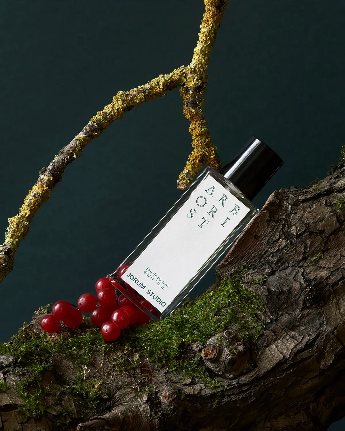
Arborist gives a tall rectangular perfume bottle a narrow white label dominated by an unusual letter arrangement. The name breaks across three rows as ARB, ORI and ST, using widely separated green outlined serif capitals. A large empty middle separates that graphic title from the small concentration, amount and solid producer name at the foot. The result is spare but not anonymous: recognition comes from how the word is organized, rather than a large emblem or decorative border. The approved photograph shows the 30 ml edition, distinct from the additional 50 ml option on the current official page.
- Perfume
- Light pack
- Bold typographic
- Botanical
About this study
Selected 30 ml Arborist bottle and woodland still life; current 50 ml option is acknowledged separately.
Sources & evidence · Reviewed 2026-10-19Color Palette
Approximate colours interpreted from photography. These are screen references, not official brand colours or print specifications.
Pack body
Glossy cap black
#171B1A
Solid cylindrical cap above the transparent bottle; bright vertical reflections are illumination, not printed stripes.
Label
Soft paper white
#F1F1EA
Tall pale label with a subtly textured-looking surface; exact stock and finish are unknown.
Ink
Deep woodland green
#345F54
Outlined title and smaller label text; approximate screen reading under directional light.
Typography
Suggested visual alternatives, not confirmed brand typefaces. Any scale below is an illustrative estimate.
Read the large three-row scent title first, then cross a deliberately empty area to the small Eau de Parfum and 30 ml / 1 fl oz lines. The producer appears in a heavier, wider uppercase line at the bottom. This separates the exploratory name treatment from a stable practical footer.
Fonts
Outlined scent title
Cormorant Garamond
- Looks like
- Classical serif capitals with open counters
- Type
- Serif
- Weight
- Medium 500 / SemiBold 600
- Case
- Uppercase
- Tracking
- Wide letter spacing within short rows; maintain a consistent reading order.
- Fallback
- Georgia, serif
For a new short scent name, explore a fine outlined treatment and generous spacing. The actual Arborist grid and original lettering should not be reproduced verbatim; avoid hairlines that disappear at bottle scale.
Concentration and producer footer
Work Sans
- Looks like
- Quiet clean sans-serif
- Type
- Grotesque sans-serif
- Weight
- Regular 400 / SemiBold 600
- Case
- Sentence case details; uppercase producer
- Tracking
- Slightly open for small copy; compact but not compressed for the producer.
- Fallback
- Arial, sans-serif
Build a plain footer that restores immediate legibility after the experimental title. Keep the amount separate from concentration and increase producer weight without enlarging it into the blank center.
Structure & Proportions
Visual proportions and finish previews are illustrative. Confirmed construction details and uncertainties are distinguished in the study notes.
Proportions
| Purpose | Value | Preview |
|---|---|---|
| Label coverage | The pale panel occupies most of the front height and width but leaves a transparent perimeter. The image is tilted, so ratios are qualitative. | — |
| Reading pause | The empty center is substantially taller than the footer and is an active part of the composition, not space awaiting additional claims. | — |
| Cap relationship | A short black cylinder narrows relative to the rectangular body, making the shoulder transition visible while retaining a simple silhouette. | — |
Shapes
| Element | Value | Preview |
|---|---|---|
| Bottle front | Long rectangular face with softened corner reflections and a clear surrounding edge. | |
| Title grid | Three rows of separated letters; the final row is shorter and does not fill a conventional rectangular word block. | |
| Black cap | Plain circular-section closure viewed obliquely above the neck. |
Finishes
Transparent reflective perimeter
Bottle body appearance; substrate unverified · transparent
Black cap reflection
Closure exterior · gloss
Diffuse pale panel
Front label appearance; stock unspecified · matte
Formats and materials
| Formats | Tall straight-sided transparent perfume bottle with a rectangular front, narrow visible clear perimeter and substantial-looking base., Selected front is marked 30 ml / 1 fl oz. The official product page offers 30 ml and 50 ml, but the larger format is not substituted into this analysis. |
| Materials | The photograph shows a transparent rigid body and opaque black cap. The reviewed product page does not establish their exact substrates or recycled content., A distinct pale front label has a fine textured appearance. Paper grade, fiber composition, adhesive and printing process are unconfirmed. |
| Closures | The black cylindrical cap is fitted over the neck. Atomizer, collar and attachment mechanism are hidden; the photograph cannot establish magnetic, screw or friction closure construction. |
| Decoration | Green outlined title letters arranged into three short rows near the top., Small green concentration and amount above a heavier green producer line at the bottom., No visible illustration on the label; woodland texture belongs to the photographic environment. |
Front Panel
Schematic reading order. The diagram’s zone heights do not represent measured artwork proportions.
Use a top title field and bottom specification field separated by a conspicuous blank interval. The name reads left to right across rows rather than vertically down a single column. The footer restores familiar order and keeps practical details from being fragmented like the title.
| Zone | Content |
|---|---|
| Upper name field | ARB / ORI / ST in outlined green serif capitals with wide separation. |
| Central pause | Unprinted-looking white area exposing the subtle label texture and slowing the reading rhythm. |
| Specification pair | Small centered concentration line followed by the 30 ml / 1 fl oz amount. |
| Producer baseline | JORUM STUDIO in solid uppercase sans-serif, spanning more of the width than the specification pair. |
Range System
The source confirms more than one Arborist volume; it does not establish an identical label grid for every fragrance. An original system could preserve the quiet center and fixed footer while adapting the title arrangement to each name, provided reading order survives.
- Keep the two available size claims separate; the selected 30 ml image should not illustrate a detailed construction claim about the 50 ml bottle.
- Test a new name in a different row count rather than forcing all words into Arborist’s exact three-line arrangement.
- Retain concentration and amount as ordinary readable lines even when the title becomes experimental.
Back of Pack & Shelf
The opposite face, underside and uncovered atomizer are not visible. There is no basis for reconstructing an ingredient panel or assigning a batch mark to a specific surface.
- Reserve an independently readable area for ingredients, responsible business information and necessary warnings in an original design.
- Verify whether production information sits on the base, reverse label or carton before describing it.
- Do not turn the visible clear body into a claim of refillability or a particular recycling route.
On shelf
The high contrast pale panel gives the bottle a clear graphic face in a dark setting, while the outlined title rewards closer inspection. Splitting the word introduces a readability tradeoff: strong visual character but more decoding than a normal horizontal name. The small solid footer helps resolve that tension. This is an interpretation of the selected image, not evidence of recognition performance or a claim about every Jorum Studio product.
Imagery
The bottle lies diagonally against bark, moss and lichen, with red berries close to its base. The pale rectangular label cuts sharply through the irregular woodland textures. The official description connects Arborist with Scottish woodland, supporting the scene’s narrative fit. The berries and lichen are styling elements rather than a verified formula inventory, and their red and yellow colors should not become extra label inks. Preserve the complete top-to-bottom label when cropping the diagonal composition.
Guidelines
Editorial principles for an original design brief, not official brand guidelines.
Do
- Preserve a clear reading order when dividing a new scent name across rows.
- Use a plain footer for concentration, quantity and producer to counterbalance the title experiment.
- Leave enough blank label space for the fine outlines to feel intentional.
- Keep woodland props separate from claims about ingredients or printed package colors.
Don't
- Do not call the outlined letters embossing or engraving without production evidence.
- Do not fill the quiet center with unrelated benefit badges.
- Do not replace the photographed 30 ml amount with the current page’s selected 50 ml option.
- Do not infer magnetic closure, refillability or glass specification from the closed front view.
Sources & evidence
How this study was built
edition · Sourced fact
Official page offers 30 ml and 50 ml and identifies 30 ml photography; selected image reads 30 ml.Jorum Studio — Arborist Eau de Parfumstructure · Visual observation
Tall clear rectangle, pale panel and black cylinder; hidden closure mechanism unclaimed.palette · Visual observation
White, deep green text and black cap; red berries excluded.typography · Visual observation
Outlined serif ARB/ORI/ST title contrasts with solid sans footer.label · Visual observation
Large blank middle separates title and footer.imagery · Sourced fact
Official narrative references Scottish woodland; selected image shows bark, lichen and berries.Jorum Studio — Arborist Eau de Parfumrange · Editorial interpretation
Title-grid adaptation proposed only as a principle, not brand-wide specification.
What remains unverified
- Exact body and cap materials unverified from consulted source.
- Label texture does not establish stock, embossing or printing method.
- Original fonts unknown; alternatives are interpretive.
- Reverse, base and atomizer hidden.
Give your AI
packaging taste
Give your design or image tool a packaging study: palette, type, structure, front panel and principles for an original brief.
Export this styleFree with an email. PACK.md works in Claude, ChatGPT, Cursor and image tools.
More like this

Bomba Curls
tropical foliage gathered around a bold yellow nameplate
Desert Rose Australia
Apricot sunscreen tube with white type and ochre flower

Akro
soft pink interrupted by an assertive black signature
Anecdote Candles
A pale-blue label tells its story through punctuation
Bijou Candles
Pink blackletter and fine webs on a tall dark candle
Binaurale
Globular teal cap above slanted pale fragrance lettering
Blake Brown
sculptural rose-brown fragrance with a jewel-like centre

Boy Smells
candy-shell flacons over blush pink glass