


Kosas

lavender chrome and candy-pink acrylic
Kosas builds its makeup around one signature hardware colour: a soft metallic lavender (#a7a5dc) used for caps, compact lids, stick barrels and mascara tubes. Against it sit translucent candy-pink acrylic brow components that show the wand and formula, brushed silver-white pencil barrels with lavender caps and, for skincare, a single opaque coral bottle (#f58a63). A rounded geometric title-case wordmark runs vertically up the body as the main graphic, solid lilac on silver or outlined in white on coral, with hero product names in a scratchy marker script beside it. The Sport sub-line breaks the code on purpose with white plastic and giant black condensed type on a blister card.
- Make-up
- Light pack
- Pastel soft-touch
- Playful colour
- Bold typographic
Color Palette
Approximate colours interpreted from photography. These are screen references, not official brand colours or print specifications.
Pack body
Lavender Chrome
#a7a5dc
Metallic lilac caps, compact lids, stick barrels and mascara tubes; the constant hardware colour
Candy Acrylic
#e9a3d8
Translucent pink acrylic on brow gels and pencils, showing the wand and formula inside
Pearl Silver
#e4e3ea
Brushed silver-white barrel on sticks and liners, paired with lavender caps
Juicy Coral
#f58a63
Opaque coral bottle and cap on the gel cleanser; skincare gets a full-body colour
Ink
Lilac Print
#9b97e0
Wordmark and product name printed on silver barrels and on clear compact lids
Pop White
#ffffff
Outlined wordmark and small copy on coral and lavender bodies
Deep Violet
#4b3f8f
Script product names on the lavender mascara tube
Accent
Sport Black
#151515
Giant condensed lettering on the white Sport lip balm blister and tube
Range coding
Shade Window
#c98a6b
The formula itself (pan, bullet, gel) seen through clear lids and acrylic; the only shade signal
Typography
Suggested visual alternatives, not confirmed brand typefaces. Any scale below is an illustrative estimate.
The vertical wordmark is the main graphic on every barrel, often running most of its height. Hero product names appear in a loose marker script beside it; plain product types, a French translation and the net weight stack small at the base.
Type scale
Estimated cap size as a share of the panel · Barrel of the Revealer concealer wand, about 110 mm tall
sport-name
35% · Regular · Headline
LipRun
vertical-wordmark
14% · SemiBold · Display
Lumi
lid-wordmark
8% · SemiBold · Display
Lumi
script-name
5% · Regular · Script
Starlash
product-type
2.4% · Medium · Body
Gel Cleanser
translation
1.8% · Regular · Body
Nettoyant gel visage
Fonts
Display
Outfit
- Looks like
- Circular Bold, Gotham Rounded
- Type
- Rounded geometric sans
- Weight
- SemiBold, Bold
- Case
- Title case
- Tracking
- Normal
- Fallback
- Avenir Next Bold, Helvetica Rounded
Wordmark, set vertically reading bottom to top; solid lilac on silver, white outline on coral.
Script
Permanent Marker
- Looks like
- Hand-drawn marker script
- Type
- Scratchy marker script
- Weight
- Regular
- Case
- Mixed
- Tracking
- Normal
- Fallback
- Marker Felt, Brush Script MT
Hero product names (mascara, liner) printed small beside the vertical wordmark.
Body
Inter
- Looks like
- Helvetica Neue, Inter
- Type
- Neo-grotesque sans
- Weight
- Regular, Medium
- Case
- Title case
- Tracking
- Normal
- Fallback
- Helvetica Neue, Arial
Product type, benefit line with French translation, shade name and net weight.
Headline
Anton
- Looks like
- Helvetica Neue Condensed Black, Druk
- Type
- Ultra-bold condensed grotesque
- Weight
- Regular (very heavy)
- Case
- Title case
- Tracking
- Tight, about -2%
- Fallback
- Impact, Helvetica Condensed Black
Sport sub-line only: product name cropped and enormous on the white blister card.
Structure & Proportions
Proportions
| Purpose | Value | Preview |
|---|---|---|
| Wordmark length | About 55% of barrel height, vertical | |
| Wordmark on bottle | About 60% of bottle height, outlined | |
| Cap share | About 35% of total component length in lavender | |
| Print coverage | About 20% of the visible face | |
| Clear window | Formula visible over most of acrylic and compact lids | — |
| Colours per component | Two: hardware colour plus one ink | — |
Shapes
| Element | Value | Preview |
|---|---|---|
| Barrel | Slim cylinder with a flat-topped cap | |
| Compact | Round compact with a clear domed lid | |
| Skincare bottle | Tall cylinder airless bottle with matching cap | |
| Brow component | Faceted translucent acrylic block | |
| Blister card | Flat card with a rounded window |
Finishes
Satin metallic lavender
Caps, compact lids, mascara tube · metallic
Translucent tinted acrylic
Brow gel and pencil components · transparent
Matte opaque plastic
Coral skincare bottle · matte
Brushed silver
Stick and liner barrels · metallic
Formats and materials
| Formats | Wand tube, Brow gel, Retractable pencil, Twist-up stick, Round compact, Lipstick bullet, Airless bottle, Lip balm tube on blister card |
| Materials | Plastic, Translucent acrylic, Metallised plastic |
| Closures | Lavender metallic caps on sticks, mascara and liners; clear-domed lavender compact lid; flat colour-matched cap on the coral bottle |
| Decoration | Vertical printed wordmark, Outline lettering, Clear windows onto formula |
Front Panel
Schematic reading order. The diagram’s zone heights do not represent measured artwork proportions.
No paper label: everything is printed straight onto the component, with the wordmark running vertically up one face and small copy stacked beside or below it.
| Zone | Content |
|---|---|
| Main face | Vertical wordmark over most of the barrel or bottle height |
| Beside wordmark | Product name, often in script, and a tiny descriptor |
| Base | Bilingual product type, shade name and net weight |
| Lid or cap | Wordmark repeated on the compact lid or cap end |
Range System
Hardware colour stays constant (lavender metallic for colour cosmetics) while the shade shows through clear parts; skincare and sub-lines each switch to one solid body colour.
- Blush = lavender compact with a clear dome over the baked pan
- Brow gel and pencil = translucent pink acrylic
- Sticks and liners = silver barrel + lavender cap
- Gel cleanser = solid coral bottle, white outline wordmark
- Sport = white plastic + black condensed type
Back of Pack & Shelf
Components carry only a tiny shade and batch line; the outer carton in lavender repeats the vertical wordmark and holds the regulatory copy on its sides and back.
- Short product description and how-to-use lines
- Full ingredient list on the carton back
- Shade name and number on a sticker at the base of the component
- Net weight in grams and ounces, PAO symbol
- Barcode and recycling marks on the carton bottom
On shelf
On a beauty wall the lavender hardware repeats across every column so the brand blocks as one lilac stripe, with pink acrylic and coral bottles as bright breaks.
Imagery
No illustration. The formula itself (baked blush, brow fibres, gel) is the visual, seen through clear acrylic; product photos add a single swatch smear beside the pack.
Guidelines
Do
- Make one pastel metallic lavender (#a7a5dc) the cap and component colour across the whole colour range.
- Run the wordmark vertically at about 55% of barrel height as the main graphic.
- Use translucent tinted acrylic so the formula shows through.
- Give skincare a single saturated opaque body colour (#f58a63) with a white outline wordmark.
- Print text directly onto components, small and stacked beside the wordmark.
- Pair a hero product name in marker script (Script) with the rounded sans wordmark.
- Show the shade through a clear lid instead of printing it.
Don't
- Don't add paper labels on the primary component.
- Don't use black or gold hardware on the core range.
- Don't set the wordmark horizontally across a slim barrel.
- Don't print patterns or illustrations; colour and transparency carry the look.
- Don't mix more than one body colour on a single component.
- Don't use serif type.
Give your AI
packaging taste
Give your design or image tool a packaging study: palette, type, structure, front panel and principles for an original brief.
Export this styleFree with an email. PACK.md works in Claude, ChatGPT, Cursor and image tools.
More like this

Bread Beauty Supply
bubblegum pumps and a fat black wordmark

ACURE
Iridescent spectacle with practical, tightly ordered type

Bask
sunny yellow with a playful turquoise signature

Beame
Orange bubble lettering, pink mascot, clear product badge

Cut By Fred
Orange gel, cropped geometry and bold bilingual utility
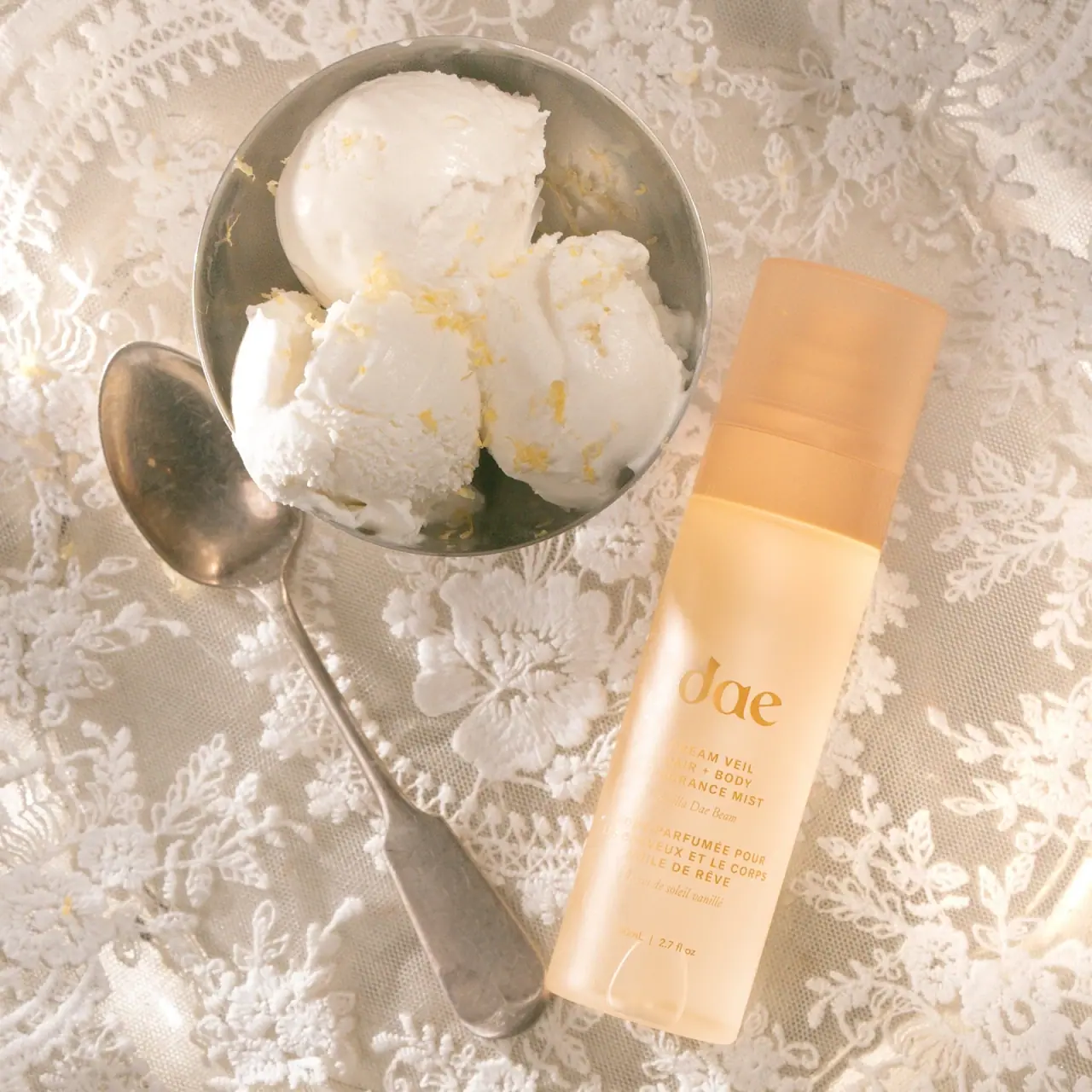
Dae
Warm translucent mist with tonal lettering and bilingual rhythm

Dune Suncare
Coral bottle with striped vertical identity and small left-aligned copy

e.l.f. Cosmetics
Pink tube, black cap, oversized thin lowercase signature