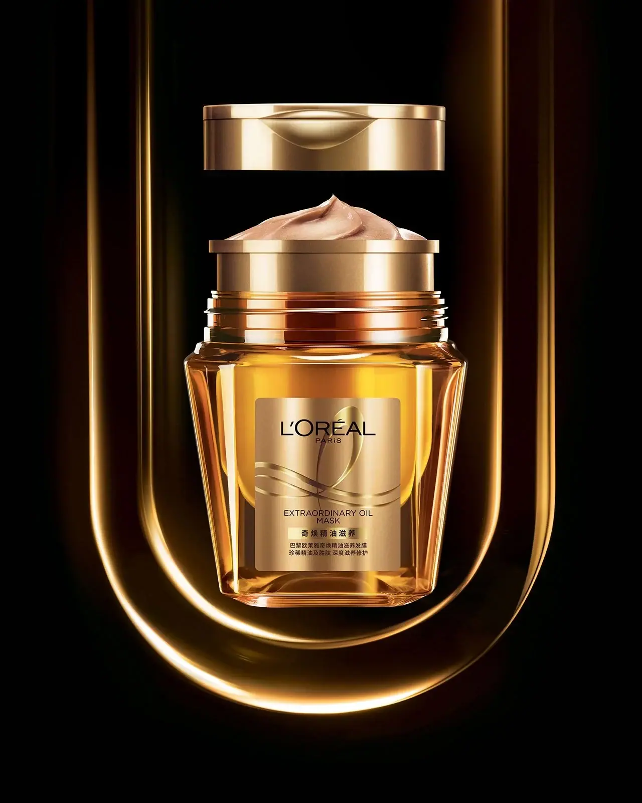
Accord Parfait 2.R. Vanille Rosé - Fond de teint fondant unifiant perfecteur
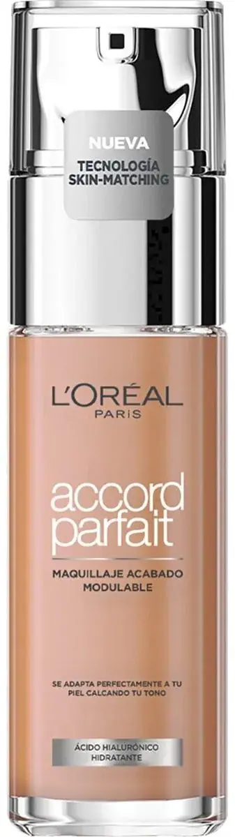
Photography: Open Beauty Facts · CC BY-SA. All imagery belongs to its respective owner.
What makes the design work
L'Oréal Paris brand studyVisual observations across the brand’s packaging. Individual formats and editions may vary.
Wordmark and city line
Narrow high-contrast capitals about 40% of bottle width at the top, PARIS tiny and widely spaced beneath.
Sub-brand masthead
Heavy high-contrast capitals about 70% of bottle width, the largest type on the pack.
Line name
Line name in brush script, italic or bracketed sans directly under the masthead, in the line's accent colour.
Reading the label
Centred vertical stack printed or sleeved on the front: wordmark, masthead, line name, product type, format strip, emblem or render, benefits, volume.
- Top
- Narrow wordmark and spaced PARIS line
- Middle
- Sub-brand masthead, line name in italic or script or brackets
- Lower middle
- Ingredient render or swirl emblem, product type
- Lower
- Benefit line, coloured format strip with hair type, volume
Typography & hierarchy
Wordmark at the top in narrow high-contrast capitals with PARIS spaced below. The sub-brand (ELVIVE, ELSEVE) is the largest type, followed by the line name in a lighter italic, script or bracketed sans, then a coloured strip naming the format, then the emblem or ingredient render and a short benefit list. On makeup the light lowercase product name replaces the masthead and sits under a smaller wordmark.
Display
Custom narrow high-contrast face, close to Didot Condensed
Narrow high-contrast capitals with fine hairlines
Uppercase · Regular
Headline
Didot Bold, custom masthead
Heavy high-contrast display capitals
Uppercase · Bold, Black
Script
Brush script, Playfair Display Italic
Casual brush script
Title case · Regular
Typeface suggestions based on visual similarity. These are not verified font identifications.
How the range holds together
Colour coding by body and cap within a fixed layout: each hair concern gets one saturated, often translucent bottle colour, and its accent repeats in the strip, script and emblem.
Shelf presence
In the hair aisle the range forms colour blocks by concern, each a column of the same tall bottle in one saturated, often glowing translucent hue, tied together by the black wordmark and identical stack.
Related packaging
More curated references in make-up, matched by format and visual style.
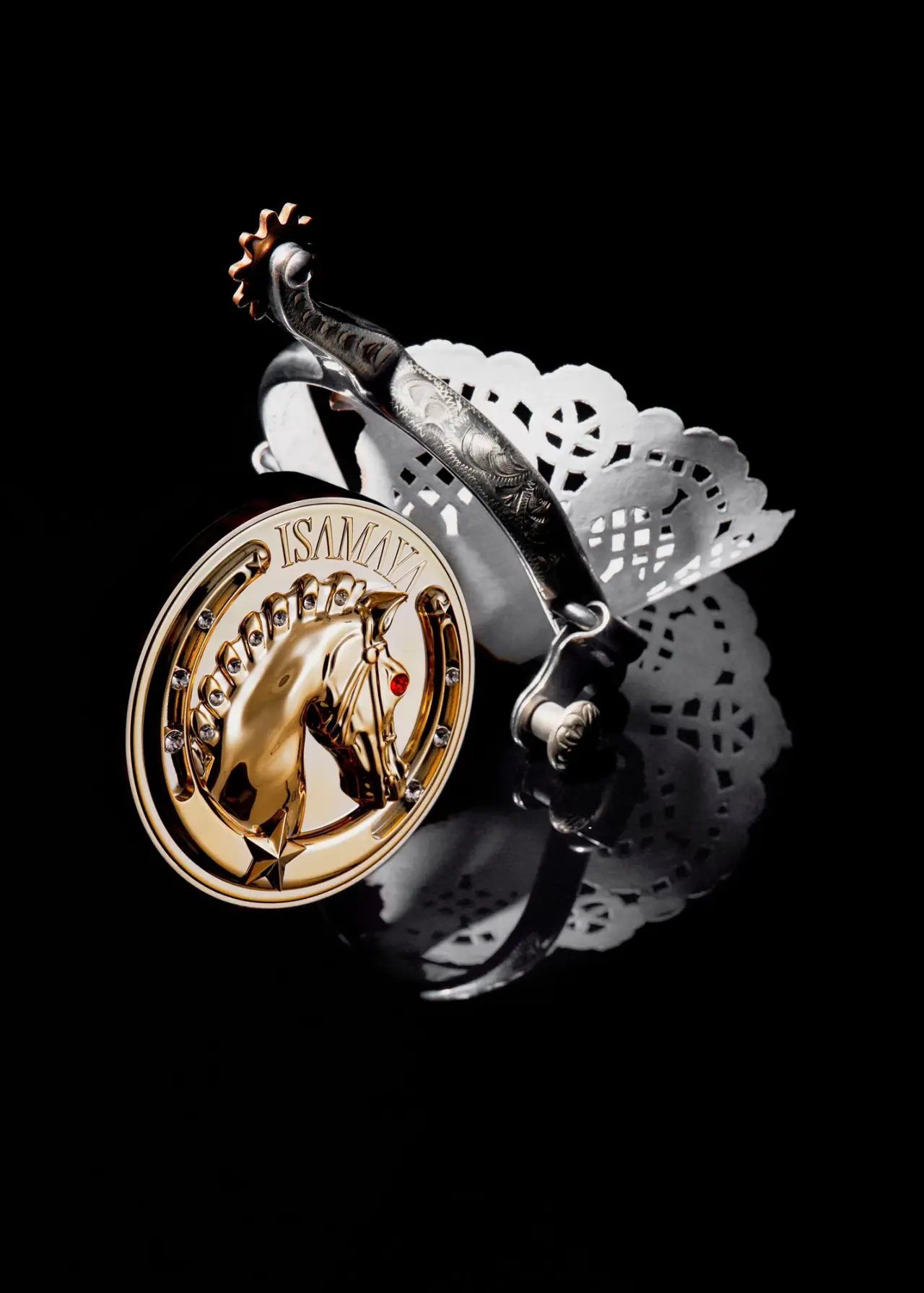

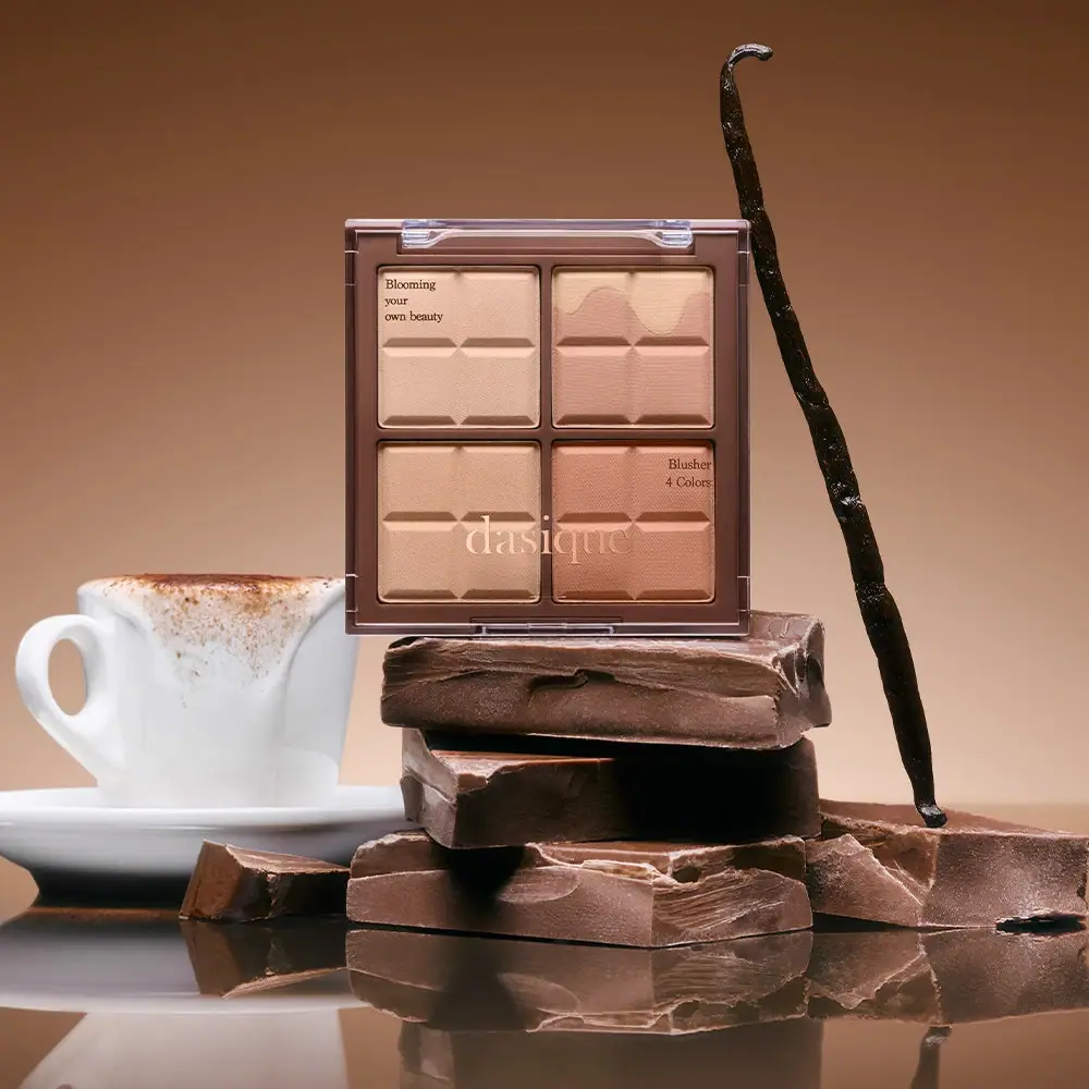
Featured from L'Oréal Paris
The selected packaging reference for this brand.