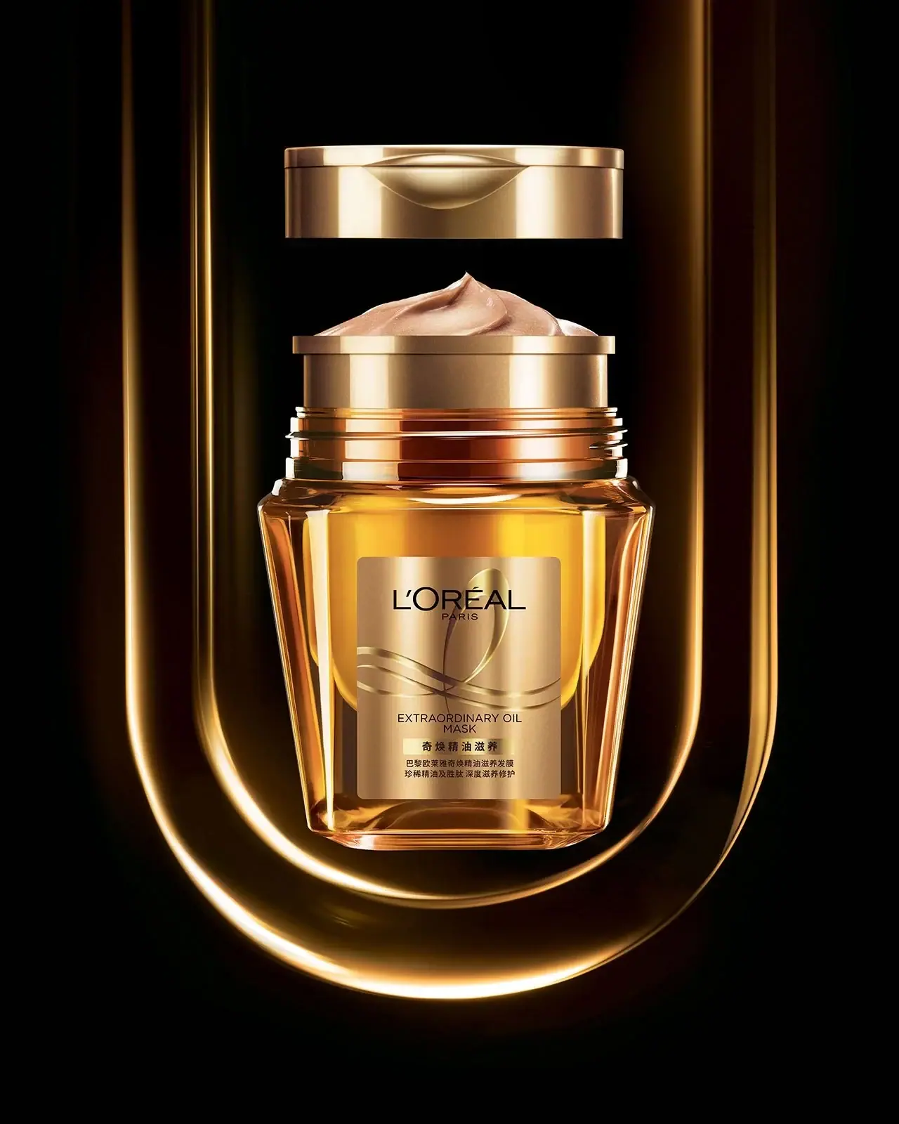
Photography: HIRO — still-life photography. Images belong to their respective owners.
L'Oréal Paris

translucent amber shampoo under a gilded serif masthead
L'Oréal Paris places a narrow high-contrast wordmark with a small spaced 'PARIS' line at the top of packs that are mostly bold, glossy and colour-saturated. The Elvive/Elseve hair range is the clearest system: tall flip-top bottles, often translucent, each in one strong colour, with the sub-brand in big heavy high-contrast capitals, the line name in a lighter italic or script, a coloured format strip and an ingredient render or swirl emblem. Makeup changes register but keeps the wordmark: foundation sits in clear glass with a silver cap and a lowercase light name ('accord parfait'), and lipsticks use a polished gold bullet case. Colour codes the hair concern; the stack order never moves.
- Skincare
- Hair
- Make-up
- Light pack
- Colour-coded range
- Bold typographic
Color Palette
Approximate colours interpreted from photography. These are screen references, not official brand colours or print specifications.
Pack body
Cap Silver
#c9cbcd
Bright metallised cap on foundation bottles and the band on compacts
Shade Nude
#d9a789
Foundation shade seen through the clear glass bottle; the pack colour of the makeup range
Ink
Paris Black
#1c1a19
Wordmark, masthead and fine copy on light and translucent packs
Accent
Masthead Gold
#c49a4a
Gold wordmark, rules and pump on the oil line, and the polished lipstick case
Range coding
Huile Amber
#e7a31f
Translucent golden bottle for the Extraordinary Oil line
Hidra Lilac
#d8a3e6
Translucent pink-lilac bottle for the hyaluronic hydration line
Hidra Violet
#6b3fa0
Format strip, line name and molecule render on the hydration line
Dream Long Coral
#f27d48
Opaque coral bottle for the long-hair line
Dream Pink
#e8336e
Flip cap, masthead and line script on the long-hair line
Clay Mint
#a9dccf
Pale mint body for the clay line
Vitamin Green
#37b54a
Cap and band on the multi-vitamin shampoo
Typography
Suggested visual alternatives, not confirmed brand typefaces. Any scale below is an illustrative estimate.
Wordmark at the top in narrow high-contrast capitals with PARIS spaced below. The sub-brand (ELVIVE, ELSEVE) is the largest type, followed by the line name in a lighter italic, script or bracketed sans, then a coloured strip naming the format, then the emblem or ingredient render and a short benefit list. On makeup the light lowercase product name replaces the masthead and sits under a smaller wordmark.
Type scale
Estimated cap size as a share of the panel · Front of the 400 ml Elvive shampoo bottle, about 200 mm tall
masthead
8% · Black · Headline
VIVANCE
line-name
4.5% · Regular · Script
Silk Lengths
product-type
3.5% · Bold · Body
SHAMPOO
wordmark
3% · Regular · Display
MAISON
volume
2.2% · Regular · Body
400 ml
format-strip
1.8% · Bold · Body
FOR DRY HAIR
Fonts
Display
Playfair Display
- Looks like
- Custom narrow high-contrast face, close to Didot Condensed
- Type
- Narrow high-contrast capitals with fine hairlines
- Weight
- Regular
- Case
- Uppercase
- Tracking
- Slightly open, about +3%
- Fallback
- Didot, Bodoni 72, Georgia
The wordmark at the top of every pack, with PARIS set tiny and widely spaced beneath; black, gold or white depending on ground.
Headline
Bodoni Moda
- Looks like
- Didot Bold, custom masthead
- Type
- Heavy high-contrast display capitals
- Weight
- Bold, Black
- Case
- Uppercase
- Tracking
- Tight, about -1%
- Fallback
- Bodoni 72 Bold, Georgia Bold
Sub-brand masthead filling about 70% of the bottle width, under the wordmark.
Script
Kaushan Script
- Looks like
- Brush script, Playfair Display Italic
- Type
- Casual brush script
- Weight
- Regular
- Case
- Title case
- Tracking
- Normal
- Fallback
- Brush Script MT, cursive
Line names such as 'Dream lengths' in the line's accent colour under the masthead.
Body
Roboto Condensed
- Looks like
- Helvetica Condensed, Roboto Condensed
- Type
- Condensed neutral sans
- Weight
- Regular, Bold
- Case
- Uppercase in strips, sentence case elsewhere
- Tracking
- Normal
- Fallback
- Arial Narrow, sans-serif
Bracketed line names, format strip reversed out of a colour bar, product type, benefit lines, volume and back-label copy.
Structure & Proportions
Proportions
| Purpose | Value | Preview |
|---|---|---|
| Print coverage | About 60% of the front face on hair bottles | |
| Masthead width | About 70% of bottle width | |
| Wordmark position | Top of the front face, about 12% down from the shoulder | |
| Emblem or render | About 25% of the front face, lower middle | |
| Cap height | About 10% of total bottle height | |
| Colours per pack | Three to four: body colour, black or gold ink, one accent for strip and cap | — |
| Density | Full centred stack top to bottom with little empty space on hair; airy on makeup | — |
Shapes
| Element | Value | Preview |
|---|---|---|
| Shampoo bottle | Tall soft-shouldered oval bottle with flip cap | |
| Format strip | Narrow coloured bar with reversed capitals | |
| Foundation | Square glass bottle with pump and metallised cap | |
| Lipstick | Gold cylinder bullet | |
| Swirl emblem | Square tile crossed by a calligraphic line |
Finishes
Translucent gloss PET
Hair bottles · gloss
Gold metallic print
Oil line and wordmarks on dark packs · metallic
Clear glass
Foundation bottle · transparent
Polished metallised plastic
Foundation caps and lipstick cases · metallic
Formats and materials
| Formats | Tall flip-top shampoo bottle, Conditioner bottle, Hair oil pump, Foundation pump bottle, Powder compact, Lipstick bullet, Hair spray can, Roll-on, Jar |
| Materials | Translucent PET, Opaque HDPE, Glass foundation bottle, Metallised plastic, Aluminium aerosol |
| Closures | Coloured flip caps sized to the body, gold pump on the oil, metallised silver overcaps on foundation, magnetic gold cap on lipsticks |
| Decoration | Ingredient render or swirl emblem, Coloured format strip, Metallic gold ink, Shrink sleeve, Embossed monogram on lipstick cap |
Front Panel
Schematic reading order. The diagram’s zone heights do not represent measured artwork proportions.
Centred vertical stack printed or sleeved on the front: wordmark, masthead, line name, product type, format strip, emblem or render, benefits, volume.
| Zone | Content |
|---|---|
| Top | Narrow wordmark and spaced PARIS line |
| Middle | Sub-brand masthead, line name in italic or script or brackets |
| Lower middle | Ingredient render or swirl emblem, product type |
| Lower | Benefit line, coloured format strip with hair type, volume |
Range System
Colour coding by body and cap within a fixed layout: each hair concern gets one saturated, often translucent bottle colour, and its accent repeats in the strip, script and emblem.
- Extraordinary Oil = translucent amber + gold
- Hydration = translucent lilac + violet strip
- Dream Lengths = coral body + pink cap and script
- Clay = pale mint
- Multi-vitamin = white with green cap
- Foundation = clear glass showing the shade + silver cap
Back of Pack & Shelf
A back label or sleeve in the same colours with multilingual text in small condensed sans: directions per language, the full ingredient list, safety notes, then recycling marks, PAO, batch and barcode at the base.
- Directions in several languages
- Full INCI ingredient list
- Short line about the key ingredient
- Recycling and sorting marks, PAO symbol
- Manufacturer address, batch code and barcode
On shelf
In the hair aisle the range forms colour blocks by concern, each a column of the same tall bottle in one saturated, often glowing translucent hue, tied together by the black wordmark and identical stack.
Imagery
Glossy 3D renders of the key ingredient (oil droplets, molecules, flowers) and a calligraphic swirl suggesting a strand of hair; no lifestyle photography on pack. Makeup carries no imagery beyond the shade itself.
Guidelines
Do
- Set the wordmark in narrow high-contrast Display capitals with a tiny spaced city line beneath.
- Give each hair line one saturated bottle colour, translucent where possible.
- Make the sub-brand Headline masthead the largest type, about 70% of bottle width.
- Name the line in an accent-colour script or italic directly under the masthead.
- Use a coloured strip with reversed condensed capitals to name the hair type.
- Repeat the line's accent colour in cap, strip and render.
- Keep the stack order identical across every line.
Don't
- Don't use pastel or muted colours on hair care, except the deliberate pale mint clay line.
- Don't set the wordmark in a geometric or rounded sans.
- Don't use matte finishes on hair bottles; packs are glossy.
- Don't leave the hair-care front empty; the stack runs from top to bottom.
- Don't use more than one body colour per bottle.
- Don't use lifestyle photography on pack.
Give your AI
packaging taste
Give your design or image tool a packaging study: palette, type, structure, front panel and principles for an original brief.
Export this styleFree with an email. PACK.md works in Claude, ChatGPT, Cursor and image tools.
More like this

AKT
Lilac stage directions with a quiet metallic detail
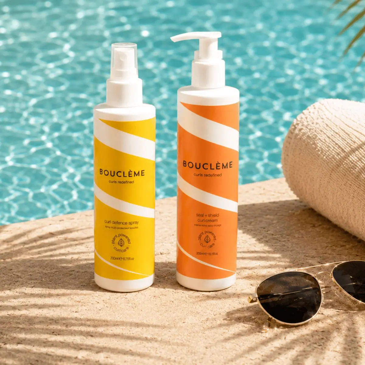
Bouclème
warm colour blocks crossed by flowing white ribbons
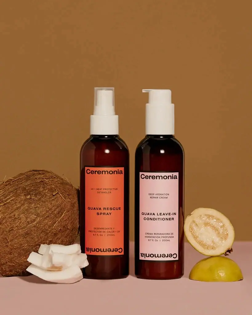
Ceremonia
Warm colour labels bounded by upright and inverted wordmarks

Dr. Bronner’s
A bright soap wrapper with a densely ordered voice
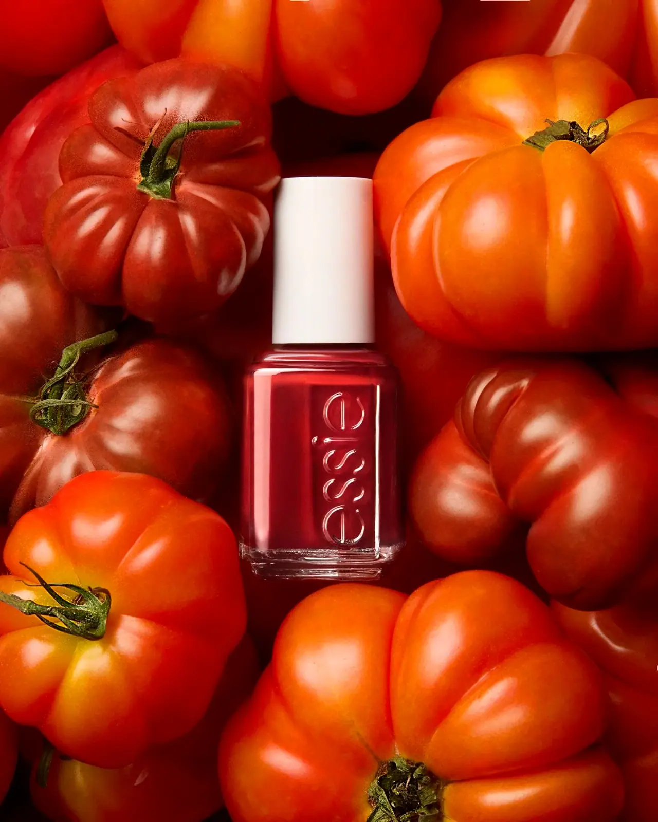
Essie
Visible red colour, clear relief and a white cap
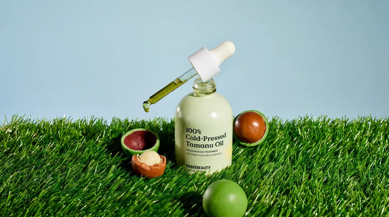
KraveBeauty
cropped wordmarks on minty skincare bottles

Malin+Goetz
pharmacy label set in bracketed helvetica

Native
white drugstore bottles, scent-tinted vertical caps