About this packaging
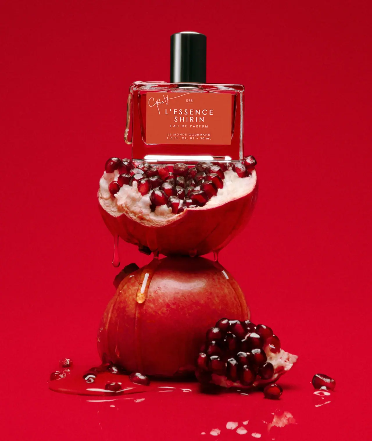
Le Monde Gourmand L’Essence Shirin Eau de Parfum is shown in a clear rectangular bottle with a glossy black cylindrical cap and warm red label. A small upper-left creator signature offsets the centred scent name, concentration, lower maker and visible 30 mL quantity.
The official listing credits Cyrus Veyssi as co-creator of L’Essence Shirin.[1]
Pack construction & use
- Bottle format
- The selected cover shows a rectangular bottle with rounded shoulders, a cylindrical cap and a centered label.Observed in the reference photograph
- Label details
- The label places a handwritten-style signature above L’Essence Shirin, with Eau de Parfum and volume below.Observed in the reference photograph
What makes the design work
Editorial analysis of this packaging reference.
Scent leads, maker closes the stack
The two-line fragrance name is the largest label element. A small code sits above it, the signature is offset at upper left, and the concentration, maker and quantity descend below. The maker is not part of the upper signature tier.
Warm label against a dark cap
The warm red label contrasts with the glossy black cap and clear-looking bottle. Red fruit and liquid-like drips belong to the campaign scene and influence reflections in the transparent body.
Simple silhouette
Rounded shoulders soften the rectangular form without creating a complex profile. The uncluttered label makes this familiar bottle shape adaptable to a distinct collaboration.
Ideas for your next brief
- Give a fragrance name priority over creator credits when the collaboration has its own identity.
- Use a strong label colour and contrasting dark cap to distinguish a fragrance while keeping the bottle architecture simple.
Sources & further reading
Researched 19 October 2026