Photography: Le Monde Gourmand official photography. Images belong to their respective owners.
Le Monde Gourmand

white spaced scent naming on red beneath a black cap
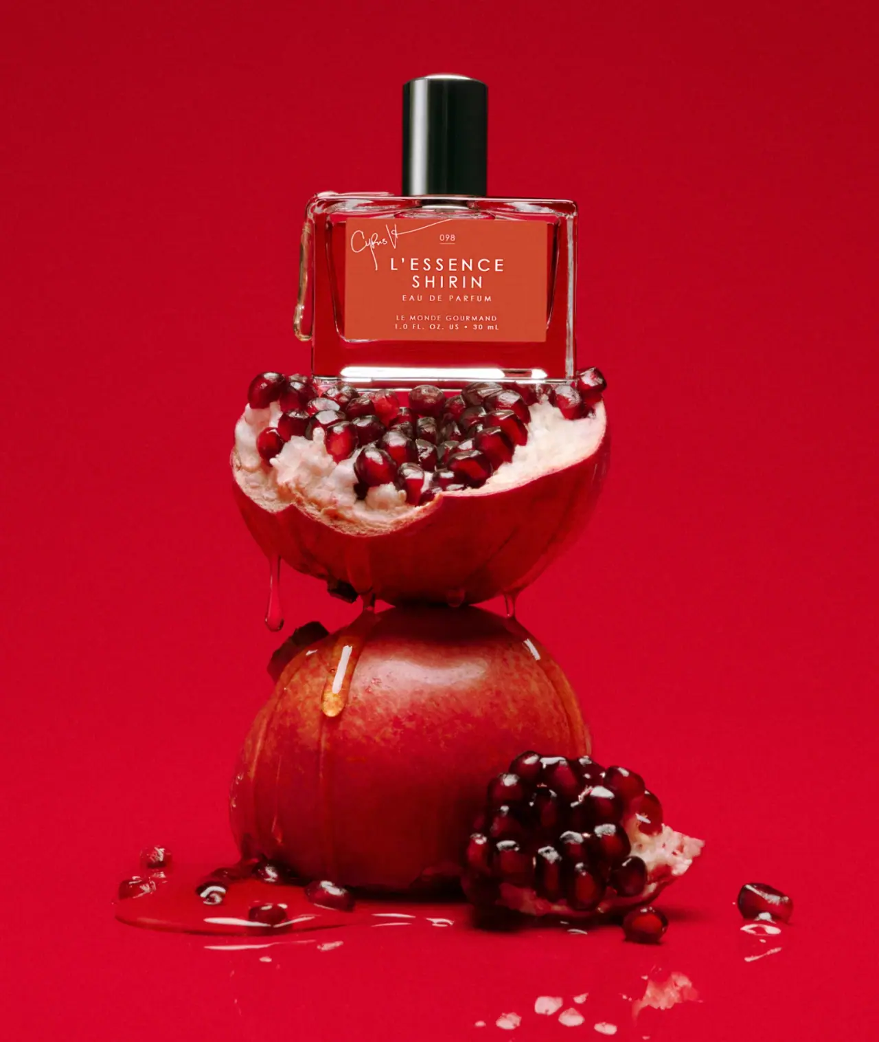
L’Essence Shirin is shown in a compact clear rectangular bottle with a glossy black cylindrical cap and a warm red front panel. The label centres the two-line scent name, concentration, maker and quantity, while a handwritten-looking creator signature interrupts the upper-left corner. A small 098 code sits above the name. The red pomegranate setting strengthens the label colour, but the cap itself is dark rather than pink.
- Perfume
- Light pack
- Bold typographic
- Playful colour
About this study
Selected L’Essence Shirin 30 mL campaign bottle with black cap and warm red label; not a full Le Monde Gourmand range analysis.
Sources & evidence · Reviewed 2026-10-19Color Palette
Approximate colours interpreted from photography. These are screen references, not official brand colours or print specifications.
Pack body
Glossy black cap
#121A16
Approximate cap appearance with bright vertical reflections; not a pink closure.
Label
Warm red panel
#BC4938
Approximate label appearance, distinct from the more saturated red campaign background.
Ink
Pale lettering
#F5E9D7
Approximate scent, signature, code and supporting information.
Typography
Suggested visual alternatives, not confirmed brand typefaces. Any scale below is an illustrative estimate.
L’ESSENCE and SHIRIN are the largest centred lines, set in a widely spaced uppercase sans-serif. EAU DE PARFUM appears below at a smaller scale. LE MONDE GOURMAND and the 1.0 FL. OZ. US / 30 mL quantity occupy a compact lower group. At the top, the small underlined 098 code aligns centrally, while the creator signature sits off-axis at the upper left and extends a fine stroke across the panel. The maker is below the concentration, not grouped with the signature in an upper tier.
Fonts
Scent-name alternative
Work Sans
- Looks like
- Work Sans as an independent visual alternative
- Type
- Sans serif
- Weight
- Medium 500
- Case
- Uppercase
- Tracking
- Generously open
- Fallback
- Arial, sans-serif
Use a short two-line scent name with deliberate spacing and a clear centre axis. Check apostrophes and the relative lengths of each line. A longer fictional name may need different proportions rather than forcing identical tracking.
Supporting-copy alternative
Inter
- Looks like
- Inter as an independent visual alternative
- Type
- Sans serif
- Weight
- Regular 400 / Medium 500
- Case
- Uppercase
- Tracking
- Moderate
- Fallback
- Arial, sans-serif
Set concentration, maker and quantity in separate readable groups. The smaller maker can remain secondary without becoming illegible. For a creator credit, commission an original signature or use a plain textual credit rather than imitating the visible handwriting.
Structure & Proportions
Visual proportions and finish previews are illustrative. Confirmed construction details and uncertainties are distinguished in the study notes.
Proportions
| Purpose | Value | Preview |
|---|---|---|
| Broad compact face | The body is relatively wide for its height, giving the two-line scent name a generous horizontal field. | — |
| Dark upper anchor | The narrow cap adds a tall dark volume above the broad clear bottle. | — |
| Centred stack with one interruption | Most information follows a central axis; the upper-left signature breaks the symmetry locally. | — |
Shapes
| Element | Value | Preview |
|---|---|---|
| Bottle | Compact rectangular body with softened corners and clear thick-looking base. | |
| Cap | Smooth glossy dark cylinder. | |
| Label | Broad warm red rectangle on the front. |
Finishes
Glossy cap
Dark cylindrical closure, not a coloured pink cap. · gloss
Clear body
Bottle edges and base transmit the red scene; exact glass specification unknown. · transparent
Even label field
Warm red front panel with pale information. · matte
Formats and materials
| Formats | Selected closed 30 mL Eau de Parfum bottle with a broad rectangular body, clear-looking edges and dark cylindrical cap. |
| Materials | Official page confirms the fragrance and quantity but does not provide a component bill of materials., Bottle glass specification, cap substrate, label stock, adhesive and printing process are unverified. The photograph’s clear refractive body should not be used to infer recycled content or material weight. |
| Closures | A tall smooth black cylinder covers the neck and presents a slightly rounded-looking top edge. Narrow white highlights reveal its gloss and curvature. The actuator and attachment are hidden, so the cap cannot be described as magnetic or assigned a particular liner. The bottle has relatively straight sides and a thick-looking clear base, with softened upper corners rather than a pronounced rounded shoulder. Clear liquid-like drips on the outside belong to the staged image and do not indicate a leaking closure or moulded bottle decoration. |
| Decoration | Centred scent and supporting-information stack., Off-axis handwritten-looking signature near the upper left., Small centred numerical code above the scent name. |
Front Panel
Schematic reading order. The diagram’s zone heights do not represent measured artwork proportions.
The upper code creates a small entry point, followed by the larger two-line scent name. Concentration is separated below, and the maker plus quantity form the final lower block. The creator signature sits near the upper-left edge rather than becoming a second centred headline. Its thin gesture contrasts with the evenly spaced sans-serif text. The panel leaves a clear bottle margin around it, especially near the base, so the red field does not conceal the entire object. The numerical code is recorded as visible text without assigning it an unsupported production-batch meaning.
| Zone | Content |
|---|---|
| Creator accent | Handwritten-looking Cyrus signature at upper left. |
| Code | Small underlined 098 above the name. |
| Scent | L’ESSENCE / SHIRIN in the largest spaced lines. |
| Concentration | Smaller EAU DE PARFUM. |
| Footer | LE MONDE GOURMAND and visible 30 mL quantity. |
Range System
The official listing credits Cyrus Veyssi as co-creator and identifies the product at 30 mL. It describes pomegranate among the fragrance notes, supporting the scene’s fruit relationship without proving that actual fruit extract is present. This study does not identify the packaging designer or establish the label code’s meaning. Other Le Monde Gourmand fragrances may share some architecture, but their cap colours, label arrangements and formats require independent image review before being described as a range system.
- Selected L’Essence Shirin 30 mL with warm red label and black cap.
- Creator credit is sourced; full brand-wide colour coding is not established by this one bottle.
Back of Pack & Shelf
The reverse, base and exposed atomizer are absent. Ingredients, batch markings and disposal guidance cannot be positioned from the front image. The small 098 on the label should not be treated as a batch or shade code without a source defining it.
- Inspect the open neck before describing cap retention or atomizer construction.
- Verify label and cap materials through component documentation.
- Keep creator involvement separate from an unverified packaging-design credit.
On shelf
Interpretation: the warm label and dark cap create a simple colour-and-silhouette signature. The scent name should read before the smaller maker because of its size and open spacing. The signature and tiny numerical code reward close viewing but may disappear in a thumbnail. An original collaboration package should test whether users can still identify the maker quickly, especially when the creator’s signature is unfamiliar or the product is shown without the fruit scene.
Imagery
The bottle sits above cut pomegranate halves and seeds against a saturated red background, with glossy liquid-like drips across the scene. This repeats the label’s warm colour while adding texture and a food-associated scent cue. The cap provides a dark interruption within the otherwise red composition. The fruit and drips are staging, not supplied components, and their red reflections can make the clear body appear more strongly coloured than it would against a neutral field.
Guidelines
Editorial principles for an original design brief, not official brand guidelines.
Do
- Give creator credit a distinct but subordinate role.
- Keep maker, concentration and quantity in a readable order.
- Separate fragrance-note props from ingredient claims.
- Verify cap colour against the actual approved image.
Don't
- Do not describe this cap as pink.
- Do not put the maker in the upper signature tier.
- Do not assign the 098 code a batch meaning without evidence.
- Do not copy the creator signature or exact label layout.
Sources & evidence
How this study was built
context · Sourced fact
Official listing identifies 30 mL and Cyrus Veyssi as co-creator.Le Monde Gourmand — L’Essence Shirin Eau de Parfumimagery · Sourced fact
Pomegranate appears among the fragrance notes, supporting a scent-related scene cue.Le Monde Gourmand — L’Essence Shirin Eau de Parfumstructure · Visual observation
Selected cap is glossy black, not pink.Le Monde Gourmand — L’Essence Shirin Eau de Parfumtypography · Visual observation
Maker sits below concentration; signature is off-axis at the upper left.Le Monde Gourmand — L’Essence Shirin Eau de Parfumlabel · Visual observation
Small underlined 098 precedes the large two-line scent name.Le Monde Gourmand — L’Essence Shirin Eau de Parfumshelf · Editorial interpretation
Scent emphasis needs maker-recognition checks outside the campaign scene.
What remains unverified
- Component materials, original fonts, label process and cap attachment unverified.
- Meaning of 098 and packaging-design authorship unknown.
- Reverse, base and atomizer unseen; red scene affects clear-body appearance.
Give your AI
packaging taste
Give your design or image tool a packaging study: palette, type, structure, front panel and principles for an original brief.
Export this styleFree with an email. PACK.md works in Claude, ChatGPT, Cursor and image tools.
More like this
Binaurale
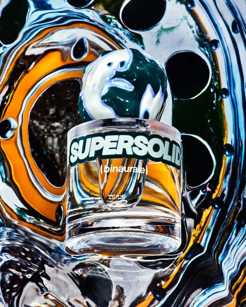
Globular teal cap above slanted pale fragrance lettering

Boy Smells
candy-shell flacons over blush pink glass
Moodcast
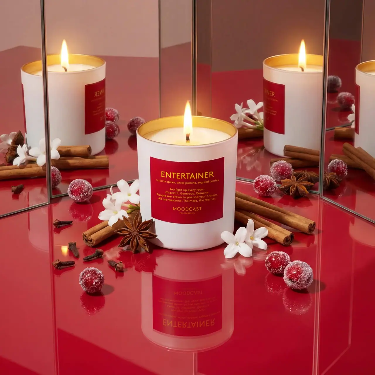
White candle with red personality label and golden inner rim

ACURE
Iridescent spectacle with practical, tightly ordered type

Bask
sunny yellow with a playful turquoise signature

Beame
Orange bubble lettering, pink mascot, clear product badge

Behave
struck-through wordmark on sour neon pouches

Bread Beauty Supply
bubblegum pumps and a fat black wordmark