About this packaging
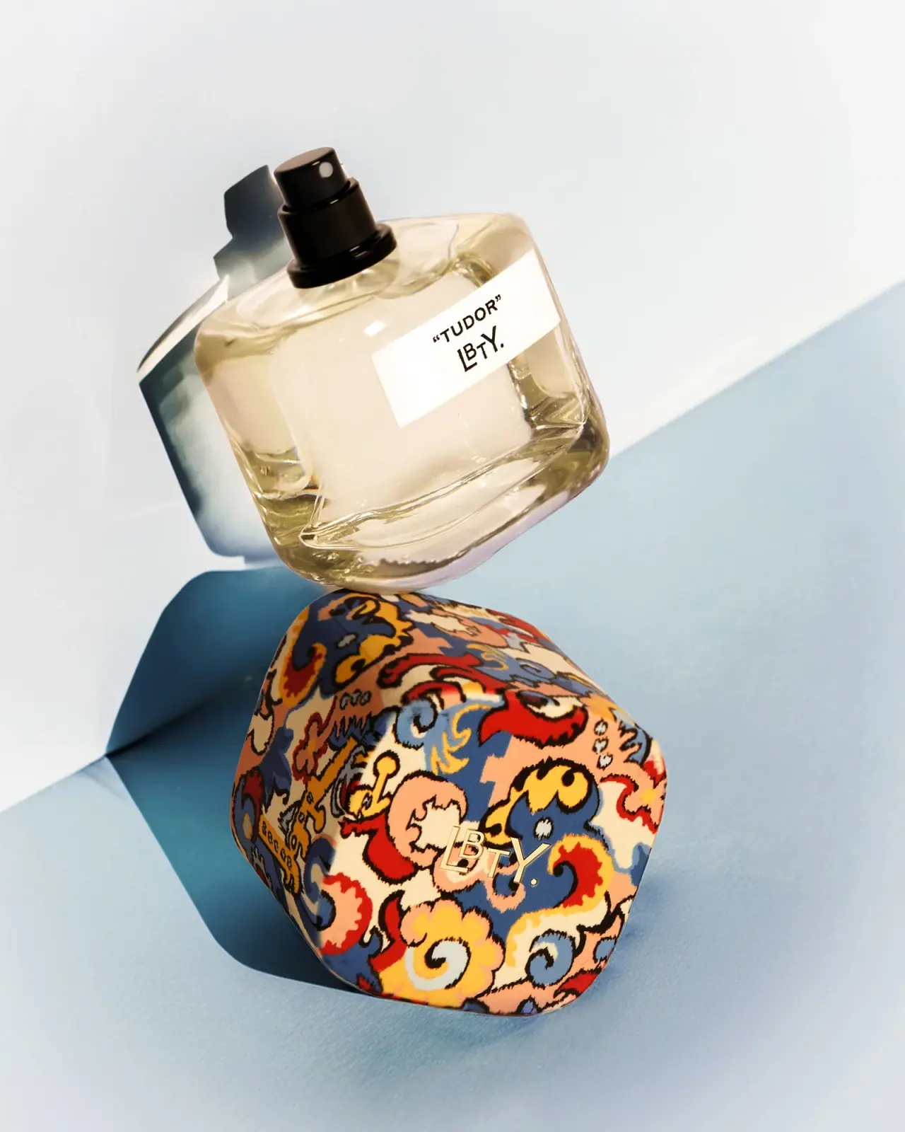
Liberty LBTY. Tudor Eau de Parfum pairs a clear sculptural bottle with a cap wrapped in the brand’s Merchant print. The selected image separates the components, showing how the patterned cap becomes the fragrance’s strongest visual signature.
Liberty’s product page identifies Tudor as a 100 ml Eau de Parfum and describes the bottle as glass with a cap featuring the Merchant print.[1]
Pack construction & use
What makes the design work
Editorial analysis of this packaging reference.
Pattern placement
The dense multicolor print is confined to the removable cap, while the bottle remains clear and lightly branded. The contrast gives the package a strong signature without covering the vessel.
Sculptural vessel
The bottle’s broad angled planes create a distinctive silhouette and refract the liquid visually; its form remains legible even when the printed cap is removed.
Two-state identity
The cap-off campaign view turns the patterned closure into a separate object and exposes the bottle’s restrained front label. Both configurations preserve brand recognition through different cues.
Ideas for your next brief
- Place archival pattern on one removable component when the vessel benefits from a quieter visual field.
- Design the bottle and closure so each can carry a clear identity when shown together or separately.
Sources & further reading
Researched 19 October 2026