About this packaging
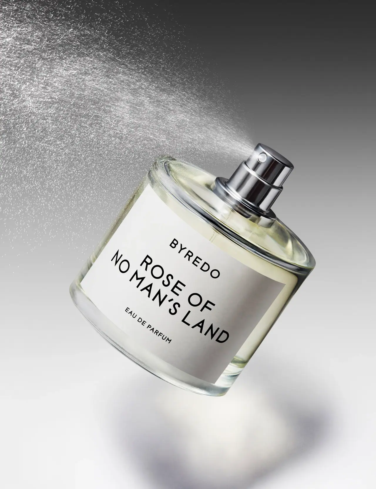
Byredo’s Rose of No Man’s Land uses a restrained fragrance presentation in which label typography remains legible across a close-cropped product view.
Byredo identifies Rose of No Man’s Land Eau de Parfum and states that it is transitioning between previous and new bottle designs. The observations here concern Josh Caudwell’s selected uncapped photograph; the current product page does not establish its exact capacity or guarantee that every current bottle has the same geometry.[1]
Pack construction & use
- Bottle and atomizer
- The official page identifies the fragrance. In the selected close-up, the rounded clear bottle is uncapped, leaving its metallic-looking spray assembly visible; exact components are not described here.[1]
- Label
- The broad white label carries BYREDO above the fragrance name in black capitals. It extends over much of the front while leaving the shoulder and base exposed.Observed in the reference photograph
What makes the design work
Editorial analysis of this packaging reference.
Typography bends with the frame
The bottle is rotated so the label becomes a large diagonal plane, and the brand and scent name remain the highest-contrast elements. This gives the close crop a clear reading direction rather than a flat catalogue view.
Label scale and margins
The white panel fills much of the front but leaves a transparent border of glass around it. The margin separates black typography from the pale liquid and preserves the recognizable bottle outline.
Exposed hardware adds a focal point
The uncapped metallic-looking atomizer creates a bright focal accent above the understated label. It also makes the product format immediately legible in a tight crop.
Ideas for your next brief
- Let one large label panel preserve legibility in a close crop while keeping a glass border visible.
- A clearly exposed atomizer can communicate the fragrance format without extra graphics.
Sources & further reading
Researched 19 October 2026