Photography: Franco Guidi — Liberty London still-life photography. Images belong to their respective owners.
Liberty LBTY.

archival colour pattern on a cap above quiet glass
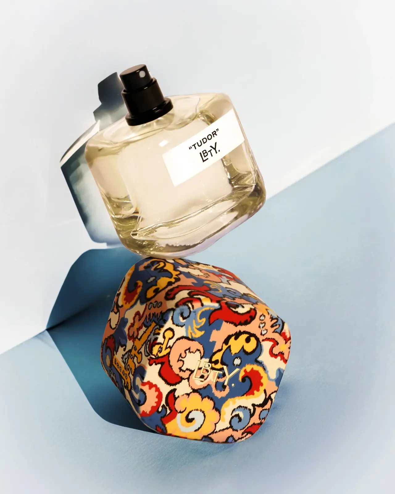
Tudor Eau de Parfum contrasts a quiet clear glass bottle with a broad sculptural cap covered in Liberty’s archival Merchant print. In the selected cap-off image, the cap becomes a separate patterned object while the bottle retains a small pale label and exposed dark spray assembly. Warm cream, red, yellow, peach and muted blue shapes are edged with dark irregular contours. The cap carries most of the visual complexity; the bottle provides transparency and a simple naming point.
- Perfume
- Light pack
- Maximalist pattern
About this study
Selected Tudor Eau de Parfum cap-off image. Official 100 mL glass bottle and Merchant-print provenance are sourced; other collection patterns are not analysed.
Sources & evidence · Reviewed 2026-10-19Color Palette
Approximate colours interpreted from photography. These are screen references, not official brand colours or print specifications.
Label
Pale label and pattern ground
#F1E4C7
Approximate warm light areas, affected by the scene’s directional light.
Ink
Dark outline and type
#241D17
Approximate pattern contours, bottle wording and spray hardware.
Accent
Merchant blue appearance
#526B85
Approximate blue areas within the cap pattern, excluding the separate blue backdrop.
Pattern red
#B52B20
Approximate warm red motifs on the cap.
Golden yellow
#E5B044
Approximate yellow ornamental forms; not a metallic process.
Typography
Suggested visual alternatives, not confirmed brand typefaces. Any scale below is an illustrative estimate.
The bottle label carries the quoted uppercase name TUDOR above the compact LBTY. mark. The scent line is simple and comparatively small, while the maker uses an interlocking-looking arrangement of different letter positions. A gold-looking LBTY. mark also appears on the patterned cap, where it is quieter against the busy background. The bottle therefore provides a high-contrast reading location, while the cap’s identity is primarily ornamental and tactile-looking. No concentration or quantity is clearly readable on this selected face.
Fonts
Scent-name alternative
Work Sans
- Looks like
- Work Sans as an independent visual alternative
- Type
- Sans serif
- Weight
- SemiBold 600
- Case
- Uppercase
- Tracking
- Moderately open
- Fallback
- Arial, sans-serif
Use a short scent name with a clear baseline and enough margin to remain readable on a small horizontal label. Quotation marks are part of the observed design, not a mandatory principle for a new identity.
Independent maker alternative
Raleway
- Looks like
- Raleway as an independent visual alternative
- Type
- Sans serif
- Weight
- Medium 500
- Case
- Uppercase
- Tracking
- Optically adjusted
- Fallback
- Arial, sans-serif
Create a new restrained maker treatment without interlocking the same letters or reproducing the LBTY. arrangement. On a patterned component, test a plain holding area or sufficient contrast instead of relying on metallic reflection alone.
Structure & Proportions
Visual proportions and finish previews are illustrative. Confirmed construction details and uncertainties are distinguished in the study notes.
Proportions
| Purpose | Value | Preview |
|---|---|---|
| Broad cap presence | The cap is wide enough to read as a substantial sculptural object, rather than a narrow cylindrical stopper. | — |
| Quiet bottle label | The pale label occupies a limited portion of the broad clear face, leaving most of the body transparent. | — |
| Separated visual roles | Dense pattern belongs to the removable cap; short high-contrast naming belongs to the bottle. | — |
Shapes
| Element | Value | Preview |
|---|---|---|
| Bottle | Broad rounded rectangle with thick-looking clear edges and softly shaped shoulders. | |
| Cap | Softly faceted rounded-square volume with convex patterned surfaces. | |
| Label | Small horizontal rectangle on the clear front. |
Finishes
Transparent glass
Bottle body, explicitly identified as glass by Liberty. · transparent
Patterned cap
Merchant print covers the curved cap exterior; application process unknown. · matte
Gold-looking cap mark
Small LBTY. mark over the multicolour print; no foil process established. · metallic
Formats and materials
| Formats | Selected broad rounded-rectangular glass fragrance bottle shown with its patterned cap detached. Official listing identifies Tudor Eau de Parfum at 100 mL. |
| Materials | Liberty explicitly identifies the bottle as glass and the cap as carrying its archival Merchant print., Cap substrate, pattern application, label stock and gold-looking mark process are not specified. The pattern’s textile origin does not prove that the cap itself is fabric-covered. |
| Closures | The detached cap has a broad softly faceted, rounded-square appearance with convex surfaces. Its patterned exterior remains visible as a complete object next to the bottle. The exposed spray assembly is dark, with a short cylindrical actuator and a small pale outlet. The inner cap, attachment, liner and locking method are not visible. There is no basis to call the closure magnetic. The bottle’s thick-looking clear edges create strong refraction, but exact glass weight and wall thickness are not measurable from this view. |
| Decoration | Archival Merchant ornamental pattern confined to the cap., Small horizontal pale naming label on the bottle., Maker repeated in different contrast conditions on bottle and cap. |
Front Panel
Schematic reading order. The diagram’s zone heights do not represent measured artwork proportions.
The bottle’s short two-level label uses a simple pale rectangle to isolate text from the liquid and refraction behind it. The quoted scent name sits above the maker. The cap repeats the maker within the ornamental pattern but does not repeat the full product information in the visible view. This division allows the bottle to remain identifiable when the decorative component is removed. The selected oblique angle should not be confused with a diagonally printed label; the whole object is posed at an angle in the photograph.
| Zone | Content |
|---|---|
| Bottle scent | Quoted uppercase TUDOR on the pale rectangle. |
| Bottle maker | Compact LBTY. mark beneath the scent. |
| Cap identity | Gold-looking maker placed over the Merchant pattern. |
| Pattern field | Dense curving multicolour motifs across the cap’s outer surfaces. |
Range System
Liberty links Tudor to the archival Merchant print and lists 100 mL. It names Pierre Negrin as the perfumer, which is not a packaging-design credit. The broader collection uses print and fragrance relationships, but this study does not analyse every cap pattern or establish a universal colour code. Only the selected Tudor bottle and detached cap are visually documented. Other formats and sizes require separate references before extending the proportions or component assumptions.
- Selected Tudor: quiet glass body and multicolour Merchant-print cap.
- Official 100 mL product context; capacity is not readable on the selected front.
Back of Pack & Shelf
The rear, underside, cap interior and outer box are unseen. Ingredient declaration, volume marking, batch code and packaging disposal information cannot be located from this view. The visible spray outlet establishes an atomizer, but not its delivered dose or attachment construction.
- Inspect cap interior before identifying its retention mechanism.
- Verify pattern application and substrate separately from archival print provenance.
- Review rear and base before mapping functional information.
On shelf
Interpretation: the patterned cap should act as the fastest recognition cue, with the bottle label providing a quieter confirmation at close range. When uncapped, the clear body loses much of that ornament but retains the maker. The small gold-looking cap mark may disappear within the pattern under diffuse light. A new design should test both assembled and separated states, and ensure the practical scent identifier does not depend entirely on recognising a particular decorative motif.
Imagery
The cap and bottle are separated on a pale blue surface under strong directional light. Their shadows create a third set of shapes, while the clear glass bends the warm liquid and blue surroundings into bright edges. The detached cap displays the print more fully than a conventional upright product shot would. Its warm red and yellow motifs contrast with the cool setting, but the background blue is not itself a bottle colour or a supplied display component.
Guidelines
Editorial principles for an original design brief, not official brand guidelines.
Do
- Separate pattern provenance from material specification.
- Design identity for both capped and uncapped states.
- Keep a clear scent-reading area beside dense ornament.
- Distinguish perfumer credit from packaging authorship.
Don't
- Do not infer a fabric cap from a textile print reference.
- Do not assume magnetic attachment without evidence.
- Do not copy the Merchant artwork or LBTY. mark.
- Do not treat the photographic pose as printed diagonal alignment.
Sources & evidence
How this study was built
structure · Sourced fact
Liberty identifies glass bottle, 100 mL and archival Merchant-print cap.Liberty — LBTY. Tudor Eau de Parfum 100 mLcontext · Sourced fact
Pierre Negrin is credited as perfumer, not as packaging designer.Liberty — LBTY. Tudor Eau de Parfum 100 mLtypography · Visual observation
Small quoted scent name and maker sit on a pale bottle rectangle.Liberty — LBTY. Tudor Eau de Parfum 100 mLlabel · Visual observation
Cap carries dense ornamental pattern and a small gold-looking maker.Liberty — LBTY. Tudor Eau de Parfum 100 mLstructure · Visual observation
Detached rounded cap reveals a dark atomizer with pale outlet.Liberty — LBTY. Tudor Eau de Parfum 100 mLshelf · Editorial interpretation
Pattern and practical naming should remain recognisable in both assembled and separated states.
What remains unverified
- Cap substrate, pattern application and retention mechanism unverified.
- Original fonts, label stock and gold-looking decoration process unknown.
- Reverse, base, box and cap interior unseen.
Give your AI
packaging taste
Give your design or image tool a packaging study: palette, type, structure, front panel and principles for an original brief.
Export this styleFree with an email. PACK.md works in Claude, ChatGPT, Cursor and image tools.
More like this
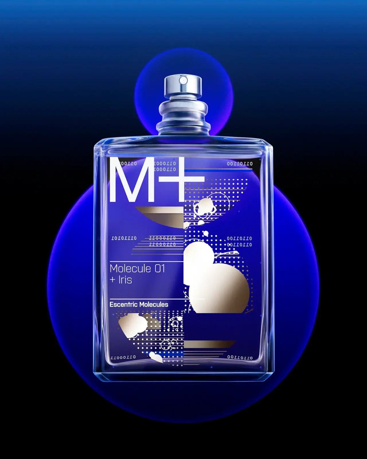
Escentric Molecules
Clear rectangular fragrance with giant symbol and layered coded graphics
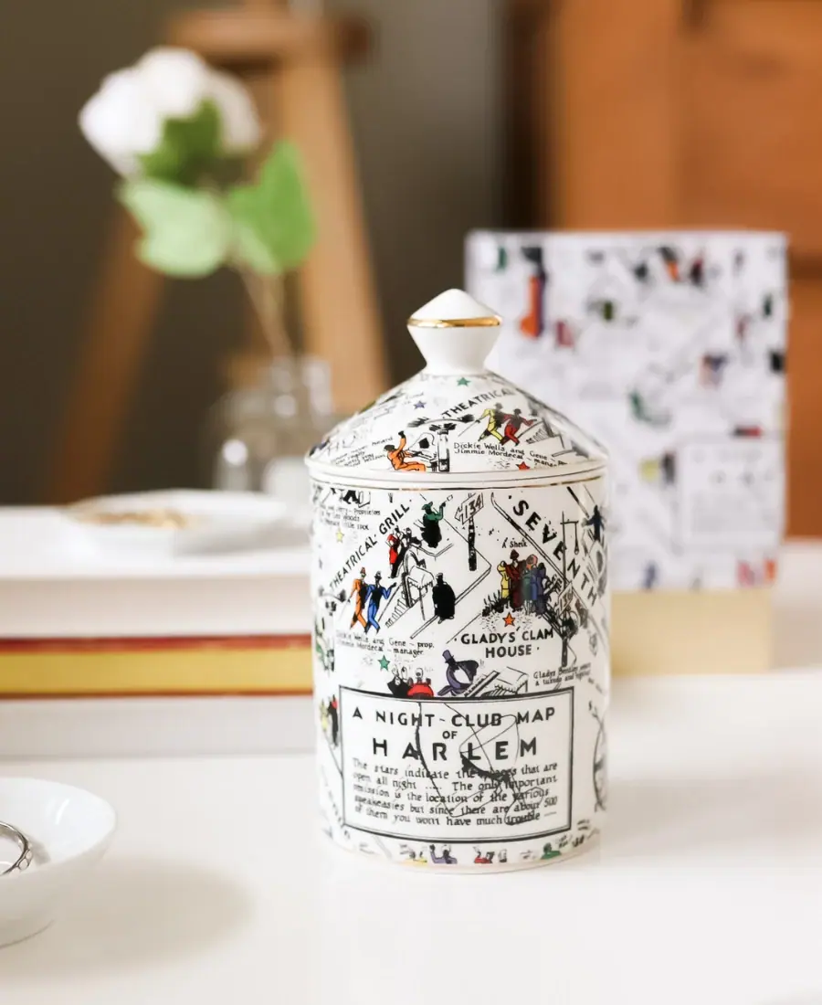
Harlem Candle Company
Illustrated ceramic map jar with coordinated lid and gold trim
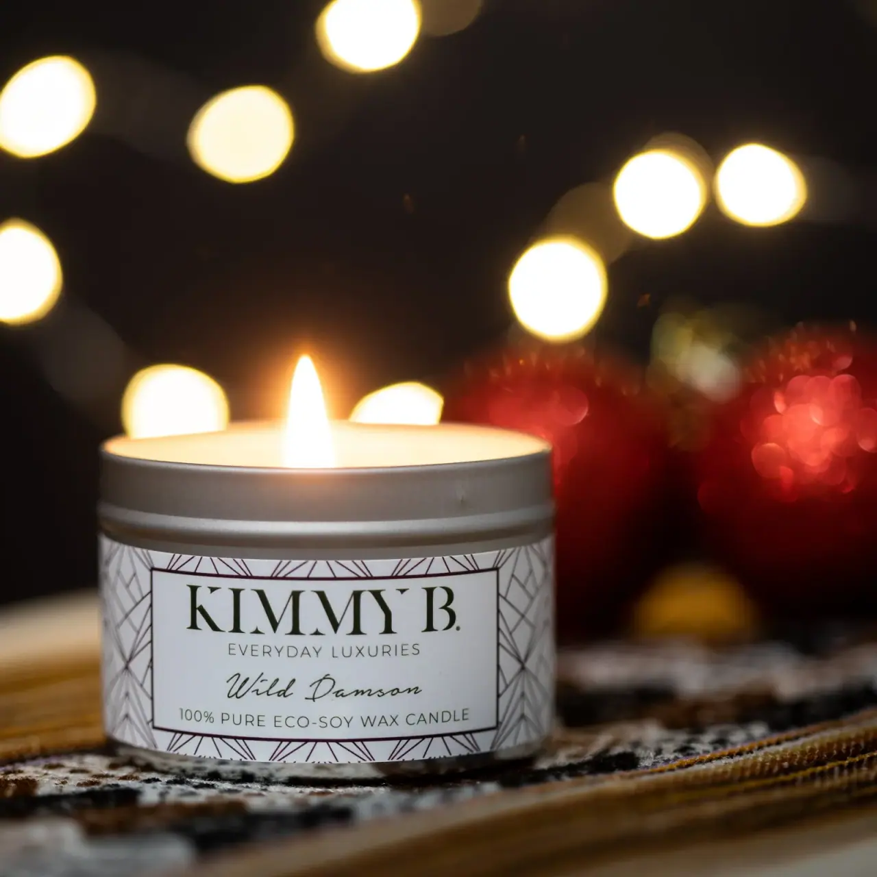
KimmyB
Silver tin, geometric frame and handwritten damson scent
Miu Miu
aqua relief, ivory neck band and a yellow disc
Paddywax
Painted koi, scalloped rim and striped pedestal

Bomba Curls
tropical foliage gathered around a bold yellow nameplate
Claus Porto
Golden geometric wrapping around a pale floral medallion
Fishwife
carnival folk art on a tin