Photography: Literie official photography. Images belong to their respective owners.
Literie
Quiet blue destination type with a playful coastal side panel
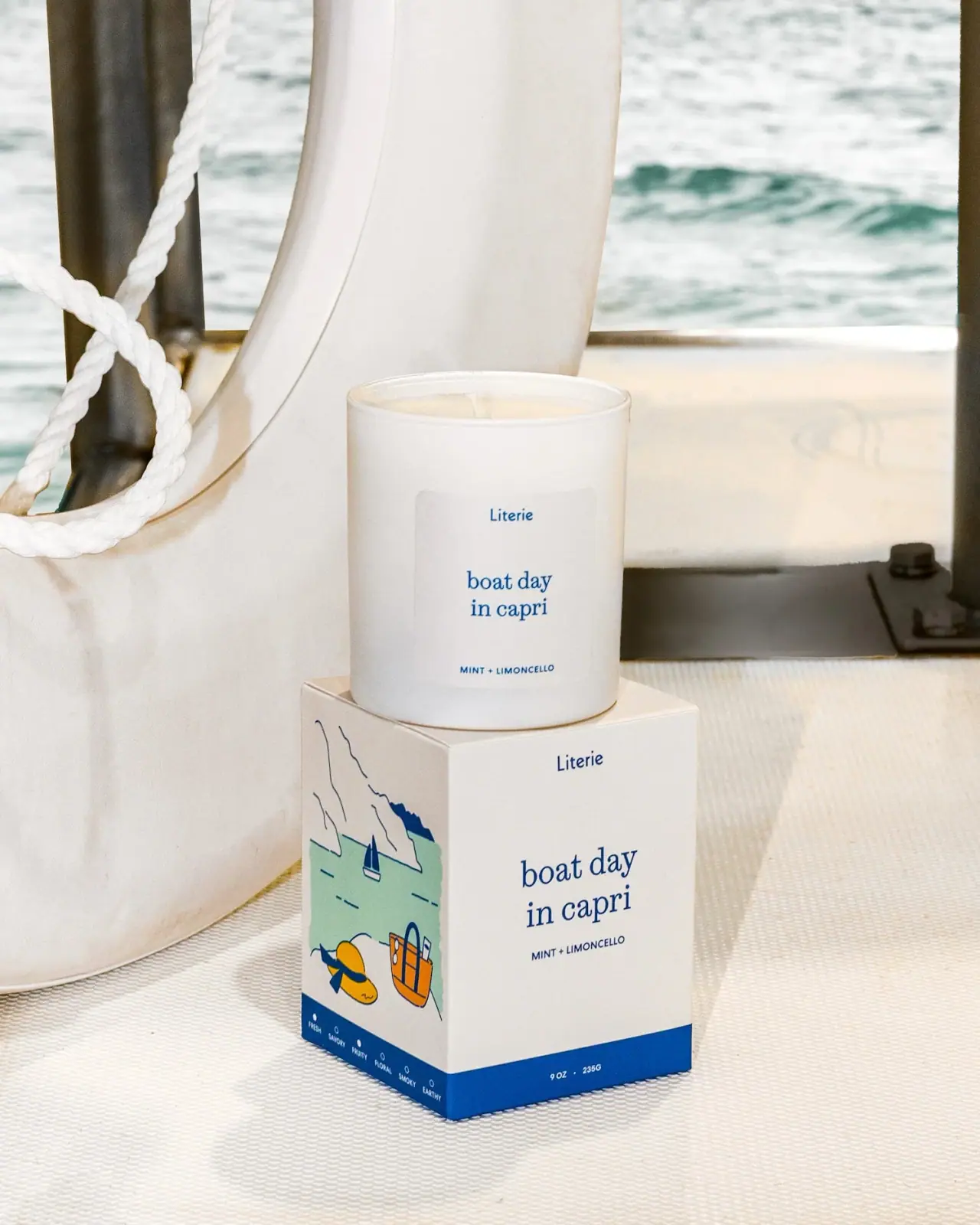
Boat Day in Capri combines a restrained white candle vessel with a more descriptive illustrated carton. The small blue maker name and larger lowercase serif destination title repeat on both components, with a compact mint-and-limoncello line beneath. The carton keeps its front largely typographic and moves the coastal scene to a side panel. A strong blue base band anchors both faces. The selected photograph places the open candle above the box in a boating setting, extending the place-based idea without covering the package's readable front.
- Candles & home scent
- Light pack
- Retro illustrated
- Playful colour
About this study
Selected official Boat Day in Capri vessel-and-carton photograph. Quantity is visible on the carton only and transcribed as printed; exact product page unavailable during review.
Sources & evidence · Reviewed 2026-10-19Color Palette
Approximate colours interpreted from photography. These are screen references, not official brand colours or print specifications.
Pack body
Warm white vessel and carton
#ECE8DF
Shared quiet base. The vessel's pale label remains subtly distinguishable from the surrounding white surface.
Ink
Coastal blue
#164F84
Maker, destination wording, illustration outlines and strong carton base band create a repeated visual anchor.
Accent
Pale mint sea
#A4C9B8
Flat water field on the illustrated side panel, distinct from the real sea visible behind the photographed pack.
Sunhat yellow
#E9B533
Small warm accent in the illustrated hat, keeping the blue/cream scene playful without overtaking the front.
Tote orange
#DD983B
A second small warm illustration accent, confined to an object on the side rather than used for product naming.
Typography
Suggested visual alternatives, not confirmed brand typefaces. Any scale below is an illustrative estimate.
The destination name is the largest text and uses lowercase serif lettering over two centered lines. Literie sits much smaller above it in a compact sans-like maker voice; the mint-and-limoncello line below is small uppercase sans. The same roles repeat on the vessel and carton, scaled to their available faces. This makes the named experience the main discovery point while keeping maker and scent notes easy to locate. The small brand mark should not be described as the same serif treatment as the destination title.
Fonts
Destination title
Lora
- Looks like
- Readable relaxed serif lowercase
- Type
- Contemporary serif
- Weight
- Regular, Medium
- Case
- Lowercase
- Tracking
- Natural spacing
- Fallback
- Georgia, serif
Use for a new place-and-occasion name with intentional short line breaks. Keep the phrase readable as language rather than turning it into a tightly fitted ornamental block.
Maker and scent details
DM Sans
- Looks like
- Compact friendly sans
- Type
- Geometric sans-serif
- Weight
- Regular, Medium
- Case
- Title-case maker; uppercase scent details
- Tracking
- Natural maker spacing; lightly open small capitals
- Fallback
- Arial, sans-serif
Alternative for the small maker signature, scent pairing and side-panel descriptors. Maintain a clear weight difference from the serif title without imitating Literie's exact mark.
Structure & Proportions
Visual proportions and finish previews are illustrative. Confirmed construction details and uncertainties are distinguished in the study notes.
Proportions
| Purpose | Value | Preview |
|---|---|---|
| Vessel label island | A modest pale rounded rectangle holds the candle's text, leaving a white border around it and generous empty space between maker, title and scent. | — |
| Carton face hierarchy | The destination name sits near the middle of a broad cream face; maker is high and scent details sit below without competing panels. | — |
| Low blue anchor | The base band is narrow relative to the carton height yet strong enough to connect front and side visually. | — |
| Illustration depth | Cliffs and sea occupy the upper side panel, with hat and tote larger in the foreground, creating a simple pictorial perspective. | — |
Shapes
| Element | Value | Preview |
|---|---|---|
| Candle vessel | Straight-sided white cylinder with an open circular rim. | |
| Vessel label | Pale rounded rectangular field carrying centered type. | |
| Outer carton | Square-plan box showing a quiet front and an illustrated side. | |
| Base band | Solid blue horizontal strip continuing around the visible lower edges. |
Finishes
Soft white appearance
Vessel and its pale label show limited glare in this scene; coating and substrate unknown. · matte
Quiet printed carton
Cream face and flat colored illustration; exact paper finish not verified. · matte
Formats and materials
| Formats | Open white cylindrical candle vessel paired with a square-plan carton; printed carton quantity transcribed as 9 OZ / 235 G without reconciling the figures |
| Materials | Vessel has an opaque white appearance with a visible pale rim and wax inside. Exact vessel substrate, coating, wax blend and wick material are not verified by the accessed sources., The carton appears folded and printed, with a flat cream ground and blue base band. Board grade, certification, laminate and print process are not established. No separate lid is pictured. |
| Closures | The candle is open with a single visible wick; no cover or dust disc is shown. The carton remains closed beneath it, and the top is partly obscured by the vessel. Visible seams support a folded-box appearance, but the opening flap, insert and internal protection cannot be mapped from this angle. The placement does not prove that the candle is intended to be used on its carton. |
| Decoration | Centered blue destination typography on both components, Small maker and uppercase scent pairing, Illustrated coastal scene on the carton's side, Continuous blue lower band with front quantity and side scent-family markers |
Front Panel
Schematic reading order. The diagram’s zone heights do not represent measured artwork proportions.
The paired fronts repeat a centered three-part sequence: small maker, larger destination title, compact scent pairing. The vessel keeps that sequence inside a subtle label island. The carton expands it over an open cream face and shifts the more detailed story to the adjacent side. The blue lower strip carries secondary factual information, allowing the main name to remain free of dense copy. This division gives the box a reason to be turned without making the front incomplete.
| Zone | Content |
|---|---|
| Maker | Small Literie naming sits high on both visible fronts, using a different typographic voice from the serif title. |
| Destination title | The two-line lowercase place-and-occasion name is the main reading element on vessel and carton. |
| Scent pairing | Mint + Limoncello appears in compact uppercase below the title. It is a fragrance descriptor, not a full wax ingredient list. |
| Illustrated side | Cliffs, mint-colored water, a small sailboat, a yellow hat and an orange tote form a simplified coastal scene. |
| Blue information band | Carton front shows the printed quantity; the side displays small scent-family labels and markers. These are scent descriptors, not certification seals. |
Range System
The brand's summer collection provides broad seasonal context, and its maker storefront listing confirms the Capri product concept. Only this vessel-and-carton combination is visually assessed. The observed combination of quiet fronts and an illustrated side suggests an adaptable architecture, but does not establish that every Literie scent uses identical art placement, vessel material or blue coding.
- For an original destination family, repeat type roles while changing the place illustration and written scent pairing.
- Keep a strong name-only face so a detailed scene does not need to be decoded to identify the product.
- If a scent-family marker system is used, explain its labels clearly instead of allowing the dots to resemble unexplained certification icons.
Back of Pack & Shelf
One carton side is visible, but the reverse, underside, full top and vessel rear are not. The illustrated panel is not a complete safety or ingredients panel.
- Inspect the base and remaining panels before mapping directions and warnings.
- Verify the printed quantity discrepancy with the maker before converting or standardizing it.
- Do not claim the vessel repeats quantity merely because the carton does.
On shelf
Interpretively, the repeated centered name helps the carton and vessel remain recognizable as a pair before and after unboxing. The front is restrained enough for the blue serif title to be the main read; the illustrated side adds a gift-like discovery moment when the box turns. Small scent notes and family markers may disappear in thumbnails, so an original design should test the actual print size. The low blue band can anchor a row, but one selected pack cannot establish a range-wide color rule.
Imagery
The official photograph places the candle on its carton near a white life ring and rope, with water visible through the background. Pale upholstery or deck texture keeps the scene light, while the real sea echoes the illustrated setting. The location is not independently identified as Capri from the image alone. The candle remains unlit, and the open top provides a quiet product cue rather than a dramatic flame. These boating props extend the title's narrative but are separate from the printed side illustration.
Guidelines
Editorial principles for an original design brief, not official brand guidelines.
Do
- Distinguish maker sans from destination serif.
- Give detailed illustration its own panel.
- Repeat the name and scent hierarchy across components.
- Transcribe visible quantity without inventing a conversion.
- Treat scent notes as descriptors rather than full ingredients.
Don't
- Do not claim a vessel quantity absent from the visible label.
- Do not identify the real photo location from the title alone.
- Do not interpret scent markers as certifications.
- Do not infer glass, soy blend or recyclable board without evidence.
- Do not reproduce the source coastal art and exact destination phrase.
Sources & evidence
How this study was built
edition · Sourced fact
Maker storefront identifies Boat Day in Capri; selected official photograph supplies the specific package details.Literie maker storefront — Boat Day in Capristructure · Visual observation
Open white vessel stands on a closed square-plan carton; a single wick is visible.typography · Visual observation
Small sans-like maker contrasts with larger lowercase serif destination naming on both components.label · Visual observation
Quiet front, illustrated side and blue base band divide title, scene and secondary information.palette · Visual observation
Blue and cream dominate, with mint water and small yellow/orange illustration accents.imagery · Visual observation
Life ring, rope and real water establish boating context without confirming actual Capri location.range · Editorial interpretation
Repeated type roles with a separate narrative panel are adaptable principles, not verified rules for every Literie product.
What remains unverified
- Exact official product URL failed; collection supports broad context only.
- Printed 9 OZ / 235 G not reconciled; no vessel quantity visible.
- Vessel material, wax blend, wick and board/print details unknown.
- Original fonts, dimensions, rear and underside not established.
- Photographic location not independently confirmed.
Give your AI
packaging taste
Give your design or image tool a packaging study: palette, type, structure, front panel and principles for an original brief.
Export this styleFree with an email. PACK.md works in Claude, ChatGPT, Cursor and image tools.
More like this
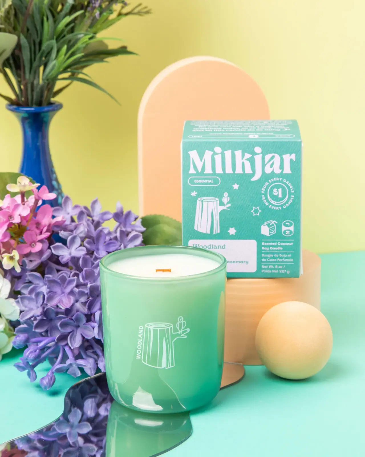
Milkjar
Green candle and carton share a white woodland illustration
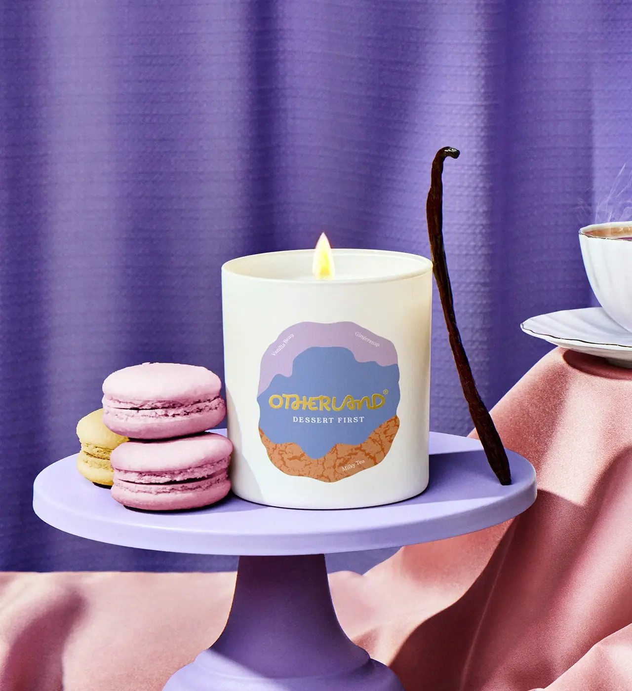
Otherland
Cream candle with a layered lavender and biscuit-coloured badge
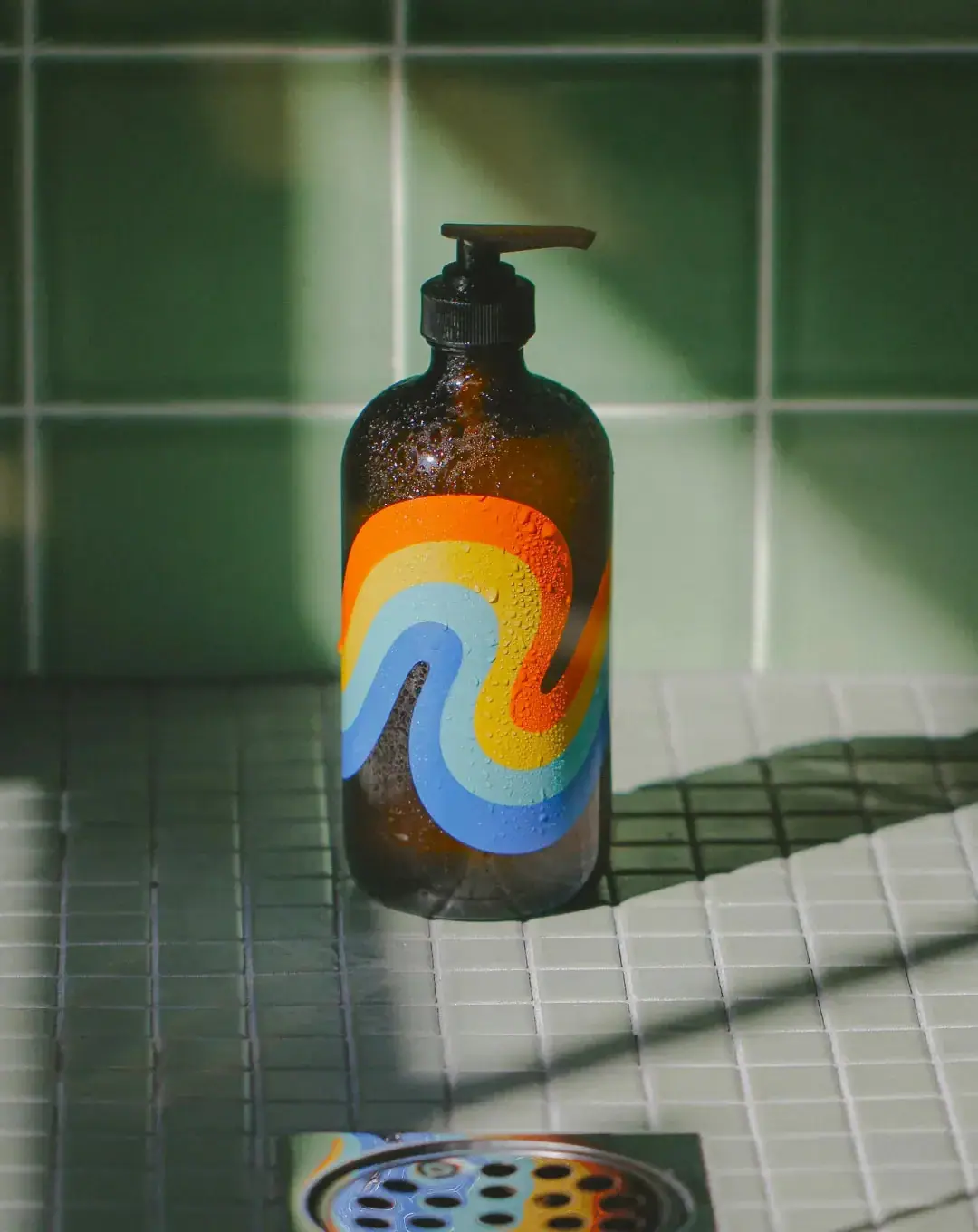
Bathing Culture
Flowing rainbow bands on dark refillable glass

Culture Pop
fruit-for-an-o wordmark on dewy cans
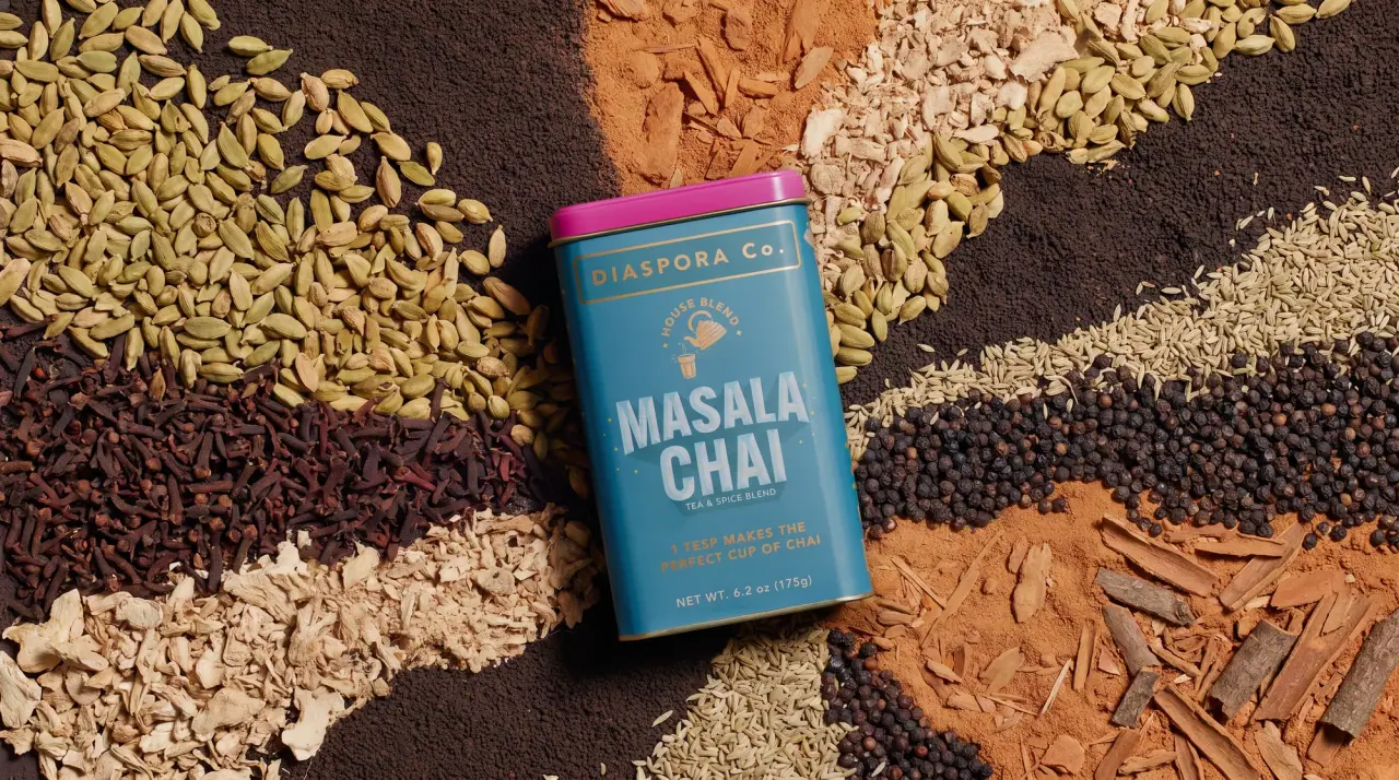
Diaspora Co.
marigold tins with a tiger crest
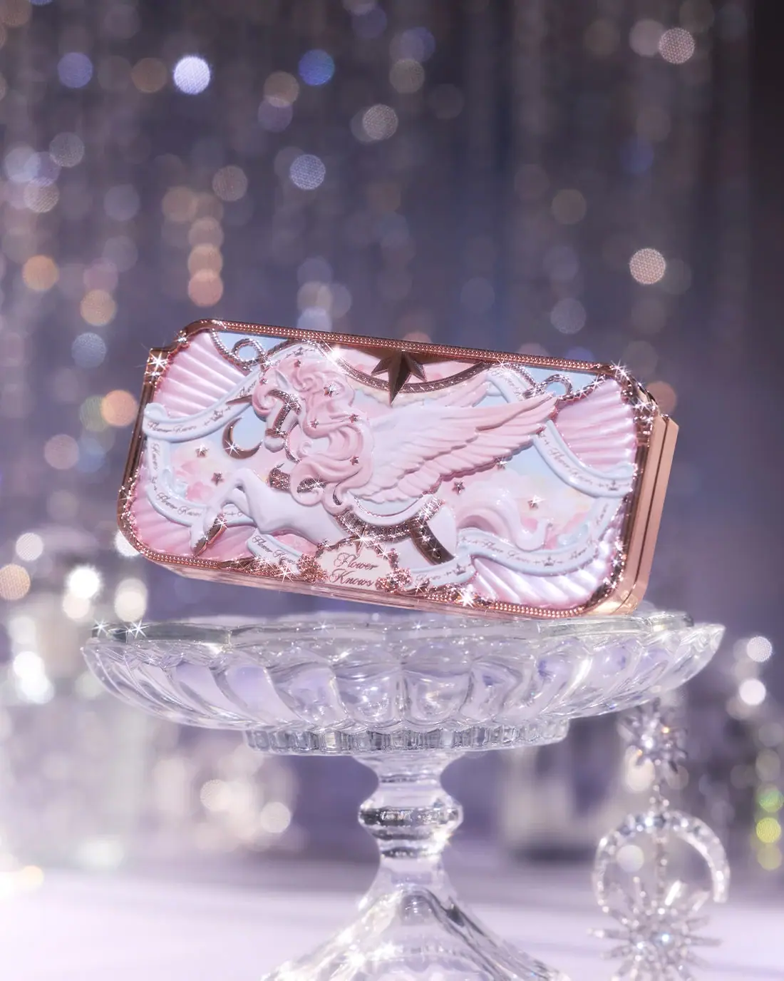
Flower Knows
Winged unicorn relief with pastel ribbons and reflective borders
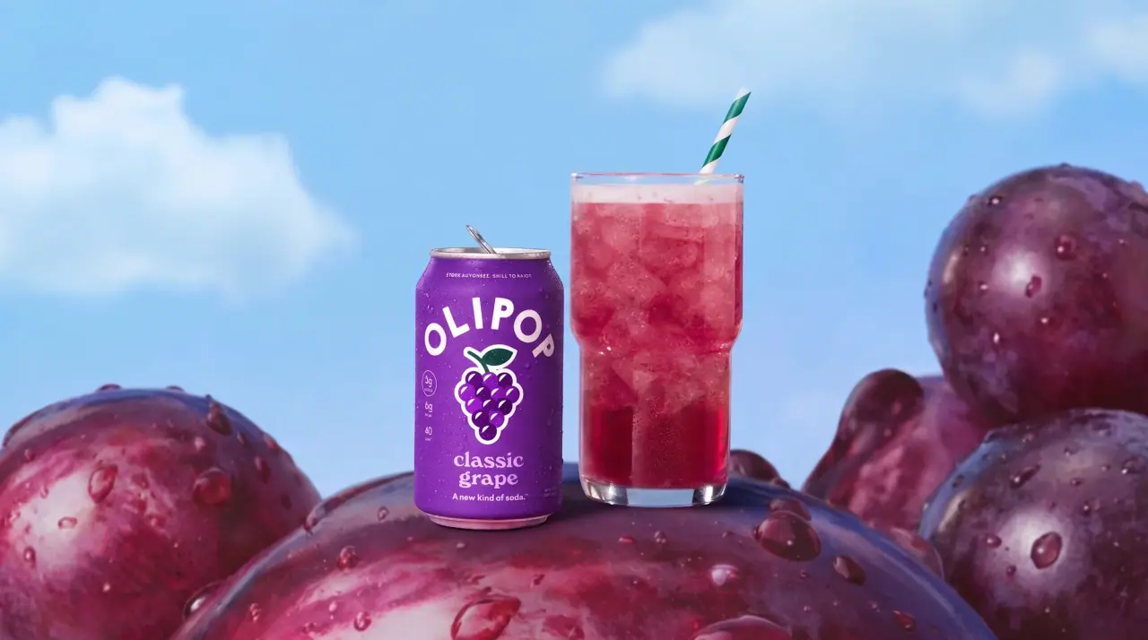
Olipop
sunny soda fountain in flat colour
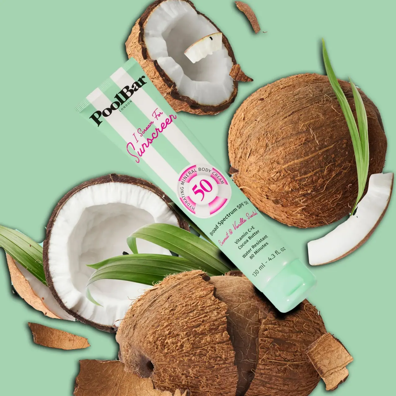
PoolBar London
Mint beach stripes with pink script and a lifebuoy badge