About this packaging
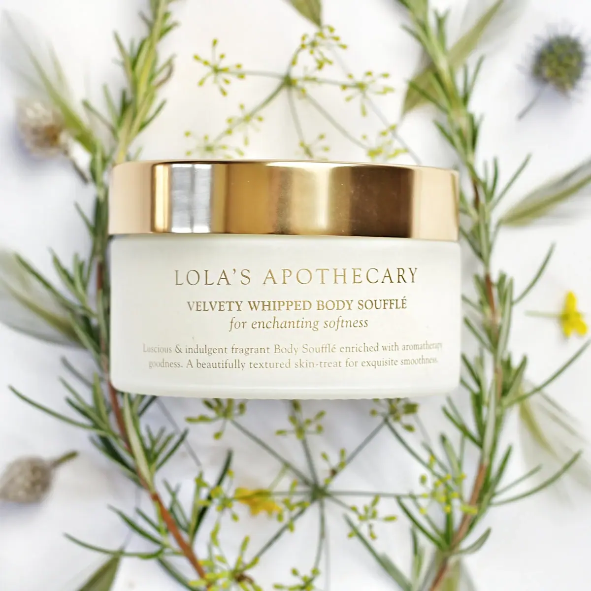
Lola’s Apothecary Breath of Clarity Body Soufflé is presented in a low, wide pale jar with a broad gold-colored lid and a centered serif label. The current official listing gives a 200 mL size; on the selected label, the brand name leads, followed by uppercase product naming and a smaller italic line.
Lola’s Apothecary lists Breath of Clarity Uplifting Body Soufflé at 200 mL and describes the fragrance through eucalyptus, rosemary, sweet marjoram, peppermint, and lemon. The cited listing does not state the jar or lid materials, so the visible finish is described without assigning construction.[1]
Pack construction & use
- Jar and size
- The official listing gives the soufflé a 200 mL size. The selected image shows a low, wide pale jar with a broad gold-colored lid; neither component’s material or closure mechanism is specified by the cited listing.[1]
- Label copy
- The front panel reads Lola’s Apothecary, Velvety Whipped Body Soufflé, and “for enchanting softness,” with smaller supporting copy below. The product name and tagline are visibly differentiated by capitalization and italic styling.Observed in the reference photograph
What makes the design work
Editorial analysis of this packaging reference.
A broad profile gives the label room
The squat vessel creates a wide uninterrupted front plane. This supports multiple text levels without forcing the product name into a narrow vertical stack.
Serif lettering makes the brand the first read
The brand name sits centered and largest on the front, followed by a more compact uppercase product descriptor. The italic tagline adds a softer third voice below the main hierarchy.
Gold-colored lid frames the pale body
The wide lid forms a contrasting band across the top of the jar and draws a horizontal line above the centered copy. Botanical sprigs in the photo echo the product’s fragrance context but remain outside the package artwork.
Ideas for your next brief
- Choose a broad-front container when product naming needs several typographic levels to remain readable.
- Use a concise italic tagline as a secondary tone cue beneath a structured serif hierarchy.
Sources & further reading
Researched 19 October 2026