About this packaging
SALT & STONE’s Santal & Vetiver Body Cream presents a minimal, pale container against a textured natural setting. The package gives its scent name room to lead, while the brand’s current product page identifies the 200 mL size and scent family.
The official page lists Santal & Vetiver Body Cream in a 200 mL size. The selected cover is the Santal & Vetiver edition; no primary source confirming the container material or disposal route was found.[1]
Pack construction & use
- Container
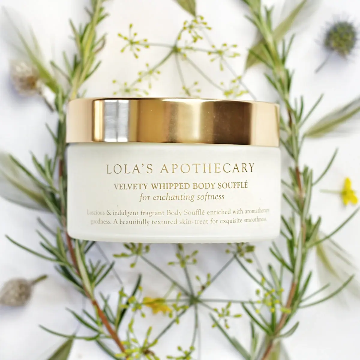
- The cover shows a rounded rectangular cream container with a broad top closure. Its light body contrasts with dark type.Observed in the reference photograph
- Scent identification
- The front uses a restrained text block for the brand, product type and Santal & Vetiver scent. The package relies on the scent name rather than a large botanical illustration to differentiate the variant.Observed in the reference photograph
What makes the design work
Editorial analysis of this packaging reference.
Negative space supports a quiet read
The open face gives the short information stack room to breathe. With little ornament, the product type and scent name can function as the primary navigational cues.
Texture belongs to the scene
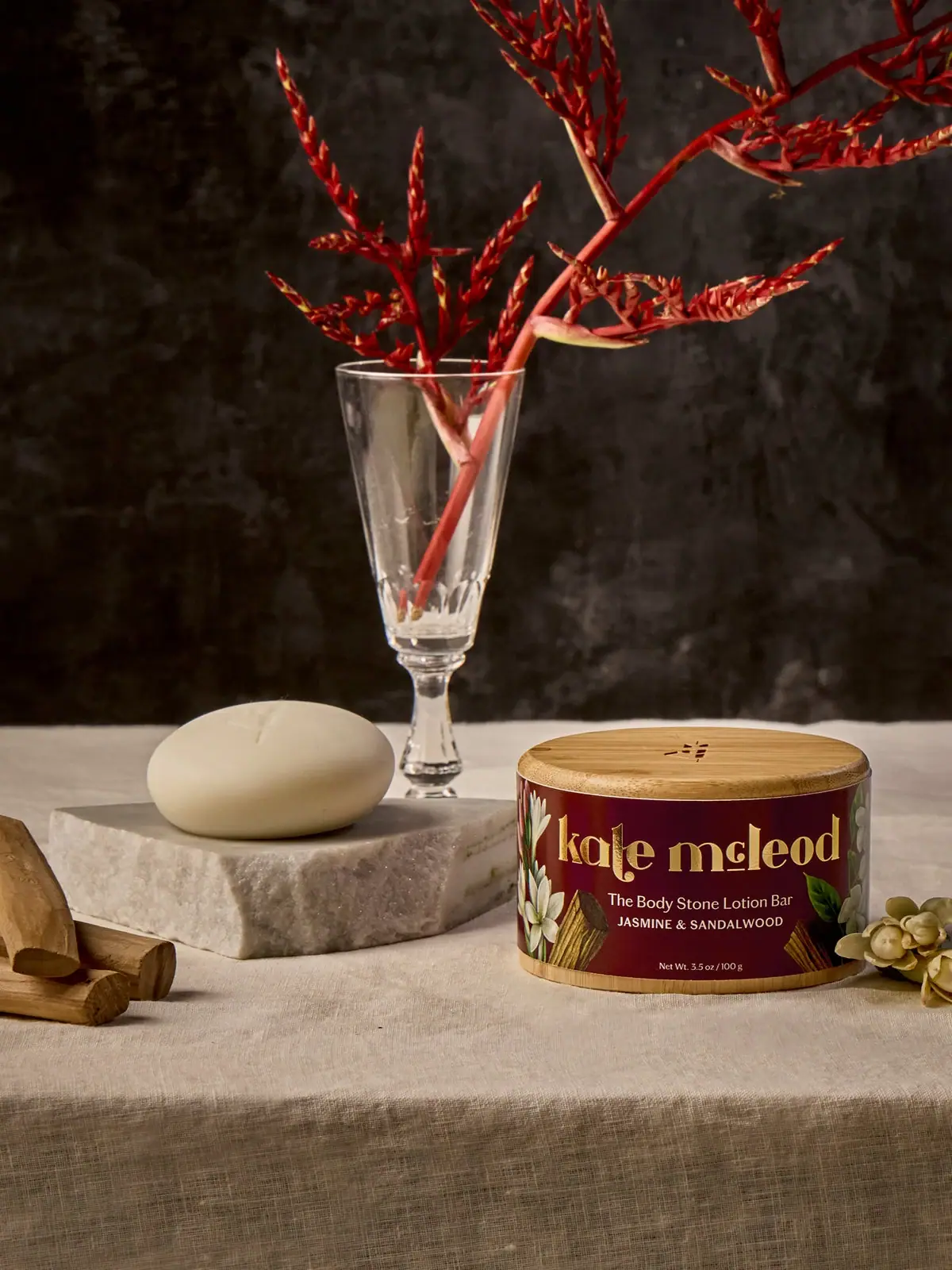
The selected image pairs the pale pack with stone and botanical references. Those natural textures cue the fragrance mood.
The closure adds visual weight
A broad top element balances the squat body and gives the package a stable silhouette. The photographic angle makes this cap-to-body proportion part of the product’s visual identity.
Ideas for your next brief
- Use generous blank space when scent and product type already provide a clear front-panel hierarchy.
- Communicate fragrance through a restrained still-life setting when a package uses minimal graphics.
Sources & further reading
Researched 19 October 2026