Photography: Lola’s Apothecary — official product photography. Images belong to their respective owners.
Lola’s Apothecary

A pale wide jar framed by a polished golden lid
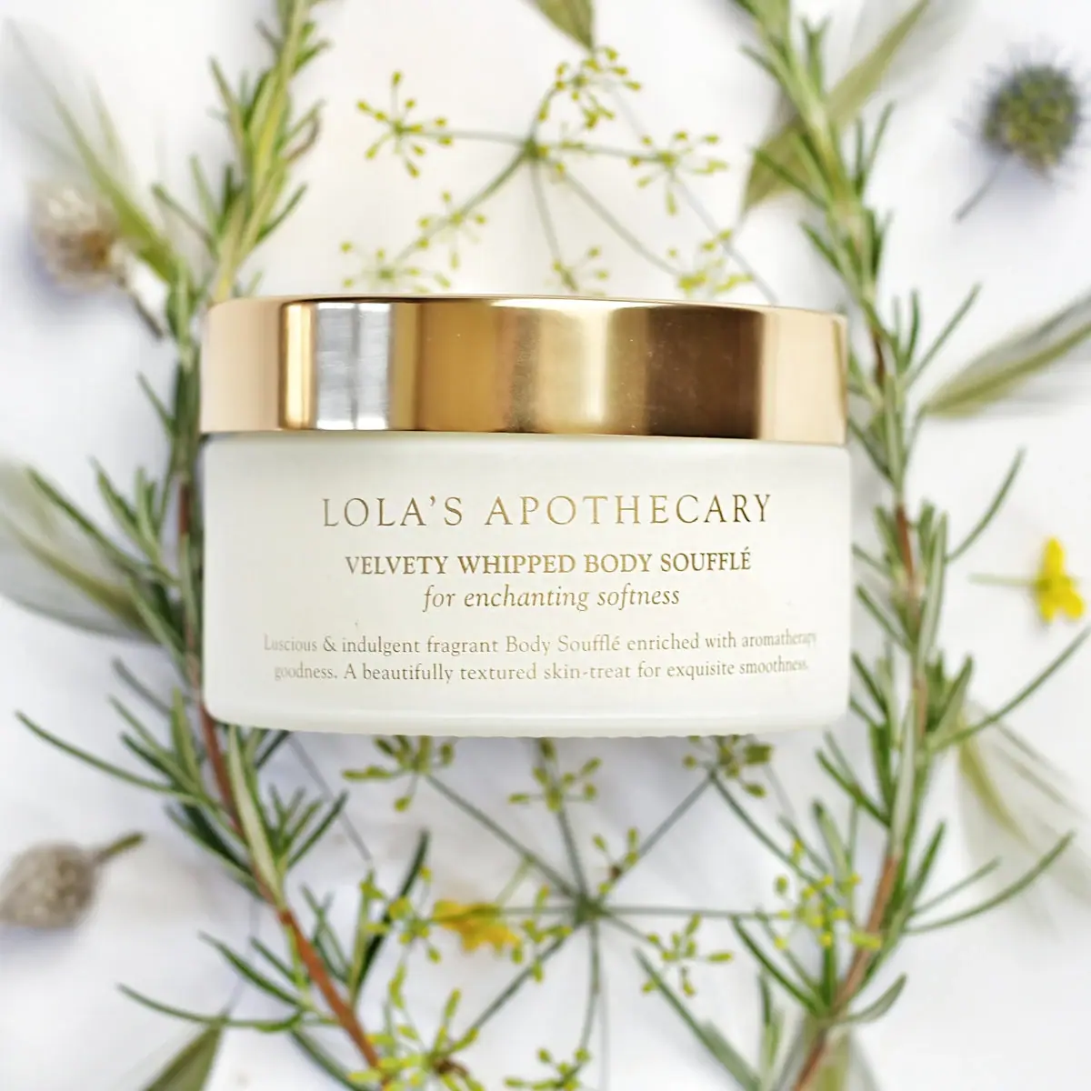
The selected Breath of Clarity Body Soufflé photograph places a low, broad pale jar among loose botanical stems. A polished gold-coloured lid forms a strong horizontal band above a restrained serif front. The producer name is the largest line, the product descriptor is heavier and more compact, and an italic phrase introduces a softer voice below it. Two small lines finish the lower face. The visible front names the soufflé format but does not clearly display Breath of Clarity; the exact variant is established by the official product page and image context.
- Body & bath
- Light pack
- Heritage label
About this study
Selected official Breath of Clarity body-soufflé image with pale jar and gold-coloured lid. Front communicates producer and format; scent name is established by product-page context.
Sources & evidence · Reviewed 2026-10-19Color Palette
Approximate colours interpreted from photography. These are screen references, not official brand colours or print specifications.
Pack body
Pale ivory body
#E9E9DD
Approximate jar appearance. Its softly diffuse pale surface does not independently identify glass, plastic, frosting or the colour of the formula inside.
Ink
Muted golden-brown lettering
#9A8B5A
Approximate visible front text colour. It relates to the lid but appears quieter; metallic ink, foil and exact printing method are unverified.
Accent
Polished gold-coloured lid
#B99A50
Approximate midtone of the reflective closure. Bright pale and dark brown areas are reflections within one finish, not separate specified colours.
Typography
Suggested visual alternatives, not confirmed brand typefaces. Any scale below is an illustrative estimate.
The broad upper producer line uses relatively fine uppercase serif letters with open spacing. Beneath it, a smaller but heavier uppercase product descriptor creates a more compact second level. An italic sentence-case phrase follows directly below, providing a change of rhythm without a new colour. Two smaller supporting lines occupy the lower area. All principal blocks are centred, but their widths differ: the producer and support copy spread broadly while the middle descriptor and italic line stay tighter. This creates a restrained nested composition on a curved wide surface.
Fonts
Producer and supporting serif alternative
Cormorant Garamond
- Looks like
- Cormorant Garamond
- Type
- Serif
- Weight
- Regular 400 / SemiBold 600
- Case
- Uppercase producer; sentence-case details
- Tracking
- Open for producer, natural for support
- Fallback
- serif
A proposed fine serif voice for an original apothecary identity. The wide letter spacing should be tested on the curved jar so the outer letters do not disappear around its sides.
Descriptor and italic alternative
Libre Baskerville
- Looks like
- Libre Baskerville
- Type
- Serif
- Weight
- Regular 400 / Bold 700
- Case
- Uppercase descriptor and sentence-case italic
- Tracking
- Neutral
- Fallback
- serif
Use a stronger serif descriptor paired with a short italic phrase. The italic is a separate style choice within this alternative family, not proof of the exact original font; keep essential product information upright and clear.
Structure & Proportions
Visual proportions and finish previews are illustrative. Confirmed construction details and uncertainties are distinguished in the study notes.
Proportions
| Purpose | Value | Preview |
|---|---|---|
| Broad vessel | The visible width is substantially greater than the body height, allowing a long producer name and short descriptive paragraph to occupy horizontal lines. | — |
| Lid band | The polished top creates a substantial visual cap above the pale body. It remains plain in the visible side view, balancing the text below. | — |
| Text stack | The producer, descriptor, italic and small support occupy separate horizontal levels with visible spacing. No numerical type scale or dieline is inferred. | — |
Shapes
| Element | Value | Preview |
|---|---|---|
| Jar | Low broad cylindrical body with softly rounded lower corners. | |
| Lid | Wide circular cover seen as a polished horizontal band. | |
| Producer line | Long centred uppercase line across the upper front. | |
| Supporting paragraph | Two small centred lines near the lower face. |
Finishes
Reflective gold-coloured band
Lid side; construction and finishing process unverified. · metallic
Soft pale appearance
Jar body; material and coating unverified. · matte
Formats and materials
| Formats | A low, broad round jar with a matching-width lid and a large horizontal front area. The official listing gives a 200 mL size; no physical diameter or height is supplied here. |
| Materials | The inspected product listing does not specify jar or lid construction. The pale body and reflective gold-coloured top are documented as appearances rather than assigned glass, metal or polymer components., The visible front may be decorated directly or through a closely matched label layer. Substrate, adhesive, coating and decoration process are not established by the photograph. |
| Closures | The broad lid is fitted, forming a shallow-looking cylindrical band over the jar. Its underside, threads, liner and any inner seal are hidden. A familiar jar silhouette is not sufficient evidence of a specific closure mechanism. |
| Decoration | The front is typographic with no visible botanical illustration, border or badge. Physical herbs and flowers are arranged behind the jar rather than printed onto it. |
Front Panel
Schematic reading order. The diagram’s zone heights do not represent measured artwork proportions.
The front has a continuous pale ground with a centred typographic stack. It lacks a visibly bounded paper-label edge in this view, so label is used here to mean the information area rather than a verified applied component. The hierarchy is achieved through serif weight, letter spacing, case and italic style within a limited colour family.
| Zone | Content |
|---|---|
| Producer | The largest line spans the upper front in fine uppercase serif lettering. Its generous width makes the house name the first textual read. |
| Product descriptor | The next line identifies the velvety whipped body soufflé in more compact bold-looking capitals. It provides the functional category beneath the brand. |
| Italic phrase | A short italic line adds an emotive tone between the descriptor and small paragraph. It is visually distinct without requiring another graphic element. |
| Lower support | Two small centred lines describe the product experience. Their muted colour and curved placement make them less legible at thumbnail size. |
| Variant identification limit | Breath of Clarity is not clearly readable on this selected front. Do not invent a visible scent badge or claim that this face alone distinguishes every fragrance. |
Range System
The official page identifies Breath of Clarity at 200 mL and describes an herbal/citrus fragrance context. The visible front chiefly communicates producer and soufflé format. Other scents and their alternative views were not inspected, so the placement of variant-specific information across the range remains unverified.
- For an original multi-scent system, preserve this producer/product/italic hierarchy but ensure the changing scent has an explicit readable location. The selected image does not demonstrate where that information sits on every jar.
- Botanical photography can vary between scent editions while the vessel remains restrained. That is an adaptable principle, not proof that each photographed herb is an ingredient or that every variant uses the same jar.
Back of Pack & Shelf
The lid top, reverse, underside and interior are unseen. No exact location can be assigned to ingredients, quantity, batch details, care instructions or fragrance identification from this front view alone.
- Inspect a rear or base view before documenting the complete information architecture.
- Do not infer a tamper seal or internal protective disc from the closed lid.
- Keep the source-confirmed 200 mL listing separate from a claim that this quantity is readable on the photographed front.
On shelf
The reflective lid and long producer name would likely register before the fine lower copy. The muted gold-on-ivory text creates a soft premium appearance but offers less contrast than a dark-ink label, especially in small images. This is visual interpretation, not a legibility study. A useful catalogue view should preserve the full front at sufficient resolution and provide a separate explicit scent title because the selected front is primarily format-led.
Imagery
The jar is photographed against a pale ground with loose green stems, delicate flower heads and small yellow accents surrounding it. The plant arrangement provides organic detail without cluttering the package face. The broad lid reflects the photographic environment in bright vertical bands, while the pale jar blends gently with the backdrop. Green foliage and yellow blossoms belong to the scene and are excluded from the pack palette. Their general herbal association is consistent with the official fragrance description, but the photo does not independently identify every botanical species or ingredient proportion.
Guidelines
Editorial principles for an original design brief, not official brand guidelines.
Do
- Use serif weight, case and italic style to separate information roles.
- Keep exact scent identification explicit outside an ambiguous front photograph.
- Describe the gold-coloured lid as appearance until material evidence is available.
- Check small muted copy at actual viewing size and across jar curvature.
Don't
- Do not call the pale jar glass or the lid metal without a source.
- Do not infer foil or metallic ink from golden-brown lettering.
- Do not turn the physical herbs into printed botanical decoration.
- Do not claim every fragrance uses the same front or coding system.
Sources & evidence
How this study was built
edition · Sourced fact
Official listing identifies Breath of Clarity body soufflé and 200 mL.Breath of Clarity Uplifting Body Soufflé — Lola’s Apothecaryrange · Sourced fact
Page provides herbal/citrus fragrance context, without a packaging material specification.Breath of Clarity Uplifting Body Soufflé — Lola’s Apothecarystructure · Visual observation
Low broad pale jar carries a wide reflective gold-coloured lid.typography · Visual observation
Fine uppercase producer, heavier descriptor, italic phrase and small support create four roles.label · Visual observation
Centred front does not clearly show the Breath of Clarity variant name.imagery · Visual observation
Loose botanical stems surround the jar without forming printed label art.palette · Editorial interpretation
Muted text and pale body create a soft appearance with a small-image legibility tradeoff.
What remains unverified
- Jar/lid materials, closure mechanism, coating and decoration process unspecified.
- Lid top, reverse, base and interior unseen.
- Variant and 200 mL identification supported by page, not clearly readable on front.
- Fonts and colours are alternatives or estimates; scene plants excluded.
Give your AI
packaging taste
Give your design or image tool a packaging study: palette, type, structure, front panel and principles for an original brief.
Export this styleFree with an email. PACK.md works in Claude, ChatGPT, Cursor and image tools.
More like this

Aesop
a botanical still life around a disciplined apothecary label
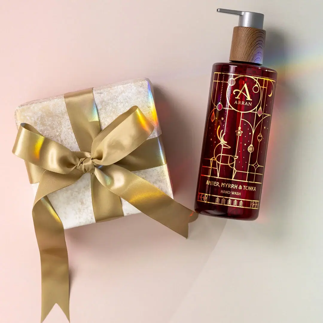
ARRAN
Festive golden linework on garnet with a grain-textured collar

Benamôr
Ornamental lilac medallion suspended above golden botanical oil
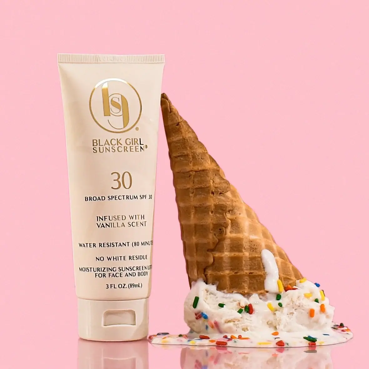
Black Girl Sunscreen
Cream tube with gold crest and an isolated SPF numeral
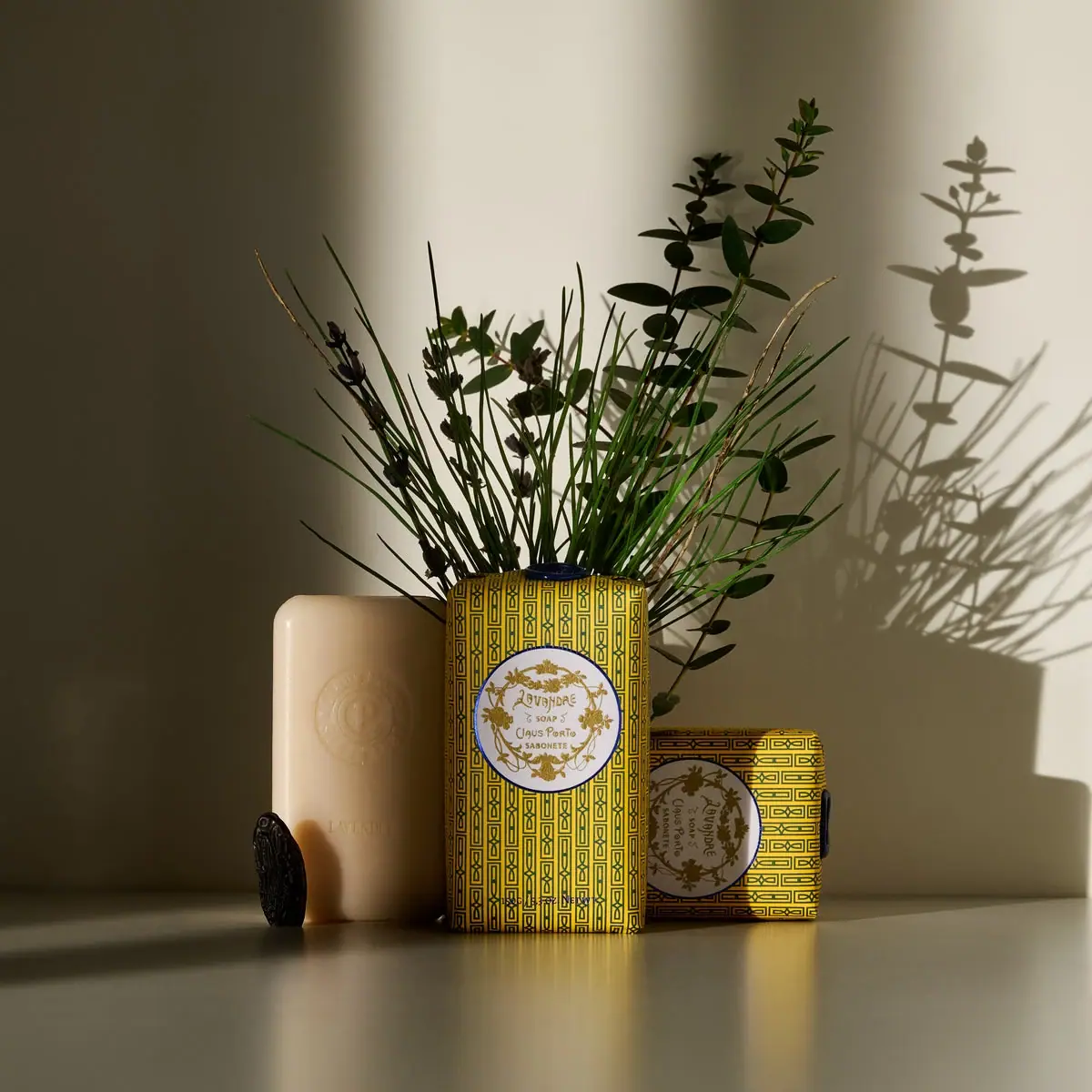
Claus Porto
Golden geometric wrapping around a pale floral medallion
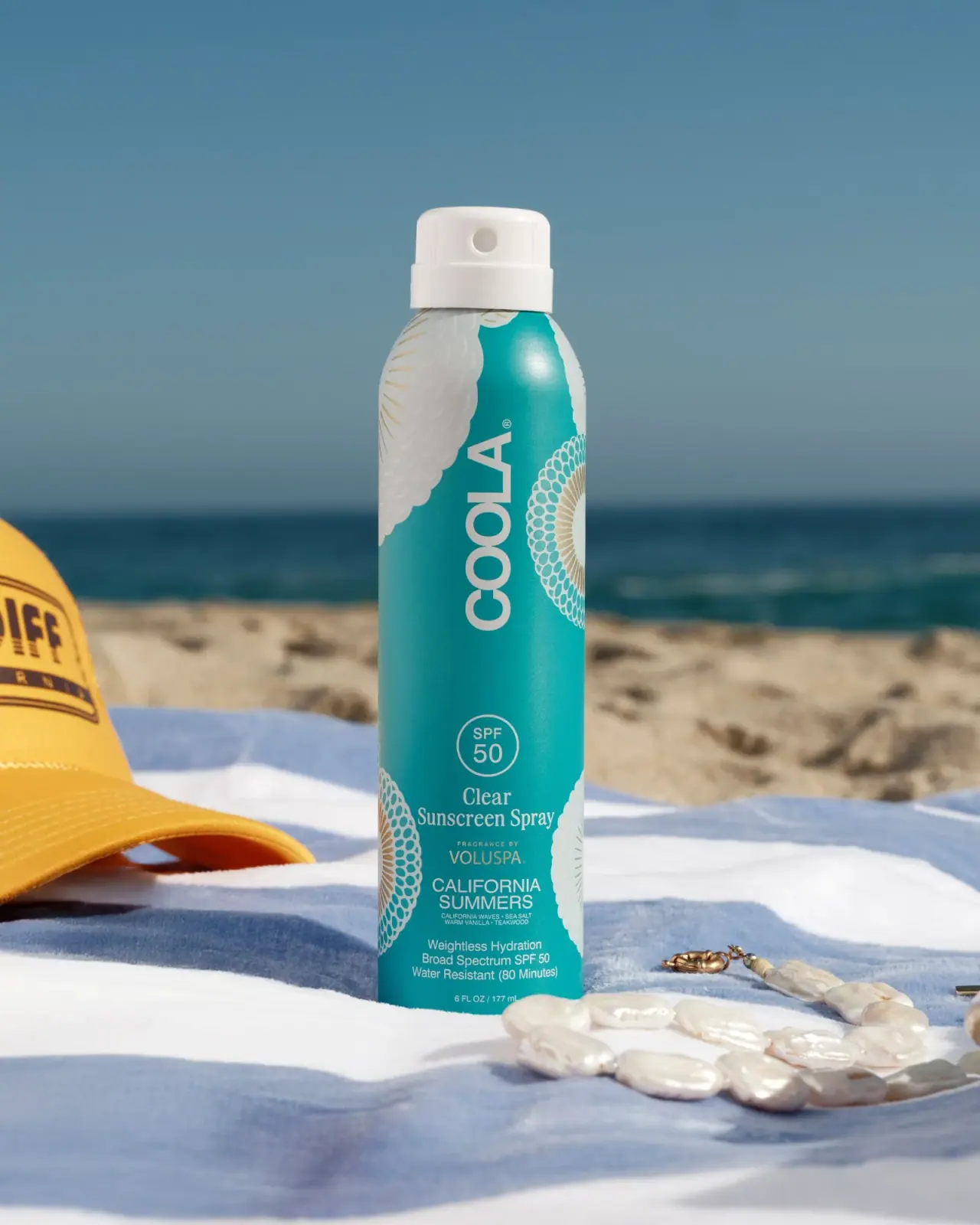
COOLA
Turquoise cylinder, cropped rosettes, vertical brand and fragrance attribution

Coppertone
Blue fields, a yellow sun and a clear number

Dr. Bronner’s
A bright soap wrapper with a densely ordered voice