About this packaging
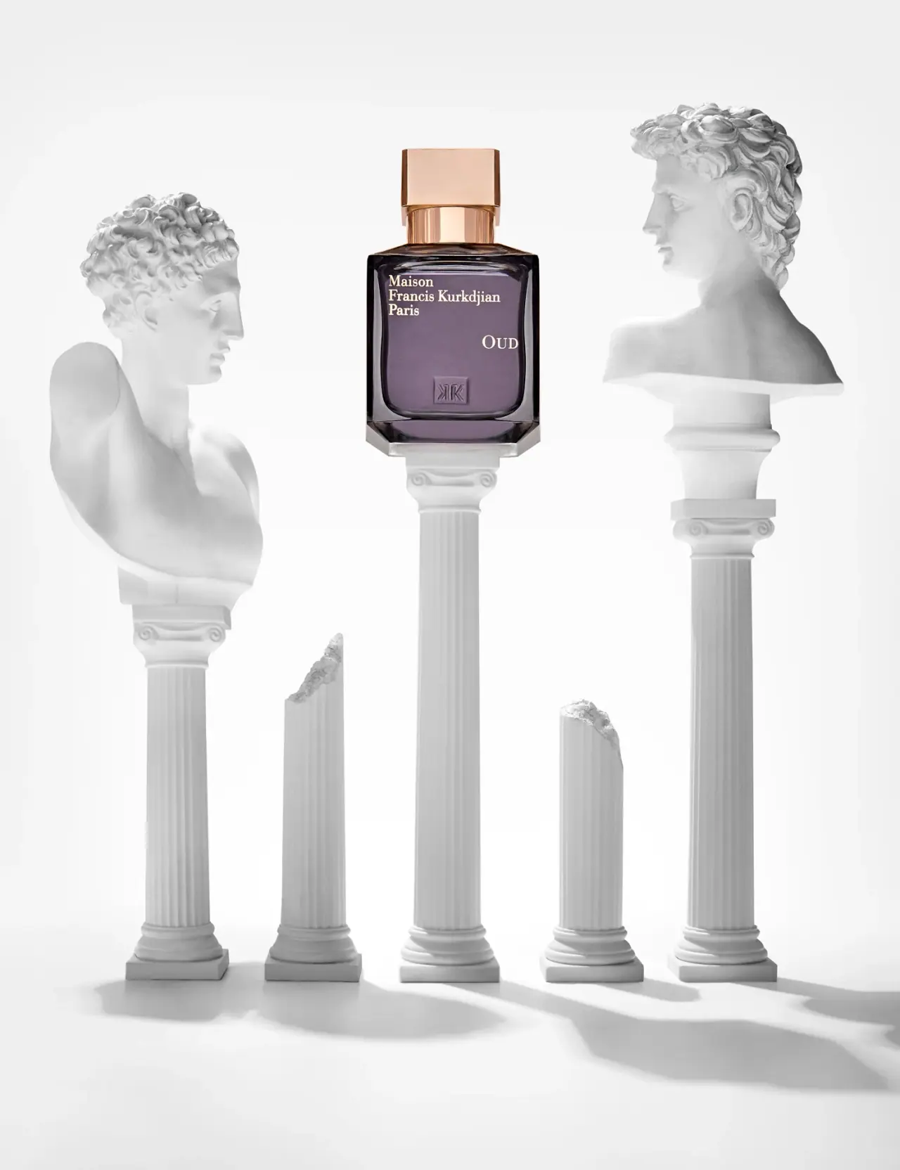
Maison Francis Kurkdjian’s OUD Eau de Parfum uses a square-shouldered bottle, dark plum front, and warm metallic-looking cap. The selected image places the bottle among classical forms while its offset front lettering remains visible.
Maison Francis Kurkdjian describes OUD as inspired by oud wood set against a marble palace with gold carvings.[1]
Edition note. Do not conflate the photographed Eau de Parfum with the separate OUD Extrait version.
Pack construction & use
- Bottle / cap
- The selected image shows a square-shouldered bottle with a dark plum front and a warm metallic-looking rectangular cap.Observed in the reference photograph
- Fragrance size
- The collection lists OUD Eau de Parfum in 35 ml and 70 ml sizes, separate from OUD Extrait.[1]
What makes the design work
Editorial analysis of this packaging reference.
Architectural proportions
The broad square bottle is stacked above fluted white columns in the image, visually extending its own vertical lines. The heavy-looking base gives the fragrance a grounded profile.
Front typography and color
The brand name sits at the upper left while OUD is positioned lower and to the right. The dark purple face and gold-toned cap echo the official marble-and-gold inspiration.
Monumental styling
Classical busts frame the bottle without obscuring its label, treating the package as the focal object in a miniature architectural scene. The staging supports the perfume’s stately character through composition rather than extra printed graphics.
Ideas for your next brief
- Use a dark bottle face and contrasting cap to establish a clear top-to-bottom color structure on a square fragrance bottle.
- Offset house and fragrance names to create a deliberate asymmetry while preserving open space on the front.
Sources & further reading
Researched 19 October 2026