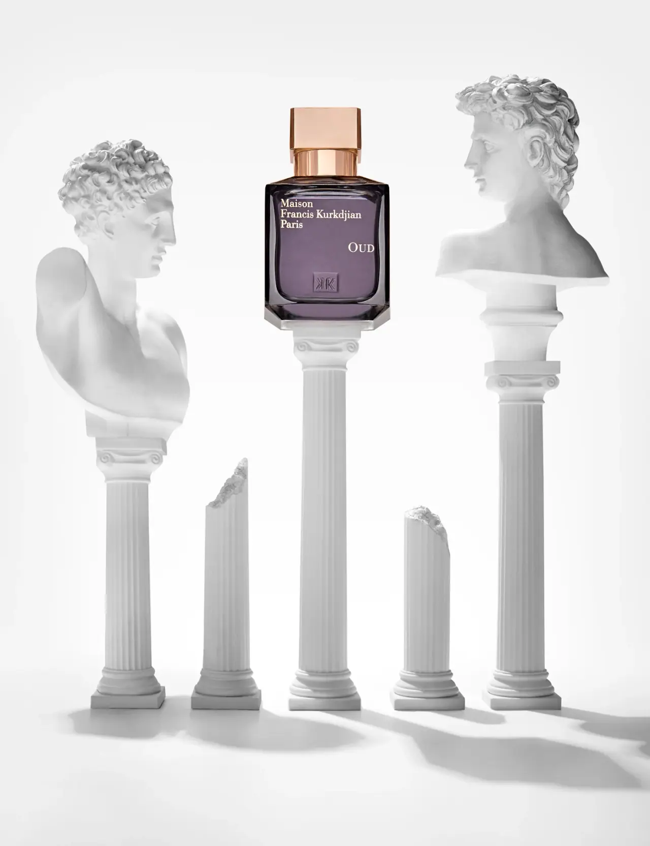
Photography: Josh Caudwell — fragrance still-life photography. Images belong to their respective owners.
Maison Francis Kurkdjian

offset ivory serif names on plum flacon beneath warm cap
The selected OUD bottle presents a dark plum-looking inner field framed by thick transparent-looking edges and a clear bevelled base. A warm reflective cap sits above a matching round collar. Small ivory serif lettering names the house at upper left, while OUD appears separately farther right and lower down. A subtle square monogram near the bottom adds another identity layer without becoming a bright printed block. The classical columns and busts belong to Josh Caudwell's still-life setting, not the perfume package.
- Perfume
- Dark pack
- Luxe monochrome
- Heritage label
About this study
Selected Josh Caudwell OUD Eau de Parfum still life with plum-looking flacon and warm cap. Exact photographed volume and date are unverified; current product source is contextual.
Sources & evidence · Reviewed 2026-10-19Color Palette
Approximate colours interpreted from photography. These are screen references, not official brand colours or print specifications.
Pack body
Muted plum appearance
#625266
Approximate central bottle appearance under the selected lighting. Tint, liquid, refraction and reflections may all contribute; this is not a verified glass-colour specification.
Deep edge shadows
#241E27
Approximate darkest side and shoulder areas. These are optical depth and reflections around the body rather than a separate confirmed ink.
Ink
Ivory serif information
#F1E9D2
Approximate house and fragrance lettering against the darker face. Actual ink or application method is unknown.
Accent
Warm metallic-looking cap
#C99B7F
Approximate copper-gold appearance of cap and collar in the photograph. Metal alloy, plating and coating are unverified.
Typography
Suggested visual alternatives, not confirmed brand typefaces. Any scale below is an illustrative estimate.
Maison, Francis Kurkdjian and Paris form a compact three-line serif block at the upper-left area of the visible face. The fragrance name occupies a distinct rightward position below that block, with a larger initial O and smaller capital-looking following letters. The two groups do not share one centred stack. Their separation creates an open middle area, while a low relief-like monogram supplies a third, less contrasty identifier. Sparse copy makes alignment and placement particularly important to the composition.
Fonts
Compact house-name alternative
Libre Baskerville
- Looks like
- Libre Baskerville for a small robust serif identity block
- Type
- Serif
- Weight
- Bold 700 / Regular 400
- Case
- Title case
- Tracking
- Natural optical spacing
- Fallback
- Georgia, serif
Set a new maker name in a short asymmetrical block and check that the longest line leaves adequate space from the bottle's optical edge. A slightly stronger serif can retain detail at small sizes, but this recommendation is not an attribution of the photographed wordmark.
Fragrance-name alternative
Cormorant Garamond
- Looks like
- Cormorant Garamond for an open, contrasting serif title
- Type
- Display serif
- Weight
- Medium 500
- Case
- Uppercase or small-cap treatment
- Tracking
- Moderate optical spacing
- Fallback
- Georgia, serif
Give a short original scent name a separate location and enough space to read independently. Do not imitate the exact OUD letter-size relationship; use the new name's own length to determine balance. Fine strokes require print and glare tests on the actual curved or bevelled face.
Structure & Proportions
Visual proportions and finish previews are illustrative. Confirmed construction details and uncertainties are distinguished in the study notes.
Proportions
| Purpose | Value | Preview |
|---|---|---|
| Cap versus body | The cap is substantially narrower than the bottle front, leaving visible shoulders on either side while still carrying a strong warm colour block. | — |
| Offset information | House and fragrance names occupy different horizontal and vertical positions, leaving more open space than a continuous centred label stack would. | — |
| Thick optical base | A clear bevelled-looking lower zone sits beneath the dark central field and creates a strong horizontal visual foundation. | — |
| Quiet lower identity | The square monogram is much smaller and lower contrast than the pale text, making it a close-view detail rather than the first reading cue. | — |
Shapes
| Element | Value | Preview |
|---|---|---|
| Flacon front | Broad near-square outer face around a more softly rounded inner field. | |
| Cap | Rectangular-looking block with flat front and narrow side planes. | |
| Collar | Short reflective cylinder between cap and shoulder. | |
| Lower monogram | Small square containing a symmetrical-looking linear mark. |
Finishes
Warm metallic-looking reflection
Cap and collar; alloy and surface process not identified. · metallic
Clear refractive edge
Especially at the bevelled-looking base and side boundaries; physical thickness is not measured. · transparent
Relief-like identity detail
Small lower square monogram, visible through shadows and tonal changes rather than a bright ink block. · emboss
Formats and materials
| Formats | Near-square frontal flacon with a thick transparent-looking lower edge, softly rounded inner shoulders and a broad rectangular-looking cap over a short cylindrical collar. |
| Materials | The photograph shows a transparent, refractive bottle appearance, but the accessed product text does not supply a complete substrate or coating specification for this pictured edition., Cap alloy, plating, tint application, lettering process and monogram construction are unverified; metallic appearance is not proof of solid metal or gold. |
| Closures | The closed cap forms a broad rectangular block with flat-looking faces and narrow darker side edges. Beneath it, a warm reflective cylindrical collar introduces a different geometry before the bottle shoulder. This contrast between square-like cap, round neck and square-like body is visible without seeing the atomizer. Attachment, magnets, friction fit, internal spray head and sealing method remain hidden. Current natural-spray product wording does not establish those details for the selected photographed presentation. |
| Decoration | Compact upper-left house-name stack., Separate rightward OUD name below the house block., Small square monogram near the lower central face., No clearly bounded paper-label panel on the selected front. |
Front Panel
Schematic reading order. The diagram’s zone heights do not represent measured artwork proportions.
This is a sparse decorated face rather than a clearly visible applied paper label. The house block begins near the upper left and follows a shared left edge. OUD sits farther right below it, creating a diagonal relationship between the two textual groups. The low square monogram occupies another quiet position near the base. Clear margins and the body's rounded inner boundary frame these elements. No concentration, quantity or complete technical footer is legible on this selected front, so none is invented as an unseen label zone.
| Zone | Content |
|---|---|
| Upper-left house | Three-line Maison Francis Kurkdjian Paris serif block. |
| Rightward fragrance | OUD, separated spatially from the house rather than centred beneath it. |
| Open middle field | Muted plum-looking area with little additional visible text. |
| Low monogram | Small square relief-like symbol above the clear base. |
Range System
The current official source confirms an OUD Eau de Parfum product with natural-spray size options. The selected archival-looking photograph is analysed as its own presentation: its exact capacity and production date are not established by the front. The separate OUD Extrait should not be substituted for this reference, and current assortment images should not silently replace the pictured typography, cap colour or body appearance.
- Selected reference: plum-looking front, warm cap, offset pale serif names and low monogram.
- Current source context: OUD Eau de Parfum, kept distinct from the separate Extrait product.
- Original design exercise: balance two small information groups through position instead of making one very large title.
Back of Pack & Shelf
The reverse, underside, atomizer and any outer carton are unseen. The selected front does not reveal quantity or a complete regulatory information system. A current product page supplies commercial identity, not a reliable map of hidden panels on an older photograph.
- Inspect the underside before assigning volume or batch-code placement.
- Open the cap before describing actuator shape or attachment.
- Obtain production evidence before labelling the monogram as moulded, etched or separately attached.
On shelf
Interpretation: the warm cap over a dark near-square body provides a stronger distant cue than the relatively small pale names. At closer range, the offset hierarchy rewards a left-to-right scan and avoids a conventional centred stack. The clear bevels and lower monogram may become harder to see against a dark shelf background. An original design using this principle should be tested without the white architectural setting, since the photograph contributes much of the contrast around the bottle edges.
Imagery
The bottle stands on the tallest of several narrow fluted white columns, with classical busts arranged on either side and broken shorter columns below. The almost monochrome setting gives the plum face and warm cap unusual colour prominence. Caudwell's retained image provenance identifies this as still-life photography; the props are not a presentation box or supplied display stand. The brand's current fragrance narrative mentions marble and gold imagery, but that thematic affinity does not establish a commission brief or the material of the photographed sculptures.
Guidelines
Editorial principles for an original design brief, not official brand guidelines.
Do
- Use position to separate house identity from a short fragrance name.
- Consider cap colour and silhouette alongside the decorated bottle face.
- Test optical edges against backgrounds beyond the hero photograph.
- Keep current source context separate from unidentified archival size or edition.
Don't
- Do not treat classical props as included packaging.
- Do not identify solid gold, plating or tint process from appearance alone.
- Do not substitute OUD Extrait specifications for the Eau de Parfum reference.
- Do not copy the house wordmark, monogram or exact offset composition.
Sources & evidence
- Maison Francis Kurkdjian — OUD Eau de Parfumproduct
- Josh Caudwell — still-life photography portfolio, retained image provenancephotographer
How this study was built
context · Sourced fact
Official source confirms OUD Eau de Parfum and natural-spray context, with marble/gold imagery in its narrative.Maison Francis Kurkdjian — OUD Eau de Parfumimagery · Sourced fact
Curation preserves the selected Caudwell still-life asset; photographer portfolio accessed for provenance.Josh Caudwell — still-life photography portfolio, retained image provenancetypography · Visual observation
House block sits upper-left; OUD is separate and farther right/lower, with a quiet monogram below.Josh Caudwell — still-life photography portfolio, retained image provenancestructure · Visual observation
Rectangular-looking cap, cylindrical collar and thick clear-looking base create contrasting geometries.Josh Caudwell — still-life photography portfolio, retained image provenancepalette · Visual observation
Plum body, warm cap and ivory lettering are distinct from the white architectural setting.Josh Caudwell — still-life photography portfolio, retained image provenanceshelf · Editorial interpretation
The sparse front should be tested away from the high-contrast white hero setting.
What remains unverified
- Exact photographed volume, production date and full component materials are unverified.
- Tint, cap coating, lettering and monogram manufacturing processes are unknown.
- Fonts and physical dimensions are visual interpretations rather than identified specifications.
- Reverse, underside, atomizer and outer carton are unseen; columns and sculptures are staging.
Give your AI
packaging taste
Give your design or image tool a packaging study: palette, type, structure, front panel and principles for an original brief.
Export this styleFree with an email. PACK.md works in Claude, ChatGPT, Cursor and image tools.
More like this

Aerangis
a quiet numbered object, an intimate scent memory

Alexander McQueen
An oval flacon crowned with dense black relief

Arquiste
blush transparency, white lettering and a stepped gold cap

Chabaud
A framed perfume label beneath a clear architectural cap
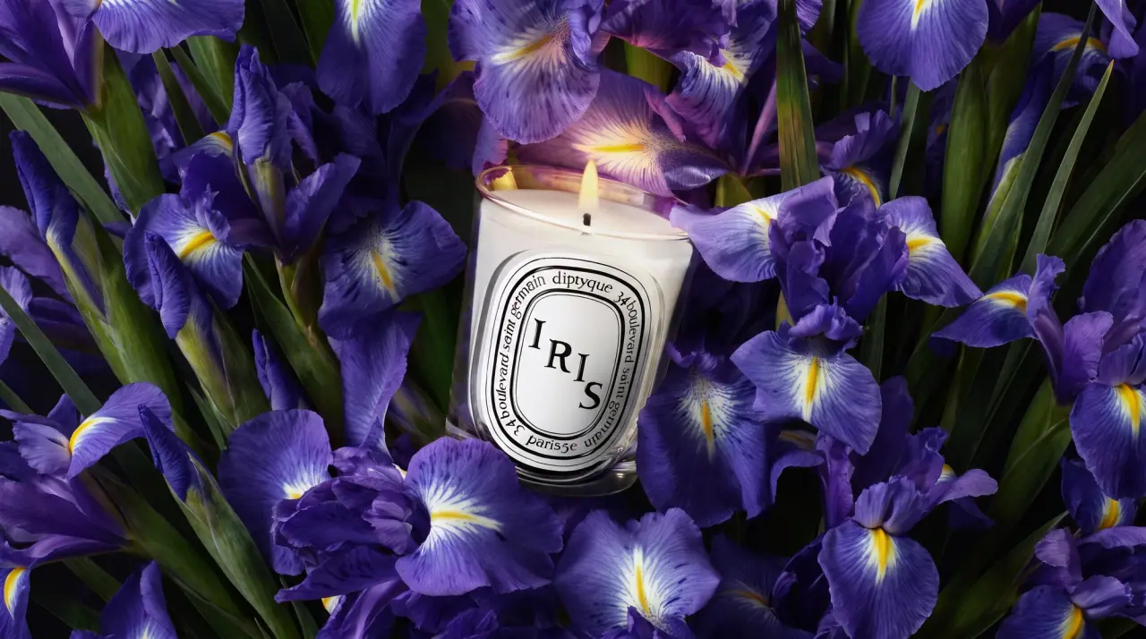
Diptyque
engraved oval labels on clear glass
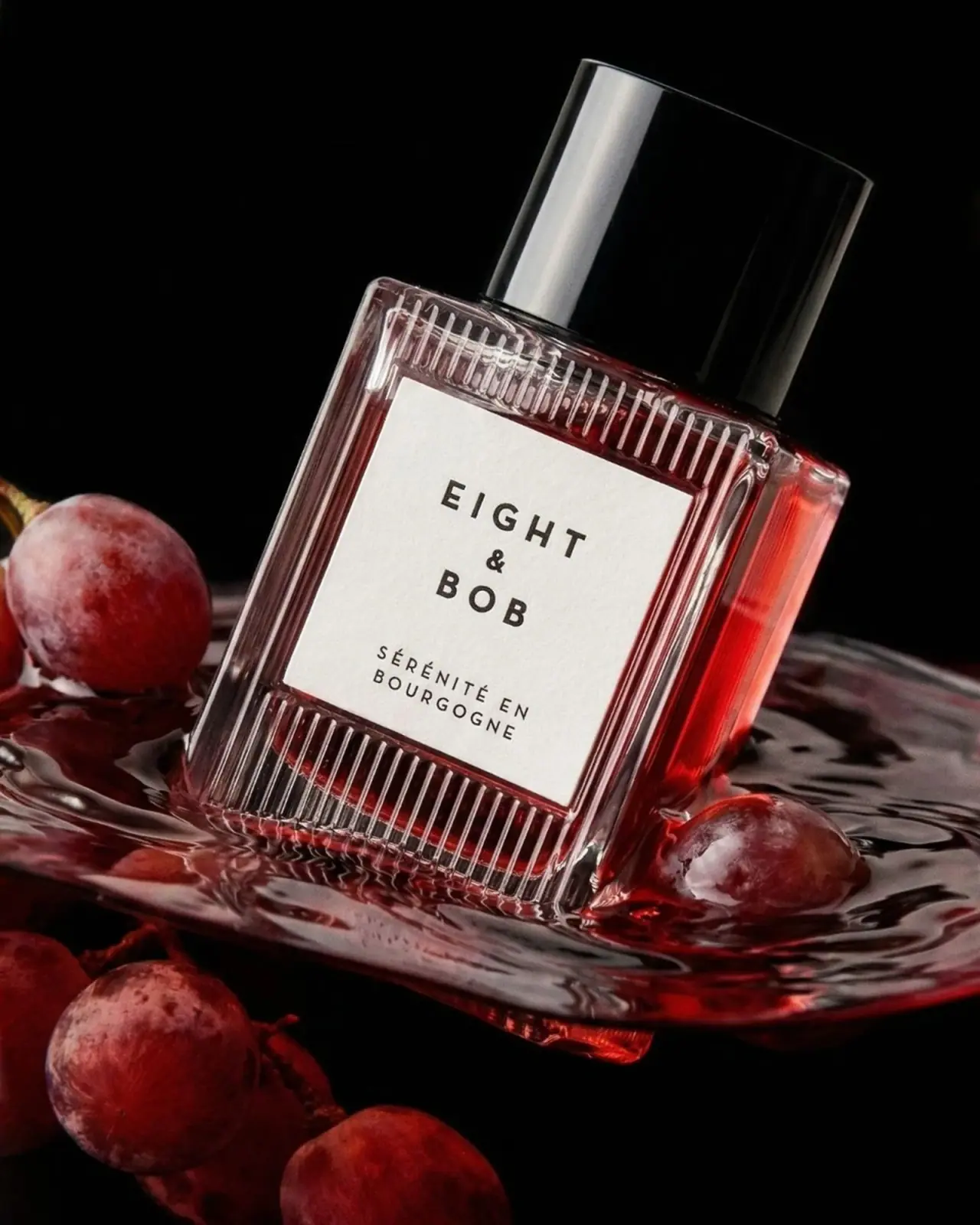
Eight & Bob
Ribbed red flacon, pale label and polished black cap
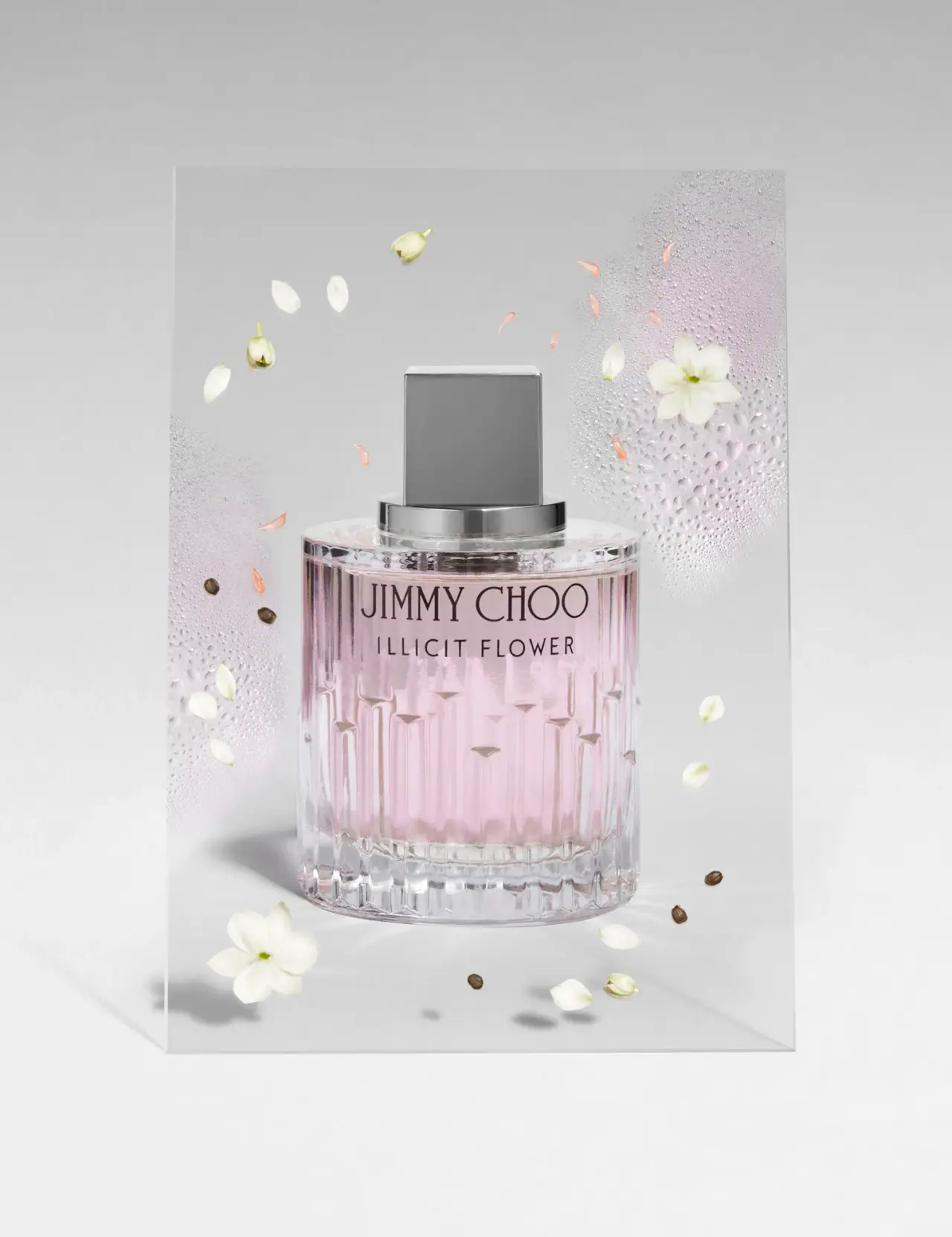
Jimmy Choo
Blush transparency, staggered flutes and a silver square cap
Lumière de Lily
Banded onyx framed by a black label and golden emblem