About this packaging
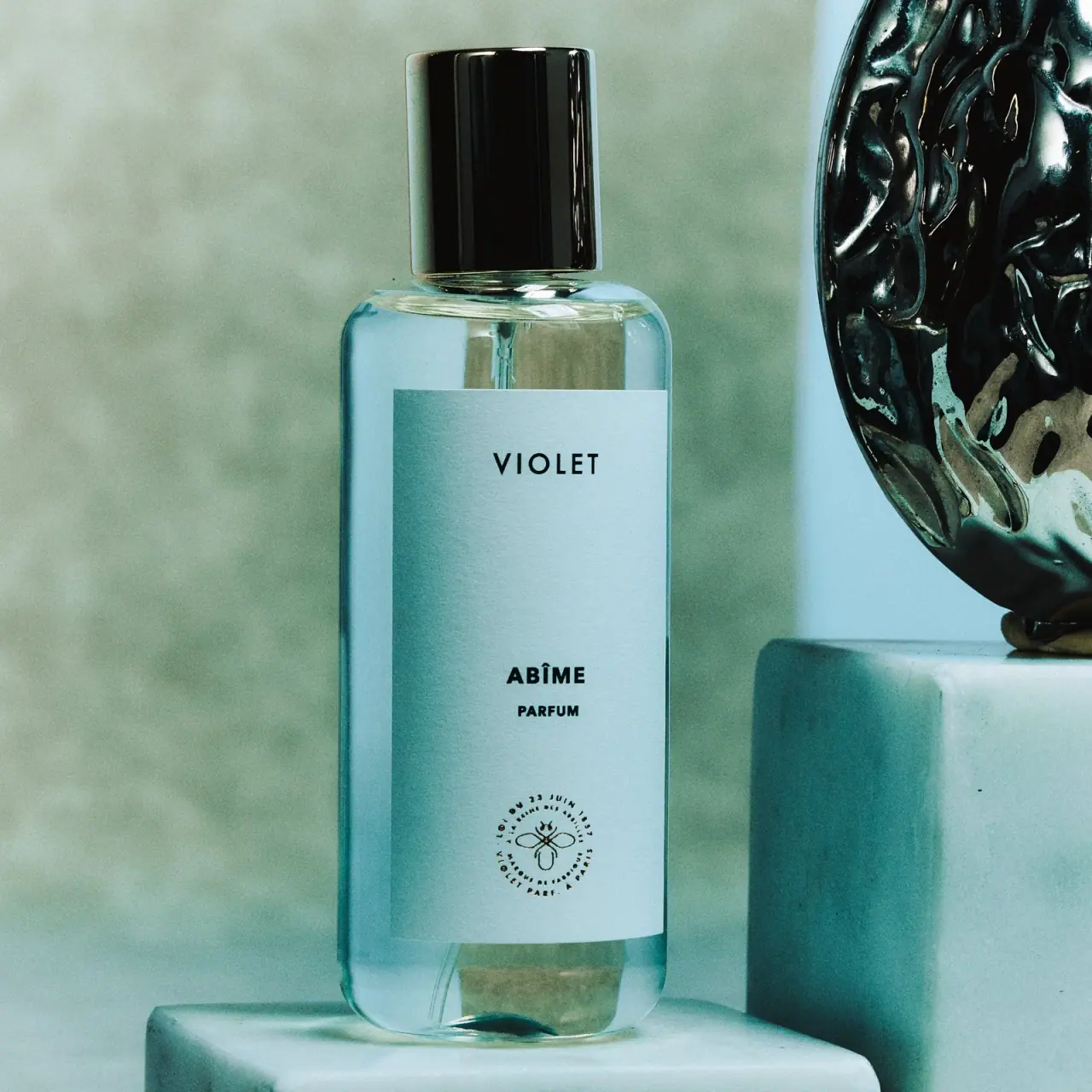
Maison Violet’s Abîme is shown in a clear rectangular perfume bottle with a pale blue front label and a sculptural dark cap. The selected cover uses restrained labeling and a cool-toned setting, allowing the cap silhouette and bottle proportions to establish the identity.
Maison Violet lists Abîme in 50 mL and 100 mL sizes. The brand says its perfume bottles use 50% less glass, without identifying a comparison baseline.[1]
Pack construction & use
- Bottle
- Maison Violet makes a brand-level claim that its perfume bottles use 50% less glass; it does not state the comparison baseline. The selected image shows a clear rectangular bottle with broad shoulders and a pale blue label.[1]
- Label and cap
- A black cap tops the bottle. The large pale-blue rectangular label stacks VIOLET, ABÎME, PARFUM, and a small circular emblem.Observed in the reference photograph
What makes the design work
Editorial analysis of this packaging reference.
Quiet label, distinctive top
The label is deliberately sparse, leaving the tall black cap to serve as the strongest silhouette cue. That contrast gives the fragrance a memorable profile without requiring decorative graphics across the bottle face.
Tiered naming
VIOLET appears first, Abîme below, and PARFUM in smaller type, followed by the emblem. The hierarchy separates house, scent, and product type while using a single centered column.
Cool color repeats the mood
The label appears pale blue in the cool sea-green setting, while the glossy dark cap creates a strong upper anchor. The transparent body transmits and reflects the scene, so its cyan appearance does not establish a fixed glass tint.
Ideas for your next brief
- Reserve one strong silhouette feature for recognition when the front label is minimal.
- Separate house name, fragrance name, and product type through scale and spacing within a simple centered stack.
Sources & further reading
Researched 19 October 2026