Photography: Maison Violet official photography. Images belong to their respective owners.
Maison Violet

widely spaced black names on a tall cool label
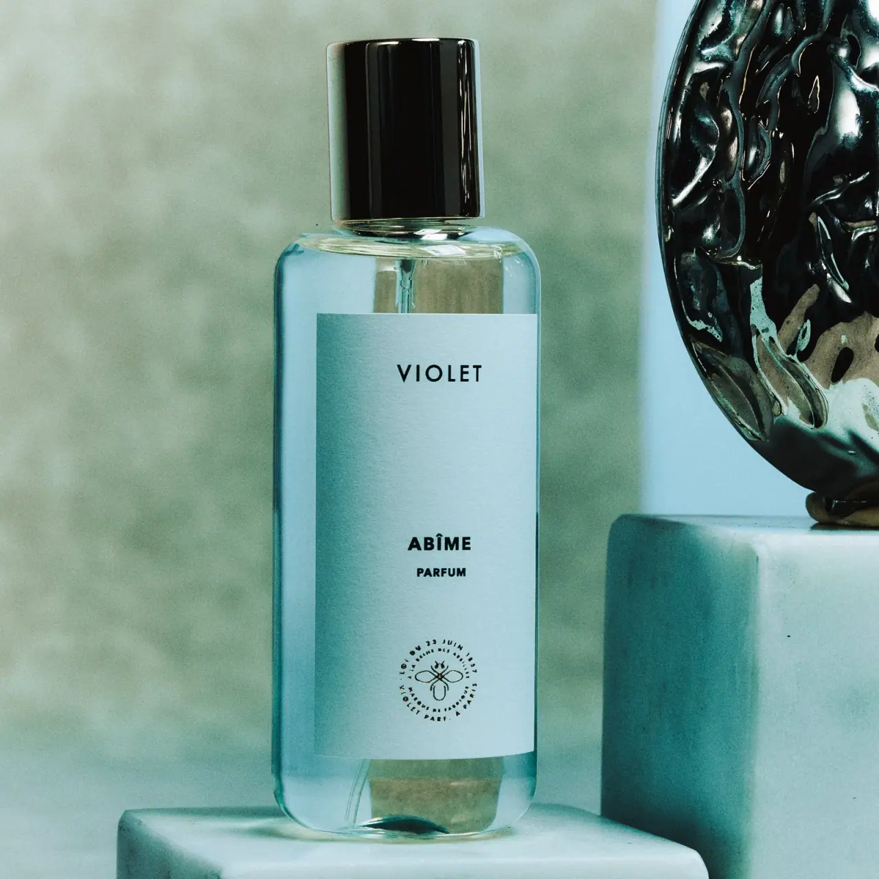
Abîme Parfum is shown in a tall transparent-looking bottle with rounded shoulders, a broad pale blue-looking label and a glossy dark cylindrical cap. The front is unusually spacious: VIOLET sits high, ABÎME and PARFUM form a smaller lower group, and a tiny circular emblem occupies its own position near the base. The cool green-blue setting influences the apparent colour of both the label and the clear body. A dark sculptural prop at the side belongs to the photograph, not the closure.
- Perfume
- Light pack
- Clinical minimal
- Heritage label
About this study
Selected official Abîme Parfum mood photograph with pale label and dark cylindrical cap. Exact pictured capacity is not legible; scene colour is not a verified tint specification.
Sources & evidence · Reviewed 2026-10-19Color Palette
Approximate colours interpreted from photography. These are screen references, not official brand colours or print specifications.
Pack body
Glossy dark cap
#101615
Approximate cap body appearance. Bright turquoise and white streaks are reflected scene light, not additional verified cap colours.
Label
Cool pale panel
#A5CBD0
Approximate label appearance in the selected cool lighting. The photograph does not establish a calibrated paper colour independent of the scene.
Ink
Black naming and seal
#111816
Approximate maker, fragrance, concentration and small emblem. Their different weights produce hierarchy within one dark-looking ink system.
Typography
Suggested visual alternatives, not confirmed brand typefaces. Any scale below is an illustrative estimate.
VIOLET appears as widely spaced uppercase sans-serif lettering high on the label. Far below, ABÎME is heavier and more compact, with a smaller bold PARFUM line beneath it. The lower emblem contains very small circular lettering around a bee-like central mark, introducing a heritage detail at a much finer scale. These are three separate information islands rather than a continuous paragraph. The maker is larger and more open, while the short scent name gains emphasis through weight despite its lower position.
Fonts
Spaced maker alternative
Work Sans
- Looks like
- Work Sans for a restrained uppercase maker line
- Type
- Sans serif
- Weight
- Medium 500
- Case
- Uppercase
- Tracking
- Open optical spacing
- Fallback
- Arial, sans-serif
Give a new short maker name generous letter spacing without making the gaps so wide that it breaks into individual letters. Position it as a distinct upper group, but use different proportions and margins from the selected label. The family is not an attribution of the VIOLET wordmark.
Fragrance and concentration alternative
Inter
- Looks like
- Inter for compact bold product identification
- Type
- Sans serif
- Weight
- Bold 700 / ExtraBold 800
- Case
- Uppercase
- Tracking
- Natural to slightly tight
- Fallback
- Arial, sans-serif
Set the scent name more heavily than the maker and place a smaller concentration line nearby. Test the accent over the name at actual size and avoid reducing concentration text excessively. A new heritage or provenance detail should be independently drawn rather than recreating the circular bee emblem.
Structure & Proportions
Visual proportions and finish previews are illustrative. Confirmed construction details and uncertainties are distinguished in the study notes.
Proportions
| Purpose | Value | Preview |
|---|---|---|
| Tall reading panel | The label covers much of the body's height while leaving clear margins above, below and along the sides. | — |
| Three separated groups | Maker, scent/concentration and emblem are spaced far enough apart to read as distinct islands within one centred column. | — |
| Dark upper mass | The cap is tall relative to its width and forms a stronger distant silhouette cue than the small label typography. | — |
| Quiet lower seal | The circular emblem is compact compared with the panel, rewarding close inspection without filling the large blank areas. | — |
Shapes
| Element | Value | Preview |
|---|---|---|
| Bottle body | Tall near-parallel sides, rounded shoulders and softly curved base corners. | |
| Cap | Smooth dark cylinder with a nearly flat top in the selected view. | |
| Label | Broad portrait rectangle that follows the front curvature slightly at its lower edge. | |
| Heritage emblem | Small circular text arrangement around a bee-like linear central figure. |
Finishes
Glossy cap
Dark cylindrical closure, where bright narrow reflections reveal curvature. No coating or substrate is identified. · gloss
Transparent body
Bottle margins and shoulder transmit the cool setting; no fixed blue tint is established. · transparent
Diffuse label field
Pale front panel, which appears more even than the surrounding refractive body. · matte
Formats and materials
| Formats | Selected tall rounded-rectangular-looking transparent bottle with a broad portrait label, rounded shoulders and a tall dark cylindrical cap; no quantity is legible on this front. |
| Materials | The official brand FAQ describes its bottle in glass terms and claims a reduction relative to an unspecified baseline; it does not provide a complete specification for this photographed unit., Cap material, label stock, adhesive, bottle tint and decoration processes are unverified. Cool transmitted colour in the image is not sufficient evidence of blue glass. |
| Closures | The cap is a smooth tall cylinder with a flat-looking top and glossy vertical reflections. Its width is noticeably narrower than the body but substantial enough to create a strong dark upper mass. A thin reflective neck area remains visible beneath it. The selected bottle is closed, so the actuator, attachment method, seal and any internal liner are unseen. The adjacent sculptural object's deep relief and irregular shape should not be confused with the cap's comparatively simple surface. |
| Decoration | Spaced upper maker line., Heavy short scent name paired with smaller concentration wording., Small circular emblem and fine perimeter lettering near the lower label., Large unprinted-looking intervals between the three text groups. |
Front Panel
Schematic reading order. The diagram’s zone heights do not represent measured artwork proportions.
A single centred axis connects the upper maker, lower scent pair and small seal. The dominant feature is the amount of empty space between those groups. VIOLET sits near the upper portion but not against the edge; ABÎME and PARFUM occupy a compact block lower down; the emblem remains separated near the base. This gives each item a clear role without rules, colour bands or illustration across the panel. The tiny circular lettering is visible as a graphic texture, but its complete wording is not reliably transcribed from this photograph.
| Zone | Content |
|---|---|
| Maker | Widely spaced uppercase VIOLET near the upper label. |
| Open interval | Large pale field separating house identity from scent. |
| Scent and concentration | Bold ABÎME above smaller bold PARFUM. |
| Lower emblem | Circular fine lettering around a bee-like mark, set apart from the scent group. |
Range System
The official page offers 50 mL and 100 mL versions, but the selected front does not reveal its capacity. The label's visual system is therefore documented without assigning a size from the current default selector. Similarly, the brand's statement about using 50% less glass lacks a comparison baseline and is not treated as a measured environmental result for this image. Other Maison Violet fragrances would need their own front review before extending the layout or colour observations.
- Selected Abîme: cool pale panel, black three-part hierarchy and glossy cylindrical cap.
- Current source offers two capacities; photographed capacity remains unconfirmed.
Back of Pack & Shelf
The reverse, underside, open atomizer and box are unseen. Quantity, batch marking, ingredient panel and application instructions cannot be located from this front. A broad brand packaging statement does not establish the selected label's fibre content or the cap's composition.
- Check the underside or original product record to establish photographed capacity.
- Inspect the opened closure before describing attachment or dispenser geometry.
- Keep brand-level reduction claims separate from exact component specifications and measured outcomes.
On shelf
Interpretation: the dark cap and tall pale rectangle form the most immediate recognition pattern. Sparse centred words can remain easy to locate, but their small scale means the identity may be read later than the silhouette. The lower concentration line and seal risk disappearing at distance. A new design using wide vertical spacing should test both eye-level and lower-shelf views, and verify that the label remains recognisable when the cool scenic light is replaced by ordinary retail illumination.
Imagery
Cool green and blue surfaces surround the bottle, with a dark highly reflective sculptural object at the right and pale plinths below. Their shadows and reflections pass through the clear body, giving it a stronger cyan appearance than would necessarily occur on a neutral background. The smooth bottle and sparse label contrast with the prop's irregular relief. This setting creates atmosphere without printing those textures on the package, and it should not be used to infer tinted glass, mineral ingredients or a supplied display object.
Guidelines
Editorial principles for an original design brief, not official brand guidelines.
Do
- Use spacing to separate house, scent and concentration without adding unnecessary panels.
- Check accents and small bold text at the final reproduction size.
- Distinguish transmitted scene colour from a verified bottle tint.
- Keep a heritage detail small enough to support rather than compete with the product name.
Don't
- Do not describe the adjacent sculptural prop as cap decoration.
- Do not assign the current default capacity to a photograph without a readable marking.
- Do not turn an unqualified glass-reduction claim into a quantified environmental benefit.
- Do not reproduce the VIOLET name, circular seal or exact three-island layout.
Sources & evidence
How this study was built
context · Sourced fact
Official Abîme page offers 50 mL and 100 mL options; neither is assigned solely from the selected front.Maison Violet — Abîme, official product and brand FAQstructure · Sourced fact
Brand FAQ makes a glass-reduction claim without specifying its comparison baseline.Maison Violet — Abîme, official product and brand FAQtypography · Visual observation
Spaced upper maker, heavier lower scent/concentration and small circular emblem form three separated groups.Maison Violet — Abîme, official product and brand FAQstructure · Visual observation
Smooth glossy dark cylinder caps the rounded-shoulder bottle; the sculptural object is beside it.Maison Violet — Abîme, official product and brand FAQpalette · Visual observation
Cool light and surrounding objects affect the transparent body's apparent cyan colour.Maison Violet — Abîme, official product and brand FAQshelf · Editorial interpretation
Large empty intervals and small concentration text need realistic viewing-distance checks.
What remains unverified
- Generic URL unavailable to web-reader; regional official page accessed successfully.
- Photographed capacity, exact glass specification, cap material and label stock are unknown.
- Fonts, physical measurements, decoration and closure attachment are unverified.
- Reverse, underside and atomizer are unseen; cool scene influences colour appearance.
Give your AI
packaging taste
Give your design or image tool a packaging study: palette, type, structure, front panel and principles for an original brief.
Export this styleFree with an email. PACK.md works in Claude, ChatGPT, Cursor and image tools.
More like this
Maison Louis Marie
left-aligned serif title card within clear square perfume geometry
Tatcha
mint tube with a purple crest and stacked gold letters

Aerangis
a quiet numbered object, an intimate scent memory

Alexander McQueen
An oval flacon crowned with dense black relief
Apotheke
White holiday vignettes with a warm golden interior

Arquiste
blush transparency, white lettering and a stepped gold cap
Atelier des Ors
Golden constellation framing a compact name on amber transparency
Bijou Candles
Pink blackletter and fine webs on a tall dark candle