About this packaging
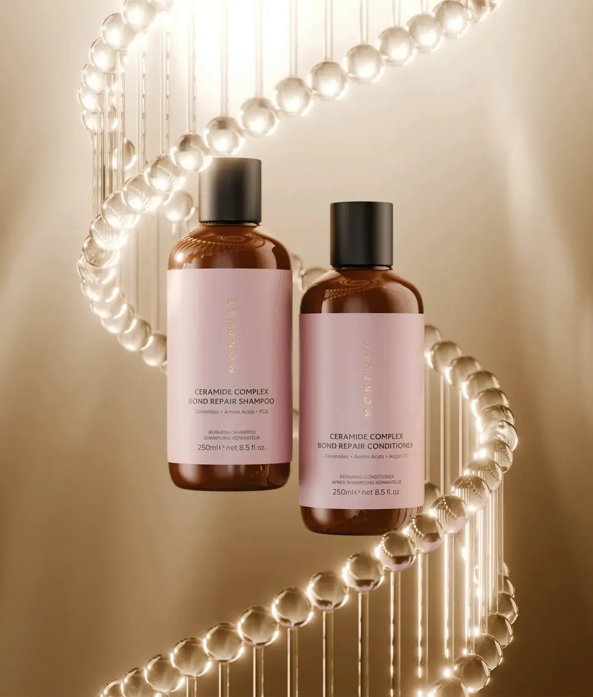
MONPURE’s Ceramide Complex Bond Repair Shampoo and Conditioner appear as a matched pair of amber-toned bottles with pale rose labels and black caps. Consistent label placement lets the two product names distinguish the routine steps.
MONPURE’s official product page identifies the Ceramide Complex Bond Repair Shampoo and Conditioner as a paired set. The selected pack image shows each bottle marked 250 ml / 8.5 fl oz.[1]
Pack construction & use
- Product pair
- The official page groups the Ceramide Complex Bond Repair Shampoo and Conditioner together.[1]
- Bottle size
- Each selected bottle is marked 250 ml / 8.5 fl oz.Observed in the reference photograph
- Bottle / closure
- Both bottles have amber-toned cylindrical bodies, broad pale rose labels, and black caps.Observed in the reference photograph
What makes the design work
Editorial analysis of this packaging reference.
Color blocks set the roles
The amber bottle, large pale pink label and black cap create three distinct surfaces. Keeping this structure constant across both products lets the changing product names do the differentiation.
Routine pairing through proportion
The shampoo and conditioner share the same 250 ml scale and silhouette, presenting a coordinated wash pair rather than unrelated products. Repeated label placement supports that unity.
Vertical centreline above practical naming
MONPURE runs vertically in small gold-looking letters near the centre of the upper rose label. A compact horizontal block below identifies Ceramide Complex Bond Repair and the shampoo or conditioner step, with supporting ingredient and bilingual format lines.
Ideas for your next brief
- Keep the same bottle and label grid across a pair, using the product name to distinguish shampoo from conditioner.
- Use label color as the strongest shared range cue, with cap and container tones forming consistent supporting bands.
Sources & further reading
Researched 19 October 2026