About this packaging
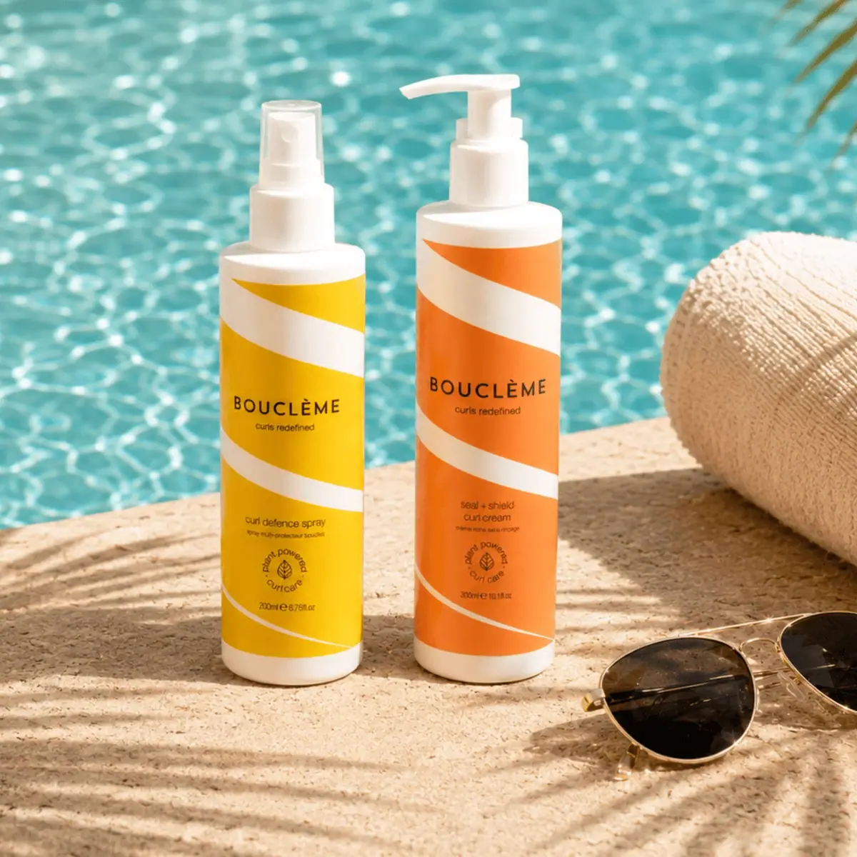
Bouclème’s summer set brings two complementary curl products together under one coordinated seasonal graphic system.
The official listing identifies the duo contents as Seal + Shield Curl Cream (300 mL) and Curl Defence Spray (200 mL). It describes the set as a summer routine for curls, not a single combined container.[1]
Pack construction & use
- Set contents
- Bouclème identifies this set as a 300 mL Seal + Shield Curl Cream and a 200 mL Curl Defence Spray. The selected cover displays the pair with coordinated warm-colored graphics.[1]
- Label bands
- The broad white diagonal bands cross yellow and orange fields, with black wordmark and smaller product text. The photography shows the graphics wrapping the containers; no material claim is made.Observed in the reference photograph
What makes the design work
Editorial analysis of this packaging reference.
Diagonal bands create motion
The broad white stripes interrupt otherwise horizontal containers and create a forward slant across the set. Warm yellow and orange fields keep the two products visually related while allowing each label to stay compact.
Wordmark as stable anchor
Bouclème’s centered black lettering sits across the diagonal graphics, providing a fixed alignment point. This is a useful way to preserve brand consistency when pack artwork uses directional shapes.
Set identity over individual art
The repeated pattern reads across the pair before each small product name is read. For a duo, shared graphics can make the combined offer clear while secondary text handles the individual role.
Ideas for your next brief
- Carry a diagonal motif across a set to create visual motion and shared identity.
- Keep the wordmark aligned consistently so it remains a stable reference across patterned pack faces.
Sources & further reading
Researched 19 October 2026