Photography: Monpure official photography. Images belong to their respective owners.
Monpure

Amber duo with rose labels and vertical gold identities
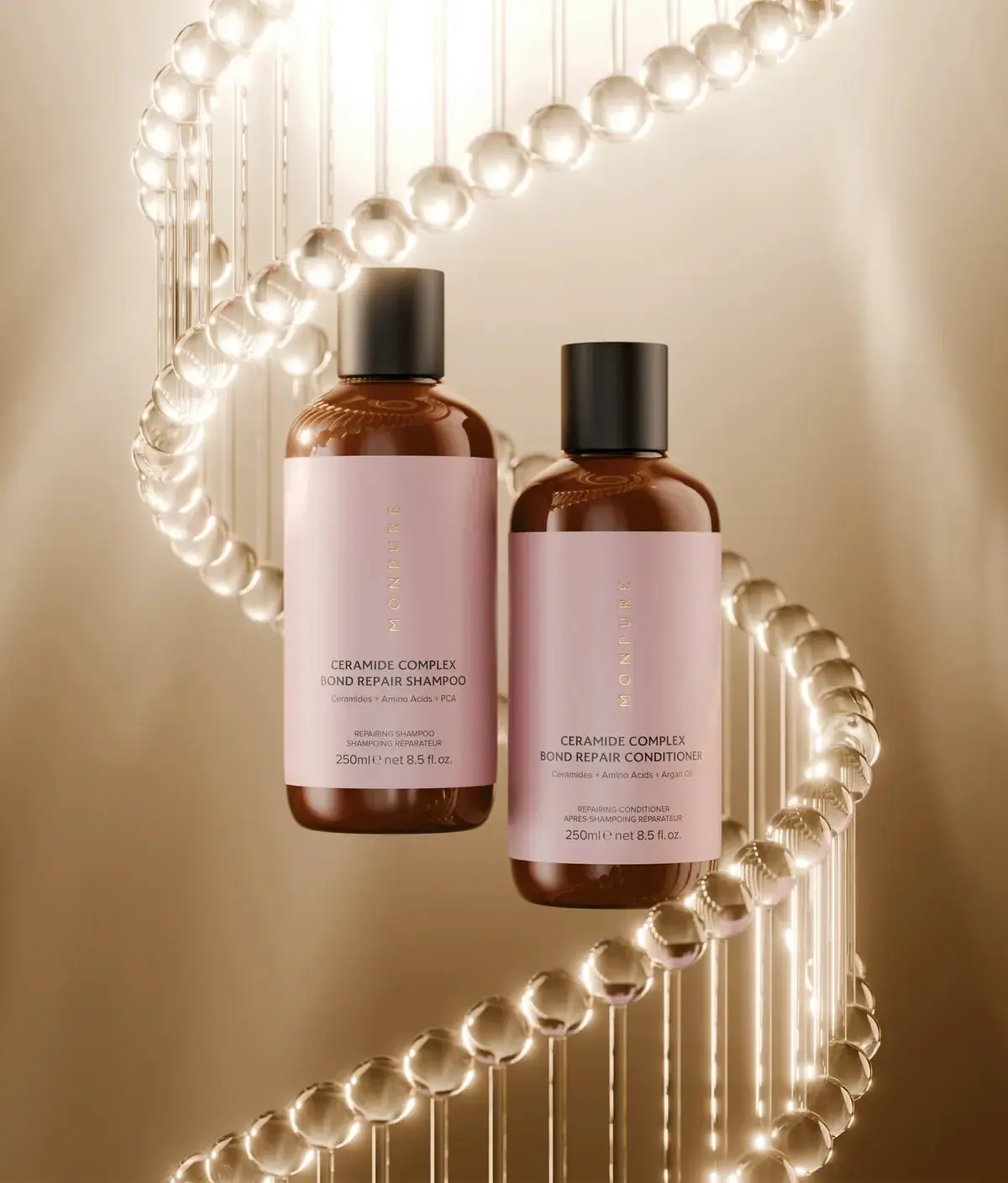
The selected Ceramide Complex Bond Repair pair uses matching amber-looking bottles, large pale-rose wrap labels and plain black cylindrical caps. MONPURE runs vertically in small gold-looking letters near the centre of each label, above a compact horizontal product block. Shampoo and conditioner are distinguished through wording and supporting ingredient lines rather than different label colours. The bottles are staged at different heights inside a luminous helix-like prop; that scene is a science cue, not a physical packaging component or proof of a biological mechanism.
- Hair
- Light pack
- Clinical minimal
- Apothecary
About this study
Selected matched Ceramide Complex shampoo/conditioner duo, each visibly 250 ml. Component materials and cap mechanism unverified.
Sources & evidence · Reviewed 2026-10-19Color Palette
Approximate colours interpreted from photography. These are screen references, not official brand colours or print specifications.
Pack body
Amber-brown vessel appearance
#80441F
Approximate warm body colour with glossy reflections. Amber appearance does not establish glass, polymer or UV-filtering performance.
Black cap
#2D2925
Plain short cylindrical cap on each bottle. Its appearance is darker and quieter than the glossy amber shoulder.
Label
Pale rose wrap
#DABFC0
Large shared label field on both bottles, with subtle shifts caused by warm lighting.
Ink
Charcoal product copy
#34302E
Horizontal product names, ingredient summaries, bilingual descriptors and quantity.
Accent
Gold-looking vertical producer
#C7AD79
Small vertical MONPURE lettering, reflective in the image. Foil or another metallic printing process is not verified.
Typography
Suggested visual alternatives, not confirmed brand typefaces. Any scale below is an illustrative estimate.
MONPURE is rotated as a vertical word along the central upper label area, rather than placed at the side edge. The large pale field around it creates a quiet identity zone. Below, CERAMIDE COMPLEX sits above BOND REPAIR SHAMPOO or BOND REPAIR CONDITIONER in dark uppercase. A smaller ingredient-summary line follows, then a separated English/French format pair and the 250 ml / 8.5 fl oz quantity. Both products share this order, making the changing shampoo/conditioner wording the principal distinction.
Fonts
Vertical producer alternative
Montserrat
- Looks like
- Montserrat
- Type
- Geometric sans serif
- Weight
- Light 300 / Regular 400
- Case
- Uppercase
- Tracking
- Wide
- Fallback
- sans-serif
A proposed light uppercase identity rotated along the label’s central axis. Use a unique producer name and test reflective treatment carefully because pale gold on rose can lose contrast.
Product and practical information alternative
Inter
- Looks like
- Inter
- Type
- Sans serif
- Weight
- Regular 400 / Medium 500
- Case
- Uppercase titles and bilingual descriptors; mixed-case ingredient line
- Tracking
- Neutral
- Fallback
- sans-serif
Use clear horizontal copy for the routine step and product description. Keep SHAMPOO and CONDITIONER readable at actual bottle scale since colour and silhouette do not differentiate the pair.
Structure & Proportions
Visual proportions and finish previews are illustrative. Confirmed construction details and uncertainties are distinguished in the study notes.
Proportions
| Purpose | Value | Preview |
|---|---|---|
| Large label field | The rose wrap covers most of the straight body height while preserving amber bands at shoulder and base. | — |
| Vertical identity area | The small gold-looking word occupies the open upper half of the label, centred rather than aligned to an edge. | — |
| Lower product stack | The horizontal name, ingredient line, bilingual descriptor and quantity form a compact group near the lower label region. | — |
| Paired silhouette | Both bottles appear to share the same format; their different image heights come from staging, not confirmed size variation. | — |
Shapes
| Element | Value | Preview |
|---|---|---|
| Bottle body | Straight cylinder with rounded shoulders and softly curved base. | |
| Black cap | Short plain cylinder, closed in the selected image. | |
| Rose wrap label | Broad rectangular field around the straight body. |
Finishes
Glossy amber appearance
Exposed body and shoulders; substrate unknown. · gloss
Diffuse rose label
Large front information field; stock and coating unknown. · matte
Gold-looking producer
Small vertical lettering; process unverified. · metallic
Formats and materials
| Formats | Two matching rounded-shoulder cylindrical bottles form a shampoo-and-conditioner duo. The official page confirms the paired product, and both photographed labels visibly state 250 ml / 8.5 fl oz. |
| Materials | The accessed exact duo page does not establish the bottle substrate, cap polymer, label stock or recycled content. The amber colour and glossy highlights are insufficient to infer glass., The gold-looking producer lettering is a visible finish cue, not a verified foil specification. The luminous helix-like structure belongs to the photographic scene and is not part of the package. |
| Closures | Each bottle has a plain black cylindrical cap with a clear seam at the neck. Both are closed. Outlet type, disc-top or screw mechanism, internal seal and removability are not visible, so no specific dispensing hardware is assigned. |
| Decoration | A broad rose rectangle wraps most of each straight body, leaving an amber shoulder above and a narrow exposed band below., The decoration is almost entirely typographic, with no visible botanical illustration or ingredient icon on the front. Repeated proportions and colour provide the pair’s coherence. |
Front Panel
Schematic reading order. The diagram’s zone heights do not represent measured artwork proportions.
Both labels use a quiet upper identity zone and a denser lower product zone. The producer is vertical and centred, while all functional information below is horizontal and centred. This change of direction gives the label distinction without adding a second colour block. The pair remains visually consistent, which makes the exact routine-step wording essential for differentiation.
| Zone | Content |
|---|---|
| Vertical producer | Widely spaced gold-looking MONPURE letters run along the central upper label. Generous rose space surrounds the narrow word. |
| Treatment and step | CERAMIDE COMPLEX sits above the specific BOND REPAIR SHAMPOO or CONDITIONER line in dark uppercase. |
| Ingredient summary | The shampoo front names ceramides, amino acids and PCA; the conditioner substitutes argan oil in its supporting line. These visible text differences provide a secondary distinction. |
| Bilingual format and quantity | Small English/French descriptors sit above 250 ml / 8.5 fl oz at the bottom. This shared scale reinforces the coordinated pair. |
Range System
The exact official page groups the two Ceramide Complex products as a duo and describes their different supporting ingredient stories. The photograph shows a deliberately matched label system, with product wording carrying most of the distinction. This is a specific pair study; other Monpure products and colour systems have not been visually audited here.
- An original wash pair can share colour and form while using clear product names to separate steps. Test quick identification under bathroom lighting, where small supporting copy may be less visible than in a studio image.
- A vertical producer can give a large plain label character, but its orientation should not force the functional product name to rotate too. Keep routine-step information in a familiar reading direction.
Back of Pack & Shelf
The rear labels, cap tops and open dispensers are unseen. Full ingredients, directions, batch coding and recycling symbols cannot be reconstructed from the front pair.
- Use reverse images for each product because their functional information may differ despite matching fronts.
- Verify closure hardware before describing squeeze, pour or pump use.
- Keep material specifications unassigned until exact component evidence is available.
On shelf
The rose label blocks and black caps should make the duo read as one family before the small vertical producer is legible. Shampoo and conditioner rely on dark lower wording, so matching appearance creates both coherence and a need for clear step identification. This is visual interpretation rather than a tested usability finding. A side-by-side neutral image at equal height would be useful for comparing the exact label differences without the helix or perspective effects.
Imagery
The two bottles appear suspended at staggered heights within a clear luminous helix-like structure against a warm beige background. The prop repeats curves and vertical connections, introducing a scientific visual association around a restrained package. Reflections from its bright spheres appear on the amber shoulders. The image does not establish a molecular model, DNA interaction or a material component of the bottles; those associations remain part of the campaign’s visual language.
Guidelines
Editorial principles for an original design brief, not official brand guidelines.
Do
- Keep the vertical producer centred as observed.
- Make shampoo and conditioner wording easy to distinguish.
- Record the visible 250 ml size for each bottle.
- Treat the helix as campaign imagery, not a product mechanism.
Don't
- Do not infer glass from amber colour.
- Do not claim gold foil without source confirmation.
- Do not interpret staggered staging as different bottle capacities.
- Do not invent cap dispensing hardware from the closed view.
Sources & evidence
How this study was built
edition · Sourced fact
Official exact page confirms paired shampoo and conditioner and distinct supporting ingredient context.Ceramide Complex Bond Repair Shampoo + Conditioner — MONPUREstructure · Visual observation
Matching amber-looking capped cylinders each show 250 ml / 8.5 fl oz.typography · Visual observation
Gold-looking producer runs vertically in label centre above horizontal dark product block.label · Visual observation
Shared rose grid differs through shampoo/conditioner naming and PCA versus argan-oil summary.palette · Visual observation
Rose, amber, black and gold-looking identity are the package colours, separate from beige helix scene.imagery · Visual observation
Bottles are staged at unequal heights beside a luminous helix-like prop.range · Editorial interpretation
Matched appearance requires readable step naming; no universal brand colour system inferred.
What remains unverified
- Amber bottle substrate, cap mechanism, label stock and gold process unverified.
- Helix-like scene prop does not establish biological mechanism or package component.
- Reverse labels and open dispensers unseen.
- Fonts proposed and colours affected by warm scene light.
Give your AI
packaging taste
Give your design or image tool a packaging study: palette, type, structure, front panel and principles for an original brief.
Export this styleFree with an email. PACK.md works in Claude, ChatGPT, Cursor and image tools.
More like this
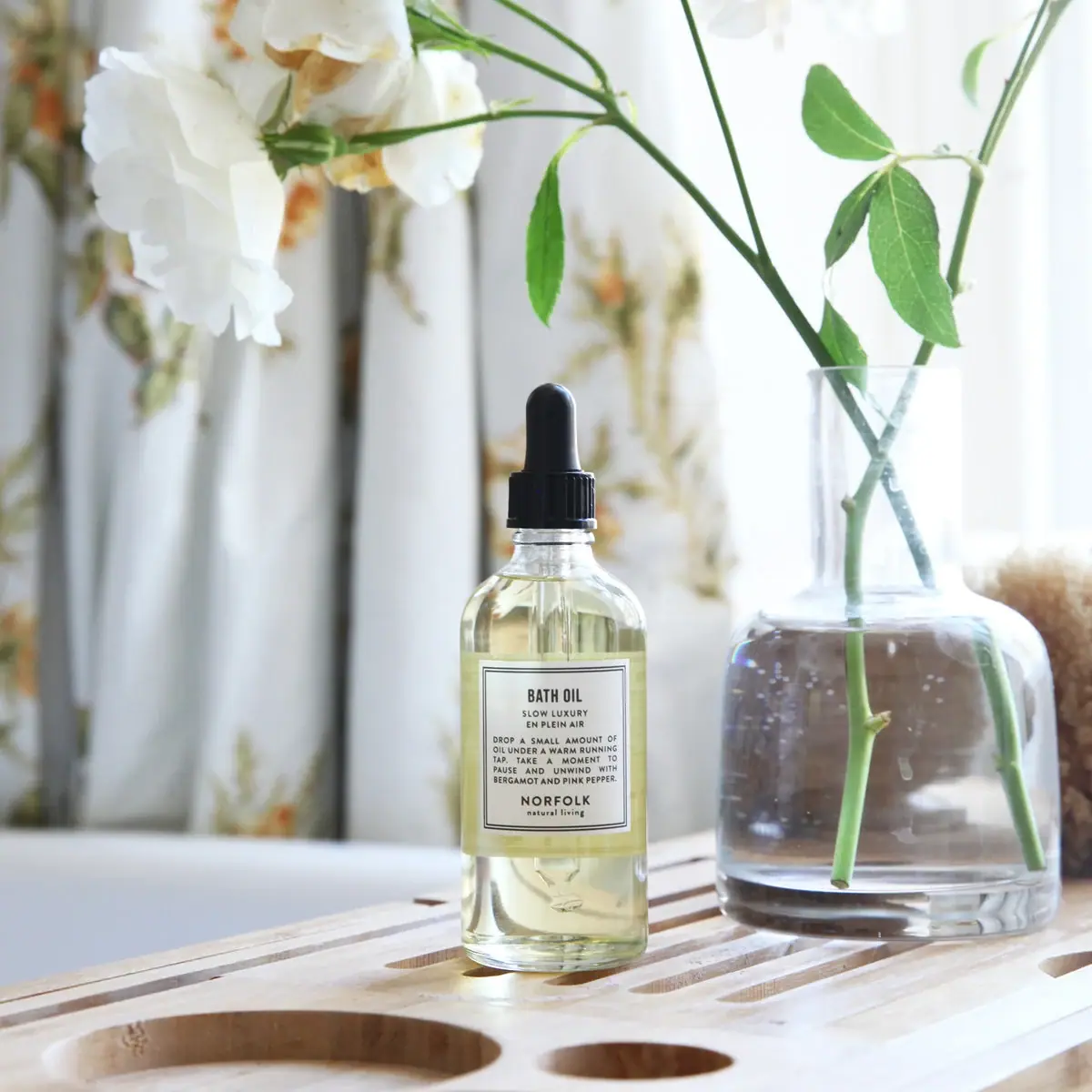
Norfolk Natural Living
Double-bordered bath-oil label on a clear black-dropper bottle
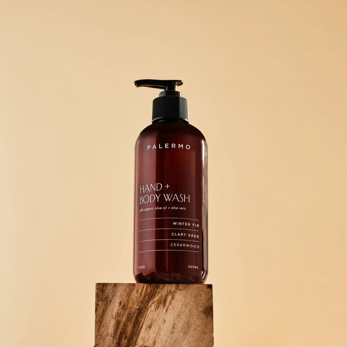
Palermo Body
Amber wash bottle with airy maker and ruled scent rows
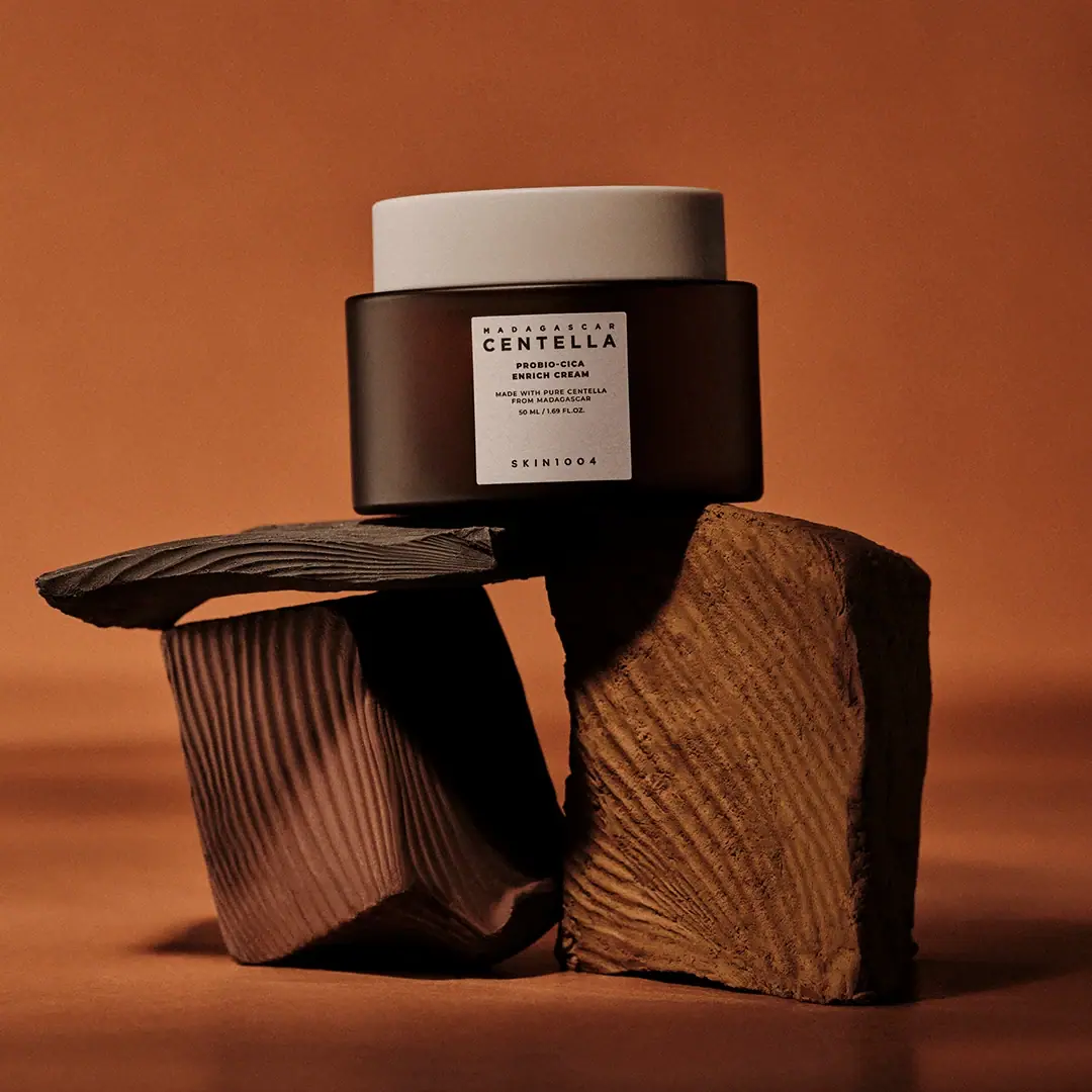
SKIN1004
cream lid above a brown jar and clinical panel
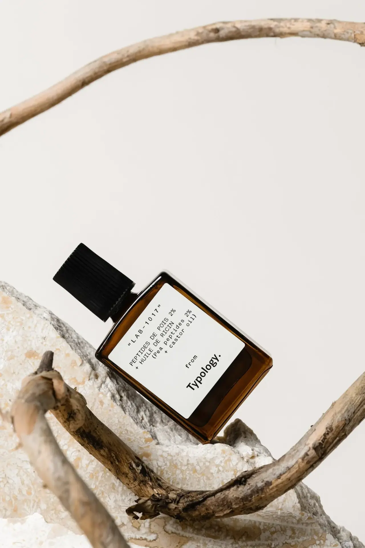
Typology
amber rectangle with a code-led bilingual white formula label

Aesop
a botanical still life around a disciplined apothecary label

African Botanics
Technical black label with a low serif signature

AussieZinc
Sun-yellow numerals on a tall, information-rich white cylinder

bareMinerals
a restrained black compact framing the powder itself