About this packaging
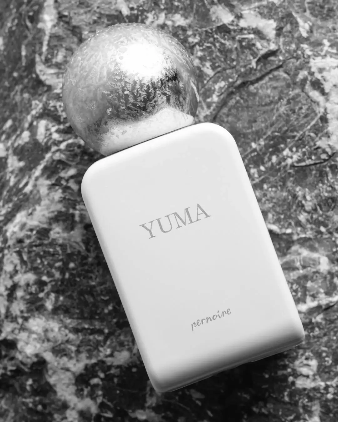
Pernoire’s Yuma Extrait de Parfum pairs a broad white rectangular bottle with a reflective spherical cap. The selected monochrome image puts the cap’s curved silhouette against the bottle’s straight edges and centered name.
The official page lists Yuma as a 50 ml Extrait de Parfum at 30% concentration, created by perfumer Andreas Wilhelm. It describes the scent as aromatic and citrusy, with Swiss mint, peppermint, yuzu and bergamot among the top notes.[1]
Pack construction & use
- Bottle / cap
- The cover shows a broad white rectangular body with a reflective spherical cap.Observed in the reference photograph
- Front face
- YUMA is centered across the bottle face, with the smaller Pernoire signature close to its base.Observed in the reference photograph
What makes the design work
Editorial analysis of this packaging reference.
Spherical cap with frost-like detail
The spherical cap combines bright reflections with frost-like crystalline marks in the selected photograph. Its rounded volume contrasts with the broad, quiet bottle face; the image does not establish a permanent frosted coating or the cap material.
Two quietly separated text groups
YUMA is centred horizontally above the middle of the face, with the smaller cursive Pernoire signature close to the base. The large pale interval separates product name from maker attribution; legibility still depends on the subdued lettering contrast.
Monochrome framing
The grayscale scene removes color cues and emphasizes the contrast between smooth bottle, reflective sphere and rugged setting. It positions the form itself as the main identifier.
Ideas for your next brief
- Pair a broad, quiet bottle face with a single sculptural cap shape to make the silhouette recognizable at a distance.
- Center the fragrance name and keep secondary branding low on the face so the product title remains the first read.
Sources & further reading
Researched 19 October 2026