Photography: Pernoire official photography. Images belong to their respective owners.
Pernoire

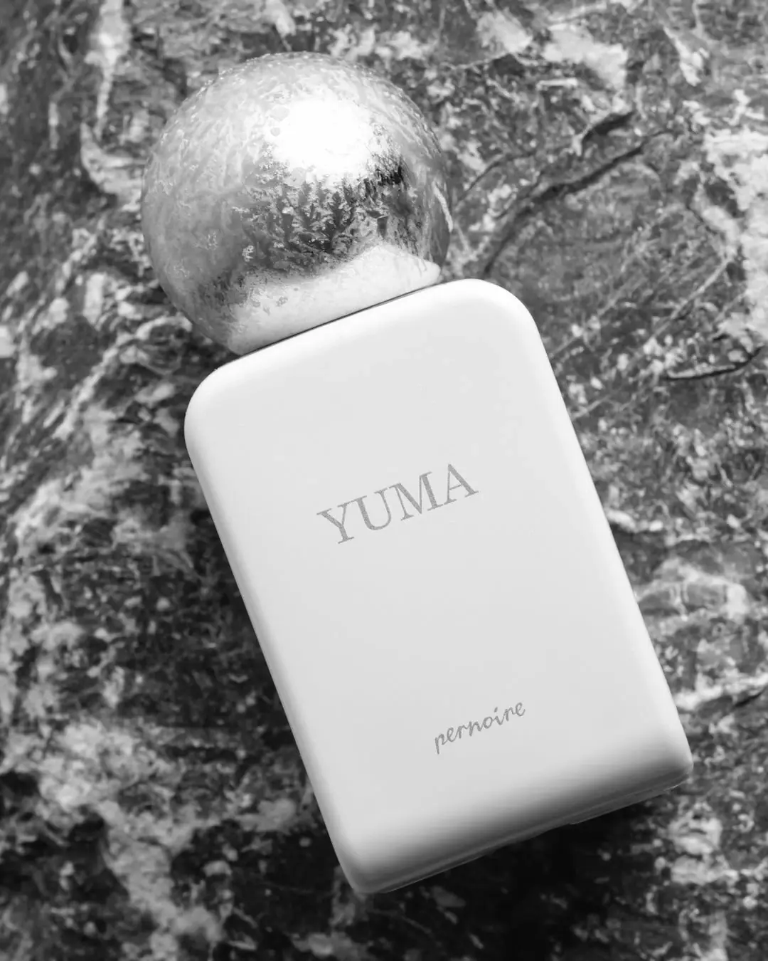
quiet pale rectangle beneath a frosted reflective sphere
Yuma contrasts a broad, softly rounded rectangular body with a large spherical cap. In the selected monochrome photograph, the pale front is almost empty: an uppercase serif fragrance name sits above the centre, and a smaller cursive house signature rests near the base. The cap carries bright reflections and frost-like surface detail against a rugged background. This study follows that exact photographic presentation, distinguishing observed tonal contrast from unverified material, colour and permanent-finish specifications.
- Perfume
- Light pack
- Luxe monochrome
About this study
Yuma Extrait de Parfum in the selected monochrome, frost-like cap photograph. Tonal observations are separated from physical colour and permanent-finish specifications.
Sources & evidence · Reviewed 2026-10-19Color Palette
Approximate colours interpreted from photography. These are screen references, not official brand colours or print specifications.
Pack body
Pale body in monochrome
#E7E7E5
Approximate light body tone in the selected grayscale image. The official image description calls the bottle white, but this is not a measured real-world colour or coating specification.
Ink
Mid-grey lettering appearance
#8C8C89
Illustrative tonal value of YUMA and the lower house signature. A monochrome image cannot establish the original ink hue, metallic content or printing method.
Accent
Reflective sphere midtone
#B8B8B5
Representative grey within a cap that ranges from dark reflections to near-white highlights. It is not a flat cap colour, alloy identification or permanent frost specification.
Typography
Suggested visual alternatives, not confirmed brand typefaces. Any scale below is an illustrative estimate.
The fragrance name is the main readable line, set in restrained uppercase serif forms. It is centred horizontally but sits above the middle of the front, leaving a long quiet interval before the smaller handwritten-looking pernoire signature. The two voices share a light grey appearance in this photograph; scale, placement and letterform do more work than colour contrast. No concentration or capacity line is legible on the shown face, even though the product page supplies that information.
Fonts
Fragrance-name alternative
Baskervville
- Looks like
- Baskervville for restrained classical capitals
- Type
- Transitional serif
- Weight
- Regular 400
- Case
- Uppercase
- Tracking
- Moderately open, adjusted optically
- Fallback
- Georgia, serif
Explore a short original scent name with quiet serif contrast. The letter shapes are only a stylistic alternative; test thin strokes against the intended body finish and avoid reproducing YUMA’s exact spacing and position.
Maker-signature alternative
Caveat
- Looks like
- Caveat for an independent informal signature
- Type
- Handwritten script
- Weight
- Regular 400
- Case
- Lowercase
- Tracking
- Natural handwritten spacing
- Fallback
- cursive
Develop an original maker line with a more informal voice beneath the title. Caveat is not an identification of the Pernoire mark; a new signature should use its own gesture, proportions and placement.
Structure & Proportions
Visual proportions and finish previews are illustrative. Confirmed construction details and uncertainties are distinguished in the study notes.
Proportions
| Purpose | Value | Preview |
|---|---|---|
| Cap versus body | The sphere is a prominent upper element but remains narrower than the broad rectangular face. No numerical diameter-to-width ratio is measured from the tilted image. | — |
| Two distant text groups | The title and lower signature are separated by a large unprinted-looking interval. Their relationship is established by shared horizontal centring rather than close proximity. | — |
| Soft perimeter | Rounded corners and broad edge shading ease the transition from frontal rectangle to side surfaces. The photograph does not establish wall thickness or exact corner radius. | — |
| Open front area | Most of the face remains pale and quiet. The layout relies on a short title; longer fragrance names would require their own fit and legibility tests. | — |
Shapes
| Element | Value | Preview |
|---|---|---|
| Bottle face | Broad upright rectangle with softly rounded upper corners and curved-looking side transitions. | |
| Closure | Near-spherical reflective form with frost-like detail in the selected scene. | |
| Information groups | One short serif line above centre and a smaller informal signature near the base. |
Finishes
Quiet pale body appearance
Broad front and rounded edges; no specific matte varnish or soft-touch coating is verified. · matte
Reflective cap appearance
Spherical closure, with highlights interrupted by frost-like markings; actual material remains unspecified. · metallic
Formats and materials
| Formats | Selected Yuma perfume bottle with a broad rounded rectangular face and spherical cap; official listing identifies a 50 ml extrait. |
| Materials | Opaque-looking pale body visible; the consulted product text does not identify its substrate or coating construction., Reflective cap appearance does not specify solid metal, metallised polymer, plating or alloy. The inner closure and dispenser materials are unseen. |
| Closures | A near-spherical cap sits above the narrow upper neck area. Much of its lower junction is obscured by the bottle shoulder and angle. The cap is closed, so no snap fit, screw connection, magnet, liner or spray arrangement can be established. Its large apparent size is a visual feature, not evidence of weight, balance, comfort or ease of opening. |
| Decoration | A single uppercase serif product name anchors the upper-middle front., A smaller cursive maker signature occupies a separate low position., The contrast between quiet face and textured reflective sphere supplies ornament without a printed illustration in this view. |
Front Panel
Schematic reading order. The diagram’s zone heights do not represent measured artwork proportions.
No separate broad label panel is apparent. YUMA and the lower signature sit against the same pale body field, so empty space becomes part of the hierarchy. The title is above the front’s midpoint rather than exactly centred vertically. The campaign tilt rotates the whole object; it should not be translated into diagonal typography on an upright production layout.
| Zone | Content |
|---|---|
| Sculptural closure | Reflective sphere above the neck, visually active through highlights and frost-like marks. |
| Fragrance title | YUMA in fine uppercase serif lettering, centred horizontally in the upper-middle part of the face. |
| Quiet interval | Broad pale area separating the two readable text groups without additional inspected ornament. |
| House signature | Small handwritten-looking pernoire mark close to the lower front, visually distinct from the serif title. |
Range System
The exact product page describes Yuma and lists discovery formats, but this study does not compare the visual construction of other fragrances. The selected body-and-sphere pairing should therefore not be declared a universal Pernoire rule. A useful independent exercise is to hold a simple vessel shape constant while testing different short titles; colour coding or identical caps across an actual range would require separate evidence.
- Observed Yuma: pale rounded rectangle, reflective sphere, serif title and low cursive signature.
- Source context: 50 ml extrait identified by the brand; discovery products listed elsewhere on the page are not visually analysed.
- Original-design exercise: check whether a long name can retain adequate stroke weight and open space without simply shrinking it to fit.
Back of Pack & Shelf
The reverse, underside, dispenser and retail carton are not shown. This image cannot locate ingredient information, concentration, batch coding or any warning text. The official product page contains information that is not legible on the visible front, but its location on the physical package remains unverified.
- Inspect reverse and base views before documenting the complete information system.
- Obtain an opened-cap view to identify the dispenser and attachment geometry.
- For an original design, plan a readable secondary information area alongside the restrained front.
On shelf
Interpretation: the sphere-and-rectangle silhouette could remain identifiable when fine front copy becomes difficult to read. The soft grey title has limited contrast against the pale body in the selected rendering, so its restrained effect comes with a possible legibility trade-off. A new design using this approach should be tested in colour and grayscale, under ordinary room light, and at both hand-held distance and thumbnail scale. The photograph alone does not prove effortless shelf recognition.
Imagery
The bottle lies diagonally against a rugged, highly textured surface, with pale crystalline-looking detail extending across the reflective cap. The official narrative references Swiss mountain air, which provides a documented thematic connection to this cold, stony presentation. Removing colour makes the difference between a quiet body and active cap especially clear. It also limits what can be inferred: the image is evidence of tonal organisation, not an accurate colour chart, a permanent frosted finish or cold-temperature product performance.
Guidelines
Editorial principles for an original design brief, not official brand guidelines.
Do
- Use silhouette contrast deliberately before increasing the amount of front decoration.
- Give the product name and maker attribution distinct typographic roles.
- Test subdued lettering against the actual body finish in ordinary lighting.
- Record when a reference is monochrome and avoid treating its grey values as measured physical colours.
Don't
- Do not describe the cap as solid chrome or assign an alloy from its reflections.
- Do not turn photographed frost-like detail into a permanent manufacturing finish without evidence.
- Do not assume every Pernoire fragrance has the same body, cap or title layout.
- Do not copy the pernoire signature or recreate the sphere-and-white-rectangle composition exactly.
Sources & evidence
How this study was built
context · Sourced fact
Exact official listing identifies a 50 ml extrait and provides the mountain-air narrative used only as photographic context.Pernoire — Yuma Extrait de Parfum, 50 ml, official product and imagerystructure · Visual observation
Broad rounded rectangular body and spherical closed cap create the principal shape contrast.Pernoire — Yuma Extrait de Parfum, 50 ml, official product and imagerytypography · Visual observation
Serif uppercase title sits above centre; a smaller cursive maker signature is positioned near the base.Pernoire — Yuma Extrait de Parfum, 50 ml, official product and imagerypalette · Visual observation
Selected image supplies grayscale tonal values rather than a full physical colour specification.Pernoire — Yuma Extrait de Parfum, 50 ml, official product and imageryfinishes · Visual observation
Cap reflections are interrupted by frost-like detail, so a uniformly smooth permanent finish is not asserted.Pernoire — Yuma Extrait de Parfum, 50 ml, official product and imageryimagery · Editorial interpretation
Rugged texture and cold-looking detail complement the source narrative without proving performance or material properties.shelf · Editorial interpretation
A recognisable silhouette may coexist with low-contrast text; controlled legibility testing remains necessary.
What remains unverified
- Exact body substrate, coating, cap material and attachment remain unverified.
- Monochrome photography cannot establish precise physical colours or ink hues; HEX values are illustrative tonal estimates.
- Frost-like cap markings are visible, but a permanent frosted manufacturing finish is not established.
- Original fonts, dimensions, dispenser, reverse, underside and carton are not inspected or measured.
Give your AI
packaging taste
Give your design or image tool a packaging study: palette, type, structure, front panel and principles for an original brief.
Export this styleFree with an email. PACK.md works in Claude, ChatGPT, Cursor and image tools.
More like this

Aerangis
a quiet numbered object, an intimate scent memory

Akro
soft pink interrupted by an assertive black signature

Alexander McQueen
An oval flacon crowned with dense black relief

Arquiste
blush transparency, white lettering and a stepped gold cap
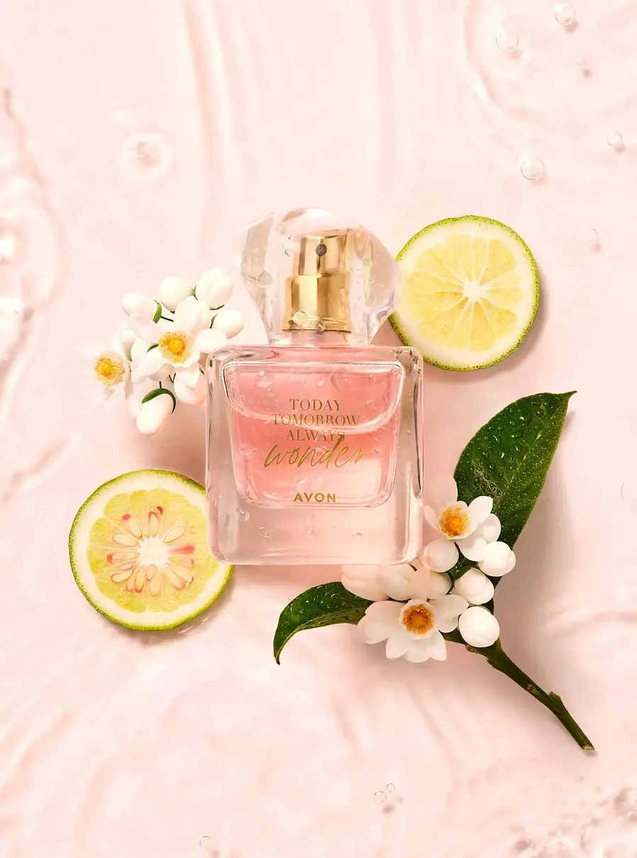
Avon
A clear flacon with a warm handwritten heart
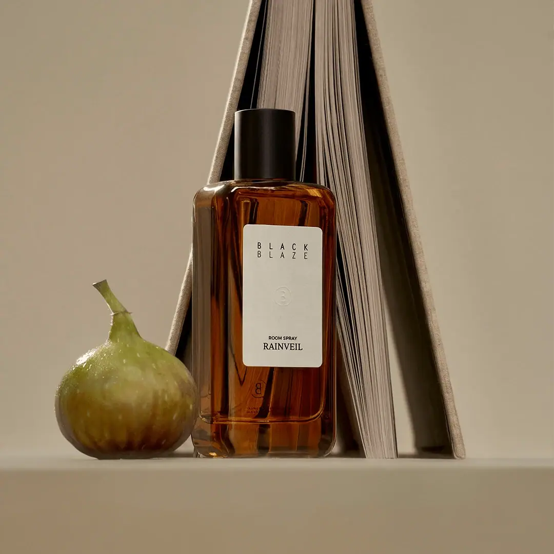
Black Blaze
Warm amber, quiet paper and a deliberate vertical rhythm
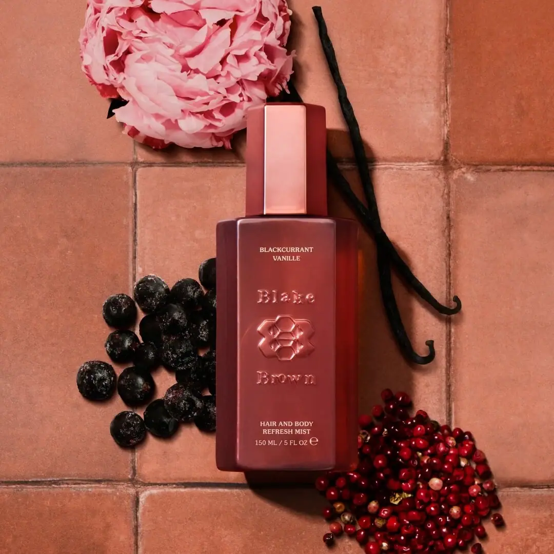
Blake Brown
sculptural rose-brown fragrance with a jewel-like centre
Byredo
Broad white fragrance label, clear round bottle, exposed silver atomizer