About this packaging
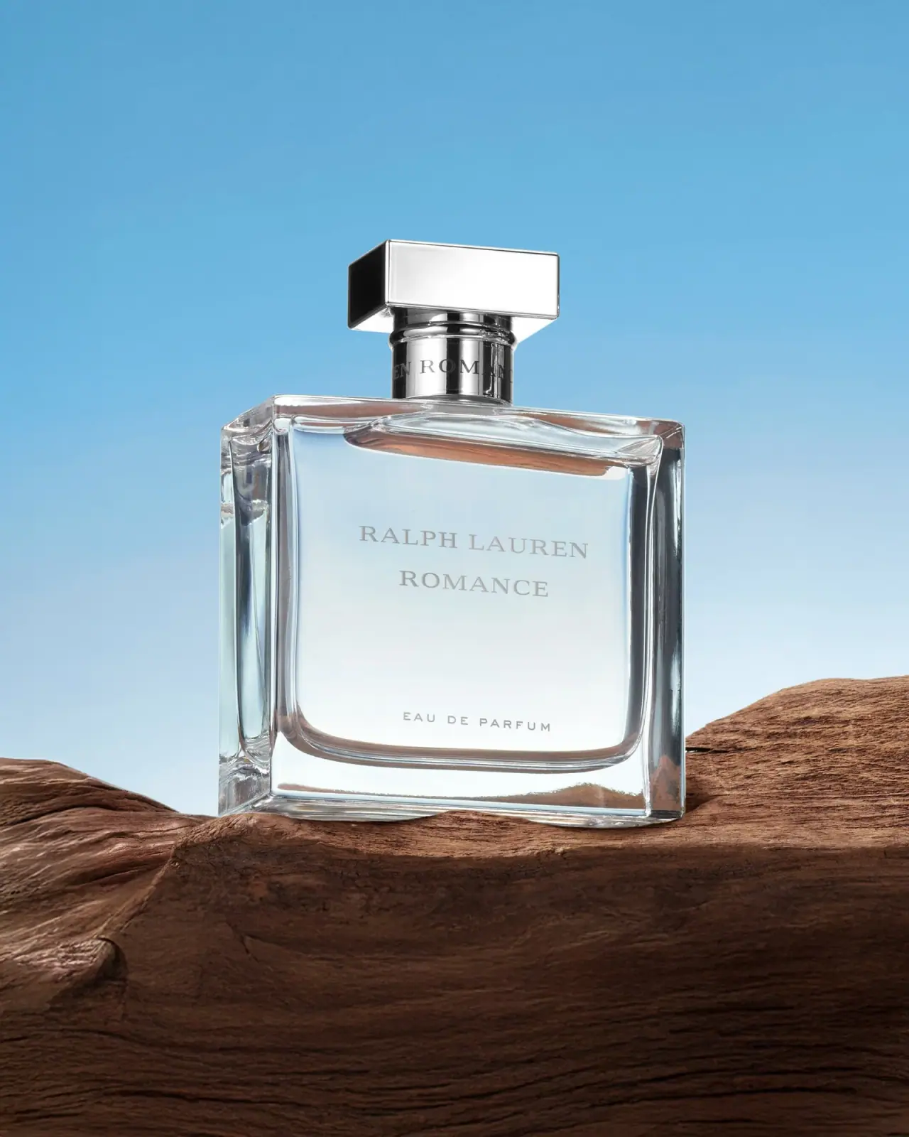
Ralph Lauren’s Romance Eau de Parfum is shown in a broad transparent-looking rectangular flacon with a pronounced clear base and a low reflective cap. Two restrained serif name lines share a central axis above a smaller concentration line, while blue and brown scenery reflects through the bottle.
Ralph Lauren Fragrances identifies Romance Eau de Parfum and offers several size options on its current page. The cover shows the Romance name and Eau de Parfum designation but does not establish which current size it represents.[1]
Pack construction & use
- Current product options
- The current official page lists Romance Eau de Parfum in multiple size options.[1]
- Flacon and label
- The wide transparent rectangular flacon has deep beveled edges and a thick clear base. A broad polished silver-colored rectangular cap sits over a cylindrical neck. The centered RALPH LAUREN ROMANCE lettering is separated from the small EAU DE PARFUM line near the bottom.Observed in the reference photograph
What makes the design work
Editorial analysis of this packaging reference.
Beveled silhouette
Angled shoulders add facets to the rectangular outline and make the heavy-looking base a prominent visual anchor.
Centered axis
Brand and fragrance naming align centrally, with the concentration line lower down; this gives a sparse front a composed reading order.
Quiet contrast
The clear bottle and pale lettering meet a reflective-looking cap. Proportion and surface contrast do the work without extra ornament.
Ideas for your next brief
- Use beveled edges to enrich a simple rectangular silhouette without adding graphic clutter.
- Keep a central type axis consistent when a fragrance front has few visual elements.
Sources & further reading
Researched 19 October 2026