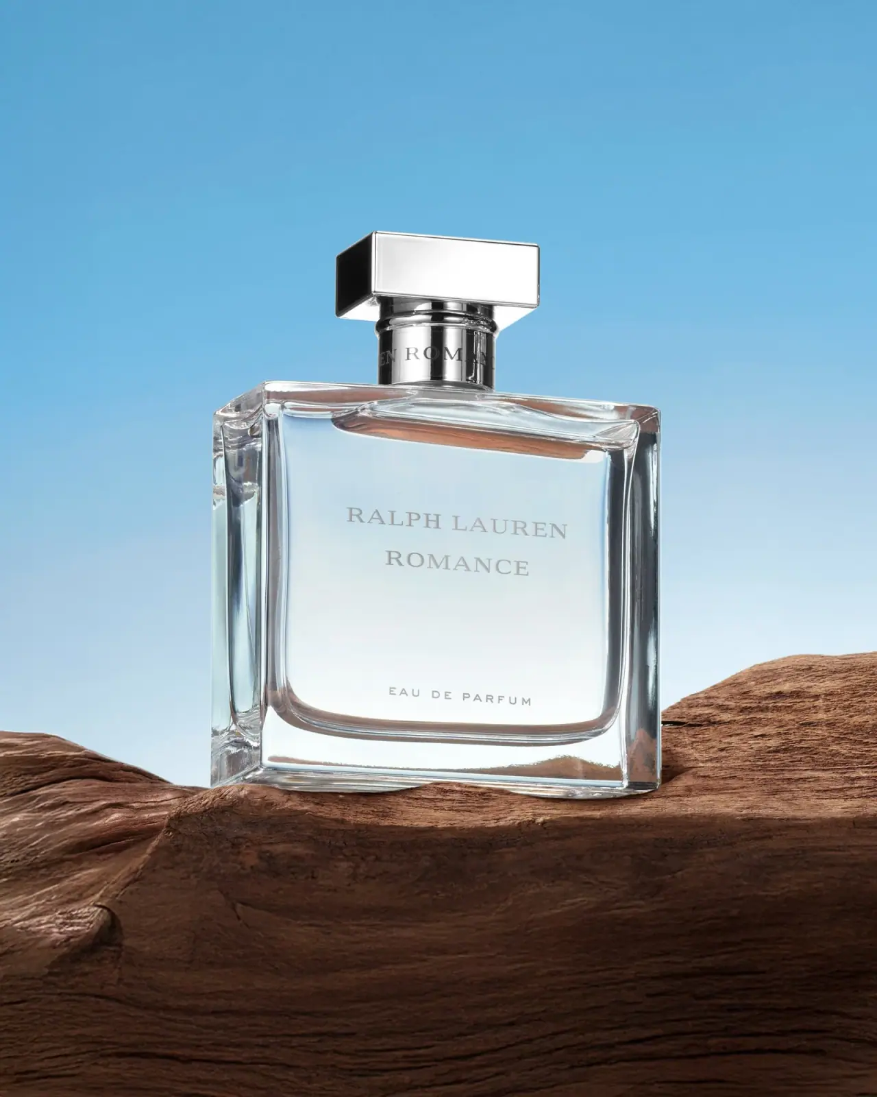
Photography: Lucas Zarebinski — Ralph Lauren photography. Images belong to their respective owners.
Ralph Lauren

bevelled transparency, silver bar and quiet centred lettering
The selected Romance flacon places a calm typographic centre inside a much more active optical perimeter. A broad transparent-looking rectangle, rounded inner cavity and substantial clear base frame two restrained serif name lines. Above them, a low silver-coloured rectangular cap crosses a cylindrical collar. Lucas Zarebinski’s credited photograph uses blue and brown scenery to reveal these reflective edges, but those scene colours should not be mistaken for the bottle’s own palette. Exact capacity and component materials are not established by this view.
- Perfume
- Light pack
- Luxe monochrome
- Heritage label
About this study
Romance Eau de Parfum in the approved Lucas Zarebinski image on wood against blue scenery. Exact capacity and construction are not inferred from the current multi-size listing.
Sources & evidence · Reviewed 2026-10-19Color Palette
Approximate colours interpreted from photography. These are screen references, not official brand colours or print specifications.
Pack body
Clear frontal highlight
#E5ECEB
Approximate pale appearance through the broad transparent-looking face. The cool cast is affected by background and lighting; no blue body tint is specified.
Ink
Soft grey lettering
#9C9D96
Approximate appearance of front names and concentration line. The image does not identify ink chemistry, etching or a metallic application process.
Accent
Silver cap midtone
#BCC1C3
Illustrative midtone of the highly reflective cap and collar. Their white and dark faces are lighting effects rather than verified separate colours or materials.
Typography
Suggested visual alternatives, not confirmed brand typefaces. Any scale below is an illustrative estimate.
Ralph Lauren sits above Romance on a shared central axis. Both use restrained serif capitals with larger initial letters, creating a small-cap-like rhythm rather than a heavy all-caps block. The house line spans more width while the shorter fragrance name has space around it. Near the lower front, EAU DE PARFUM appears in much smaller, widely spaced sans-like capitals. The separation between names and descriptor provides hierarchy without an oversized title or decorative illustration.
Fonts
Classical name-line alternative
Cormorant SC
- Looks like
- Cormorant SC for a restrained small-cap direction
- Type
- Display serif with small-cap forms
- Weight
- Medium 500
- Case
- Small-cap-like hierarchy with larger initials
- Tracking
- Moderately open with optical correction
- Fallback
- Georgia, serif
Explore two related name lines for a new fragrance identity. Check that delicate strokes survive the intended decoration process and background; do not reproduce the Ralph Lauren signature or exact two-line arrangement.
Concentration-line alternative
Montserrat
- Looks like
- Montserrat for a compact geometric descriptor
- Type
- Geometric sans serif
- Weight
- Regular 400
- Case
- Uppercase
- Tracking
- Open, but tested at actual size
- Fallback
- Arial, sans-serif
Use a small supporting line with sufficient contrast and spacing. This is a proposed alternative to the observed sans-like descriptor, not a confirmed typeface attribution; excessive tracking can make short text harder to scan.
Structure & Proportions
Visual proportions and finish previews are illustrative. Confirmed construction details and uncertainties are distinguished in the study notes.
Proportions
| Purpose | Value | Preview |
|---|---|---|
| Outer rectangle and inner cavity | The relatively straight outer perimeter surrounds a more softly rounded inner outline. Their difference creates a visible transparent frame rather than a printed border. | — |
| Horizontal cap | The broad low cap repeats the body’s horizontal emphasis while the narrower cylindrical collar connects two rectangular volumes. | — |
| Names and descriptor | The two central name lines sit well above a separate concentration line. The large interval keeps this sparse face ordered without making every line equally prominent. | — |
| Clear standing base | A substantial-looking transparent area separates the rounded cavity from the bottom perimeter. Refraction affects its apparent thickness, so no mass or wall measurement is assigned. | — |
Shapes
| Element | Value | Preview |
|---|---|---|
| Outer vessel | Broad rectangular outline with bevel-like edge transitions and softly rounded corners. | |
| Inner cavity | Rounded lower corners create a second outline visible through the transparent-looking body. | |
| Closure bar | Low rectangular prism above a cylindrical collar, with strong planar reflections. |
Finishes
Clear optical frame
Body perimeter and pronounced base; substrate and physical thickness remain unverified. · transparent
Reflective silver appearance
Cap and collar; no specific alloy or plating process is established. · metallic
Quiet grey graphics
Front name lines and concentration descriptor; printing or etching technique unknown. · matte
Formats and materials
| Formats | Broad rectangular perfume flacon with a clear-looking perimeter, rounded internal cavity, cylindrical neck and horizontal rectangular cap. |
| Materials | The body is rigid and transparent-looking; the accessed product’s bottle description does not provide a component bill of materials or glass specification., Cap and collar have a silver-coloured reflective appearance. Their substrates, plating and internal components are not identified by the photograph. |
| Closures | The closed cap is a low rectangular prism wider than the cylindrical collar below it. A dark side face and bright frontal face emphasise its planar geometry. Partial lettering is visible around the collar, but its complete wording and application are not inspected. The hidden spray head, cap retention, liner and any refill access cannot be inferred from the closed silhouette or generic site navigation. |
| Decoration | Two centred serif name lines occupy the upper-middle front., A small spaced concentration line sits separately near the lower cavity boundary., Bevel-like edges and a pronounced clear base create most of the visual ornament. |
Front Panel
Schematic reading order. The diagram’s zone heights do not represent measured artwork proportions.
The front reads as lettering on a transparent-looking field, not as a separate large contrasting label. The two main names share one axis; the lower descriptor repeats that axis with smaller type and wider spacing. A second partial identity appears around the collar. The optical perimeter frames the composition naturally, so a flat rectangular graphic border would add a different effect rather than reproduce the observed structure.
| Zone | Content |
|---|---|
| Reflective top bar | Broad silver-coloured cap anchors the top with planar rather than spherical geometry. |
| Collar detail | Partial dark lettering wraps around the cylindrical neck component; complete copy is not reconstructed. |
| Centred name pair | Ralph Lauren above Romance in related serif voices with larger initial letters. |
| Lower descriptor | Small widely spaced EAU DE PARFUM line above the visible rounded cavity edge. |
| Transparent perimeter | Clear-looking margins and base reveal refracted surroundings without a printed frame. |
Range System
The official page lists several Romance sizes, but the selected image has no readable capacity. This supports the existence of multiple formats, not identical proportions or construction across them. The study concerns the photographed eau de parfum, not every Romance flanker or Ralph Lauren collection. For an independent family, a shared central axis could organise different names while each physical size receives its own optical and legibility checks.
- Observed reference: transparent-looking broad body, horizontal reflective cap and two central serif lines.
- Source context: multiple sizes are listed, without establishing which one appears in the selected creator image.
- Original-design exercise: compare short and long names on differently sized vessels instead of scaling one front mechanically.
Back of Pack & Shelf
Reverse, base, retail carton and exposed dispenser are not visible. The front concentration line is readable, but no capacity or batch information can be located from this photograph. The product page’s engraving service should not be confused with evidence for how the factory identity was applied.
- Inspect underside and reverse to locate capacity and production information.
- Obtain a cap-off view before specifying dispensing or refill access.
- For an original fragrance, ensure supporting copy remains readable despite transparent surfaces and reflected backgrounds.
On shelf
Interpretation: the broad clear frame and low horizontal cap may make the silhouette recognisable before the pale lettering becomes readable. Low-contrast copy on transparency depends on what sits behind the bottle; the selected photograph supplies a deliberately favourable tonal field. An original design should be tested on light, dark and visually busy shelves, with attention to the small concentration line and reflections crossing the name. Apparent weight in a photograph is not a measured tactile benefit.
Imagery
The bottle stands on rough brown wood against a bright blue field. These two scene colours pass through or reflect in the transparent body, creating warm bands near the cavity and cool tones through the face. The cap’s bright front and dark side reveal a controlled lighting arrangement. The smooth geometric object contrasts with the irregular wood texture, giving a sparse package context without adding decoration to it. The scene is not evidence of blue-tinted glass, brown liquid, outdoor durability or an included wooden accessory.
Guidelines
Editorial principles for an original design brief, not official brand guidelines.
Do
- Let physical contours frame a sparse identity before adding a printed border.
- Use related type voices for house and scent while giving secondary information a clear separate position.
- Test pale lettering through several realistic backgrounds and light directions.
- Keep current size options separate from the unconfirmed capacity of a specific photograph.
Don't
- Do not treat the blue backdrop or brown wood reflections as fixed bottle colours.
- Do not infer metal composition, glass thickness or package weight from highlights.
- Do not assume generic refill navigation or engraving services describe this photographed edition’s construction.
- Do not copy the Ralph Lauren wordmark, exact cap geometry or complete front arrangement.
Sources & evidence
- Ralph Lauren Fragrances — Romance Eau de Parfum, official productproduct
- Lucas Zarebinski — primary photographer portfolio, credited image provenancephotographer
How this study was built
context · Sourced fact
Official listing identifies Romance Eau de Parfum and multiple sizes, without identifying the size of the selected photograph.Ralph Lauren Fragrances — Romance Eau de Parfum, official productstructure · Visual observation
Broad transparent-looking body, pronounced clear base, cylindrical collar and horizontal cap form the observed assembly.Lucas Zarebinski — primary photographer portfolio, credited image provenancetypography · Visual observation
Related serif name lines with larger initials sit above a smaller spaced concentration line.Lucas Zarebinski — primary photographer portfolio, credited image provenancelabel · Visual observation
No broad paper label is apparent; partial additional lettering appears on the collar.Lucas Zarebinski — primary photographer portfolio, credited image provenancepalette · Visual observation
Clear highlights, soft grey lettering and silver-looking reflections are separated from blue and brown scene colours.Lucas Zarebinski — primary photographer portfolio, credited image provenanceimagery · Editorial interpretation
Rough wood and smooth reflective geometry contrast visually; no included accessory or material performance is inferred.shelf · Editorial interpretation
Transparent-surface lettering requires background and lighting tests despite the strong framed silhouette.
What remains unverified
- Exact capacity of the photographed unit, component materials, wall dimensions and cap attachment are unverified.
- Original fonts and factory lettering process are unknown; alternatives are illustrative.
- Blue and brown scenery changes the bottle’s apparent colour; HEX values are approximate screen references.
- Reverse, underside, retail carton and exposed dispenser were not inspected; no refill mechanism is established.
Give your AI
packaging taste
Give your design or image tool a packaging study: palette, type, structure, front panel and principles for an original brief.
Export this styleFree with an email. PACK.md works in Claude, ChatGPT, Cursor and image tools.
More like this

Aerangis
a quiet numbered object, an intimate scent memory

Alexander McQueen
An oval flacon crowned with dense black relief

Arquiste
blush transparency, white lettering and a stepped gold cap

Chabaud
A framed perfume label beneath a clear architectural cap
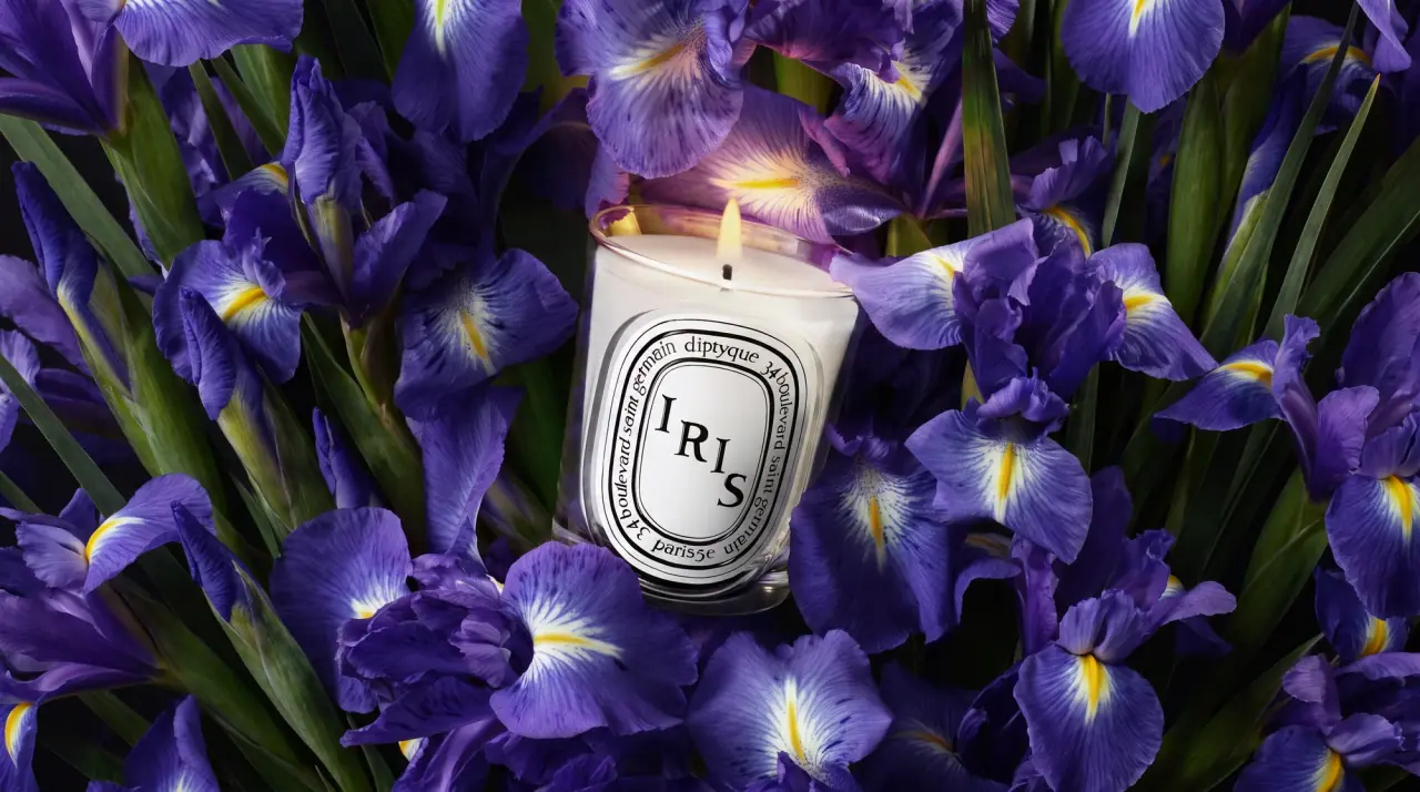
Diptyque
engraved oval labels on clear glass
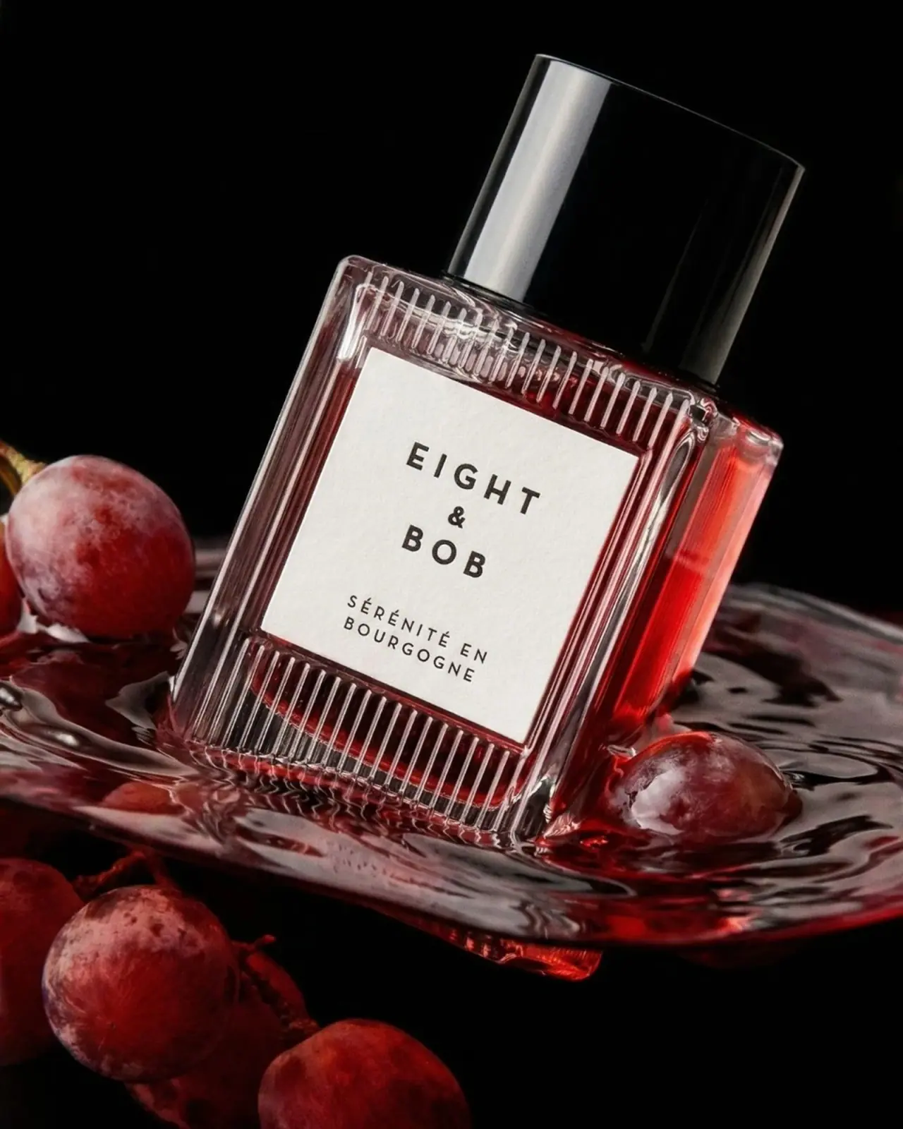
Eight & Bob
Ribbed red flacon, pale label and polished black cap
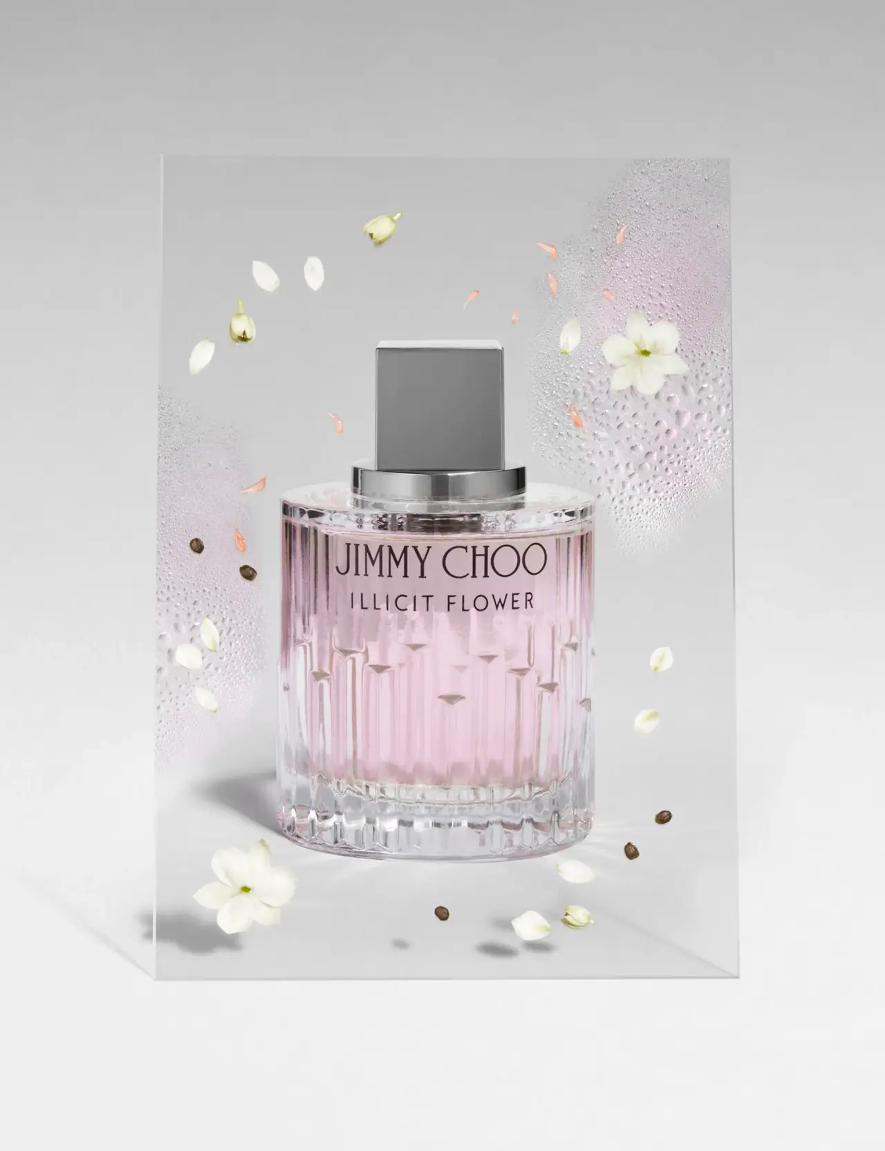
Jimmy Choo
Blush transparency, staggered flutes and a silver square cap
Lumière de Lily
Banded onyx framed by a black label and golden emblem