About this packaging
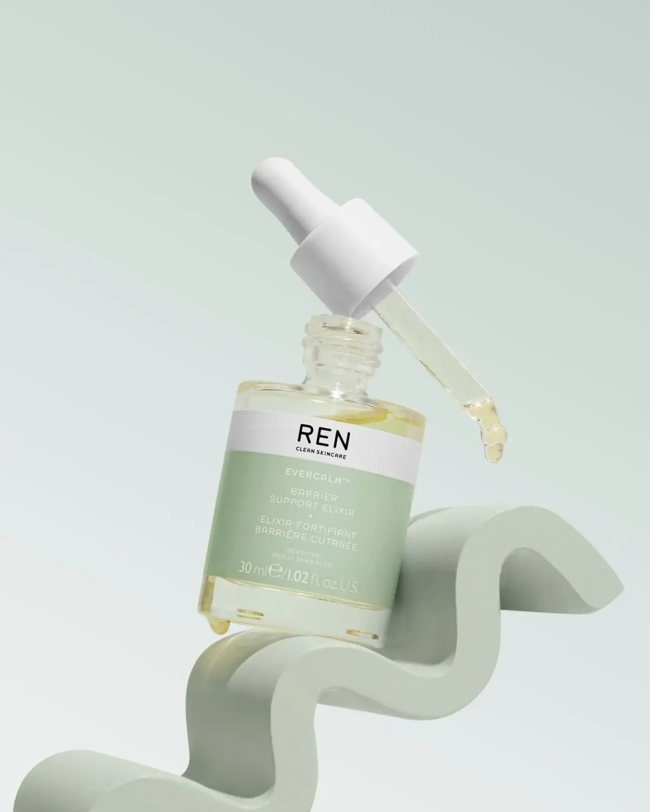
The REN Evercalm Barrier Support Elixir archive image shows a compact dropper bottle with pale green labeling and golden liquid visible through the body. A white brand band separates the house name from the product details.
ASOS lists REN Evercalm Barrier Support Elixir as a 30 ml fragrance-free serum.[1]
Pack construction & use
- Bottle / dropper
- The image shows a short clear bottle with a white dropper assembly and pale golden liquid.Observed in the reference photograph
- Label
- A white REN band sits above a pale green panel with product naming and volume.Observed in the reference photograph
- Front label
- The white REN signature band sits above a pale green panel with product naming.Observed in the reference photograph
What makes the design work
Editorial analysis of this packaging reference.
Dropper form and scale
The bottle’s short, broad body gives the dropper a stable visual base, while the long pipette makes the dispensing format immediately legible. The detached closure in the image reveals the neck and applicator as functional parts rather than hiding them behind a lifestyle prop.
A label with clear tiers
The white REN band establishes the brand first. Below it, the pale green panel organizes Evercalm, Barrier Support Elixir, bilingual descriptor and volume in descending levels. The restrained contrast suits a compact label: brand and product remain distinguishable without large blocks of copy.
Quiet color coding
Muted green is concentrated on the label while the clear bottle and warm liquid remain visible. This lets the product color add warmth without disrupting the cool, low-contrast setting. The sculptural prop raises the bottle but keeps the front panel unobstructed.
Ideas for your next brief
- Separate house name from product descriptor with distinct label bands on a small dropper bottle.
- Keep a muted label distinct from a clear container so the liquid remains visible without weakening text contrast.
Sources & further reading
Researched 19 October 2026