About this packaging
Fresh’s Tea Elixir serum is framed by the brand as a product built around its tea-inspired skincare story.
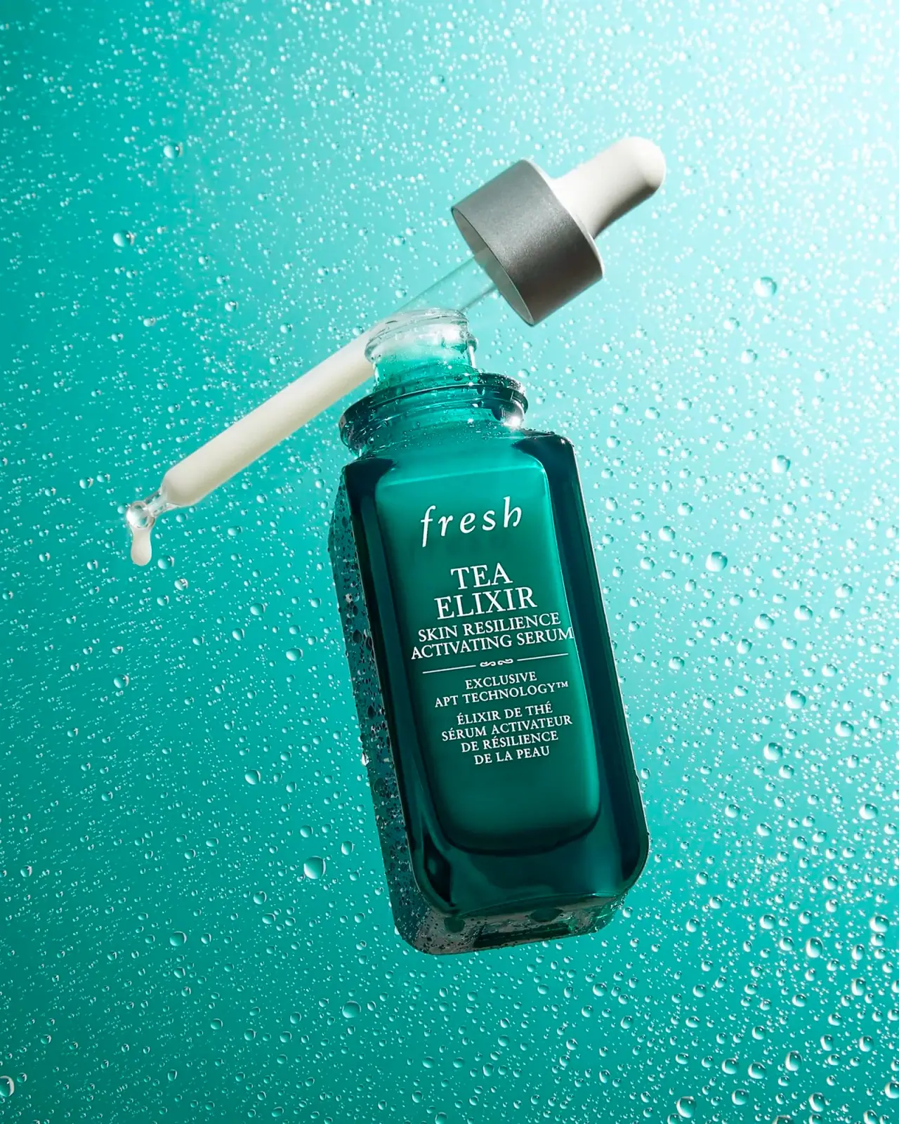
Fresh’s July 2022 editorial introduces Tea Elixir Skin Resilience Activating Serum and describes its formula as a milky emulsion in a green serum bottle. The article establishes product identity and color context but does not specify bottle or dropper materials.[1]
Pack construction & use
- Formula and bottle color
- Fresh’s July 2022 article identifies Tea Elixir Skin Resilience Activating Serum and describes a milky emulsion in a green serum bottle.[1]
- Dropper bottle and front
- A teal rectangular bottle has softly rounded shoulders and a thick transparent lower edge. The white italic fresh wordmark sits above stacked serif Tea Elixir naming and bilingual text. A silver-colored collar and white bulb contrast with the long transparent dropper.Observed in the reference photograph
What makes the design work
Editorial analysis of this packaging reference.
Soft rectangle
Rounded shoulders soften the straight-sided profile, creating a balanced silhouette that still reads as a stable bottle.
Naming hierarchy
The italic Fresh mark leads into stacked serif naming; white text remains distinct against the teal field, with smaller bilingual lines taking a supporting role.
Formula and color
Green bottle and pale milky contents reinforce the Tea Elixir identity. The narrow contrasting collar visually separates the pipette assembly from the body.
Ideas for your next brief
- Keep brand, product-family, and bilingual details at clearly different type scales.
- Coordinate package color with the visible formula while preserving a contrasting break at the closure.
Sources & further reading
Researched 19 October 2026