Photography: Halves Studio — product photography. Images belong to their respective owners.
REN Clean Skincare

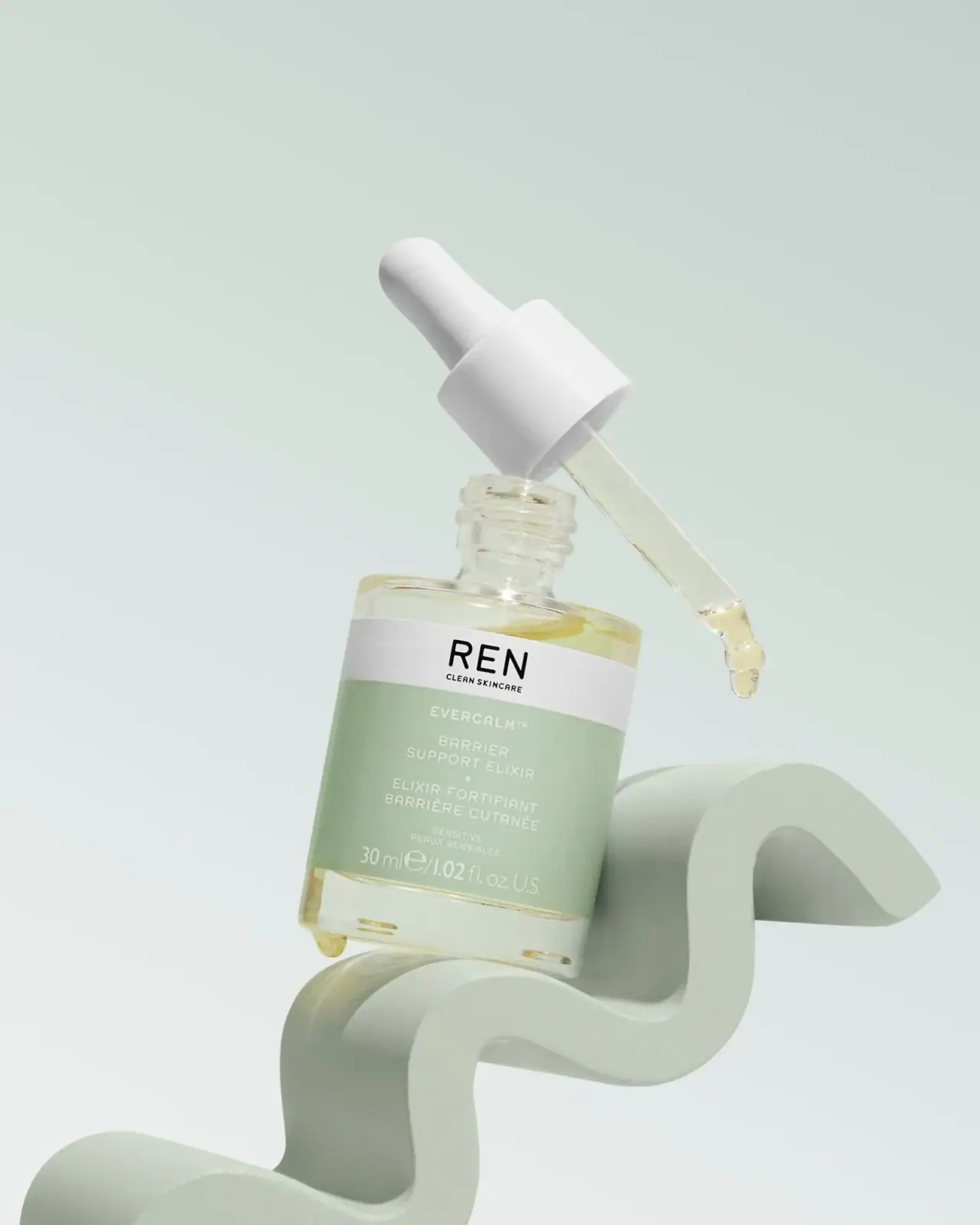
Sage bilingual label, white dropper and visible golden elixir
The selected archive Evercalm Barrier Support Elixir uses a short clear-looking bottle, a white dropper assembly and a two-part label. A white maker band carries black REN lettering; the larger sage field below uses pale centred product information in English and French. Golden liquid remains visible above and below the label and inside the detached pipette. Halves Studio's exact portfolio caption identifies this sculptural product photograph. The study treats it as archive packaging, separating the visible 30 mL format from uncertain current availability and manufacturing details.
- Skincare
- Light pack
- Clinical minimal
About this study
Archive 30 mL Evercalm image identified by its photographer; historical indexed brand specifications are qualified separately from direct visual evidence.
Sources & evidence · Reviewed 2026-10-19Color Palette
Approximate colours interpreted from photography. These are screen references, not official brand colours or print specifications.
Label
Muted sage field
#AFC3A2
Approximate product-information panel; curved-surface light changes its apparent density. The mint background and prop are not additional package colours.
White maker band
#ECEDE8
Neutral upper label strip, related in appearance to the white dropper assembly but not proof of identical material or colour specification.
Ink
Black maker
#111310
Strong REN signature and smaller CLEAN SKINCARE line, visibly darker than the product text below.
Pale product copy
#E6EAD7
Approximate light lettering on sage; contrast is materially quieter than black on the white band.
Accent
Golden liquid appearance
#DCD393
Approximate visible contents and pipette droplet, not a coating or guaranteed formula colour under other lighting.
Typography
Suggested visual alternatives, not confirmed brand typefaces. Any scale below is an illustrative estimate.
REN appears as large black uppercase sans-serif lettering in the white strip, with CLEAN SKINCARE much smaller beneath. In the sage field, EVERCALM begins a centred stack followed by the English product name across two lines, a small separator, the French product wording, sensitive-skin wording and quantity. The maker is the strongest contrast event, while the product block has a softer pale-on-green relationship. The quantity line is relatively broad across the bottom, rather than hidden in a tiny corner. This separates house recognition from detailed product identification without decorative frames or botanical illustrations.
Fonts
Original maker alternative
DM Sans
- Looks like
- Simple open sans-serif capitals
- Type
- Sans serif
- Weight
- Medium, Bold
- Case
- Uppercase
- Tracking
- Slightly open
- Fallback
- Arial, sans-serif
Create a different short maker with an equally clear small descriptor beneath. Maintain strong dark-on-light contrast in the maker strip without copying REN's exact letterforms or proportions.
Product-information alternative
Source Sans 3
- Looks like
- Quiet neutral sans serif
- Type
- Sans serif
- Weight
- Regular, SemiBold
- Case
- Uppercase with conventional quantity units
- Tracking
- Slightly open
- Fallback
- Arial, sans-serif
Keep English and French product roles distinct through spacing rather than abrupt style changes. Test light lettering on the chosen colour at actual label size; a soft palette should not make the practical name difficult to read.
Structure & Proportions
Visual proportions and finish previews are illustrative. Confirmed construction details and uncertainties are distinguished in the study notes.
Proportions
| Purpose | Value | Preview |
|---|---|---|
| Compact body | The short broad bottle creates a substantial lower mass against the taller detached dropper assembly. | — |
| Two-part label | The white maker strip is shallower than the sage product field, giving the latter room for several bilingual information levels. | — |
| Clear margins | Visible contents and transparent-looking bottle remain exposed above and below the opaque label, providing a warm accent around the cool sage. | — |
| Long pipette | The applicator extends clearly beyond its collar, making the dispensing format legible when photographed outside the bottle. | — |
Shapes
| Element | Value | Preview |
|---|---|---|
| Bottle | Short straight-sided cylinder with softened shoulders and a threaded neck. | |
| Dropper | Rounded white bulb above a cylindrical collar and clear narrow pipette. | |
| Maker strip | Shallow white rectangular band wrapping around the bottle. | |
| Product field | Larger sage rectangle containing a centred information stack. |
Finishes
Transparent bottle appearance
Bottle margins and pipette; historical brand text supports glass bottle · transparent
Quiet label surface
White and sage label; paper and varnish unspecified · matte
Low-glare closure exterior
White collar and bulb; tactile finish unverified · matte
Formats and materials
| Formats | Short cylindrical 30 mL bottle with a broad clear-looking lower zone, Open threaded neck above gently rounded shoulders, Detached white dropper collar and rounded bulb, Clear pipette containing pale golden liquid and a visible terminal drop |
| Materials | Historical indexed official gift-set text describes the Elixir's bottle as glass; direct access to that page failed during this review., The same historical brand text describes a PCR-plastic and glass dropper, but does not establish the exact resin, recycled percentage or component composition of this photographed assembly., Label stock, adhesive, print treatment and bulb material are not identified by the image or accessible photographer page. |
| Closures | The detached assembly reveals a smooth white cylindrical collar, a rounded white bulb and a long clear pipette. The bottle's external neck threads are visible, supporting a screw-on closure interpretation rather than a press-fit cap. The pipette is held diagonally above the opening and contains a small amount of golden liquid ending in a drop. This illustrates the dispensing format but does not show the full operating sequence, a calibrated dose or drop volume. The image cannot establish whether the bulb, collar and pipette separate for disposal or whether the bottle is intended for refilling. |
| Decoration | White upper maker strip above a larger sage panel, Black house identity and pale product information, Centred English and French wording, No decorative border or botanical ingredient illustration |
Front Panel
Schematic reading order. The diagram’s zone heights do not represent measured artwork proportions.
The maker strip and product field create two distinct contrast regimes on one small wrap. Black lettering on white quickly identifies the house, while pale lettering on sage presents the product more quietly. Within the sage field, the English and French names occupy separate centred groups, followed by smaller audience wording and the broad quantity line. The label is readable in the selected large image, but its pale type deserves more cautious thumbnail treatment than the maker. The clear lower zone remains free of information, so liquid colour and reflections can appear without passing behind the primary text.
| Zone | Content |
|---|---|
| White house band | REN above the much smaller CLEAN SKINCARE line. |
| Sage upper field | EVERCALM followed by the English product identity in two lines. |
| Sage middle field | French product wording, separated from the English block by space and a small mark. |
| Sage lower field | Sensitive-skin wording and 30 mL / 1.02 fl oz U.S. quantity declaration. |
Range System
The indexed historical brand gift-set page lists Evercalm Barrier Support Elixir at 30 mL, consistent with the quantity visible here. It also places the Elixir beside other Evercalm products, but those packages have not been inspected in this individual study. No universal sage colour rule or shared container construction is inferred. The archive designation is retained because present retail availability is not established through the failed direct brand product routes. Historical packaging guidance remains historical guidance, rather than a current promise about recycling infrastructure or component design.
- The 30 mL declaration is visible on the selected front and supported by historical official product context.
- A historical brand description identifies a glass bottle and a mixed-component dropper; exact pictured component specifications remain unresolved.
- An original family could preserve separate maker and product bands while changing format, but each label needs its own multilingual spacing review.
Back of Pack & Shelf
The back, underside and carton are not shown. The open assembly reveals the neck and pipette but does not expose every closure component.
- No complete ingredient list, barcode or batch-code location is visible.
- Historical brand disposal guidance distinguishes bottle from dropper and makes recycling dependent on local facilities; it is not a universal current disposal instruction.
- No refill instruction, calibrated pipette scale or verified dose marking appears in the image.
On shelf
The white maker band should remain easier to recognise than the pale product lettering when reduced, because it combines a simple short name with strong tonal contrast. This is a visual inference rather than a usability test. The clear bottle margins and golden contents soften an otherwise clinical label structure, but their appearance changes with illumination and fill level. A straight-on closed-pack image would complement this open composition by showing how the product reads in ordinary storage. The sculptural scene explains the dropper format more clearly than it tests shelf competition.
Imagery
Halves Studio identifies the exact image as Evercalm Elixir on a mint sculptural prop with dropper detail. A broad wave-like support raises the tilted bottle while the detached pipette crosses diagonally above it. The pale green scene echoes the label, and the golden liquid adds a restrained warm contrast. A small droplet also hangs near the bottle's lower edge. These details make the liquid format explicit, but the scene is an arranged product photograph, not proof that the support is supplied with the product or that this is a normal storage position. The rig and construction of the prop are not established.
Guidelines
Editorial principles for an original design brief, not official brand guidelines.
Do
- Separate source-confirmed history from current availability.
- Evaluate pale product copy independently of the strong maker band.
- Use open photography to explain actual visible components.
- Keep multilingual naming groups distinct through spacing.
- Distinguish liquid colour from the label palette.
Don't
- Do not present the sculptural support as a supplied cradle.
- Do not assign a dose volume from a photographed drop.
- Do not turn historical recycling wording into a universal current claim.
- Do not infer exact resin or recycled percentage from a white collar.
- Do not equate pale green scenery with additional pack decoration.
Sources & evidence
- REN Evercalm product photograph — Halves Studiophotographer
- Evercalm Gift of Calm — historical indexed REN product textproduct
How this study was built
imagery · Sourced fact
Halves Studio directly captions the selected Evercalm image with mint sculptural support and dropper detail.REN Evercalm product photograph — Halves Studioedition · Sourced fact
Historical indexed official gift-set text lists the Elixir at 30 mL, agreeing with visible quantity.Evercalm Gift of Calm — historical indexed REN product textstructure · Sourced fact
Historical brand text describes a glass bottle and PCR-plastic/glass dropper, without proving exact pictured component composition or current recycling access.Evercalm Gift of Calm — historical indexed REN product textstructure · Visual observation
Detached dropper reveals clear pipette and open threaded neck; liquid appears inside and at the pipette tip.label · Visual observation
Black maker on white precedes pale centred bilingual information on sage.palette · Visual observation
Golden contents are visible beyond the label; mint wave and background are separate scene elements.
What remains unverified
- Direct official product routes failed; historical indexed brand text used with explicit scope.
- Current availability and exact production date unverified.
- Exact label process, bulb material, resin and recycled percentage unverified.
- Reverse, underside and carton unseen; no calibrated dose established.
Give your AI
packaging taste
Give your design or image tool a packaging study: palette, type, structure, front panel and principles for an original brief.
Export this styleFree with an email. PACK.md works in Claude, ChatGPT, Cursor and image tools.
More like this

African Botanics
Technical black label with a low serif signature

AussieZinc
Sun-yellow numerals on a tall, information-rich white cylinder

bareMinerals
a restrained black compact framing the powder itself

BeautyPWR
Clear square shell, white cream cup, black serif identity

BioSeivas
Vertical serif identity on a mauve treatment band

Byoma
candy-coloured barrier science on a shelf
CeraVe
white pump bottles split by a coloured diagonal

Cocokind
sideways lowercase on spa-water pastels