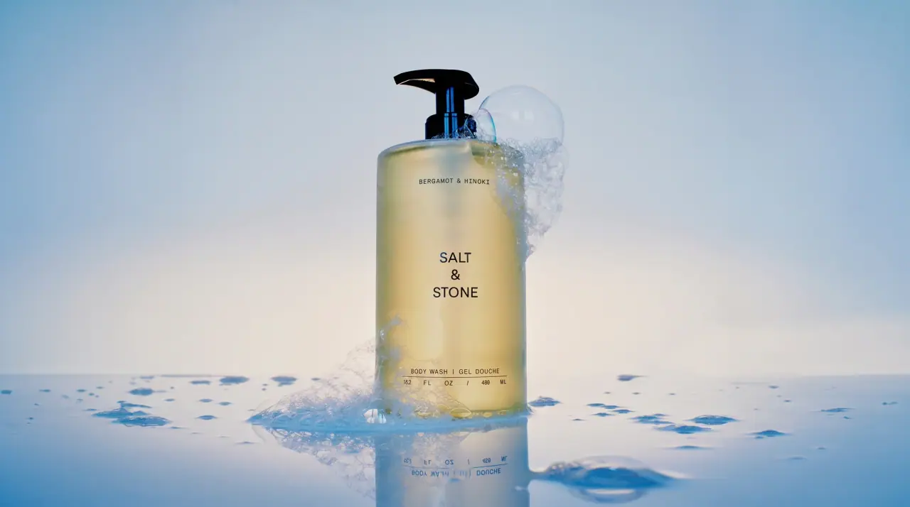
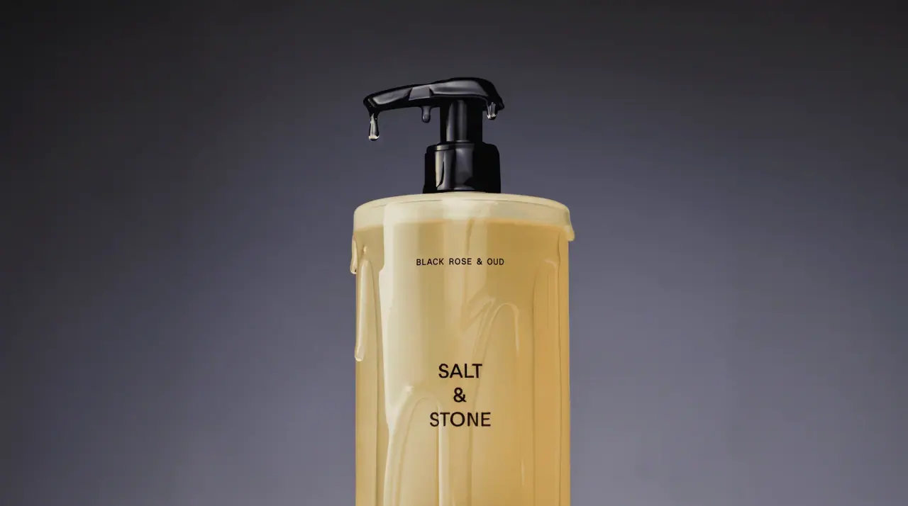
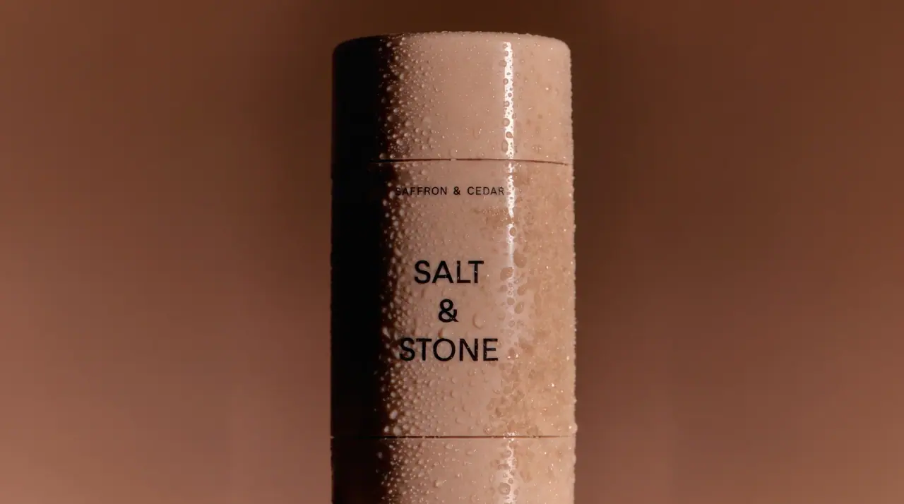
Campaign images © Salt & Stone, from saltandstone.com
Salt & Stone

spec-sheet type on mineral-toned bottles
Salt & Stone treats every pack like a calm technical sheet printed in one black ink (#1d1f1e): the brand name stacked and centred in plain grotesque capitals (SALT / & / STONE on tall packs, one line on jars and the perfume), the scent pair in tiny tracked capitals above it, and at the base a hairline rule with the product name in English and French split by a slash, plus a volume row whose figures and units are spread across the full width. The containers carry all the colour in soft mineral tones: sage (#a9b7a8) lotion bottles, warm stone jars, frosted straw-tinted body wash and oil, an eucalyptus-slate deodorant, a cream refill pouch and an amber candle glass, closed with black pumps or tone-on-tone caps. Type never changes size or position, so a pouch, a candle label and a perfume bottle read as the same document.
- Body & bath
- Light pack
- Clinical minimal
- Colour-coded range
Color Palette
Approximate colours interpreted from photography. These are screen references, not official brand colours or print specifications.
Pack body
Sage Lotion
#a9b7a8
Matte pump bottle of the body lotion
Warm Stone
#c9c3bc
Body cream and hand cream jar lid and frosted base
Frosted Wash
#e3d9b9
Translucent body wash and body oil bottles tinted by the formula
Eucalyptus Slate
#677a72
Deodorant canister in a deep grey-green matte plastic
Clear Flacon
#eceeee
Heavy clear glass perfume bottle
Label
Refill Cream
#efe8d9
Matte refill pouch and the white candle label
Ink
Ledger Black
#1d1f1e
Wordmark, scent line, rules and volume row on every pack; also the pumps
Accent
Amber Glass
#cf9d70
Tinted candle vessel
Blush Cap
#e9cbb8
Matte cap on the clear glass eau de parfum
Pale Stone Cap
#d8d6d2
Tall matte overcap on the body oil bottle
Typography
Suggested visual alternatives, not confirmed brand typefaces. Any scale below is an illustrative estimate.
Three levels only. The wordmark in mid-size grotesque capitals sits centred, stacked on three lines on tall packs or on one line on jars and the perfume. Above it, the scent pair in very small widely tracked capitals; below, a hairline rule with the bilingual product name and a volume row whose numbers and units are spaced across the full width.
Type scale
Estimated cap size as a share of the panel · Front of the 450 ml body lotion pump bottle, about 170 mm of body below the pump
wordmark-stacked
4.5% · Medium · Display
SAND & SKY
wordmark-single
3.5% · Medium · Display
SAND & SKY
product-name
1.1% · Regular · Body
BODY LOTION / CRÈME CORPS
scent-pair
1% · Regular · Label
FIG & CEDAR
volume-row
1% · Regular · Label
15.2 FL OZ / 450 ML
back-copy
0.9% · Regular · Body
Massage onto clean skin.
Fonts
Display
Inter
- Looks like
- Helvetica Neue Medium, Neue Haas Grotesk Display
- Type
- Neutral grotesque
- Weight
- Medium
- Case
- Uppercase
- Tracking
- Normal to slightly wide, about +2%
- Fallback
- Helvetica Neue, Arial, sans-serif
The wordmark, stacked on three lines with a centred ampersand on bottles and pouches; one line on jars and fragrance.
Label
IBM Plex Mono
- Looks like
- Akkurat Mono, Söhne Mono
- Type
- Monospaced grotesque
- Weight
- Regular
- Case
- Uppercase
- Tracking
- Very wide, about +15%
- Fallback
- Courier, monospace
Scent pair at the top and the volume row whose figures and units are spread across the label width.
Body
Inter
- Looks like
- Helvetica Neue Regular
- Type
- Neutral grotesque, small
- Weight
- Regular
- Case
- Uppercase
- Tracking
- Wide, about +6%
- Fallback
- Helvetica, Arial, sans-serif
English and French product name on the hairline rule, and the back-of-pack copy in sentence case.
Structure & Proportions
Proportions
| Purpose | Value | Preview |
|---|---|---|
| Printed area | Under 10% of the container face carries ink | |
| Wordmark width | About 30% of bottle width when stacked | |
| Wordmark position | Optical centre about 45% down the body | |
| Spec block | Bottom 12% of the face: rule, product name, volume row | |
| Side margin | About 12% of face width each side for the rule and volume row | |
| Colours per pack | Two: container tone plus black ink | — |
| Density | Mostly empty container with three small text blocks on a centred axis | — |
Shapes
| Element | Value | Preview |
|---|---|---|
| Pump bottle | Straight cylinder with a square-shouldered black pump | |
| Jar | Wide low jar with a deep matching lid | |
| Refill pouch | Stand-up pouch with an angled corner spout | |
| Candle label | White landscape rectangle with square corners | |
| Deodorant | Plain cylinder with a flat cap |
Finishes
Soft matte plastic
Lotion bottle, jar lid, deodorant and pouch · matte
Frosted translucent
Body wash and body oil bottles · frosted
Clear glass
Eau de parfum flacon · transparent
Tinted glass
Candle vessel · gloss
Formats and materials
| Formats | Pump bottle, Screw-cap jar, Refill pouch with spout, Bottle with overcap, Deodorant stick, Candle vessel, Perfume bottle, Squeeze tube |
| Materials | Matte plastic, Frosted plastic, Glass, Tinted glass, Flexible film pouch |
| Closures | Black dispensing pumps, tone-on-tone overcaps, a spout cap on the refill pouch, a blush cap on the fragrance |
| Decoration | Direct black print, Hairline rules, White rectangular label on candle |
Front Panel
Schematic reading order. The diagram’s zone heights do not represent measured artwork proportions.
Printed directly on the container (or on one white rectangle for the candle) as a centred column: scent at top, wordmark in the middle, ruled spec rows at the base.
| Zone | Content |
|---|---|
| Top | Scent pair in tiny tracked capitals |
| Centre | Stacked or single-line wordmark |
| Base | Hairline rule, bilingual product name, spaced volume row |
Range System
Container colour and translucency change with the product type, while ink, layout and type sizes are fixed; scents are identified only by the small top line.
- Body lotion = sage matte bottle + black pump
- Body wash and oil = frosted straw-tinted bottles
- Body cream = warm stone jar
- Deodorant = eucalyptus slate canister
- Candle = amber glass + white label
- Refill = cream matte pouch
- Eau de parfum = clear flacon + blush cap
Back of Pack & Shelf
The back repeats the same quiet column in black: a two-line product description, directions, the full INCI list in small capitals, then made-in line, PAO and recycling icons and a small barcode, all aligned to the same hairline rules as the front.
- Two-line product description in sentence case
- Directions in one short line
- INCI ingredient list in small uppercase
- Made-in and distributor address
- PAO, recycling marks and a small barcode
On shelf
On a shelf the range reads as a row of soft mineral-coloured objects with identical small black type, so it blocks by container tone and the repeated stacked wordmark rather than by graphics.
Imagery
None; the pack is purely typographic.
Guidelines
Do
- Centre a three-line stacked uppercase grotesque wordmark at about 4.5% of pack height on tall packs.
- Put the scent pair in tiny tracked capitals at the top of the face.
- Close the face with a hairline rule, a bilingual product name and a full-width spaced volume row.
- Colour the container in muted mineral tones such as sage (#a9b7a8), stone (#c9c3bc) and slate (#677a72).
- Use black pumps and Ledger Black (#1d1f1e) ink as the only dark elements.
- Keep every type size and position identical across formats.
- Leave at least 90% of the container unprinted.
Don't
- Don't add illustrations, botanicals or photography.
- Don't use bright or saturated container colours.
- Don't print the scent name large; it stays a quiet top line.
- Don't use serif or script type.
- Don't add glossy decoration or metallic foil.
- Don't print in more than one ink colour.
Give your AI
packaging taste
Give your design or image tool a packaging study: palette, type, structure, front panel and principles for an original brief.
Export this styleFree with an email. PACK.md works in Claude, ChatGPT, Cursor and image tools.
More like this

Byoma
candy-coloured barrier science on a shelf
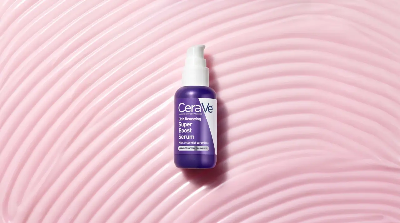
CeraVe
white pump bottles split by a coloured diagonal

Cocokind
sideways lowercase on spa-water pastels
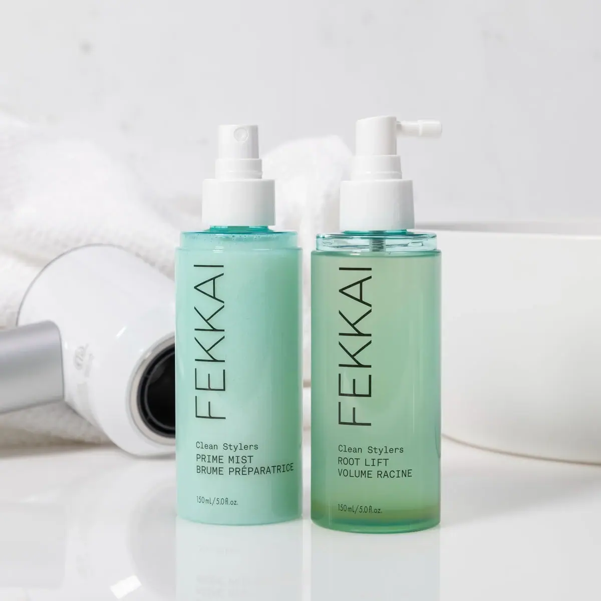
FEKKAI
Green styling duo with vertical hairline maker and white actuators
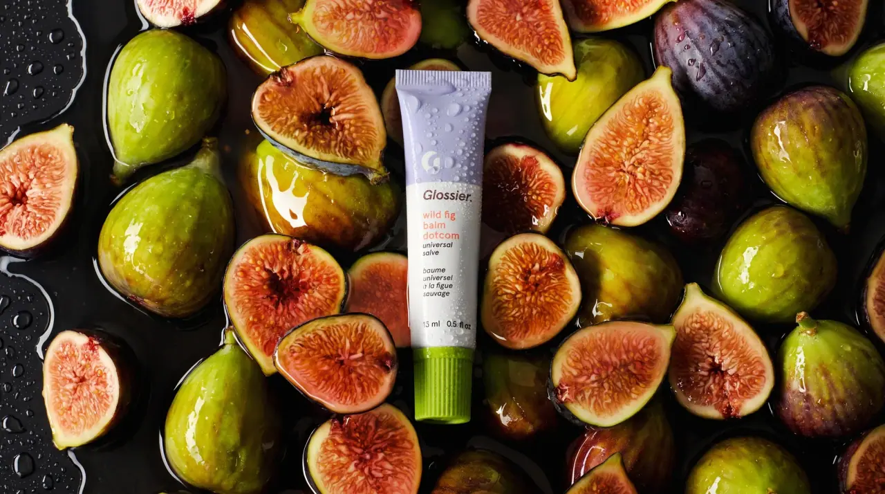
Glossier
clean white tubes with candy accents

Herbivore
pastel tinted vessels with a white tag
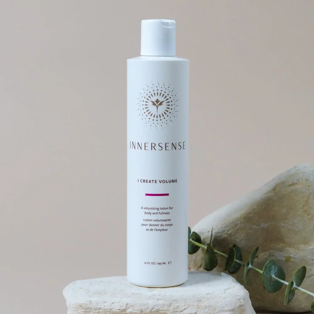
Innersense
Radiating bird emblem and magenta bar on a pale cylinder

Malin+Goetz
pharmacy label set in bracketed helvetica