About this packaging
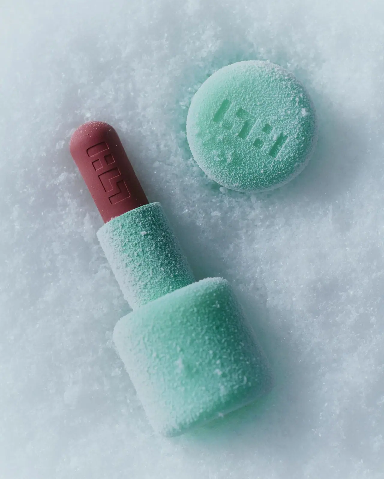
The selected Velvet Blur image shows a sculptural mint case with a broad rounded base, a narrower sleeve and a domed mauve bullet. A recessed geometric identity repeats on the cap face and formula surface; no ordinary product-name lettering is legible on the visible case.
The official page identifies Velvet Blur as a matte lipstick balm and confirms a custom dome-shaped tip. The selected photograph does not establish its shade name.[1]
Pack construction & use
- Stepped case and detached cap
- A broad rounded mint base steps into a narrower sleeve. The detached cap is shown mainly through its circular outer face, leaving its full depth and attachment mechanism unclear.[2]Observed in the reference photograph
- Recessed identity
- A geometric symbol appears recessed into both the cap face and the exposed bullet. No vertical product-name lettering is legible on the visible case.[2]Observed in the reference photograph
What makes the design work
Editorial analysis of this packaging reference.
A dome tip becomes a functional signature
The rounded exposed tip is confirmed by the official description. It sits above a sculptural stepped case rather than a uniform narrow cylinder.[1][2]
Relief connects product and packaging
The repeated geometric symbol links the cap and formula without contrasting ink. Shadows within the recesses make the mark visible.[2]
Scene texture is separate from case finish
White snow-like granules cover the case and background. They obscure the underlying finish and should not be described as a permanent frosted or textured coating.[2]
Ideas for your next brief
- Repeat an original relief identity across packaging and product surfaces.
- Use a distinct broad-to-narrow silhouette while keeping the application tip clearly visible.
Sources & further reading
- 1.SIMIHAZE Beauty — Velvet Blur Matte Lipstick Balm
- 2.Sara Zanoni — Walter Schupfer Management portfolio
Researched 19 October 2026