About this packaging
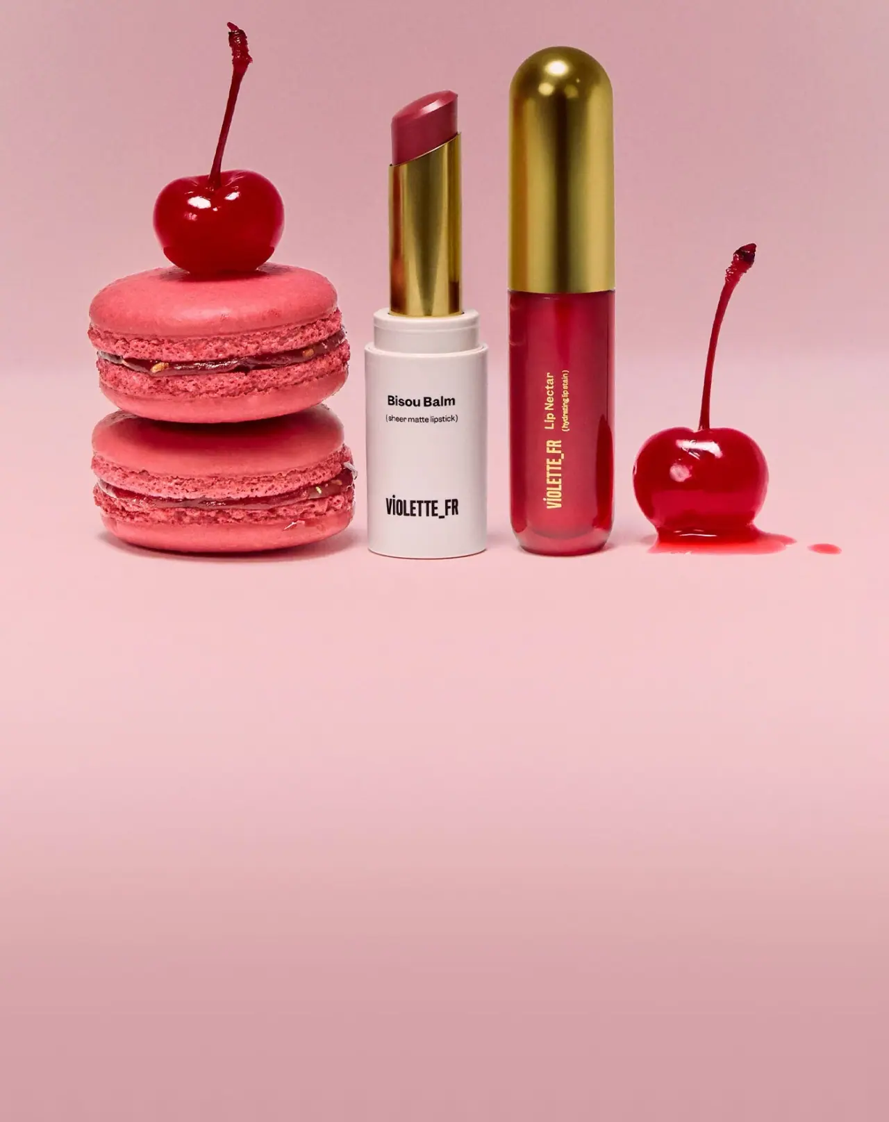
VIOLETTE_FR’s limited Bouche Duo Bêtise pairs an open ivory Bisou Balm case with a visible gold-tone sleeve and a closed berry-coloured Lip Nectar with a domed gold-tone cap. The shared reflective appearance connects two distinct product formats in the pink campaign still life.
The official page describes the holiday set as two expressions of Bêtise, a warm berry shade: Bisou Balm has a sheer matte finish and Lip Nectar has a high-shine stain finish. The product page identifies it as a limited-edition set.[1]
Pack construction & use
- Two-piece set
- The official page identifies Bisou Balm and Lip Nectar as the two products in the Bêtise set. In the selected photograph the balm is open, exposing its gold-tone sleeve and berry bullet; the nectar is closed beneath a domed gold-tone cap. Component materials remain unverified.[1]
- Shade identification
- Bêtise appears as one coordinated berry shade across both products, while the case colors and visible product forms distinguish the matte balm from the glossy liquid.Observed in the reference photograph
What makes the design work
Editorial analysis of this packaging reference.
One shade links two finishes
The berry hue repeats across a solid stick and a liquid format, giving the duo visual unity without making the products indistinguishable. The brand’s product descriptions explain the matte and shine contrast.[1]
Different cases clarify format
The ivory balm base contrasts with the berry-coloured nectar body. The exposed balm sleeve and the nectar cap share a reflective gold-tone appearance, connecting components with different functions.
The still life magnifies the berry cue
Pink macarons and cherries surround the products on a monochrome pink background. Their scale and color make the set feel like a shade presentation, while generous open space keeps the cases distinct.
Ideas for your next brief
- Use one shade across different formats to unite a set, while case color or transparency distinguishes each product.
- Pair a limited-edition set with a consistent shared accent across closures.
- Keep the product forms separated in campaign imagery when shoppers need to understand a duo at a glance.
Sources & further reading
Researched 19 October 2026